chapter 11 -...
TRANSCRIPT

Chapter 11Visual Design and Data RepresentationVisual design of your document is often constrained by the rhetorical situation. Although you might prefer one font over another, or a particular alignment on the page, if your audience expects a certain visual style, then you usually have to abide by that wish.
In this chapter, we are going to focus on textual design and graphic design in research-based writing, but recognize that most of the concepts presented here can be adopted for creating web pages, designing flyers or posters, or inventing new forms of expression. We will begin with some discussion of general design theory and then move into talking more specifically about text and graphic design.
How do readers interpret visual design?People process visual information in a particular way as a result of cultural expectations, exposure to past visual models, and cognitive and sensory limits. A great deal of research has shown that we tend to interpret visual representations based on a number of principles:
Limited capacity – People can only process between four and seven pieces of information in our working memory at a given time. Because of this, the brain has learned shortcuts. People tend to group like objects, seek enclosed patterns, and continue trends and paths in order to quickly process information. Although this all may seem overwhelming, the principle here is to make sure each representation does a very focused task. It is better to have two or more charts and graphs than it is to try and cram all of the information into one chart.
Salience – If you are trying to differentiate two items visually, you should really differentiate them. If they are too close together, people tend to see them as like objects. In a number of software packages, too many variables in one graph will require that they be represented by colors that are too similar, so that processing the differences is difficult.
Information value – People have learned through cultural exposure that certain elements in a visual representation appear in certain areas. For example, in Western cultures, we expect the left side of an image to present old information and the right to present new information. You would not make a timeline that began with the most recent year on the left and went back in time as it moved right. Additionally, the top of an image denotes the ideal and the bottom denotes the real. You will note that most graphs have descriptions of the variables and study comments in small print under a graph (see figure 11.9). Finally, the center tends to be where we focus. The margins are the peripheral—we focus on the center, or center-top, but the peripheral acts almost subliminally or as background information.

Discussion and Practice1. Advertisers understand the concepts of limited capacity, salience, and
information value when they create ads. Figure 11.1 is a print ad for Toyota’s Prius. The ad was created by Saatchi & Saatchi LA. What is being communicated in this advertisement? In what ways does observe the principals of limited capacity, salience, and information value? In what ways does it violate these principals, and does it do so effectively?
Figure 11.1. Toyota Prius: Harmony. Saatchi & Saatchi LA; Reprinted from Howard, T. (2009, May 18). Ad Track: Prius, Insight face off in battle of the green, hybrid ads. USA Today. Retrieved from http://www.usatoday.com/money/advertising/adtrack/2009-05-17-prius-insight-dial_N.htm

What are some text design features? Modern word processers have changed how we read, write, and design documents. The ease with which you can move text on the page and change the font opens up new possibilities, but it can also lead to confusion for your reader. As we have already indicated, certain cultural expectations place limits on just how creative you can be with your text. Whether that is a culture of academics at a university or professionals at a place of business, the common practices of that culture will dictate what is possible.
At probably the simplest level of text design is whether to use a serif or sans-serif font. Many print texts use serif fonts, whereas many online and screen-based texts use sans-serif fonts. Serif is a printing term that refers to a pen stroke or flourish on a letter. Figure 11.2 is an example of a serifed font, in this case, Times New Roman. A sans-serif font like Helvetica or Arial does not have these cross-strokes (see figure 11.3)
Most academic writing uses serifed fonts because academic writing has a long tradition with print text. Similarly, most academic writing uses a 12-point font. In some professional writing and in some print publications, a 10-point font might be used, but generally speaking, a 12-point font is the standard. The size of a font is referred to as a point, a measure that was originally derived from a traditional printing press blocks. In modern times, a point is equal to 1/72 of an inch, so that a 72-point font will equal 1 inch on the page or screen.
When selecting a font, you are trying to balance the two principles of legibility and readability. Legibility refers to how noticeable a font is and readability is how easy it is to read. Titles, headings, and headlines should be more legible than body text, and are therefore often in sans-serif fonts. Body text should be easier to read; on the printed page, serif fonts are generally used for the body. While different fonts, boldface type, and italics can be used to call attention to headings or other parts of a text, it is generally better to keep things simple and use no more than two or three fonts or typefaces in any document.
Discussion and Practice1. There have been studies on font readability and legibility for about 100 years, and
despite these many studies, no definitive answer has been found as to whether a serif or sans-serif font is easier to read. How would you create a study of font readability and legibility? Would this be a qualitative, quantitative or text-based study? What would be your protocol?
2. Font choice conveys meaning just as much as the content of your text. Because readers expect a particular font in a particular rhetorical situation, when that font is different, the writer’s content can be looked at with some skepticism—he or she didn’t
sans-serifFigure 11.3 Arial font, sans-serif
serifFigure 11.2 Times New Roman font, serif

understand the rhetorical situation. Consider the following examples. Are any of these written in the appropriate font? How does the font change the meanings?
If any of the parties participating in this contract are shown not to be in their right mind the entire agreement is automatically nullified.
Is Environmental Tobacco Smoke Exposure a Risk Factor for Acute Gastroenteritis in Young Children?
SHE WALKS IN BEAUTY, LIKE THE NIGHT / OF CLOUDLESS CLIMES AND STARRY SKIES; AND ALL THAT’S BEST OF DARK AND BRIGHT / MEET IN HER ASPECT AND HER EYES.
How do you use headings?When designing a document for an academic audience, there are also heading styles that should be observed. A heading separates one section of a text from another. Whether you are writing a lab report or a grant proposal, heading levels let you chunk text into sections and subsections so it is easier for your audience to follow. You should be consistent with each level of your headings—by level, we mean whether a section is a major or minor section.
In APA style, there are five heading levels. They are as follows:
LEVEL FORMAT
1 Centered, Boldface, Capitalize the Beginning of Major Words2 Left-aligned, Boldface, Capitalize the Beginning of Major Words3 Indented, boldface, Only capitalize first word, end with a period.4 Indented, boldface, italicized, Only capitalize first word, end with a period.5 Indented, italicized, all lowercase heading, end with a period.
Table 11.1. APA Style heading levels.
Figure 11.4 shows a sample page with at least three APA style heading levels:

Figure 11.4. Sample Method section with three levels of APA style headings.
MLA style does not have a standard heading style; the MLA Style Manual and Guide to Scholarly Publication asserts that your heading design depends on the rhetorical situation. In cases where the heading style expected of you as a writer and researcher is unclear, either use the APA style of headings or one that clearly shows a relationship from the standard text on a screen or page. For example, a top level heading should use a Larger Font, ALL CAPS or Bold, a second level heading might use underline or italics. Whatever style you choose for headings and subheadings, make sure to be consistent throughout your document.
What are some graphic design features?Research writing often relies on the visual representation of data and reproduction of images and artifacts to more fully express results or an argument. The use of visuals is a rhetorical choice that can either help better explain complex data or simplify a complex relationship. We might classify three types of visuals that you would include in your writing: ornaments, artifacts, and data representations.
Ornaments are visuals such as pictures or graphics that add context or additional information but are not vital to your argument. They are not referred to in the text, but instead, exist in addition to the text. Many newspaper and magazine articles use ornamental visuals to show what a context or person looks like. You will rarely see such visuals in academic research-based writing because such images usually are appeals to pathos—they are intended to evoke an emotional response. For example, in a story in the New York Times about preserving blueberries, the editor or writer used a picture of blueberries taken by Steven Senne (figure 11.5). The
Figure 11.5. BlueberriesReprinted from New York Times, image by Steven Senne/Associated Press
Method
In order to measure whether there were any gender differences in study preferences
of college students, we administered a 10-item questionnaire at a local community college
campus.
Participants
Females. A convenience sample of 75 female students were given the survey on a
Monday during the 5th week of the 16th week term.
Males. A convenience sample of 50 male students were given the survey on a
Monday during the 5th week of the 16th week term.

Figure 11.7. Thomas Edison's patent drawing for an improvement in electric lamps, patented January 27, 1880. Reprinted from Records of the Patent and Trademark Office, National Archives.
writer, Harold McGee did not refer to the picture once in the text. It is just attached to the story as a way to evoke an emotional response, to connect these fresh blueberries with the story on how to preserve that freshness.
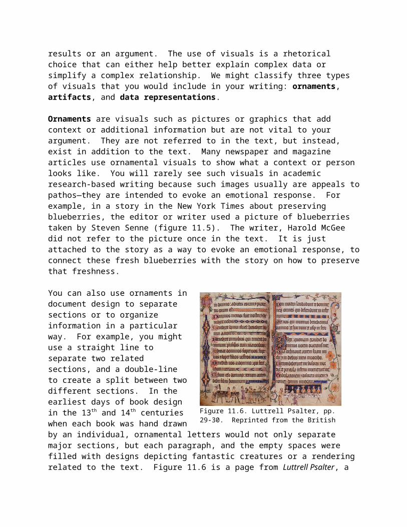
You can also use ornaments in document design to separate sections or to organize information in a particular way. For example, you might use a straight line to separate two related sections, and a double-line to create a split between two different sections. In the earliest days of book design in the 13th and 14th
centuries when each book was hand drawn by an individual, ornamental letters would not only separate major sections, but each paragraph, and the empty spaces were filled with designs depicting fantastic creatures or a rendering related to the text. Figure 11.6 is a page from Luttrell Psalter, a 14th century book that is supposed to depict images of everyday life in medieval Europe. Notice how all the graphical ornaments separate the text, each sub-section begins with an ornamental letter, and each major section begins with an even larger ornamental letter.
Artifacts are images of documents, art, or objects that you are analyzing in your text and that you specifically refer to in your text. For example, if you were writing a rhetorical analysis of a print advertisement, you would copy that advertisement in your document so your reader would be able to see the elements that you are referring to. In each of the figures of this chapter, we are using them as artifacts.
When you insert or paste artifacts into your document, you might even modify those images by adding lines or arrows pointing to key areas, or by zooming or blurring certain parts to focus on an element. In qualitative or observational research, you might include images of the setting or images of specific objects like menus, letters, seating arrangements, decorations, or any other relevant information to your study.
In documents such as grants or patents, artifacts are used to show what an object looks like or will look
Figure 11.6. Luttrell Psalter, pp. 29-30. Reprinted from the British Library, copyright 2009
like when produced. For example, figure 11.7 is Thomas Edison’s original patent for the light bulb.
Data representations are images or figures such as graphs, tables, charts, and matrices that depict data in forms different than their original state. These representations are very common to research-based writing because they help the researcher better explain complex data and relationships within that data. Quantitative data lends itself well to visual representations, such as in tables, charts, and graphs, but every research method can use data representations. For example, in business writing, complex strategies or models based on text-based research can be explained with visual flowcharts, and in qualitative research, tables can help show relationships between interview and observational data.
The problem with these data representations is that there are many ways that such graphics can be interpreted and misinterpreted. After all, you are transforming your data into a visual metaphor—it is a representation. To be sure, all images on the page or screen are representations. For example, figure 11.7 is only a drawing of Thomas Edison’s light bulb, not the actual light bulb, and figure 11.6 is only a picture of the stiff, musty pages of the Luttrell Psalter under lock and key at the British Library. What we mean here specifically is that transforming data from a number or sentence into a colorful slice of a pie chart or the strict columns of a table re-presents information in a new way, and as such, it can be misinterpreted. Spend the extra time creating a chart that is meaningful to your audience. Although your computer has many options for creating tables, charts, graphs, and other visual representations of data, the defaults don’t always produce a visual that is easy for your audience to understand. You should spend time thinking about the color schemes, uniqueness, and ease of reading of your data representation.
Discussion and Practice1. Think for a moment about a favorite publication, whether on the web or in print.
How does this publication treat visual design? Do they use ornaments, artifacts, or data representations? How do these visuals make appeals to ethos, pathos, or logos? In what ways do these images identify with readers?
2. Web-based publications share many similarities and differences with print-based publications both in visual and textual designs. What are some of these similarities and differences? What does print allow as far as design is concerned that web-based publications cannot match? What does web-based design offer that print cannot match?
a. Compare a publication that appears on both the web and in print. How are they similar in design or different?
b. If you were designing this textbook for the web and to make it accessible for your peers, what design choices would you make?
What are some common visual data representations?The three most common visual data representations in research-based writing are tables, diagrams, and graphs. Each has their purpose. In the following examples, we present either data or original graphs and diagrams to demonstrate how data can be represented.

We use these illustrations not as the best examples but to show you some possibilities and problems with how they might and have been used. When do you use a table?A table organizes information by columns and rows, and is best used when you want to preserve the precise or absolute measures from your data. It is also a good way to organize raw data. Although table 11.2 is a very small table, it clearly shows a trend, and if we had the data, it could be broken down even further by music genre, gender, and student level (high school, undergraduate, graduate).
Silence MusicWords per minute 18.8 17.8Table 11.2 Writing speed with and without musicSource: Ransdell, S. E. & Gilroy, L. (2001) The effects of background music on word processed writing. Computers in Human Behavior 17, 141-148
Table 11.2 is similar to the default tables that you would see in many professional and web-based documents. However, in most academic writing, the table is designed differently. Both MLA and APA style use an open table design as shown in table 11.3.

Note that table 11.3 is double spaced as per the rest of your text in APA/MLA style. Creating a table in APA and MLA style can be done with a word processor’s table function much like table 11.2. Create your table, and insert your data into the columns and cells, then erase the borders on the sides and between datasets. If you are unfamiliar with your word processor’s table function, you can simply make a table by using the hyphen/minus key to make lines, and then use the tab key to organize your data into columns.
Discussion and Practice1. Consider both table 11.2 and 11.3. What are the advantages and disadvantages
of representing data in a table format based on these examples?
Table 11.3
Highlights of Socio-demographic and Health Information by percent and frequency
Non-Smoker
(n=254)
Smoker
(n=13)
Social
Smoker
(n=40)
Former
Smoker
(n=16)
Total
(n=323)
Age
17-18 6.3 (16) 7.7 (1) 2.5 (1) 0 (0) 5.6 (18)
19-20 93.3 (237) 84.6 (11) 97.5 (39) 100.0
(16)
93.8 (303)
21-22 0.4 (1) 7.7 (1) 0.0 (0) 0.0 (0) 0.6 (2)
Academic Program
Arts 43.3 (110) 84.6(11) 55.0 (22) 81.3 (13) 48.3 (156)
Science 22.4 (57) 7.7 (1) 22.5 (9) 12.5 (2) 21.4 (69)
Business 29.9 (76) 7.7 (1) 17.5 (7) 6.3 (1) 26.3 (85)
Music 4.3 (11) 0.0 (0) 5.0 (2) 0.0 (0) 4.0 (13)
Overall Health Status
Excellent/Good 94.1 (239) 69.2 (9) 90.0 (36) 87.5 (14) 90.4 (292)
Fair/Poor 5.5 (14) 30.8 (4) 10.0 (4) 12.5 (2) 7.4 (24)
Source: Fletcher, P., & Camblin, A. (2009, March). Preliminary examination of first
year female university students: Smoking practices and beliefs in a city with no-

When do you use a diagram?A diagram is a 2- or 3-dimensional visual representation of a model or process. Diagrams are useful in trying to represent non-precise measures, qualitative information, or methods. Figure 11.8 is a diagram that represents a model of the writing process:
Figure 11.8. Visual model of the writing process.Reprinted from Flower, Linda and Hayes, John R., (1981). A cognitive process theory of writing. College Composition and Communication 32(4), 365-387.
Discussion and Practice1. Diagrams are good for explaining complex models or processes. In figure 11.8,
Flower and Hayes created a model of the writing process based on a study with students. Think of your own writing process. Does this diagram match your writing process? Create a diagram of your writing process. Once you have completed it, work with at least 5 other peers to create a writing process diagram that takes into account all of your individual diagrams. Share this diagram with the class.
When do you use a graph?In many of the sciences, a graph represents data points plotted against two axes, as in a line graph. A chart is used to refer to more basic data representations, such as a pie chart. However, you will find that these two terms are used interchangeably in many writing situations. Regardless, charts and graphs are best used when trying to represent a general comparison or trend in data. They are not good for visualizing precise measurements. The three most common are pie graphs, bar graphs, and line graphs.

How do you use a pie graph?Pie graphs are useful when you are representing how a single population or sample can be separated by various variables. Each wedge of the pie represents a percentage of that population or sample that has represents that particular variable. The figure 11.9 is a pie graph that represents the number of Bachelor’s degrees granted to students in 2005-06 by major.
Figure 11.9. Percent of total number of bachelor's degrees awarded by degree-granting institutions, 2005-06Source: Contexts of Postsecondary Education, Table 39-2. The Condition of Education, NCES. Retrieved November 1, 2008 from http://nces.ed.gov/programs/coe/2008/section5/indicator39.asp
Discussion and Practice1. Look at the pie graph representing college degrees conferred (figure 11.9).
Considering the ideas of limited capacity, salience, and information value, is this a successful pie graph? How would you improve it?
How do you use a bar graph?Bar graphs are useful when you want to show the amounts of two or more variables, usually separate and not continuous. Bar graphs can represent everything from nominal to ratio data. The bar graph in figure 11.9 is from the National Assessment of Adult Literacy. They measured literacy in three areas, and the bar represents a literacy score that a given population attained on a literacy test. Because these are discrete scores, meaning that participants were not judged every day or even every year on their literacy, a bar graph is better than a line graph.

Figure 11.10. Average prose, document, and quantitative literacy scores, by gender, 1992 and 2003.
Reprinted from National Assessment of Adult Literacy. A First Look at the Literacy of America’s Adults in the 21st Century. National Center for Educational Statistics, NCES 2006-470. Retrieved November 1, 2008, from http://nces.ed.gov/NAAL/PDF/2006470.pdf
Discussion and Practice1. The bar graph in figure 11.10 is from the National Assessment of Adult Literacy.
Participants were given a test on seven different documents, and then asked content questions; a maximum score of 500 is possible. They display the results in a bar graph. Is this an effective visual data representation for their data? What are its strengths? What are its weaknesses?
How do you use a line graph?Like bar graphs, line graphs are useful for showing amounts of two or more variables, but they are usually continuous, so can only be used with interval or ratio data. Figure 11.11 is a line graph looking at trends in bachelor’s degrees awarded to both men and women. Note how line graphs are useful in showing time-based trends, since time is ratio data.

1976-77
1978-79
1980-81
1984-85
1986-87
1988-89
1989-90
1990-91
1991-92
1992-93
1993-94
1994-95
1995-96
1996-97
1997-98
1998-99
1999-2000
2000-01
2001-02
0
100,000
200,000
300,000
400,000
500,000
600,000
700,000
800,000
MenWomen
Bach
elor
's de
gree
s gra
nted
Figure 11.11. Bachelor’s degrees conferred by gender and year. Source: Bachelor's degrees conferred by degree-granting institutions, Table 264. Digest of Education Statistics, NCES. Retrieved November 1, 2008 from http://nces.ed.gov/programs/digest/d03/tables/dt264.asp
These are the basic charts and visual representations of data that you should be familiar with. However, there are many more. Ralph Lengler and Martin J. Eppler at Visual Literacy.org have created a periodic table for data visualization (http://www.visual-literacy.org/periodic_table/periodic_table.html). Certain writing situations might require one or more of these methods of visualization.
How do you use a mixed visual?Transforming visual data into a standard graph or diagram as we have just described is often the best strategy when writing for an academic audience. However, some rhetorical situations call for more creative transformations of data. Although ornamented graphs like that of figure 11.13 are visually fun, they can obscure important data as the reader can get distracted. By contrast, figure 11.11 is a data map of the CDC’s Body Mass Index data displaying the average BMI of state residents, and then transposed on a map of the United States. In
Figure 11.11. State BMI averages from CDC's Behavioral Risk Factor Surveillance System (BRFSS). Reprinted from U.S. Obesity Trends: Trends by State 1985–2008, http://www.cdc.gov/obesity/data/trends.html

some ways, this is a like a pie graph or bar graph, but the visual display of data is much better than either of those alone.
Discussion and Practice1. Return to Table 11.3, the data from a study on the smoking habits of college
females. Construct a pie graph, bar graph, line graph, or mixed method visual using some or all of the data in that table. What is lost in the transformation? What is gained?
2. Diagrams can be used to interpret quantitative data as well as qualitative and text-based data. Figure 11.11 shows a trend of more females than males earning college bachelor’s degrees. What do you think are the reasons for this trend? Based on this data, work with a peer to create a diagram that interprets some of these reasons.
How do you choose the right visual for your audience?If you are writing for a public or popular audience, then advanced statistical analyses, unfamiliar measurement units (see figure 11.10), or extensive information might be too much. Although there is much to critique in the USA Today’s news snapshot charts, they are easy to interpret for a general audience (see figure 11.13). In contrast, if writing a business plan, an academic paper, or a grant proposal, you might want to avoid overly fancy graphical representations that could potentially obscure your data. Finally, don’t expect the tool to do the work for you. If using a bar or line graph, you have to compute measures of central tendency or absolute numbers for your data—you cannot just select all in a software package and expect the program to do the work for you. For example, if creating a pie chart, try to avoid creating too many slices, such as in figure 11.9.
How do you compose a visual?Like research and writing, it is best to approach the design of visual representations of data as a process of invention, drafting and revision. Although there are many tools that can help you present information, your own imagination and what you have seen in the past should guide you first and foremost when considering how to represent data. You might consider these three stages as important to drafting a good visual for your data.
1. Create a rough draft first – The biggest mistake people make is that they expect computer software tools to do all the work for them, and they tend to go to the tool without first thinking of what they want to represent, and how they want it to look.
Figure 11.13. USA Today’s News Snapshot from February, 2008. Reprinted from Healy, Michelle & Ward, Sam. How often parents join their teens in a video game. USA Today. February 4, 2008. Retrieved November 1, 2008 from http://www.usatoday.com/news/snapshot.htm.

You should draft your table, chart or graph on paper first, even as a rudimentary set of lines and squiggles so you can see what it should look like.
2. Share a draft with a peer – Having a peer look over your visual representation of your data can help you see what is working and what is not. One strategy that can be useful might be to have your peer describe the major findings from the table in his or her own language. This will let you know what is most salient and also what might be confusing.
3. Create more than you think you need – Rather than putting all your data into one table or figure, create multiple visuals that display your findings, and look for the most important details to use for your final version. Selecting the right visual is tied to the rhetorical situation and your audience, but having some backups and some alternatives will allow you to be better prepared if your professor, manager, or publication want you to select a different visual.
4. Save Backups – when transforming data into a visual, it is a good idea to keep backups of your data and tables or figures that seem particularly effective. There’s nothing more frustrating than losing valuable information or a great deal of work to a misstep or computer failure.
Most word processing programs allow you to create and insert diagrams and charts, though their design capabilities may be limited. Excel, likewise, includes a Chart Wizard that can help you create visual representations of your data. You might also take advantage of freeware or online tools to create graphs. For example, the National Center for Education Statistics hosts the user-friendly “Create A Graph” tool (http://nces.ed.gov/nceskids/createAgraph/) that lets you select your type of graph and design options, then enter your data and generate a graph that you can email or save as a jpeg to insert into a document; although the tool is in the NCES “Kids’ Zone,” the resulting charts can be professional
As you create visuals for your work, also think about issues of size and aspect ratio when placing it in your document. Too large an image will take up too much room on the page, and too small an image will hide its details. You should avoid stretching an image that was originally very small to make it large as it will not look as good. Similarly, you should preserve the aspect ratio, or the ratio of length to width of a visual so that it does not distort the visual. You can usually preserve the aspect ratio when resizing an image in a word processor by holding down the shift key when resizing from the corner of the visual.
How should you label and title your visuals?All visuals should have a title, and any data representations should also include appropriate labels.

A label refers to a specific part of your visual, whether it is a visual contrast or an appeal to pathos in a visual advertisement or a data point in a line graph. It is important to label the various parts so that your audience will know how to read the visual element. For example, we have labeled figure 11.12 with the various parts of a typical graph. The y- and x-axes should always be labeled, as should the scale or numbers you are using. If you use different colors or patterns to represent variables, that should also be explained in a legend for the graph. Make sure that readers can easily tell what is being measured and what units the numbers represent. Are you presenting count numbers or percentages? Miles or kilometers? Number of days per week or month? Clear labels avoid confusion. Some computer programs allow you to tilt the labels such as in figure 11.8, and that allows a more efficient use of space. While certain writing situations allow you to be more creative with how you label your graph, most academic writing situations require you to follow a particular style. Look for examples in publications in the field you are writing for or ask your professor what they expect in visual representations of data.
A title or what is sometimes called a caption usually appears below or above your visual and provides valuable information about that visual. The most common format is to provide a title, followed by a brief description, then its source. This is a common practice both in print and on the Internet. For example, every image at Wikipedia includes its description and a link to its source. You will notice that every table, image, or graph in this textbook has a caption underneath it. These captions allow you to refer to your visual clearly in your text.
Label /Label abbreviation
FigureFig. #.
TableTable #
Consists of Graphs, diagrams, maps, images
Data organized in columns and rows
Label location Below the figure Above the tableCaption With label, below figure,
describes figureBelow table, describes abbreviations
Table 11.4. Differences between figure and table labels and captions.
Any visual that was not created by you as author or researcher should also list its source. If just the data is from another source, then write “Source:” before the citation, and if the entire image is from another source, then write “Reprinted from” before the citation. In either case, a separate entry should also appear on your Works Cited or References page.
Figure 11.12. Elements of a graph

How can you fairly use images from other sources?In the United States, any image, text, or video is copyrighted as soon as it is fixed to a medium. Pictures that you find on the Internet are usually owned by somebody else, so you cannot use those images without their permission. Of course, copyright law has a provision called fair use that allows you to use limited amounts of a text or visual work for educational uses or criticism, so most of the work that you are doing in your classes is protected. However, be careful with multimodal projects that will reach an audience outside your university or class. For example, it is your responsibility to obtain permission from a copyright owner for a web project that uses a significant amount of an image, audio, or video from another source because the web reaches beyond the limits of that educational setting.
Although you do not have to attain permission to copy an image from Sports Illustrated that you are writing a rhetorical analysis about, you still need to cite it as you would any other text. As we have discussed in this chapter already, your caption of the image should clearly state where any image, figure, or data came from.
There are two special circumstances with regard to copyrights: Creative Commons and Public Domain.
Creative Commons (http://creativecommons.org) was created to provide authors and artists more control over what could be done with their works. A Creative Commons license allows for the author to decide whether his or her work is protected through four features. Table 11.5 from the Creative Commons website lists these features. Thus, a work could be given both the Attribution and Noncommerical designation, meaning that you can do whatever you want with the work, as long as you give the original author credit through a citation and you do not charge money for the work. Wikipedia has adopted an Attribution, Share Alike license for its articles, which means that you can use what you want from Wikipedia as long as you attribute it and apply the same privileges to that new work. A number of academic journals have also adopted a creative commons license.
Most works use a standard copyright, so Creative Commons only applies when a work specifically displays that designation. You can find Creative Commons works by going to the Creative Commons website, or by searching for websites that have Creative Commons options, such as Flickr (http://www.flickr.com/creativecommons/). Some other sites, such as Stock.XCHNG (http://www.sxc.hu/), house photos and illustrations that can be used royalty-free with limited restrictions. It is your responsibility to ensure you are using images within the limitations set by their copyright holders, and you should always give credit to avoid plagiarism or copyright infringement and to build your ethos as a researcher.
Attribution Share Alike Noncommercial No Derivative Works
You let others copy, distribute, display, and

You let others copy, distribute, display, and perform your copyrighted work — and derivative works based upon it — but only if they give credit the way you request.
You allow others to distribute derivative works only under a license identical to the license that governs your work.
You let others copy, distribute, display, and perform your work — and derivative works based upon it — but for noncommercial purposes only.
perform only verbatim copies of your work, not derivative works based upon it.
Table 11.5. Creative Commons license options. Reprinted from http://creativecommons.org/about/licenses
The other special copyright consideration is that of works in the public domain. Public domain works are owned by the public, and you use them freely without permission, although in most academic works you should still provide a citation for them. Generally speaking, United States government works and any work that is over 120 years old should be in the public domain. Unfortunately, determining exactly what is in the public domain or not can be confusing as laws are continually passed that change the limits and scope of when public domain goes into effect on a given work. Also, representations of a work are under a different copyright than the original—for example, even though Luttrell Psalter is well over 120 years old, we used an image of it from the British Library, an image it owns, so we had to attain permission to use it for this textbook. You should never assume a work is in the public domain, even if you think it should be—always refer to the author for works that are not clearly marked.
You can find public domain works by adding the phrase in quotes to your search term, or using websites that indicate they use public domain images; for example, the National Archives website (http://www.archives.gov/) clearly states that images and documents on their website are in the public domain unless indicated otherwise. One special note should be made about Wikipedia—although they strive to use only public domain images, there are occasional images on Wikipedia that are not in the public domain. Do not assume an image at Wikipedia is in the public domain even though the website says so. Refer to the primary author of the image by clicking on it and then following the link to its source.
A final note on using visualsYou should always think rhetorically about using visuals in your texts. Will your font convey the right tone? Will a photo or diagram enhance your readers’ understanding of a concept? Will a table or graph present your data and connections more clearly than a textual summary? Choose visual elements to supplement or enhance your text, not just because they are pretty or take up space.
As mentioned earlier, visual design is a process, and you should not create or insert visuals haphazardly at the last minute. On the other hand, avoid tinkering with the design of a document too early in the drafting and revision process when your attention should be devoted to research and content development. Obsessing over the color, size, or alignment of a visual will be a waste of time if you end up cutting it, and most professors will weigh the substance of your argument more heavily than the polish of your graphic design. The visual design of a report or article is important, however, and paying attention to graphic elements can increase the impact of your research and writing.