avilÉs warehouse ecca collection - prepaintedmetal.euprepaintedmetal.eu/repository/publications -...
TRANSCRIPT
Architect: Sergio Baragano
Location: Avilés, Spain
Cladding: ArcelorMittal
AVILÉS WAREHOUSEEC
CA
CO
LLEC
TIO
N
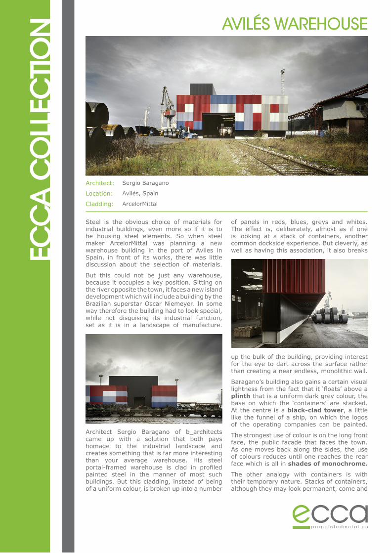
Steel is the obvious choice of materials for industrial buildings, even more so if it is to be housing steel elements. So when steel maker ArcelorMittal was planning a new warehouse building in the port of Aviles in Spain, in front of its works, there was little discussion about the selection of materials.
But this could not be just any warehouse, because it occupies a key position. Sitting on the river opposite the town, it faces a new island development which will include a building by the Brazilian superstar Oscar Niemeyer. In some way therefore the building had to look special, while not disguising its industrial function, set as it is in a landscape of manufacture.
Architect Sergio Baragano of b_architects came up with a solution that both pays homage to the industrial landscape and creates something that is far more interesting than your average warehouse. His steel portal-framed warehouse is clad in profiled painted steel in the manner of most such buildings. But this cladding, instead of being of a uniform colour, is broken up into a number
of panels in reds, blues, greys and whites. The effect is, deliberately, almost as if one is looking at a stack of containers, another common dockside experience. But cleverly, as well as having this association, it also breaks
up the bulk of the building, providing interest for the eye to dart across the surface rather than creating a near endless, monolithic wall.
Baragano’s building also gains a certain visual lightness from the fact that it ‘floats’ above a plinth that is a uniform dark grey colour, the base on which the ‘containers’ are stacked. At the centre is a black-clad tower, a little like the funnel of a ship, on which the logos of the operating companies can be painted.
The strongest use of colour is on the long front face, the public facade that faces the town. As one moves back along the sides, the use of colours reduces until one reaches the rear face which is all in shades of monochrome.
The other analogy with containers is with their temporary nature. Stacks of containers, although they may look permanent, come and
AVILÉS WAREHOUSEEC
CA
CO
LLEC
TIO
Ngo. This building also will come and go. It is intended for a short life and can be disassembled and moved elsewhere, or easily adapted for another function, such as housing concerts.
It is a no-nonsense and in many ways a very standardised building, serving a basic function with no frills and built economically. What is clever and exciting is that the client and architect have faced up to the challenge of the unusually exposed situation by selecting a cladding solution that is exciting and appropriate, and that makes the building a worthy neighbour to architectural innovation.
Facades - Details