artist typeface huddersfield university
DESCRIPTION
Artist typeface By Josh Gardner. 1st year projectTRANSCRIPT

Module TFD1064. Design for Communication DesignGraphic Design Group Artist typefaceJosh GardnerU1262228Email : [email protected] : joshgardner1.wordpress.com


Modulus is a clean, minimal, modern sans typeface. It looks smooth in any layout with its sleek rounded lines, use it for your maga-zines, brochures and editorial layouts.
Modulus makes awesome headings, it looks great on its own or with imagery, body copy looks neat and tidy.
The font was designed by VirtueCreativejohannesburg, South Africa, in 2011. I like the simple minamilistic approach to the typeface, i also like the roundness that flows throughtout the letters.
Modulus

Soin Sans Pro is another clean, minimal, modern sans typeface that i have looked at. The design is clean and clear and has been designed with geometric ratios and human-istic proportions. i like how the deigner has managed to shift circular countours to erode the vertical stems
It looks neat in any layout with its sleek rounded edges, use it for your magazines, brochures and editorial layouts and sale/advertisment material. The bold is very eye catching and stands out from the back-ground.
The font was designed by Stawix. Starwix is a Bangkok-based personal font foundry found-ed by Stawix Ruecha. This is a brand new font and was released on 9th, January, 2013. Again I like the simple minamilistic approach to the typeface, i also like the roundness that flows throughtout the letters.
Soin Sans Pro

CODE is another beautiful, clean typeface suitable for all types of web and graphic design work. The thin sans serif font can help produce elegant and modern typography designs. However, you have to be careful at smaller font sizes because fonts with narrow widths can become illegible or hard to read when the characters are too small.
I like the idea of creating a high luxury type-face which can be used in all kinds of me-dia. i would like to give my design its own styalistic approch with inspriartion from other designs. It looks neat in any layout with its sleek rounded edges, use it for your maga-zines, brochures and editorial layouts and sale/advertisment material. The bold is very eye catching and stands out from the back-ground.
The font was designed by Fontfabric, Fontfabric is an independent type foundry , which was launched at the close of 2008 by designer Svetoslav Simov who is based in Sofia, Bulgaria.
CODE

QuickSand is overall a very nice sans serif font and slightly grotesk and slightly rounded opentype typeface, which looks really nice and professional. Quicksand gives a nice neutral contemporary face for easy to read signage, text, headlines, etc.. Supplied in seven styles- Bold, Bold Oblique, Book, Book Oblique, Dash, Light, and Light Oblique – Quicksand had a lot of options! I especially like the Dash style. This diverse face was cre-ated by Freelance graphic designer Andrew Paglinawan from Quezon City in the Philip-pines (2008) I really like the round, smooth fell you get from the font. Influenced by the geometric-style sans serif faces that were popular during the 1920s and 30s, the fonts are based on geometric forms that have been optically corrected for better legibility.
QuickSand

Typogami is a creative typeface whichhas letters that look like they’re made from fold-ed paper. Still not smitten? It’s customizable and animated. Designed by Calango for After Effects CS3 and up, Typogami can be tweaked in a number of ways--by adjusting the color, fold angles, where the light falls, and the intensity of the shadow.
I found this typeface when i was browising the site of http://animography.net/products/typogami. I found this site fasinating and i really like the bolck typefaces and all of the options you can play around with.
Typogami

I started at looking a geometric fonts and i like the idea of using maths to create letters. I like the idea of exploration based on mod-ern shape geometric forms.
The repetition of simple geometric shapes forms a daily part of our environment. Throughout the 20th century – and into the 21st – typefaces whose designs have taken advantage of this have remained popular.
I like the idea of this as there is lots of options to playaround with using squares, traingles and circles to c create a font with a modern twist.
Geometric Fonts

I started looking at the idea of creating my alphabet out of shapes and diffrent images. one design which took my intrest inperticluar was this fun choice lettering, in a christmas theme. The font was reated by a design Illus-trator, David Sierra, Bayona, Spain.
http://cargocollective.com/davidsierra
I like the idea of creating a fun, bright and cherfull typeface and would let me experi-ment my skills in illustration.
Fun choice lettering

I came across this font when looking at Art Deco styled typefaces. Metropolis 1920 comes from the industrial movement of the 1920’s where skyscrapers where born. Us-ing a double line technique, The result is a bold, bumptious typeface with a stolidly calm disposition. I like the fell that this type of typograpghy gives and how the simple use of liknes can creating an intresting ad good looking font. I feel that this style also reminds me of neon light signs and i feel that i could use that creative aspect in my promotional material.
Metropolis 1920

The Diamonds type family was designed by Hannes von Döhren in 2012. It is an ex-perimental search for geometric new let-terforms, which are still easy to reads and generate some unexpected attention. Hannes wanted to create a straight and clear typeface but pull away from the path of classic and well learned letter shapes.
Diamond

Infinity free font, by designer Tarin Yuangtra-kul, was created from the simplicity of lines and curves with round corner and cap. The name comes from guides for creating, they are similar to number 8 and infinity symbol.
i like thisfont as it works on a very simple basis and all letters have a unique look. overall this creates an easy to read type-face which looks modern and elegant.
Infinity

Creation of this typeface for titling, display, and logos was inspired by my exploration and drawing of forms found in nature. Re-fined, quiet and elegant, yet quirky enough to employ slim filaments that somehow are not faint of heart, Mandevilla is named for the verdant tropical vine. The sturdy plant has firm footing in the soil, then climbs, curv-ing around trees, stretching toward the light, bridging earth and sky.
Mandevilla began as a sans-serif, but its foot-ing, in the form of tiny round lachrymal termi-nals, roots it and transforms it into a semi-serif. From there the tendrils spiral.
I like the playfull handwritten feel about this text, the spirals give the typeface a modern and elegant look.
Mandevilla

Locksmith was created by California based designer Kenji Enos
i like the modern, sleek look of this typeface, and the suttle serifs gives it a very distincive look.
Locksmith (Kenji Boy)

MAGNA is a free typeface created in April 2012 by Graphic Designer & Jr. Art Direc-tor Hendrick Rolandez and based on a “vintage/art deco” style. I like the sim-plicity if this font and how the simple rule of 8cm heigh by 3 cm wide has created a uniquie an well stuctured typeface.
Magna

Architype Ingenieur is a four weight family inspired by Crouwel’s late 1950s exhibition catalogues and posters.
Available in light, bold, regular and dot, the typeface was inspired by the simplified geo-metric letterforms Crouwel created for vari-ous exhibition catalogues and posters during the late 1950s. Influenced by his boyhood fascination with naval lettering, Crouwel designed grid-based type with 45-degree angles for the Olanda poster for the Dutch entry to the 1960 Venice Biennale.
Architype Vierkant has been developed from the letterforms that Crouwel created on the theme ‘typo vision international’ for a 1972 Drupa catalogue. This references many of the experimental ideas which underpin his controversial New Alphabet and Fodor type-faces. This single weight typeface forms part of the Architype Crouwel Collection.
Both typefaces are part of Foundry Types’ newly expanded Architype Collections.
Wim Crouwel
Architype Vierkant
Architype Ingenieur

After the lecture on thursday afternoon i lstarted looking at a few of the artists ect. that stud-ied at the bauhaus school. Herbert Bayer’s ‘universal’ type, created at the same time as Josef Albers’ ‘Stencil’, 1925, within the Bauhaus school. caught my eye, i like how by Both Albers and Bayer, by limiting his typefaces to geometric form and composition meant he could create a suitable typefaces for the modernist era.
Universal, conforming strictly to the principles of The New Typography features letterforms reduced to their bare essentials. Bayer removed capitals letters and serifs.5 He strove to revo-lutionise typography.6 Within his essay ‘On Typography’ he maintains that typeface is only the beginning of the revolution, however he aimed to lead the way with ‘universal’.
Within Universal Bayer removed the need for upper and lower cases, resulting in the one char-acter set, each letter form from only straight lines and circles. Bayer argued that as the spoken word does not require two cases, why should the written one. Unlike Albers’ ‘stencil’, ‘univer-sal’ does not conform to be modular.
Herbert Bayer - ‘Universal’ 1925

Neville BrodyBrody was one of the key designers who took advantage of technological advances to break away and reinvent traditional print setting. Brody often used a computer to design his various typefaces - the letter forms themselves used as a dramatic part of the composition. It is the 1980’s and Brody’s freedom to mix images and text hints at an approach that will be used by website designers a decade later.
He gained a fair amount of attention as an art director for The Face magazine, where he worked from 1980 to 1993. The magazine was very popular in the 1980s, it was called a “fash-ion bible” and set many of the trends of design which enjoyed success during the same time period. While he was working there, he designed many new typefaces but one of my favorites is Typeface Six / 1986. The typeface was designed for the face magazine in 1986, used from issue 73 onward’s replacing the Futura that had been used extensively throughout the previ-ous issues. All the characters are designed around a circle and sqaure.
This was an all-cap typeface: one light and one bold. While later completing these for inclu-sion in the FontFont library, Brody added a middle weight: FF Typeface Six-point-Five. All three of these fonts include smaller versions of certain letters, with heavy underlines underneath them; these are mapped to lowercase keystrokes on the keyboard.

Mario FelicianoMario Feliciano was born in Caldas da Rainha, Portugal, in 1969. He began work as a graphic designer for Surf Portugal Magazine in 1993. He has been heavily involved in type design since. A versatile designer, he has made typafeaces that range from contempory display and text fonts to classic interpretations of early spanish types.
Feliciano’s largest type family so far is what he calls “The Morgan Project,” an extensive set of sans serif faces that cover both the biggest, boldest display and a stylishly techno form of text. The names suggest their uses: FTF Morgan Big is a family of fat all-caps display faces with sharp corners on the interiors of the letters and rounded rectangular forms on the outside.
FTF Morgan Sans, is a subtler, squarish sans serif text face with regular and condensed widths in two weights, and italics for the regular. Morgan Sans probably wouldn’t work in really long passages of text, but in short text blocks it’s very effective, and at small display sizes its crisp-ness and the curved notches and rounded flaring of its construction -- a sort of softened indus-trial look with a hint of the LCD screen -- give it a very contemporary look

Within his translated essay “Albers Discussion of the Stencil Font” Albers explains how the ex-panding industrial world requires fast legible text for a fast moving lifestyle.2 The elegant script previously utilised was no longer appropriate for the required economy of reading, resulting in Albers developing the ‘Stencil’ typeface.
The intention of the typeface was to fill the available gap, to provide a typeface which were increasingly legible at distance. Therefore predominantly suitable for posters and billboards.3
It is made up exclusively of geometric shapes, the square, the triangle which corresponds to half the square cut diagonally and the quarter-circle, whose radius is that of the side of the square.4 This modular typeface echoes the principles of The New Typography and sought to provide legibility by reduction. Albers sought to remove any irrevelant elements of the letters, allowing them to be easily read at distance and at speed, suiting the corresponding fast-paced lifestyle.
Albers, J., 1925. Stencil Letterforms

Jock Kinneir (Transport)Richard ‘Jock’ Kinneir (11 February 1917 – 23 August 1994) was a typographer and graphic de-signer who, with colleague Margaret Calvert, designed many of the road signs used through-out the United Kingdom. Their system has become a model for modern road signage. Kinneir’s first big commission was the design of the signage for Gatwick Airport. He chose one of his students at Chelsea, Margaret Calvert, to assist him. When Sir Colin Anderson, the chairman of the P&O Line shipping company read about the Gatwick signage, he chose Kinneir to design a baggage labelling system for P&O. In 1957 Anderson was appointed chairman of the gov-ernment committee formed to design signs for the new British motorway network. The objec-tive was to produce signs that could be read at speed.
The typeface they designed was called Transport, Two forms of the typeface exist; Transport Medium and Transport Heavy. Both have the same basic form, but Transport Heavy is bold-face, to allow easier readability for black letters on white backgrounds, such as those used on non-primary roads, while Transport Medium is lighter, and is used for white letters on dark back-grounds, such as the green primary route signs.

Alias (Gareth Hague - Elephant)Gareth Hague met David James in 1990, working together designing record sleeves for bands such as Soul II Soul, Neneh Cherry and Boy George. They formed Alias in 1996 to design and market their typefaces. Alias also undertakes commissions for custom typeface and logotype design, services include designing custom type and digitising and amending existing typefac-es. While Browsing thier collection, i found a quirky font called Elephant.
Elephant was designed in 1966, it was the first complete typeface, developed from a logo for a film production company, Elephant is based on two weights of line, a thick and a thin stress and thier intreaction throught a system of circle based curves. the drawing of elephant is al-ligned very much to the process of designing using the computer.
http://alias.dj/blog/grot-but-not/

Eric GillArthur Eric Rowton Gill, Letter cutter, sculptor, wood- engraver and type designer, was one of the most prominent and controversial figures of his day.
The history of Gill Sans stems from Edward Johnston’s iconic typeface, Johnston Sans, de-signed for the London Underground in 1913. Eric Gill, who had studied under Johnston at Lon-don’s Central School of Arts and Crafts, later became a friend and apprentice—and even had a small role assisting in creation of the proprietary typeface.
Gill Sans rose to popularity in 1929 when it became the standard typeface for the London and North Eastern Railway (LNER), appearing on everything from locomotive nameplates to time tables. Originally released as metal type, over 36 derivatives emerged between 1929 and 1932—many of which were created by the Monotype drawing office (with input by Gill). The typeface is renowned for its inconsistencies between weights, as they were not mechanically produced from a single design each weight retains a distinct character of its own. The light font, with its heavily kerned ‘f’ and tall ‘t’, has an open, elegant look. The regular font has a more compact and muscular appearance, with its flat-bottomed ‘d’, flat-topped ‘p’ and ‘q’, and short, triangular-topped ‘t.’ The bold font tends to echo the softer, more open style of the light, while the extra bold and ultra bold have their own vivid personalities.
Today over two dozen Gill Sans designs are available digitally, with mainstream reach thanks to its inclusion on Mac OS X and Microsoft Office. It can be seen everywhere, used (or over-used) on everything from corporate logos to movie posters and has been called the The Hel-vetica of England. Gill Sans is a very unique and modernistic piece of type a hybrid among the others that were out there in the 20th century. As being branded as one of the best fonts created ; he made a very easy and readable type by removing those serif tails on the ends, one of the very reasons to why it still gets applauded.

Edward Johnston (Johnston)The London Underground Railway commissioned Edward Johnston in 1915 to create a new alphabet for its signs and publicity (corporate identity), he finished a sans serif typographic de-sign in 1916. His design was a success and is considered the first modern sans serif type based on the proportions of Classical Roman capitals, Johnston is a humanist sans-serif typeface. Features of the font are the perfect circle of the letter O and the use of a diagonal square dot above minuscule letters i and j and for the full stop. Commas, apostrophes and other punc-tuation marks are also based on the diagonal square dot.
The font family was originally called Underground. It became known as Johnston’s Railway Type, and later simply Johnston. It comes with two weights, heavy and ordinary. Heavy does not contain lower-case letters.
Johnston’s type became a distinctive feature of the Underground brand over the years, but by the late 70s it was less practical to use the old wood and metal fonts. Inevitably, the brand was getting watered down as other typefaces were chosen for different uses around the sys-tem.

Max Miedinger (Helveltica)Max Miedinger was a Swiss typeface designer. He was famous for creating Neue Haas Grotesk typeface in 1957 which was renamed Helvetica The aim of the new design was to create a neutral typeface that had great clarity, no intrinsic meaning in its form, and could be used on a wide variety of signage. since then it has succeeded in becoming the most popular type-face in the world.
Today, Helvetica is shunned by many designers because it is overused due to its being the default typeface on many desktop publishing software packages. But, remember, it is the default face because it is such a reliable, workhorse of a typeface. Together with Times New Roman, Helvetica was the most specified face of the ’60s, ’70s and ’80s.
Just a few examples of Logo’s that have used Helvetica.

Herb Lubalin (Avant Garde)Herb Lubalin was one of the most charismatic figures in design and typograpghy in america after world war two. Most of his design solutions relied upon typograpghy for their effect. In the early days his typefaces, and indeed those of ITC in general, where aimed at display advertising rather than text setting. ITC Avant Garde, was designed in 1970 with Tom Carnase. this font could be described as a reproduction of art-deco, and is seen in logos created in the 1990s and 2000s.
TC Avant Garde Gothic is a font family based on the logo font used in the Avant Garde mag-azine. Herb Lubalin devised the logo concept and its companion headline typeface, then he and Tom Carnase, a partner in Lubalin’s design firm, worked together to transform the idea into a full-fledged typeface. ITC Avant Garde Gothic is a geometric sans serif type, that is, the basic shapes were made with a compass and T-square. The design is reminiscent of the work from the 1920s German Bauhaus movement. Its letterforms are built of circles and clean lines and highly effective for headlines and short texts.
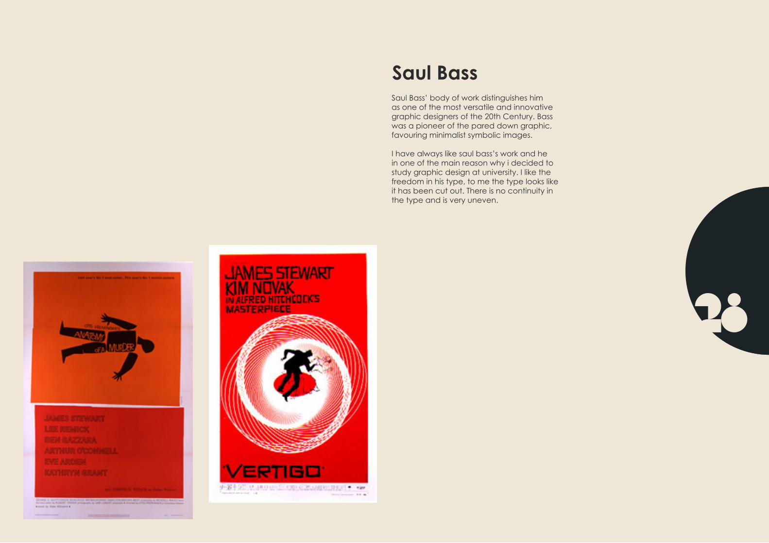
Saul BassSaul Bass’ body of work distinguishes him as one of the most versatile and innovative graphic designers of the 20th Century. Bass was a pioneer of the pared down graphic, favouring minimalist symbolic images. I have always like saul bass’s work and he in one of the main reason why i decided to study graphic design at university. I like the freedom in his type, to me the type looks like it has been cut out. There is no continuity in the type and is very uneven.

dana tanamachiDana Tanamachi is a Texas-bred, Brooklyn-based graphic designer and letterer who enjoys living a quiet life and working with her hands. After designing Broadway show posters at SpotCo and working under Louise Fili, Dana opened her own design & lettering boutique, Tanamachi Studio. She has been commissioned by clients such as Google, Yahoo!, Rugby Ralph Lauren, The Ace Hotel, Tommy Hilfiger, West Elm, and Blooming-dale’s. In 2011, she was named a Young Gun (YG9) by the Art Directors Club and a Young Creative to Watch by HOW Magazine. In 2012, Dana had the unique honor of creat-ing custom cover art for O, HOW, and TIME Magazines.
http://lookslikegooddesign.com/typogra-phy-dana-tanamachi/ here is some of the example of the work she did for her client, Ralf Lauren.

Pablo PicassoPablo Picasso was a painter, sculptor, print-maker, ceramicist, and stage designer from Spain, who lived in France for most of his adult life. He is widely known for co-founding the Cubist movement, the invention of con-structed sculpture, the co-invention of col-lage, and for the wide variety of styles that he helped develop and explore. Picasso, Henri Matisse and Marcel Duchamp are commonly regarded as the three artists who most defined the revolutionary devel-opments in the plastic arts in the opening decades of the 20th century, responsible for significant developments in painting, sculp-ture, printmaking and ceramics. Picasso demonstrated extraordinary artistic talent in his early years, painting in a realistic manner through his childhood and adoles-cence. During the first decade of the 20th century, his style changed as he experi-mented with different theories, techniques, and ideas. His revolutionary artistic accom-plishments brought him universal renowned and immense fortune, making him one of the best-known figures in 20th-century art.

Typeface Idea 1here are some exaple of block typograpghy, for my typeface i would like i would like to try and combine the unbalanced style from saul bass and the cubisim square look from the block typograpghy.

Typeface Idea 1First Draftshere are some more examples. The top pho-to on the right is some of my first sketches of the letter A. I wouldl like to combine the use of lines and block outline letter to create my typeface. Iam going to take inspration from saul bass and cubanism.
I would like to experiment with slab serifs and sans serif typefaces and play around with lines and blocks to create my typeface. The black and white version will either be a plan outline of the letters or lines.
To the left are some of my ideas that i would like to experiment in more deatail. i prefer the idea of creating a lower case typeface first and then if i have time to create the uppercase. The typeface will be based on geometric fonts, the only downside to this is that some leters can become hard to read and aknowledge.

Typeface Idea 2My secound idea has been inspired by Her-bert Bayer font ‘Universal’ i love how he stripped the letters down to the bare es-sentials. becuase this typeface is so round i thought about playing around with lines and curves. i like the flowness and restricted look that neon lighting gives but also i would to experiment with thick and thin lines to create my typeface. also the outline of the text and play around with diffrent fonts.
I would like to create a clean, minimal, mod-ern sans typeface. using just lines. Using lines also means i could create a futur-istic styled typface. Below are some of my first rough idea sketches.

Typeface Idea 3his idea has been insprised from chalk typography,and dana tanamachi. i was out last night and when ordering at the bar noticed some of there signs and the creative typograpghy that they had used, i love the idea of being able to create a free flowing/handrawn typeface in a vintage style. There are some many diffrent ways you can play around with the type, with diffrent shadows and shading and playing around with the colour. I like the ide of having a fun, free al-most childish look to it. Ive also been looking at the art of calligrapghy and feel that this idea would be a good way of experimenting and kearning a new skill.

Typeface Idea 1 SketchesBelow are some of my rough ideas that i came up with, i took nspriration from saul bass’s style and added a very minamilistic geometric feel to the typeface. On the right is ,y favortie idea which if i chose this style would be the idea a would take to further develop.
I would like to make the typeface look like it is created by diffrent coloured blocks to give it that cubanism feel.
when i was playing around with my ideas i used a grid of 4cm wide by 6cm heigh. I found that this wored well and gave me plently of room to play around with my letter and get the shapes i required.

Typeface Idea 2 SketchesBelow are some of my rough ideas that i came up with, i took nspriration from Her-bert Bayer font ‘Universal’ Below again are some of the idea that came to my head and i really liked stripping down the letter to there basic form, and tried to use the minu-mum about of line that i could and still get a reconisigned letter/typeface.
I also started playing around with diffrent line thicknesses and played around with straigh and curved lines. In the end i decided that the letters on the right where my favorite and would be my favorite idea to experiment with if i was to choose this idea. I love the simplicity of the typeface and i like the geo-metric style that the letter have aswell.
I think that the typeface looks very futuristic and has a miniamilistic feel overall.

Typeface Idea 3 SketchesTo the right are some of my first ideas for my vintage style typeface. i looked at the work by dana tanamachi. I loved the style she put across in her typograpghy but relised imedi-atndly thatshe has a very talented skill.
I like the idea of playing around with serfifs and shadows on my font but i would need more preperation of i was going to follow this idea.
Below are some of the styles that i would like to experiment with. I would like to play about with the depth of the letters and play around with the shadows.

Typeface Idea 2 DevelopmentI then went on to experiment with diffrent ideas, i was using grid paper as i felt this was the easierst way to get all my shapes the same size. i was playing with all types of diffrent shapes, lines, weights and sizes. and eventually found a typeface which i felt worked well and that i could experiment more with.

Typeface Idea 2 Developmenthere is my secound idea, this typeface was inspired by herbert bayer, i wanter this type-face to be a clean rounded font. i tried stipping the letters down to there basic form and tried to use as little possible line but for them to still be reconisable. I like the clean modern feel that this type face has but i do feel that it has less depth than my other idea and i feel i would have more options with my first idea. I also found it difficult to create uppercase and lowercase letters with this typeface.

Typeface Idea 1 Final DevelopmentI have decided to take my first idea to further development, i carried on experimenting on grid paper and eventually came up with a set of shapes which i could use to create my alphabet. I then carried on and played around with the numbers but have to add a couple of shapes to get to get the numbers to look right.
I then showed the letters working ina bigger size and spelling the artist i was insprired by.

Typeface Idea 1 Final DevelopmentIn IllustratorHere is my final font delveopled in illustrator, the print screens on the right show all the diffrent options i have for my typeface they are, Black and white, Block outline, Brick Out-line and Brick Colour. I am very happy with my final typeface and i fell that it has lots of options to play with. If i get time i plan to play around with a lower case typeface.

Typeface Idea 1 Options and 1st draftsHere is my final font delveopled in illustrator, I decided to call my typeface Revolution as it has a meaning of being a procedure or course, as if in a circuit, back to a starting point. I wanted to strip the typeface back to basic shapes and structure and felt that this name fited my type-face well.
Below are all of the diffrent ways my typeface could be shown ,there are six options
1) Brick Filled2) Block Filled3) Brick Outline4) Brick Double Outline5) Block Outline 6) Block Double Outline
i have show my type face in diffrent shades one at 100% and the othere at 60%. i choose the mountain background as it is one of my favorite landscapes and i fekt that the mountains have a powerfull form which i wanted to use to promote my typeface. I like how the ridge of the mountains are just above my type and that is creates a good balance in the advert. I am also considering adding some more information.

Typeface Idea 1 LogoHere is my final font delveopled in illustrator, This is the logo i have designed to promote each typeface idea. I used the R of my tyeface becuase the font is called revolou-tion so i fet was the most important letter. I again used my mountain landscape photo and then cropped it into a cirlce and then placed the R in the middle. I then repeted this process untill i had all of my typeface ideas shown. I chose a circle as i feel it has more freedom and i like that there are no sharpe edges.

Typeface Idea 1 Body CopyHere is my final font delveopled in illustrator, Here are two ideas that i have thought of for my body copy. My first idea is similar to my adverts, I have used a 10x5 grid and placed my letters above my numbers and then showed it in two diffrent versions one 100% and the other at 60%. i like this idea as it will keep concistancy in my design. but dose not include the name of the typeface. My second idea is a more simpler version where i have just included the logo in the style of the lettering. I then spaced the logo and the typeface so that the gap at the bot-tom is double the gaps at the top between the logo, i feel this design is a cleaner and more balanced and could be used along side my other designs.

Font Bureau Type Specimens CoverHere are some ideas that i hae come up with for the font bureau type specimen book. I decided to go for the forth edition and used the number four out of my typeface. I then divided the cover into thirds and played around with diffrent ways where i could make the nuber four look like it was running over the cover.
I then played aroundwith the typeograpghy and the logo and decided that i prefered having a smaller logo and the type close together. my favorite design is the first cover but i am not sure which colours to go for, be-low is the alternative version of the cover.
I used Gautami for the font bureau type and Edwardian Script ITC for the fourth edition as i felt these two complimented each other well and kept a link to the original font bureau covers.

here are my two finished idea for my advertisment posters.
RevolutionAdvertismentPoster

Webpage following the exsisting rules of the font bureau site.
Revolution Webpage

SHADOW
REVOLUTION AVAILABLE FROM FONT BUREAU
BLOCK
OUTLINE
BRICK OUTLINE
DOUBLE BRICK OUTLINE
BRICK COLOUR
DOUBLE OUTLINE
7 STYLES : BLOCK, SHADOW, OUTLINE, DOUBLE OUTLINE, BRIK OUTLINE, DOUBLE BRICK OUTLINE, BRICK COLOUR
A geometric typeface designed by joshua gardner inspired by the work of saul bass (1920 - 1996)It is strictly geometric only using seven diffrent shapes to create the typefaceThe idea was to create a typfaceusing the minimum about of shapes forsaking readability and visual correction. Designed in 2013 as part of a 1st year university project. The typface works well for the creation of posters, pictures and promoional material and it can be used for headlines.
REVOLUTION TYPEFACE
Copyright Josh Gardner2013
REVOLUTION AVAILABLE FROM FONT BUREAU
7 STYLES : BLOCK, SHADOW, OUTLINE, DOUBLE OUTLINE, BRIK OUTLINE, DOUBLE BRICK OUTLINE, BRICK COLOUR
A geometric typeface designed by joshua gardner inspired by the work of saul bass (1920 - 1996)It is strictly geometric only using seven diffrent shapes to create the typefaceThe idea was to create a typfaceusing the minimum about of shapes forsaking readability and visual correction. Designed in 2013 as part of a 1st year university project. The typface works well for the creation of posters, pictures and promoional material and it can be used for headlines.
REVOLUTION TYPEFACE
Copyright Josh Gardner2013
BLOCK
84 Point Size
72 Point Size
60 Point Size
48 Point Size
36 Point Size
24 Point Size
12 Point Size
here are the tow downloadable PDF’s one showing all the diffrent versions of my type-face and the other one showing my type-face working in diffrent point sizes.
Revolution PDF’s

REVOLUTION TYPEFACE
Copyright Josh Gardner2013
A geometric typeface designed by joshua gardner inspired by the work of saul bass (1920 - 1996)It is strictly geometric only using seven diffrent shapes to create the typefaceThe idea was to create a typfaceusing the minimum about of shapes forsaking readability and visual correction. Designed in 2013
as part of a 1st year university project. The typface works well for the creation of posters, pictures and promoional material and it can be used for headlines.
Here is my secound advertisng poster.
Secound Advert

In conclusion i feel i have completed the breif fully, I have chosen an artist which has truly in-spried me to become a graphic deisgner and i love his work. I am really pleased with my final typeface and have had fun while designing this project. Ive enjoyed working with the shapes
and and the simplicity of the letters, I feel my typefaces works best in Bold, but there are lots of diffrent wersions that can be used to play around with. I like how the unbalanced thickness of
the lines represents Saul Bass style and gives it a playfull let serious look.