art through the pages: library collections at the art institute of chicago || pochoir in art nouveau...
TRANSCRIPT
The Art Institute of Chicago
Pochoir in Art Nouveau and Art Deco Book IllustrationAuthor(s): Amy BallmerSource: Art Institute of Chicago Museum Studies, Vol. 34, No. 2, Art through the Pages:Library Collections at the Art Institute of Chicago (2008), pp. 26-29, 92-93Published by: The Art Institute of ChicagoStable URL: http://www.jstor.org/stable/20205613 .
Accessed: 14/06/2014 15:01
Your use of the JSTOR archive indicates your acceptance of the Terms & Conditions of Use, available at .http://www.jstor.org/page/info/about/policies/terms.jsp
.JSTOR is a not-for-profit service that helps scholars, researchers, and students discover, use, and build upon a wide range ofcontent in a trusted digital archive. We use information technology and tools to increase productivity and facilitate new formsof scholarship. For more information about JSTOR, please contact [email protected].
.
The Art Institute of Chicago is collaborating with JSTOR to digitize, preserve and extend access to Art Instituteof Chicago Museum Studies.
http://www.jstor.org
This content downloaded from 91.229.229.162 on Sat, 14 Jun 2014 15:01:45 PMAll use subject to JSTOR Terms and Conditions
o
;v~
v*
(A* ̂ K:
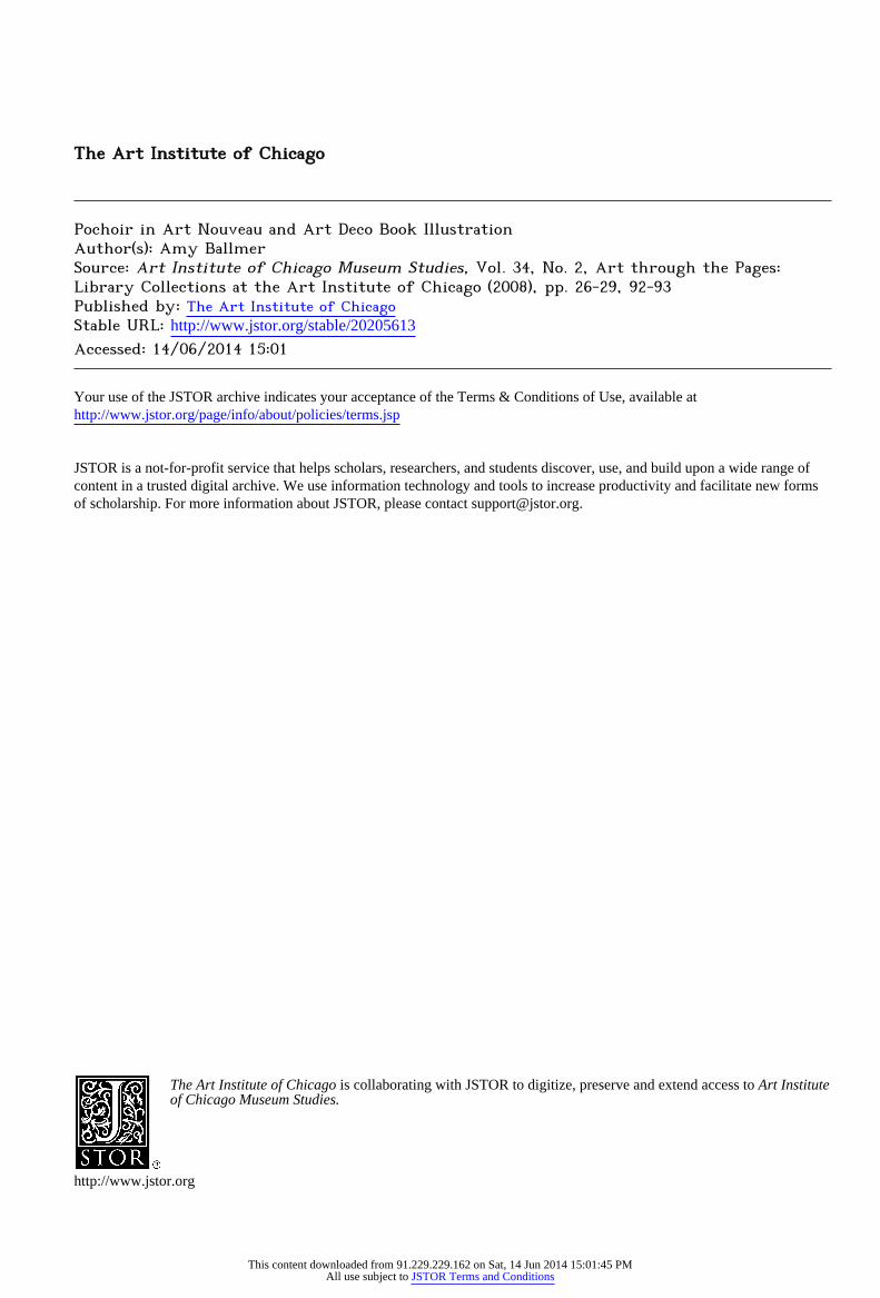
Figure 3. The front doublure of
Alfred Tennyson, Maud, and Other
Poems (Edward Moxon, 1855),
featuring a trout adorned with a
ruby eye and mother-of-pearl fins
and tail. Binding by Sangorski and
Sutcliffe (1901-present).
Rubdiydt of Omar Khayyam, also known as The Great
Omar. This spectacular example, adorned with 1,050 jewels set among intricately inlaid leather and gold tooling, was
famously lost in 1912 with the sinking of the Titanic.'4
The libraries' copy of Maud, while much less elaborate
than the Great Omar, is a fine example of the style upon which Sangorski and Sutcliffe's reputation was built (for
another, see p. 21, fig. 3). Maud is bound in green levant
morocco, elaborately inlaid and adorned with twelve opals, four amethysts, and four moonstones. The outer covers are
gold-tooled with decorative suggestions of the song "Come
into the Garden Maud," which appears in the principal poem. Rose and lily designs occupy the central portion of
the front and back covers, respectively. Yet as stunning as
the outer covers are, it can be argued that the decoration of
the doublures, inspired by Tennyson's poem "The Brook," are even more
spectacular. A trout, adorned with a ruby eye
and mother-of-pearl fins and tail, is depicted in the center
of the front doublure, surrounded by a gold-tooled design of fish, water lilies, and weeds (see fig. 3). The central figure of the back doublure is a dragonfly with iridescent mother
of-pearl wings. Each doublure is in mauve leather, enclosed
by a verse of the poem that is inscribed onto a border of
dark green leather.15 The binding, which is accompanied by a
velvet-lined clamshell box, also features gilt edges, white silk
flyleaves with gold tooling, gold-tooled titling on the spine, and hand-sewn endbands in red, green, and gold silk.
POCHOIR IN ART NOUVEAU AND ART DECO BOOK ILLUSTRATION
AMY BALLMER
Pochoir?French for stencil?is a hand-coloring process
that was popularized in France during the late nineteeth and
early twentieth centuries and used widely in Art Nouveau
and Art Deco publications. The method produces extremely vibrant coloring, and artisans took great care in matching
pochoir pigments with the colors of the original painting or other work being reproduced. The technique is simple. An artisan, called a d?couper, cuts a stencil?usually from
thin sheets of copper, zinc, aluminum, or oiled cardboard?
for each color in the image. The work of coloring takes
place along a kind of assembly line, with each individual
responsible for a single color. The colorist applies gouache
26
This content downloaded from 91.229.229.162 on Sat, 14 Jun 2014 15:01:45 PMAll use subject to JSTOR Terms and Conditions
or watercolor pigment using a brush called a pompon, which varies in size depending on the desired opacity and
thickness of the pigment. Pochoir-colored prints can often
be distinguished from freehand coloring by the buildup of pigment that sometimes occurs around the edge of the
plate, since it is a challenge for colorists to remove the stencil
without smearing the image. The process became so popular in the second and third decades of the twentieth century that
Parisian ateliers staffed hundreds of colorists.
While artisans had been coloring with pochoir for
centuries, it was used primarily to add color to playing cards
and other inexpensive items. European graphic and fine
artists did not begin to consistently integrate pochoir into
their methods of creation and reproduction until the late
nineteenth century, when they discovered the sophisticated
/<? ..? LiKtttunej .Jtt/'iJ
(*/>t'/f'//f' ti/t tfOt'it 4> 4'tlt/t'ftt
III
?r; t1
1
use of color and patterns on Japanese stencil-printed kimonos
and woodblock prints. They soon began to experiment with
pochoir and to realize its potential as a design element, which
included the use of stencils in wall and furniture decoration as well as on rugs and textiles.
By 1925, the technique was considered important enough to warrant a treatise, Trait? d'enluminure d'art au
pochoir by
the printer Jean Saude, of which the Ryerson Library owns
a copy. This volume, useful to printmakers and historians
alike, offers a history of pochoir, details the method, and
provides many examples of pochoir-colored images ranging from reproductions of famous paintings to abstract color
studies; it also contains a copper stencil.
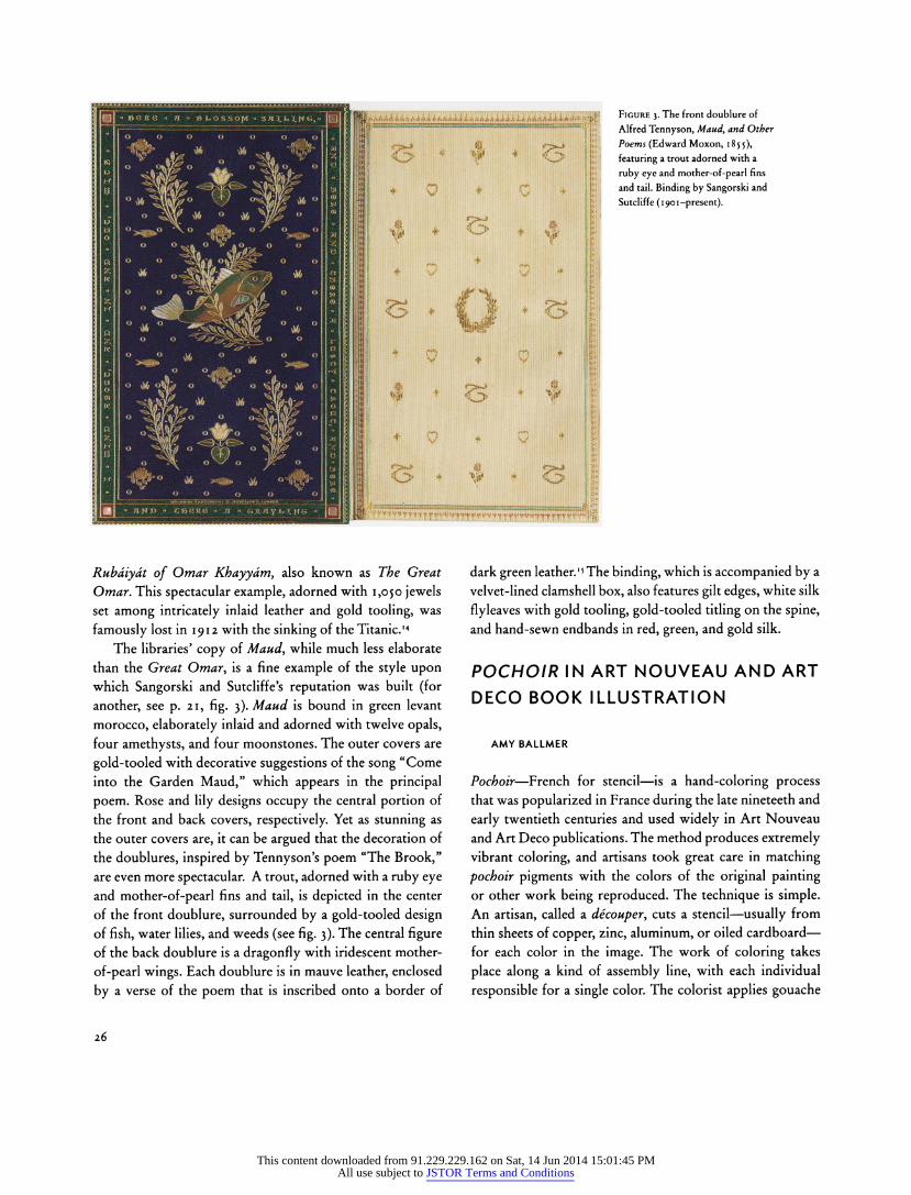
Figure i (left). Umberto Brunelleschi (Italian, 1879-1949). Plate 122 of Journal des dames et des modes 3 (November 20, 1913). The outline and black color were
printed mechanically and the remaining color was added by hand.
Figure 2 (above). Sonia Delaunay (French, born Russia, 1885-1979). Plate 3 of Compositions: couleurs, id?es (C. Moreau, 1930). Delaunay's pochoirs for
Compositions appear as stand-alone designs made entirely of pure color.
27
This content downloaded from 91.229.229.162 on Sat, 14 Jun 2014 15:01:45 PMAll use subject to JSTOR Terms and Conditions
During its years of popularity, pochoir was also util
ized to great effect in journals such as Gazette du bon ton and Journal des dames et des modes, which document
the heights of Parisian fashion, and in books, which were
often filled with patterns and designs for use in the home.
Exhibition catalogues and artist books were also colored
using this method. With the exception of Saude, credit
for the illustrations in such publications went to the artist
responsible for the original image reproduced, while the
colorist remained anonymous.
What follows is a selection of /?oc/?o?r-illustrated texts
from the collection of the Ryerson and Burnham Libraries.
While this is by no means an exhaustive examination of the
pochoir holdings, it does offer a representative sampling of
particularly beautiful and important examples.
FASHION
Perhaps the best-known pochoir illustrations are those from
Parisian fashion periodicals, most particularly Gazette du
bon ton and Journal des dames et des modes.1 The libraries are
fortunate to have complete runs of both journals, since they
are
invaluable documents of Parisian avant-garde fashion, as well
as a showcase, in their exquisite plates, for famed illustrators
and designers such as L?on Bakst, Georges Barbier, Paul Iribe,
Georges Lepape, and Andr? Marty. The publisher of the
Gazette, Lucien Vogel, vowed in the promotional issue of the
journal to make the magazine a work of art in its own right, with the fashion plates functioning as portraits of dresses.
The pochoir plates in the Journal, while typically less
daring than those in the Gazette, include an exquisite example illustrated by Umberto Brunelleschi (fig. i). The outline and
black color of the image were printed mechanically, and the
remainder of the color was added by hand, ranging from
delicate opaque swaths in the landscape to the highlights and shading of the model's skirt. Brunelleschi contributed to other fashion publications, including the Gazette, and
although the colors appear more subdued and the scenes less
dramatic in his illustrations for the Journal, his technique is no less accomplished.
DECORATIVE ARTS AND DESIGN
Publications illustrating decorative arts and design motifs in
the Art Nouveau and Art Deco styles frequently employed
pochoir coloring. Saude executed many of these, including a catalogue of textiles and carpets entitled Etoffes & tapis
?trangers (1926), edited by the French artist and designer Maurice Pillard Verneuil. Published on the occasion of the
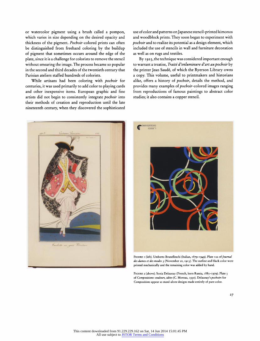
Figure 3. Edouard Benedictus (French, 1878-1930). Plate 13 of Variations;
quatre-vingt-six motifs d?coratifs en vingt planches (Levy, 1923). This oversized
book, with pochoir coloring by Jean Saude, measures 49 x 41 cm (19 74 x 16 '/? in.).
1925 Exposition des Arts D?coratifs in Paris, the exhibition at which the Art Deco style gained official recognition, the
catalogue is illustrated with black-and-white phototyped
photographs that were then hand-colored by Saude.
At this time, in response to renewed attention to and
appreciation of interior decoration, many design books were
published with numerous plates of patterns. These could be
transferred onto walls by means of a stencil or with wallpaper, or they could be printed onto fabrics and sewn into rugs. The Russian-born artist and designer Sonia Delaunay created two such portfolios, Tapis et tissus (1929) and Compositions: couleurs, id?es (1930). While the former followed the trend
of bound design portfolios such as Verneuil's, the latter is
composed of forty unbound plates. Indeed, Delaunay's
pochoirs for Compositions appear as stand-alone works made
entirely of pure color, with no printed outlines laid down first.
The designs range from organic to geometric, and include
intertwined circles, a motif repeated throughout Delaunay's career (see fig. 2 and front cover). The opacity of the vibrant,
28
This content downloaded from 91.229.229.162 on Sat, 14 Jun 2014 15:01:45 PMAll use subject to JSTOR Terms and Conditions
flat colors indicates that gouache was the pigment used.
Appealing signs of the human hand also distinguish these
plates, and are evident in the slightly wavy edges and overlaps of color, as well as in the visible brushmarks.
Variations (c. 1923), a book with designs by Edouard
Benedictus, also features vegetal design motifs. This oversized
volume, with pochoir coloring by Saude, measures forty-nine centimeters in height; each plate contains multiple designs. These pages of pure design show off pochoir to its greatest effect. Plate 13 (fig. 3) demonstrates the variety of colors
Saude used. While difficult to fully appreciate in reproduction, the subtle variations in the surface that Saude created in his
application of color, particularly in the maroon areas at the
bottom left of the page, are particularly impressive.
ILLUSTRATED BOOKS
Sonia Delaunay is not the only painter who explored
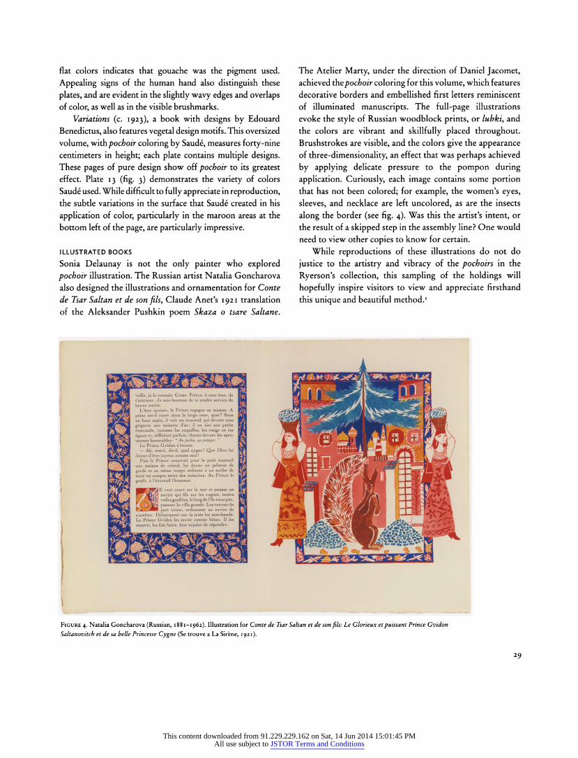
pochoir illustration. The Russian artist Natalia Goncharova
also designed the illustrations and ornamentation for Conte
de Tsar Saltan et de son fils, Claude Anet's 1921 translation
of the Aleksander Pushkin poem Skaza o tsare Saltane.
The Atelier Marty, under the direction of Daniel Jacomet, achieved the pochoir coloring for this volume, which features
decorative borders and embellished first letters reminiscent
of illuminated manuscripts. The full-page illustrations
evoke the style of Russian woodblock prints, or lubki, and
the colors are vibrant and skillfully placed throughout. Brushstrokes are visible, and the colors give the appearance
of three-dimensionality, an effect that was perhaps achieved
by applying delicate pressure to the pompon during
application. Curiously, each image contains some portion
that has not been colored; for example, the women's eyes,
sleeves, and necklace are left uncolored, as are the insects
along the border (see fig. 4). Was this the artist's intent, or
the result of a skipped step in the assembly line? One would
need to view other copies to know for certain.
While reproductions of these illustrations do not do
justice to the artistry and vibracy of the pochoirs in the
Ryerson's collection, this sampling of the holdings will
hopefully inspire visitors to view and appreciate firsthand
this unique and beautiful method.2
^ fA^M veille, je la connais. Cette, mon ?me, de i HMfAiWfJBfAfAfAfBK^SHr I B^^SVLVtVaValBTJHHBH ^H|H|H t'attrister. Je heureux de te rendre service de I ^ ^ ^ ^ ^^B3BV7?lv^HVL^iflH^i^i^BSfe^K?
BpSf?L? Donne HhvbbAe^L^&LwAvJv ^^ ?swAvAvAvJLY5^a?HB ?Bg|KwA]
L'?me apais?e, le Prince regagne sa maison. A I ^g5K^^^^^mH^^AI|^^M^^B^^g^HR<S^ 19K99 p*'nc ******entr* d*0? 1* ̂u-ge cour, quoi? Sous i ?^^fvMBP^fff^^SM^BI^Uy^^^fcJfci^^^^^^KB^^^si W?B^S? un haut un tous I w??tfl[^^3^E^g^fl^^^^^^H|A^B^^^^^HH6^^MM?H|H
EosW^H em'rAU^c- ramasse les coquilles, les range en tas I Jv^K<s^^^^^BP^!^^^^BS^^^^^^^L^^^^I^L^^^^V(l\^^H\
IHjHBj^H ?gaux et, sifflotant parfois, chante devant les spec- I #)^^i wA^HBHT4flVAV^i^LflVAVJ|N^LV?iwJjL^SB^Uw ^v^^ x
^HbHm tateurs honorables: "Au jardin, au potagtr. I /^CA?L.^&^^^^KB^9H?I^^^^^^^^i^M*^Hlj^Et?iHf/ A. ~J? ^^ H^SI Le Prince Gvidon I / ̂̂ FTM ^PIKSSSflMHI^flVAvJiV ?w HHP Erw^L^LwT?^v"?tY / fiVAsU
? Ah, merci, dit-il, quel cygne! Que Dieu lui I [ ifcorf?fi ̂ L^LwAvAV^HNUKJI^^tiw flViS? N?v^^H'^Ml.?w / ^uVSjH donne d'?tre joyeux comme moi I V ra&Sg? ^L^^^^^^E^HHlBS^tw^BssJIL^VSi^L L^k^HVa. A?QcmL I HnSft^fl P""* '* Prince construit pour le petit ?cureuil I ^^J???^^^^Dj?^^^^fSl?ti?S^S^^^BBS?S?^k iWP^ Jgg^jjf/ FozjogflH unc nMrt*?o de cristal, lui donne un peloton de I jR^BvflHKlIlB^EsfiHnt^&^HVAvAvAH" r^^^LVjLwAHflLm
MMalH garde et en m?me temps ordonne un scribe de I A^BB^BBltj^BlBnHMflfffiB^m^BB^Bw^^B^ l^^p^|^^^H H^^HB tenir un compte des noisettes. Au Prince le I ^Hfl^H^HVEXafl^RRBHlLyulSsaH^H^HYll h*"iHH3hHH^H^Hi ^B^a ? l'?cureuil l'honneur. i iflVAvAvJMVAvATSMfS'aESVAYAV^M H? LaflHflVAvAY^
rm9e?I slHBRSil^ *ur'amerctp?usseu? i ^^^hh^h^BHI^?v/,^bSm|Hmm?AhVh^h^h1 "?^he~?9^h^h\ HHE&ftffl BTjBCn navire qui file sur les vagues, toutes I BBJBjT^^^swJ!s?K*ifyBMrBBM?s?ff3^B B^ r*~^Lw?^RHVAVA\ ^HBg?j?| Kh^Rm voiles gonfl?es, le long de 111e escarp?e. I BVftVftV VMflHUUflratflYtlHBHHl Ea L^HflrvHYaVaVawat kBBbMH] Lj^^flHs passant ville grande. Les canons du I ^HBVBW VM^LwJsnrflkUt^HHVjHHVJ I I HV?flVAVAVA Sm^LB! KSBSMH port au I ^HBVHBl BB'^H^jmBB^BmmBJHJBJ I? r^^gSTglBHHBVj
Kag^^H s'arr?ter. D?barquent sur la les marchands. I BVftVftVB iVtwE?ltfln^BH^H^B&fll H""^P^"?Wtwawawawal wAeSLH Le Prince Gvidon les comme les I AVAVAVJ BCvBHSM^HYaVaVaVHfl J lm lYaVaVaVaVav gSH^B nourrit, les fait boire, leur enjoint de r?pondre : I ^HftVftVH jftf'C'W^JF M HB^BBB^B -^Vf?icJHhlvYaVaVaVaVaVal
\
Figure 4. Natalia Goncharova (Russian, 1881-1962). Illustration for Conte de Tsar Saltan et de son fils: Le Glorieux et puissant Prince Gvidon
Saltanovitch et de sa belle Princesse Cygne (Se trouve a La Sir?ne, 1921).
29
This content downloaded from 91.229.229.162 on Sat, 14 Jun 2014 15:01:45 PMAll use subject to JSTOR Terms and Conditions
Harshe, Apr. 26, 1933, Walter S. Brewster Collection of Whistleriana, Ryerson and Burnham Archives.
3. James O'Donnell Bennett, "Art Institute Has Big Exhibit of Whistleriana,"
Chicago Daily Tribune, July 8, 1934, p. 4.
4. The accession number of "Song of the Graduates" is 1933.281.
5. John Ruskin, "Fors Clavigera," in The Works of John Ruskin, vol. 29, ed. E. T.
Cooke and Alexander Wedderburn (George Allen, 1907), p. 160.
6. James McNeill Whistler, The Gentle Art of Making Enemies (William
Heinemann, 1890), p. 5.
7. A farthing is worth a quarter of a penny. This ridiculous compensation spoke of
the disrespect the court held for the case.
8. James McNeill Whistler, The Gentle Art of Making Enemies (Frederick Stokes
and Brother, 1890). The history of this publication is fascinating. Sheridan Ford
edited the Gentle Art with Whistler's full approval, but the artist's sanction was
withdrawn on the eve of publication. Whistler wanted a different editor and
wished to revise some of the more damaging portions of the book related to his
quarrel with Mortimer Menpes. Ford went forward with the publication anyway,
printing it in Belgium for shipment to New York. The bulk of the shipment was
seized in Antwerp by Whistler's legal representatives. About twenty-five copies reached New York, but most were burned in a fire in 1890. It is believed that as
few as five copies survived; one ended up in Brewster's Whistleriana.
9. Whistler's The Gentle Art of Making Enemies prompted a number of books on
a similar theme, such as Frederick Keppel's The Gentle Art of Resenting Injuries
(1904) and the anonymous A Reply to an Attack Made by One of Whistler's
Biographers on a Pupil of Whistler, Mr. Walter Greaves, and His Works (1911). 10. Walter S. Brewster, Catalogue of an Exhibition of Whistleriana (R. R.
Donnelley and Sons, 1917), p. 6.
11. Quoted in ibid.
12. There is no evidence in the Whistleriana collection that Whistler and Brewster
met. Brewster was still in his twenties when Whistler died.
13. The second volume is similar in design but without a miniature reproduction; instead of a peacock, four butterflies on the cover surround an inlay of Whistler's
famous butterfly signature. 14. Brewster (note 10), verso, n.pag.
15. Brewster dedicated most of his civic time to the museum. He became a
member in 1909, a trustee in 1925, and from 1925 to 1947 served as chairman
of the Committee on Prints and Drawings, the department to which he devoted
most of his efforts after retiring from his stock brokerage firm in 1938. He served as vice president of the museum from 1944 until the year before his death in 1954. Over his lifetime, he donated hundreds of prints by Pierre Bonnard, Edouard
Vuillard, and others, but there was no other artist whom he pursued as intensely and intimately as he did Whistler.
16. Walter S. Brewster to E. Weyhe, Nov. 12, 1919. Walter S. Brewster Collection
of Whistleriana.
17. Gideon Stanton to Walter S. Brewster, Sept. 10, 1932. Walter S. Brewster
Collection of Whistleriana.
Fabian, "To the Highest Manner: Fine Bindings in the Ryerson and Burnham
Libraries," pp. 2,3-2,6. 1. Matt T. Roberts and Don Etherington, Bookbinding and the Conservation of
Books (Library of Congress, 1982), p. 12.
2. While housed in the Ryerson Library's Special Collections, the first two
volumes are part of the collection of the Department of Prints and Drawings, which received them as a bequest of Maxine Kunstadter on Dec. 15, 1978. The
Ryerson Library acquired the third volume on Dec. 5, 1947.
3. This new approach to design is the hallmark of the Modernist movement in
bookbinding. The French bookbinder Pierre Legrain, along with his English
counterpart Edgar Mansfield, are considered by many to be the originators of this
style. See Bernadette G. Callery and Elizabeth A. Mosimann, eds., The Tradition
of Fine Bookbinding in the Twentieth Century (Hunt Institute for Botanical
Documentation, Carnegie-Mellon University/Davis and Warde, 1979), pp. 56-57. 4. Pierre Legrain, who began designing bindings in 1917 at the encouragement of
bibliophile Jacques Doucet, "literally established the profession of artist-designer of bookbindings in France." Roberts and Etherington (note i), p. 155.
5. Alastair Duncan and Georges De Bartha, Art Nouveau and Art Deco
Bookbinding: French Masterpieces 1880-1940 (Harry N. Abrams, 1989), p. 189. 6. For more on Creuzevault, see Colette Creuzevault, Henri Creuzevault 1905
19JI, 6 vols. (Editions de Montfort, 1987). In this homage by the artist's daughter,
biographical accounts, descriptive entries of the bindings, and preliminary design sketches (in which Creuzevault's talents as a draftsman and painter are evident) are
presented alongside images of his stunning bindings. Images of and sketches for
Creuzevault's bindings for Le Chef-d'oeuvre inconnu, including one very similar to
the Art Institute's copy, can be found in vol. 5, The Fifties, pt. 2, pp. 425-37.
7. The libraries hold two copies of the 1931 Vollard edition of Le Chef-d'oeuvre inconnu. The copy bound by Creuzevault is number 268 in the edition of 305; the
second copy, number 90, was bound at the Lakeside Press, Chicago. 8. Creuzevault (note 6), vol. 5, pp. 425-26.
9. Doublures are decorative, ornamental inside linings of a book cover, typically made from leather or silk and often elaborately decorated. Flyleaves are the loose
leaf or leaves at the beginning and end of a book. Roberts and Etherington (note
1), pp. 80, 104. 10. Georges Blaizot, Masterpieces of French Modern Bindings (Services Culturels
Fran?ais, 1947), pp. 95-110. This volume examines a broad selection of Bonet's
fine bindings, featuring several of his unique creations for Surrealist works.
11. The texts included in this book, chiefly Russian Futurist, "Zauom," and
Dadaist writings from Berlin, Paris, and Zurich, were written between 1910 and
1948. They share a common desire to break from any given language and to seek
one of sounds with multiple associations. "Zaoum," a Russian variant of literary Dadaism created in 1913, is a type of phonetic poetry that was considered to be
a language beyond reason. See Sebastian Goeppert, Herma Goeppert-Frank, and Patrick Cramer, Pablo Picasso: The Illustrated Books; Catalogue Raisonn?
(Patrick Cramer, 1983), pp. 150-52. 12. The poetic excerpts stamped onto the front cover of the binding are by
Antonin Artaud (O PEDANA . . .), Hugo Ball (FATAKA), Camille Bryen
(SIPITI SKOLINAK), Alexis Krutchonyth (KHO EO RO), Kurt Schwitters
(NAA KAA NAA), Michel Seuphor (HOLLOWIGHE), and Raoul Hausmann
(UNEUNACHTS...).
13. Sangorski and Sutcliffe continued a line of fine bookbinders. Douglas Cockerell, a revered binder who made invaluable contributions to the field of bookbinding and
the preservation of books, was a prot?g? of T. J. Cobden-Sanderson. Considered
by many to be the forefather of modern craft binding, Cobden-Sanderson was
founder of the Doves Bindery, best known for binding the publications of William
Morris's Kelmscott Press, the most notable of which is The Works of Geoffrey Chaucer. The Ryerson and Burnham Libraries hold copies of several Kelmscott
Press publications, including the Chaucer (see pp. 43-44). 14. A second copy of the Great Omar was bound several years later and
subsequently destroyed during World War II. Fortunately, images of this very ambitious binding can be examined through reproductions created from the
original designs and tooling patterns. See Bernard Middleton, A History of English
Craft Bookbinding Technique (Holland Press, 1978), pp. 124-27.
15. A pamphlet with a detailed description of the binding, written and signed
by George H. Sutcliffe, accompanies Maud. Sutcliffe's description has been
summarized here with additional comments by the author.
Ballmer, "Pochoir in Art Nouveau and Art Deco Book Illustration,"
pp. 26-29. 1. The Gazette du bon ton: art, modes, & frivolit?s was published monthly from
1912 to 1914 (with the exception of the Jan. and Aug. issues) and from 1920 to
1923; publication was suspended from 1915 to 1919. Journal des dames et des
modes was published three times monthly from 1912 to 1914. 2. For further reading on the history and technique of pochoir, see Sarah
Schleuning, Moderne: Fashioning the French Interior (Princeton Architectural
Press, 2007); The Stencil Art of Pochoir: An Exhibition of French Color Prints,
1920-1930, from the Collection of Charles Rahn Fry, '6j, exh. cat. (Graphic Arts
92
This content downloaded from 91.229.229.162 on Sat, 14 Jun 2014 15:01:45 PMAll use subject to JSTOR Terms and Conditions
Collection, Princeton University Library, 1982); Burr Wallen and Stephen Neil
Greengard, Pochoir: Flowering of the Hand-Color Process in Prints and Illustrated
Books, 1910-1935, exh. cat. (UCSB Art Museum, Santa Barbara, 1978); and Pat
Gilmour, "Stencilling," in Jane Turner, ed., The Dictionary of Art (Grove, 1996), vol. 29, pp. 626-29.
Ford and Tallarico, "Chicago Comics: A Century of Progress," pp. 30-34. 1. Jay Lynch, "The Adventures of Janey and Jay," Chicago Mirror 1, 2 (Winter
1968), p. 3. 2. The Ryerson's collection contains Zap Comix issues 1 through 11, and issue o.
Chipps, "Sarah E. Raymond Fitzwilliam and the Nuremberg Chronicle"
pp. 35-36. 1. For more on Raymond, see "Sarah Raymond: An Early School Administrator,"
Alliance Library System, www.alliancelibrarysystem.com/IllinoisWomen/files/
mc/htmi/raymond.htm (accessed Jan. 18, 2007); and "Obituary," Chicago Daily
Tribune, Feb. 1, I9i8,p. 15. 2. Hartmann Schedel, Chronicle of the World: The Complete and Annotated
Nuremberg Chronicle of 1493 (Taschen, 2001), p. 8.
3. Adrian Wilson, The Making of The Nuremberg Chronicle (Nico Israel, 1977),
p. 45.
4. Schedel (note 2), p. 8.
5. Ibid., p. 16.
6. Alfred Hamill spent a number of years as president of the Newberry Library board of trustees; served as a member of the board of trustees and vice president of the Art Institute; and was president of the Lake Forest Public Library, to name
just a few of his endeavors.
Van Deman, "Architectura Curiosa Nova" pp. 36-37. 1. For more on B?ckler and F?rst, see Andreas Kreul, "B?ckler, Georg Andreas,"
Grove Art Online, www.oxfordartonline.com (accessed Nov. 12,2007); "Boeckler,
Georg Andreas," in Ulrich Thieme and Felix Becker, eds., Allgemeines Lexikon
der bildenden Kunstler von der Antike bis zur Gegenwart, vol. 4 (W. Engelmann,
1910), p. 178; and "F?rst, Paul," in ibid., vol. 12 (1916), p. 563. 2. The only architectural work by B?ckler that has been specifically identified was a gate tower at Herried in Ansbach, built for the margrave in 1684-85 and
destroyed in 1750-51; see Andreas Kreul, "B?ckler, Georg Andreas,'" Grove Art
Online, www.oxfordartonline.com (accessed Nov. 12, 2007).
Cipkowski, "Inland Architect and News Record" pp. 38-39. 1. Inland Architect and News Record 1, 1 (Feb. 1883), p. 1.
2. Ibid.
3. Inland Architect and News Record 20, 5 (Dec. 1892), p. 47. The Ryerson and
Burnham Libraries hold extensive printed and archival collections on the World's
Columbian Exposition, including the personal and professional papers of its
director of works, Daniel H. Burnham (see pp. 67-70).
Martin Cole, "The Rub?iy?t of Omar Khayyam" pp. 40-41. 1. Regina Soria, "Vedder, Elihu," Grove Art Online, www.oxfordartonline.com
(accessed Jan. 17, 2008). 2. "Vedder's Drawings for Omar Khayyam's Rub?iy?t," Atlantic Monthly 55,
327 (Jan. 1885), p. 112. The Nineteenth Century in Print: Periodicals, Library of Congress, http://memory.loc.gov/ammem/ndlpcoop/moahtml/snchome.html
(accessed Dec. 28, 2007).
Carillo, "Animal Locomotion" pp. 41-42. i. Robert Bartlett Haas, Muy bridge: Man in Motion (University of California
Press, 1976), p. 46. This essay is especially indebted to Haas's seminal biography. 2. James L. Sheldon and Jock Reynolds, Motion and Document, Sequence and
Time: Eadweard Muybridge and Contemporary American Photography, exh. cat.
(Addison Gallery of American Art, Phillips Academy, 1991), p. 9.
3. Gordon Hendricks, Eadweard Muybridge: The Father of the Motion Picture
(Grossman Publishers, 1975), p. 101.
4. J. B. Lippincott and Company, later a prominent publisher of medical texts,
published the catalogues of plates, while the printer of the plates themselves, the
Photogravure Company of New York, was in control of plate distribution; Haas
(note 1), p. 154.
5. Ibid., p. 155; and Art Institute of Chicago library accession books, Ryerson and
Burnham Libraries, vol. 1, nos. ^66-y6. 6. Haas (note 1), pp. 155, 157.
7. The zoopraxiscope was based upon earlier inventions, the zoetrope and the
phenakistoscope. Edward J. Nygren and Frances Fralin, Eadweard Muybridge:
Extraordinary Motion, exh. cat. (Corcoran Gallery of Art, 1986), p. 8.
8. Haas (note 1), p. 174; and Kevin MacDonnell, Eadweard Muybridge: The Man
Who Invented the Moving Picture (Little, Brown, 1972), p. 32.
Oliveri, "TheKeimscott Chaucer" pp.43-44. 1. One Hundred Books (Bridwell Library, Southern Methodist University, 1986), no. 64, quoted in William S. Peterson, The Kelmscott Press: A History of William
Morris's Typographical Adventure (University of California Press, 1991), p. 229. 2. Peterson (note 1), p. 257.
3. Morris's suppliers were Henry Band and later William J. Turney and
Company. 4. The press run had to be increased from 325 to 425 paper copies in order to
make a profit. 5. The full leather copies were bound by the Doves Bindery, and one dummy full leather (made of extra and mistake pages from the press run) is also ascribed
to Leighton. Marion Tidcombe, The Doves Bindery (British Library/Oak Knoll
Books, 1991), p. 58.
Arvio and Nichols, "Ephemeral and Essential: The Pamphlet Files in the
Ryerson Library Collection," pp. 45-46. The introductory quote is taken from Martin Andrews, "The Stuff of Everyday Life: A Brief Introduction to the History and Definition of Printed Ephemera," Art Libraries Journal 31,4 (2006), p. 6. Other useful sources on ephemera include
Extra Art: A Survey of Artists' Ephemera, 1960-1999 (Smart Art Press, 2001); and
Maurice Rickards, This is Ephemera (Gossamer Press, 1977). 1. James Elkins, e-mail message to Thea Liberty Nichols, fall 2007.
Carillo,"Camera Work"pp.46-47. i. Although quarterly publication was not always sustained, fifty issues were
published from 1903 to 1917. 2. Camera Notes 6 (July 1902), as cited in Christian A. Peterson, Alfred Stieglitz's Camera Notes, exh. cat. (Minneapolis Institute of Arts/W. W. Norton, 1993), p. 52.
3. Alma Davenport, The History of Photography: An Overview (Focal Press,
1991), p. in. Shaw's letter appeared in issue fifteen, Steichen's photogravures in
issue nineteen.
4. Pam Roberts, "Foreword," in idem, Alfred Stieglitz, Camera Work: The Complete Illustrations 1903-1917 (Taschen, 1997), p. 14.
5. Ibid., 14. 6. Davenport (note 3), p. 115; William Innes Homer, Alfred Stieglitz and the
American Avant-Garde (New York Graphic Society, 1977), p. 75.
7. The Ryerson Library apparently did not subscribe to Camera Work as it was
issued. Thirty-five issues were purchased from Stieglitz in 1917 for $78, and others
were filled in later. Ryerson Library accession books, Ryerson and Burnham
Libraries, nos. 19008-017, May 1923 entries.
8. New periodicals featuring avant-garde art, such as The Seven Arts and The Soil,
emerged soon after the Armory Show.
9. Homer (note 6), p. 258. 10. Katherine Hoffman, Stieglitz: A Beginning Light (Yale University Press,
2004), p. 292. 11. Davenport (note 3), p. 116. Other sources state there were only thirty-six subscribers. 12. Roberts (note 4), p. 30.
93
This content downloaded from 91.229.229.162 on Sat, 14 Jun 2014 15:01:45 PMAll use subject to JSTOR Terms and Conditions