art meets insight: eye catching visualizations for better analytics
TRANSCRIPT

CatalystDigital.com
ART MEETS INSIGHTEye Catching Visualization For Better Analytics

CatalystDigital.com
ABOUT
Paul Shapiro

CatalystDigital.com
WHAT IS DATA VISUALIZATION?

CatalystDigital.com
“The use of computer-supported, interactive, visual representations of abstract data to amplify cognition.”Source: Readings in Information Visualization: Using Vision to Think by By Stuart K. Card, Jock D. Mackinlay, & Ben Shneiderman

CatalystDigital.com
IN OTHER WORDS…
USING VISION TO THINK

CatalystDigital.com
THIS IS THE DATA VISUALIZATION WE’RE TALKING ABOUT…

CatalystDigital.com

CatalystDigital.com

CatalystDigital.com

CatalystDigital.com

CatalystDigital.com

CatalystDigital.com
WE’RE NOT TALKING ABOUT THIS…

CatalystDigital.com

CatalystDigital.com

CatalystDigital.com
NUMBERS!

CatalystDigital.com
WHY SHOULD YOU CARE?

CatalystDigital.com
MARKETERS ARE INUNDATED WITH DATA

CatalystDigital.com
PROPERLY LEVERAGING DATA VISUALIZATION WILL…
1. Enable you to better convey information to your audience and get your point across fast and effectively.
2. Uncover insights that would otherwise go unnoticed.

CatalystDigital.com
VISUAL PERCEPTION IS POWERFUL!

CatalystDigital.com
Sources: http://bit.ly/2ayqCpV and http://bit.ly/2bhefeY
Most people read words at
about 120 words per minute
(or 8.16 bits per second).
The brain receives 8.96mbof data from the eye every
second.

CatalystDigital.com
PICTURE SUPERIORITY EFFECT
“We are incredible at remembering pictures. Hear a piece of information, and three days later you'll remember 10% of it. Add a picture and you'll remember 65%.”
Source: http://www.brainrules.net/vision and https://en.wikipedia.org/wiki/Picture_superiority_effect

CatalystDigital.com
60-65% OF THE GENERAL
POPULATION ARE
“VISUAL LEARNERS”
Source: https://en.wikipedia.org/wiki/Visual_thinking#CITEREFDeza2009

CatalystDigital.com

CatalystDigital.com

CatalystDigital.com
“The first and main goal of any graphic and visualization is to be a tool for your eyes and brain to perceive what lies beyond their natural reach”Source: The Functional Art by Alberto Cairo

CatalystDigital.com
Main Website Microsite
Male Female Male Female
542 694 491 613
634 829 764 551
Age Groups
20-24
25-29

CatalystDigital.com

CatalystDigital.com
2 TYPES OF DATA VISUALIZATION
DISCOVERY STORYTELLING
• We don’t yet know what we’re looking for yet in our data. Data visualization helps us detect patterns.
• Optimized for pattern discovery. Typically shows more data.
• We already have a story to tell and want to tell it more effectively.
• More refined, more designed, less extraneous data presented.

CatalystDigital.com
OFTENTIMES, DISCOVERY TURNS
INTO STORYTELLING

CatalystDigital.com
HOW TO GO ABOUT VISUALIZING YOUR DATA

CatalystDigital.com
STEP #1Do you already know the story you’re trying to tell with your data?
NOLook at your data using
“Shneiderman’s Mantra”
DISCOVERY
YESDetermine what you would
like to show and map to an
appropriate chart type.
STORYTELLING

CatalystDigital.com
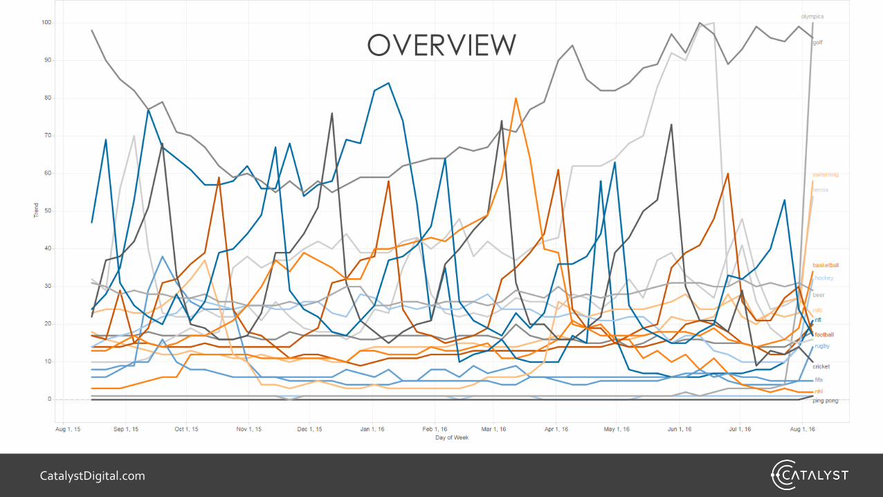
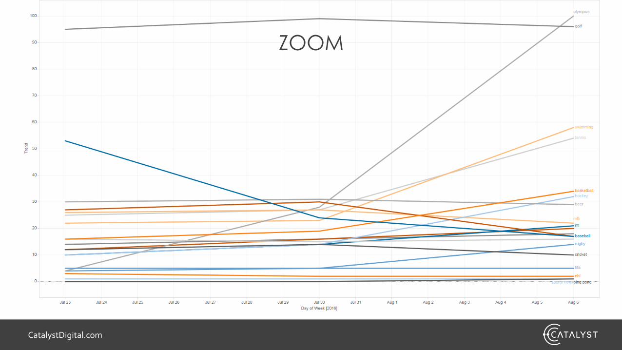
LOOKING AT YOUR DATA WITH SCHNEIDERMAN’S MANTRA
1.Overview
2.Zoom and Filter
3.Details on Demand
LET’S APPLY TO SEARCH TRENDS DATA PERTAINING
TO SOME DIFFERENT SPORTS
CatalystDigital.com
OVERVIEW
CatalystDigital.com
ZOOM

CatalystDigital.com
FILTER

CatalystDigital.com
DETAILS ON DEMAND

CatalystDigital.com
STEP #1Do you already know the story you’re trying to tell with your data?
NOLook at your data using
“Shneiderman’s Mantra”
DISCOVERY
YESDetermine what you would
like to show and map to an
appropriate chart type.
STORYTELLING

CatalystDigital.com
TYPES OF DATA
Comparison
Compare magnitudes
Relationship
Show correlations, outliers, and
clusters
Distribution
How values are
distributed along an axis
Composition
How parts of a whole
related to each other
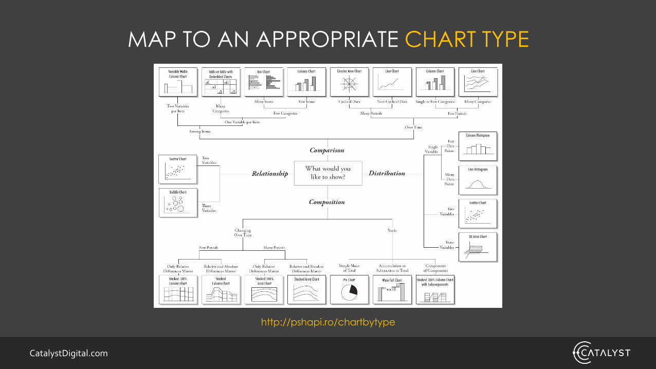
CatalystDigital.com
MAP TO AN APPROPRIATE CHART TYPE
http://pshapi.ro/chartbytype

CatalystDigital.com
STEP #2Make first attempt at creating a graph (most people stop at this step)

CatalystDigital.com
STEP #3If graph seems suboptimal, try a different kind.
CatalystDigital.com
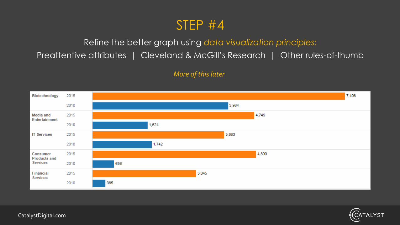
STEP #4Refine the better graph using data visualization principles:
Preattentive attributes | Cleveland & McGill’s Research | Other rules-of-thumb
More of this later
CatalystDigital.com
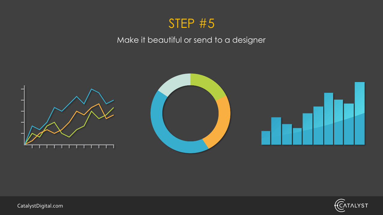
STEP #5Make it beautiful or send to a designer

CatalystDigital.com
DATA VISUALIZATION PRINCIPLES

CatalystDigital.com
Source: https://www.perceptualedge.com/articles/ie/visual_perception.pdf

CatalystDigital.com
92742847284724824856200977747
74747100104779749748480252211
12110956698424669629810921053

CatalystDigital.com
92742847284724824856200977747
74747100104779749748480252211
12110956698424669629810921053

CatalystDigital.com

CatalystDigital.com

CatalystDigital.com
http://www.creativebloq.com/design/science-behind-data-visualisation-8135496 (derived from Information Dashboard Design by Stephen Few)

CatalystDigital.com
THE CLEVELAND & MCGILL HIERARCHY
More Accurate
1. Position along a common scale
2. Position along nonaligned scales
3. Length/Direction/Angle
4. Area
5. Volume/Curvature
6. Shading/Color saturation
Less Accurate
Source: https://www.cs.ubc.ca/~tmm/courses/cpsc533c-04-spr/readings/cleveland.pdf

CatalystDigital.com
Source: The Functional Art by Alberto Cairo

CatalystDigital.com
DATA VISUALIZATION RULES OF THUMB
AND TIPS!

CatalystDigital.com
“MAXIMIZE DATA-INK RATIO”-Edward Tufte
Source: http://www.tbray.org/ongoing/data-ink/di1
BetterBad
CatalystDigital.com
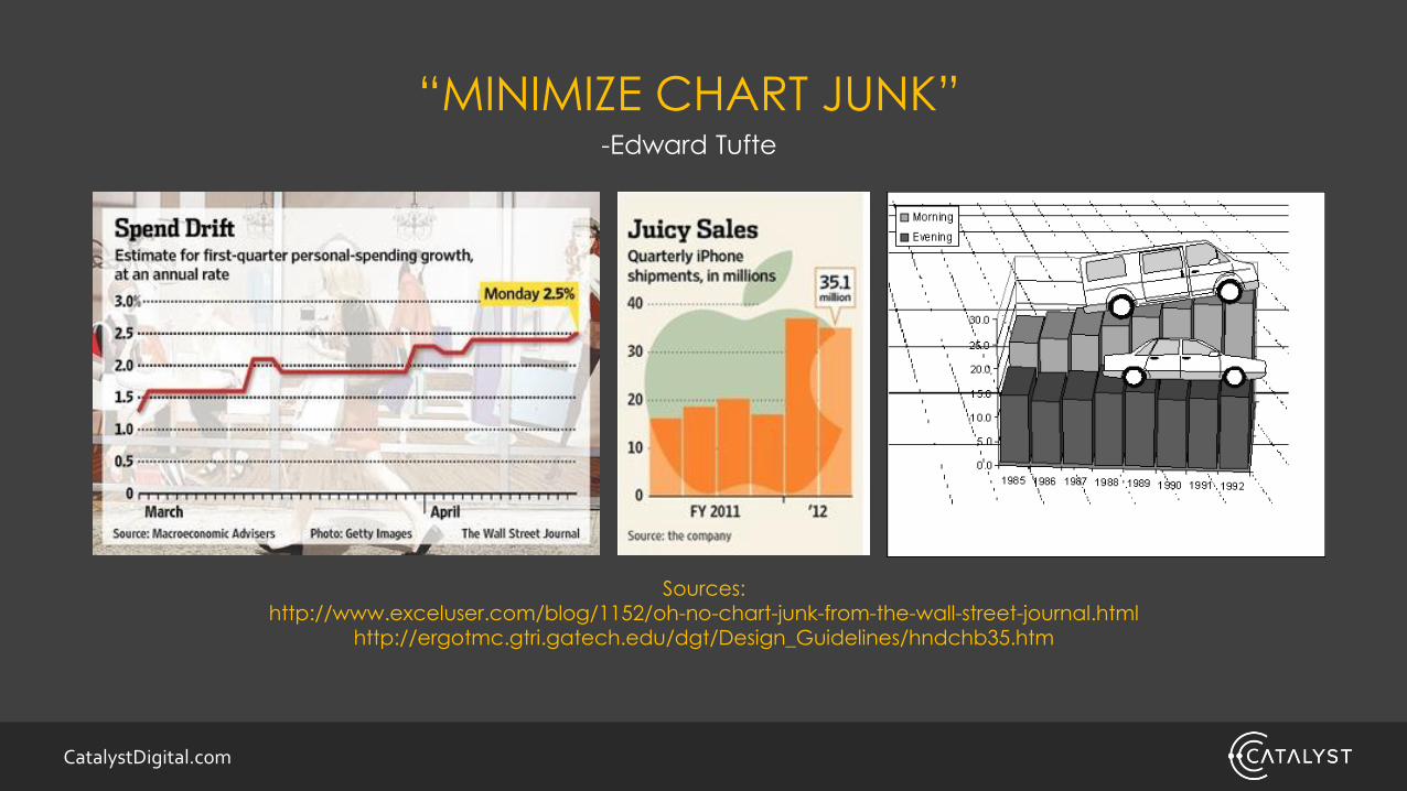
Sources: http://www.exceluser.com/blog/1152/oh-no-chart-junk-from-the-wall-street-journal.html
http://ergotmc.gtri.gatech.edu/dgt/Design_Guidelines/hndchb35.htm
“MINIMIZE CHART JUNK”-Edward Tufte

CatalystDigital.com
8% OF MEN (0.5% OF WOMEN) ARE COLOR BLIND

CatalystDigital.com
AVOID RED + GREEN

CatalystDigital.com
USE COLOR-BLIND FRIENDLY PALETTES!

CatalystDigital.com
CHECK USING CHROMATIC VISION SIMULATORhttp://asada.tukusi.ne.jp/webCVS/

CatalystDigital.com
DON’T USE PATTERN FILLS

CatalystDigital.com
AVOID LEGENDS IF POSSIBLE

CatalystDigital.com
BETTER!

CatalystDigital.com
USE HORIZONTAL BAR CHART WHEN…
• Your category labels are
too long
• Your showing a notable
ranking relationship in your
data
Source: https://bi.luc.edu/ibi_help/index.jsp?topic=%2Fcom.ibi.help.ia%2Fsource%2Ftopic42.htm

CatalystDigital.com
WHEN DATA IS INCOMPLETE, DON’T DO THIS…
0
1000
2000
3000
4000
5000
6000
7000
8000
Jan Feb Mar Apr May Jun Jul Aug Sep Oct Nov Dec Jan
Traffic
Traffic

CatalystDigital.com
DO THIS!
0
1000
2000
3000
4000
5000
6000
7000
8000
Jan Feb Mar Apr May Jun Jul Aug Sep Oct Nov Dec Jan
Traffic
Traffic

CatalystDigital.com
SHOW UPWARD SLOPING GRAPHS WHEN POSSIBLEResearch from Gattis and Holyoak, demonstrated that upward sloping graphs are
perceived as better.
0
5
10
15
20
25
Date Jan Feb Mar Apr May Jun Jul Aug Sep Oct Nov Dec
Rank
0
5
10
15
20
25
Date Jan Feb Mar Apr May Jun Jul Aug Sep Oct Nov Dec
Rank
✓X
CatalystDigital.com
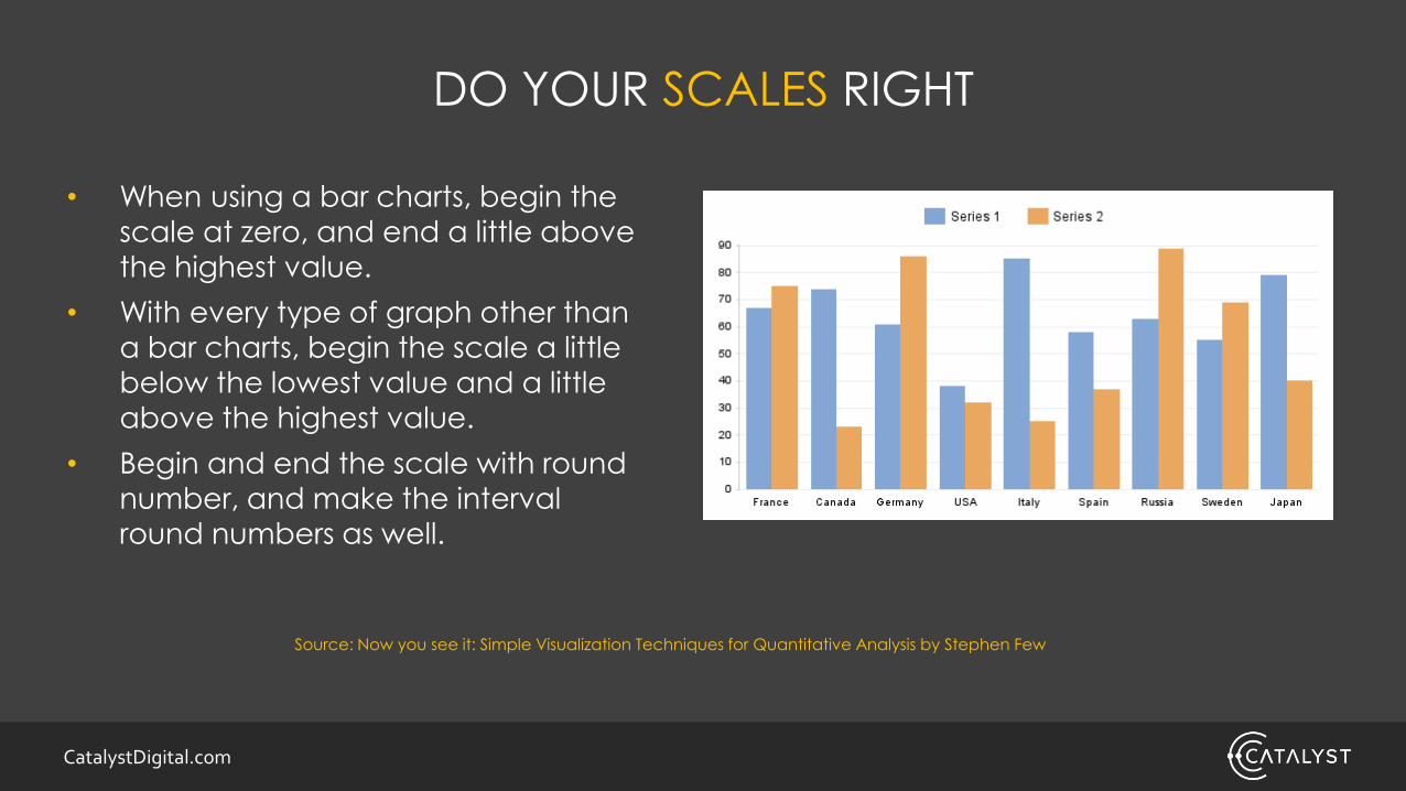
DO YOUR SCALES RIGHT
• When using a bar charts, begin the
scale at zero, and end a little above
the highest value.
• With every type of graph other than
a bar charts, begin the scale a little
below the lowest value and a little above the highest value.
• Begin and end the scale with round
number, and make the interval
round numbers as well.
Source: Now you see it: Simple Visualization Techniques for Quantitative Analysis by Stephen Few

CatalystDigital.com
WHEN MAKING COMPARISONS…
Try adding a “reference line” to make those comparisons clearer.

CatalystDigital.com
PICTOGRAPHS MAY HELP YOU REMEMBER DATA BETTER
Says research from Haroz, Kosara and Franconeri

CatalystDigital.com
TRY TRELLISING DATA INSTEAD OF RESORTING TO 3D GRAPHS

CatalystDigital.com
A LOT OF WEB ANALYTICS DATA IS TIME SERIES DATA…

CatalystDigital.com
USE LINE GRAPHS FOR ANALYZING PATTERNS AND EXCEPTIONS
Seasonal
Decrease

CatalystDigital.com
USE BAR CHARTS FOR EMPHASIZING & COMPARING INDIVIDUAL VALUES

CatalystDigital.com
YOU COULD DO SOMETHING LIKE THIS…

CatalystDigital.com
ALTHOUGH, YOU’RE BETTER OFF SHOWING THE DIFFERENCE

CatalystDigital.com
YOU CAN USE RADAR GRAPHS AS AN OPTION FOR COMPARING CYCLES…
12-1am1-2am
2-3am
3-4am
4-5am
5-6am
6-7am
7-8am
8-9am
9-10am
10-11am
11am-12pm12-1pm
1-2pm
2-3pm
3-4pm
4-5pm
5-6pm
6-7pm
7-8pm
8-9pm
9-10pm
10-11pm
11-12pm
Average Visits by Hour

CatalystDigital.com
BUT THIS CAN ALSO EASILY BE A LINE GRAPH
Average Visits by Hour

CatalystDigital.com
USE HEATMAPS FOR ANALYZING HIGH-VOLUME CYCLICAL PATTERNS AND EXCEPTIONS

CatalystDigital.com
USE BOX PLOTS FOR ANALYZING DISTRIBUTION CHANGES

CatalystDigital.com
USEFUL VISUALIZATION FOR SEARCH

CatalystDigital.com
NETWORK GRAPHSite Architecture

CatalystDigital.com

CatalystDigital.com
VENN DIAGRAMOverlapping Organic Keywords

CatalystDigital.com
TREEMAPCompetitive Landscape

CatalystDigital.com
WORD CLOUDSocial-Keyword Research
http://searchwilderness.com/semantic-keyword-research/

CatalystDigital.com
BUBBLE CHART

CatalystDigital.com
HTTP://DATAVIZCATALOGUE.COM

CatalystDigital.com
CONCLUSION
Follow the Discover to
Storytelling Process
Make use of
preattentive attributes
Utilize the Cleveland
and McGill hierarchy
Follow best rules-of-
thumb/best practices
Familiarize yourself with the different charts
and graphs available for use
CatalystDigital.com
TL;DR
There’s no quick and easy way to make an ideal data
visualization, but with an understanding of some of the
basic data visualization principles we can make them a
whole lot better.

CatalystDigital.com
THANK YOU!
SEE YOU AT THE NEXT #SMX
617-663-1247 | CatalystDigital.com© 2016 Catalyst | All Rights Reserved