art deco in estonian and latvian graphic design · pdf fileart deco in estonian and latvian...
TRANSCRIPT
43 www.folklore.ee/folklorewww.folklore.ee/folklorewww.folklore.ee/folklorewww.folklore.ee/folklorewww.folklore.ee/folklorehttp://www.folklore.ee/folklore/vol30/talvik.pdf
ART DECO IN ESTONIAN AND LATVIANGRAPHIC DESIGN JOURNALS
Merle Talvik
AbstractYears of the first independence in Estonia and Latvia involved the secondwave of nationalism in art and culture. National theme became a sourcewhich had to be treated fashionably. The fashionable European style was artdeco that spread in the Baltics, Finland and elsewhere in periphery of Eu-rope from the second half of the 1920s until 1940. The author has examinedand analysed a wide variety of Estonian illustrated magazines and journals.The examples of Latvian magazines come from the collections of the Infor-mation Centre of Art Academy of Latvia.The article explores common features in the pieces of the following artists:Vabbe – Vidbergs, Vaino – Apsītis, Madernieks – Reindorff, also Luhtein,Siirak, Mugasto, Verny, Triik versus Strunke, Zeberiņš and Kasparsons.The first goal is to prove that graphic design journals in art deco style werevery popular in the periphery of Europe in these years. Secondly, the authorclaims that objects that apparently lie outside the definition of ‘art’ can besubjected to visual analysis in such a way as to open important doors to theunderstanding of their origin, reception, place in society, and subsequenthistory. They are reflections of relations of power, aesthetic objectives, changingtheories and rituals of art and society. This is the reason why graphic designjournals are treated as carriers of culture.Keywords: graphic design journals, applied graphics, Estonian and Latvianart, visual culture, silent age
INTRODUCTION
Journalism gives good information to historians about the lifestyleand cultural standard of an era. Not only the text but also an ap-pearance of a journal (cover design, illustrations, vignettes, etc.)contain a lot of information.
Graphic design journals and magazines have beenpublished in Eu-rope, the USA and other countries since the 19th century. The jour-nals covered graphic design, typography, illustration, advertising,photography, book publishing and other related subjects such asthe mechanical aspects of publishing. Many of these journals dem-onstrate beautiful graphics and are an excellent source of informa-tion about the artists as well as about the everyday life of people. It
44www.folklore.ee/folklorewww.folklore.ee/folklorewww.folklore.ee/folklorewww.folklore.ee/folklorewww.folklore.ee/folklore
is important that they include a far wider range of visual materialsthan is normally embraced by art history. They are reflections ofrelations of power, aesthetic objectives, changing theories of art andeven the religious conceptions and rituals of society.
In the pre-television era, written press was intended for a very wideaudience. As almost the only channel of mass media, it had an im-mense influence on shaping people’s tastes and preferences, thusguiding the political arrangement and cultural life of society. Me-dia was also a tool for exercising power thanks to the rather privi-leged access of politicians and government officials to journals andmagazines.
From the point of view of culture, media is the primary source fordefining social reality and the most widespread expression of thecollective identity or Zeitgeist.
The German word Zeitgeist means the spirit of time and refers tothe cultural trends and tastes that characterise a given era. Thefield of graphic design on the whole is characterised by immediacyand a short life-span, on which P. B. Meggs (1998: xiii) and M. Rickards(1988: 13) have focussed in their research. Thus journals are pass-ing documents of everyday life, the contents of which are often notmeant to last longer than a week or a month. A typical person throwsthem out after reading. The journal is always directed to the con-temporary consumer, it reaches almost everyone in the society. Fromthis stems the link between its contents and the vision of the social,political and economic life of the society that often enables it toexpress the Zeitgeist of the era more closely, by telling more thanother means of human expression, such as the art of painting. Wesee and read the human story in journals.
The years of prewar national independence (1918–1940) in Esto-nian and Latvian art are characterised by a national-inspired ap-proach to form and decoration. Development took place in parallelin both countries, as cultural contacts were close. In the first partof the present article the author provides an overview of the devel-opment of the national style in Estonia, to the study of which theauthor has dedicated 7 years. The best studies of Latvian artisticdevelopments in the first half ot the 20th century are written by M.Brancis (1994), S. Grosa (1999) and J. Howard (2004). But they mainly
Merle Talvik Folklore 30
45 www.folklore.ee/folklorewww.folklore.ee/folklorewww.folklore.ee/folklorewww.folklore.ee/folklorewww.folklore.ee/folklore
concentrate on jugendstil or art nouveau, and do not explore theera of art deco. That is why in the present article the author takesone step forward and looks at the works in the style of art deco,trying to assess their artistic maturity in the cultural context.
The era of art deco in Estonian and Latvian graphic design journalscan conventionally be divided into two. The best works in the artdeco style are from the second half of the 1920s and the beginningof the 1930s, when preconditions for the development of journalismwere good and the freedom of activity was great. On the basis of theworks of the second half of the 1930s, both in Estonia and Latvia, aconsequent direction of state national propaganda through art intopublic consciousness can be observed. The cover picture is no longera work of “art for art’s sake”. It has been given the high-mindedobjectives of shaping a citizen who thinks independently and is self-aware, which, ultimately, should have improved the culture and qual-ity of life of the whole society. The individual contribution of theartist was subjected to function, the ideological basis of which wasthe futuristic belief in a better tomorrow, the method for which wasproto-totalitarianism.
THE DEVELOPMENT OF NATIONAL GRAPHIC DESIGN INESTONIAN WRITTEN PRESS
National independence brought along an increase in the number ofpublications. In the years of prewar national independence (1918–1940) over 200 journals and bulletins were published in Estonia, 90per cent of them were in Estonian. Most of them had an artisticlook with remarkable decoration and composition, texture, colour-ing and script drawn by well-known artists. Both the content andappearance of the journals were shaped by local economic and cul-tural conditions.
The keywords for art between the two world wars were order,monumentalism, nationalism, classics and hierarchy, which wereespecially clearly expressed in architecture (Borsi 1987: 13; Kalm1990: 75–100; Kalm 1994: 93–136; Kodres 2001: 236–240). The youngEstonian national culture, with its identity to protect, had takenthe direction of internationalism via nationalism. In a few decadesEstonian culture developed extremely fast. In 1968 B. Bernstein
Art Deco in Estonian and Latvian Graphic Design Journals
46www.folklore.ee/folklorewww.folklore.ee/folklorewww.folklore.ee/folklorewww.folklore.ee/folklorewww.folklore.ee/folklore
introduced the relatively new term of “national culture accelerateddevelopment” in the Estonian art history. A few years later B.Bernstein wrote the following
The essence of accelerated development lies in the fact that theculture of a given ethnic union makes up for what it has missedby relying on foreign experience and acquiring it in its own way.Unions possessing this cultural experience may have movedahead in one, two or three phases; in this case accelerated devel-opment does not quickly repeat all the phases in-between but itskips them” (Bernstein 1977: 27).
This fact inevitably posed Estonian artists the problem of creativecopying and interpretation. In a short time a synthesis of the na-tional tradition, which is difficult to define, and the internationalcultural experience treated as a certain “norm” had to be achieved(Abel 1995: 143).
The basis for the development and spread of graphic design in the1920s and 30s was the rapid development of the economy and com-merce in the country. The rise in the number of publications led to agreater need for designers. The need for local staff arose in all fieldsof applied graphics. The rise began with the development of graphicart currency design and badge design, leading to the founding ofnumerous new enterprises and organisations that in the conditionsof economic competition created favourable grounds for advertis-ing. As the demand in applied graphics grew, many visual artistslike Nikolai Triik, Ado Vabbe and Günther Reindorff were active inthis field. Most of them had received their education and first ar-tistic experiences in St. Petersburg or Western Europe. Many ap-plied graphic artists were self-taught.
In the 1920s and especially in the 30s, applied artists and graphicartists trained in decorative painting or graphic art at RiigiKunsttööstuskool (State School of Applied Art) in Tallinn and visualartists who had studied at Kõrgem Kunstikool Pallas (Higher ArtSchool Pallas) in Tartu also became active.
Tallinn school can be characterised by a masterly script, refinedstylising of ornament in art deco style, integral composition and
Merle Talvik Folklore 30
47 www.folklore.ee/folklorewww.folklore.ee/folklorewww.folklore.ee/folklorewww.folklore.ee/folklorewww.folklore.ee/folklore
essentially motivated use of pictorial images. Script, ornament anddrawing are logically connected, forming a compact and rich whole.National ornament is widely used. The mission of creating distinc-tive national style emerged in the foreground. The curricula of theState School of Applied Art were modelled upon those of theStieglitz Institute of Technical Drawing in St. Petersburg whichfocussed on applied art. The study conditions at the Stieglitz Insti-tute were more appropriate for ordinary people than other art edu-cation establishments in St. Petersburg and many young people fromthe Baltics acquired their education there, including about 60 Es-tonians. The curricula of the Tartu Higher Art School were based onWestern European art experience. Therefore the visual languageof the artists from Tartu school is more picturesque. Individualitiesemerge more clearly. National propaganda is less evident, but scriptis often unprofessional.
The so called “silent age” in Estonian politics (1934–1940) involveda second wave of nationalism in Estonian art. National theme inornament and images became a source that had to be treated fash-ionably. Motifs and colours were taken from folk embroidery. Orna-ment was geometrised in the style of art deco and connected moreor less harmoniously with script. Geometric division of surfaceswas widely used.
COMPARISON OF ESTONIAN AND LATVIAN GRAPHICDESIGN JOURNALS
Unabashed novelty, chic modernity and constant change all playeda part in the creation of the myriad of styles, looks, products andideas which characterize the 1920s and 1930s (Horsham 1997: 11).Jazz music, the spread of wireless communications, skyscrapers,subways, orientation to mass production, the emergence of adver-tising art, great tolerance towards other experimental art move-ments and the transfer of all this to national socialism, antisemitism,the empires of Adolf Hitler and Josef Stalin all belong to two dec-ades.
Reoccurring shapes, contrastive lines expressing speed, bright pri-mary colours, the flatness of the picture surface, stylising and geo-metric simplicity made modernist art and its way of thinking un-
Art Deco in Estonian and Latvian Graphic Design Journals
48www.folklore.ee/folklorewww.folklore.ee/folklorewww.folklore.ee/folklorewww.folklore.ee/folklorewww.folklore.ee/folklore
derstandable and accessible for everyone. Mass production did notnecessarily have to mean a reduction in quality (Sternau 1997: 36).
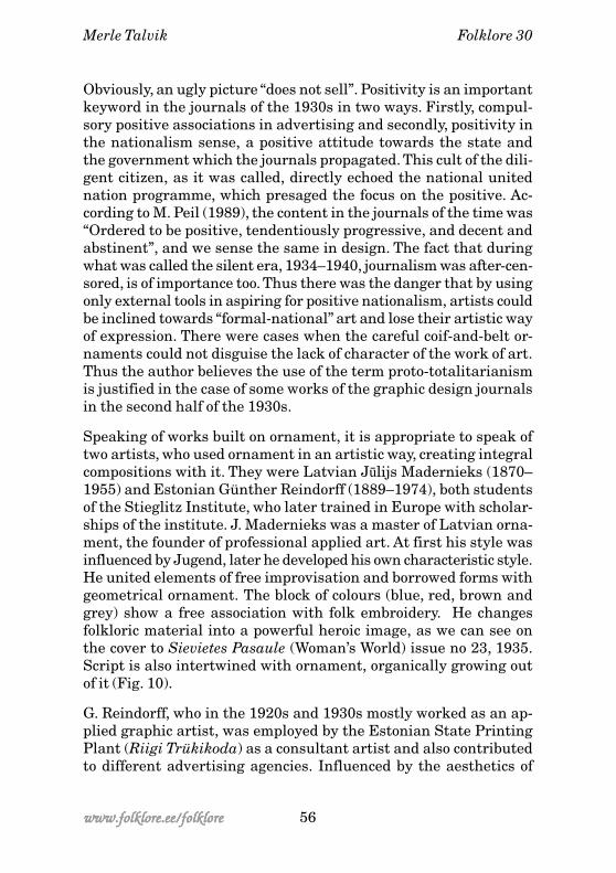
The interest in indigenous and national art was very characteristicof the art deco era. As we know, no “pictures” were featured in Esto-nian and Latvian national art, but ornament was. In graphic designone cannot do without the figure and that is why the national hu-man figure was introduced, which besides journals is also featuredon several diplomas and certificates and can easily be recognisedby adding national costumes or some other national symbols (Talvik2000: 36). It is an impersonal figure with a typical face, mostly afemale, with whom it is easy to identify. This angular, strong femaleis a completely different person from the shy woman of the Jugendera. She either does cross-stitch, sings or defends the country, sheis self-conscious, demanding an equal position with men in the lifeof society. This woman is thoroughly national but also entirely artdeco. A typical art deco woman has freed herself from the confinesof bustles and corsets, her silhouette is tall, tubular and unadorned,she has bobbed hair, she wears a cloche hat (see Fig. 1) and a shortishdress, drives a car, drinks alcohol and smokes equally with men. Wesee a woman like this in the drawings of the fashion genius PaulPoiret, and also in the drawings of George Lepape for the journalVogue and in Vladimir Bobritsky’s drawings for the journal VanityFair. The woman is often accompanied by hounds or deer withstreamlined bodies, as symbols of speed and modernism. So didEstonian and Latvian artists produce many images of the modernwoman living the good life. The fashionable woman of leisure ap-pears on a cover to Atpūhta (Vacation) No 360, 1932. It is an aquarelleof Aleksandrs Apsītis (1880–1942) called Near the Opera. The beau-tiful and gracious lady is pictured walking a dog in an autumnalpark in front of an opera theatre. In the background other strollerscan be seen and a car as the symbol of a comfortable lifestyle. Thecomposition is complete, the colouring tasteful and soft (see Fig. 2).Aleksandrs Apsītis was an original artist, who did not have a goodeducation. But he was a skilful drawer who created his own ideal ofbeauty in journalism oriented to a wider audience. He regularlypublished his drawings in journals Jauna Nedēļa (Young Week),Atpūhta (Vacation), Ilustrē ts Žurnā ls (Illustrated Journal), Zeltene(Maiden), Latvijas Jaunante (Youth of Latvia) and Tautas Žurnā lsVisiem (Popular Journal for Everybody).
Merle Talvik Folklore 30
49 www.folklore.ee/folklorewww.folklore.ee/folklorewww.folklore.ee/folklorewww.folklore.ee/folklorewww.folklore.ee/folklore
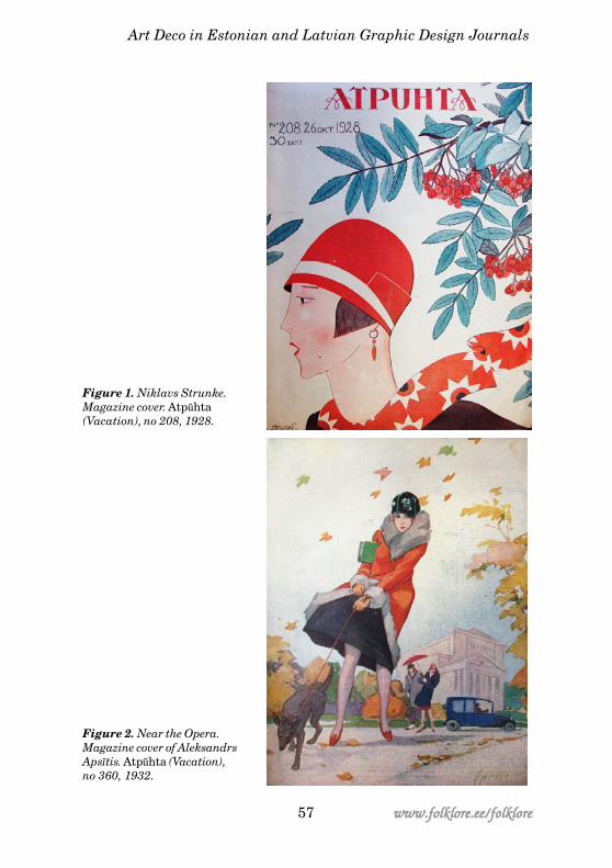
We find the same scene on the cover of the Estonian journal Kodu(Home). Estonian graphic artist and painter Eugen Vaino (1909–1969) was a member of the State Applied Art School generation. Inthe 1930s he was active in the fields of graphic art and applied andbook graphics. On the cover of the journal Kodu issue no. 8 from1937 he depicts in an art deco manner a couple with stretched fig-ures walking a dog. The motif is a typical one, but the figures areflat and superficial. The composition as a whole is not convincingand the work is obviously not as good as that of the classics of theworld (see Fig. 3). It is more of a decorative than artistic composi-tion that again makes it possible to identify with the figures repre-sented, as though everyone could afford to have a walk like that.This represents an identity, a feeling of belonging among happy andsatisfied people. Art deco graphic artists create a world of escap-ism (Sternau 1997: 69) by representing something to be wished for,desired, a splendid world of fantasy, not reality. Hence the snobberyand glamour that are characteristic of the style.
Often we see happy couples spending time in the country or in theamusement park. Reinholds Kasparsons (1889–1966) worked formany years at the Atpūhta, where he was active in the field of ap-plied graphics. He also made posters and painted porcelain. Hisscenes of vacation on the covers of Atpūhta can be compared to thecover drawings of the American journal Woman’s Home Compan-ion, which spread in Estonia and probably in Latvia too. IndriķisZeberiņš (1882–1969) also worked intensively for journals, he pub-lished his first drawing in the journal Vērotajs (Observer) in 1905.He liked to depict patriarchal peasant life. On the covers of Atpūhtahe deviates from his favourite characters, peasants, by depictingtown people having a holiday in the country. These cover drawingsdo not carry specific formal features of art deco, but depict the life-style of the era.
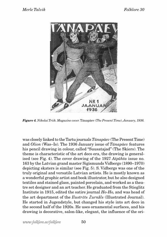
Among the Estonian artists, Nikolai Triik (1884–1940) undoubtedlyhad as much experience in illustrating journals, attracting atten-tion in 1905 with his romantic “Tulekandja” (Flame Bearer) on thecover of the Noor-Eesti (Young Estonia) I album. N. Triik had beeneducated at the St. Petersburg Stieglitz Institute, and complementedhis skills at the liberal Paris academies. From 1921 he was a tutorin Pallas, and for a short time also the director. In the 1930s N. Triik
Art Deco in Estonian and Latvian Graphic Design Journals
50www.folklore.ee/folklorewww.folklore.ee/folklorewww.folklore.ee/folklorewww.folklore.ee/folklorewww.folklore.ee/folklore
was closely linked to the Tartu journals Tänapäev (The Present Time)and Olion (Was–Is). The 1936 January issue of Tänapäev featureshis pencil drawing in colour, called “Suusatajad” (The Skiers). Thetheme is characteristic of the art deco era, the drawing is general-ised (see Fig. 4). The cover drawing of the 1927 Atpūhta issue no.163 by the Latvian grand master Sigismunds Vidbergs (1890–1970)depicting skaters is similar (see Fig. 5). S. Vidbergs was one of thetruly original and versatile Latvian artists. He is mostly known asa wonderful graphic artist and book illustrator, but he also designedtextiles and stained glass, painted porcelain, and worked as a thea-tre set designer and an art teacher. He graduated from the StieglitzInstitute in 1915, edited the satire journal Ho-Ho, and was head ofthe art department of the Ilustrē ts Žurnā ls (Illustrated Journal).He started in Jugendstyle, but changed his style into art deco inthe second half of the 1920s. He uses ornamental surfaces, and hisdrawing is decorative, salon-like, elegant, the influence of the ori-
Figure 4. Nikolai Triik. Magazine cover. Tänapäev (The Present Time), January, 1936.
Merle Talvik Folklore 30
51 www.folklore.ee/folklorewww.folklore.ee/folklorewww.folklore.ee/folklorewww.folklore.ee/folklorewww.folklore.ee/folklore
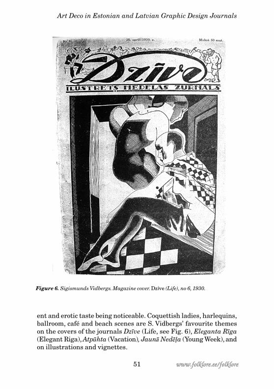
ent and erotic taste being noticeable. Coquettish ladies, harlequins,ballroom, café and beach scenes are S. Vidbergs’ favourite themeson the covers of the journals Dzīve (Life, see Fig. 6), Eleganta Rīga(Elegant Riga), Atpūhta (Vacation), Jaunā Nedēļa (Young Week), andon illustrations and vignettes.
Figure 6. Sigismunds Vidbergs. Magazine cover. Dz¥ve (Life), no 6, 1930.
Art Deco in Estonian and Latvian Graphic Design Journals
52www.folklore.ee/folklorewww.folklore.ee/folklorewww.folklore.ee/folklorewww.folklore.ee/folklorewww.folklore.ee/folklore
The airy elegance of S. Vidbergs’ drawings in Chinese ink can to acertain extent be compared to the style of Estonian Ado Vabbe (1892–1961). Ado Vabbe studied in Munich 1911–1913 at the art school ofA. Ažbé. For 21 years between 1919 and 1940 he worked in Tartu atthe Pallas as a tutor of painting and graphic art. Having encoun-tered new art movements in Munich, he became a keen disciple ofthem. In his earlier drawings a Jugend stylisation prevails. A. Vabbewas associated with the traditions of the Noor-Eesti (Young Esto-nia) movement, A. Beardsley, and the art world of Mir Iskusstva(Solomykova 1972: 25). A. Vabbe shaped his improvising objectlessmanner of drawing on the style of Vassili Kandinsky, whom AdoVabbe knew personally (Paris 1939: 653; Hain 1992: 141; Komissarov1992: 7; Varblane 1994: 183), and on the influence of the abstractexpressionism of the group Der Blauer Reiter. Like V. Kandinsky’s,A. Vabbe’s drawing is a synthesis of what he depicted and what thedepicted subject could imply. He also became acquainted with thecreative work of the futurists, but aggressive and destructive meth-ods did not suit A. Vabbe. He liked the futurists’ way of structuringthe surface, dividing the picture surface into mosaic pieces, andalso the transfer of the movement effect. But he always remainedan aesthete; balance, elegance and beauty prevail in his works(Varblane 1994: 185). In this sense Ado Vabbe may certainly be com-pared to Sigismunds Vidbergs. His love for masquerade-like andtheatrical scenes also brings A. Vabbe nearer to S. Vidbergs.
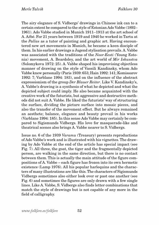
Issue no. 6 of the 1939 Varamu (Treasury) presents reproductionsof Ado Vabbe’s work and is illustrated with his vignettes. The draw-ing by Ado Vabbe at the end of the article has special impact (seeFig. 7). All three, the goat, the tiger and the fragmentally depictedperson, are walking in the same direction, but there is no contactbetween them. This is actually the main attitude of the figure com-positions of A. Vabbe – each figure has frozen into its own hermeticexistence (Lamp 1976). All his popular harlequins and the charac-ters of many illustrations are like this. The characters of SigismundsVidbergs sometimes also either look over or past one another (seeFig. 6) and sometimes the figures are only drawn with a few singlelines. Like A. Vabbe, S. Vidbergs also finds letter combinations thatmatch the style of drawings but is not capable of any more in thefield of calligraphy.
Merle Talvik Folklore 30
53 www.folklore.ee/folklorewww.folklore.ee/folklorewww.folklore.ee/folklorewww.folklore.ee/folklorewww.folklore.ee/folklore
Figure 7. Ado Vabbe. Vignette to Varamu (Treasury), no 6, 1939.
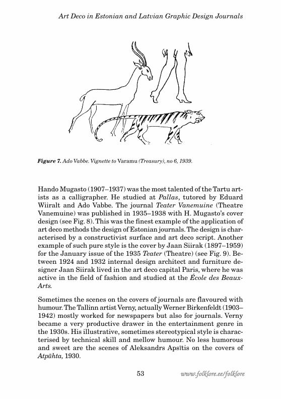
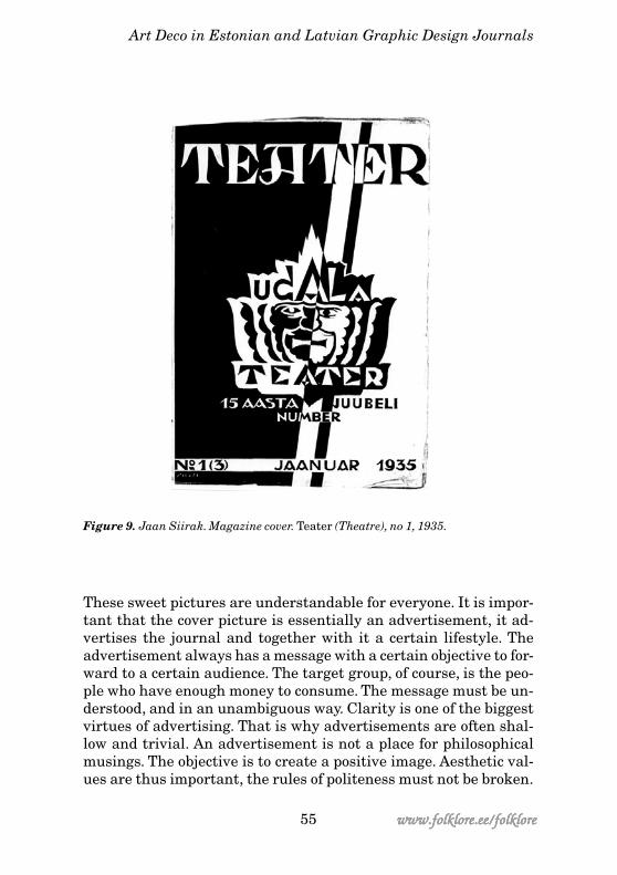
Hando Mugasto (1907–1937) was the most talented of the Tartu art-ists as a calligrapher. He studied at Pallas, tutored by EduardWiiralt and Ado Vabbe. The journal Teater Vanemuine (TheatreVanemuine) was published in 1935–1938 with H. Mugasto’s coverdesign (see Fig. 8). This was the finest example of the application ofart deco methods the design of Estonian journals. The design is char-acterised by a constructivist surface and art deco script. Anotherexample of such pure style is the cover by Jaan Siirak (1897–1959)for the January issue of the 1935 Teater (Theatre) (see Fig. 9). Be-tween 1924 and 1932 internal design architect and furniture de-signer Jaan Siirak lived in the art deco capital Paris, where he wasactive in the field of fashion and studied at the École des Beaux-Arts.
Sometimes the scenes on the covers of journals are flavoured withhumour. The Tallinn artist Verny, actually Werner Birkenfeldt (1903–1942) mostly worked for newspapers but also for journals. Vernybecame a very productive drawer in the entertainment genre inthe 1930s. His illustrative, sometimes stereotypical style is charac-terised by technical skill and mellow humour. No less humorousand sweet are the scenes of Aleksandrs Apsītis on the covers ofAtpūhta, 1930.
Art Deco in Estonian and Latvian Graphic Design Journals
54www.folklore.ee/folklorewww.folklore.ee/folklorewww.folklore.ee/folklorewww.folklore.ee/folklorewww.folklore.ee/folklore
Figure 8. Hando Mugasto. Magazine cover. Teater Vanemuine (Theatre Vanemuine),no 2, 1935.
Merle Talvik Folklore 30
55 www.folklore.ee/folklorewww.folklore.ee/folklorewww.folklore.ee/folklorewww.folklore.ee/folklorewww.folklore.ee/folklore
Figure 9. Jaan Siirak. Magazine cover. Teater (Theatre), no 1, 1935.
These sweet pictures are understandable for everyone. It is impor-tant that the cover picture is essentially an advertisement, it ad-vertises the journal and together with it a certain lifestyle. Theadvertisement always has a message with a certain objective to for-ward to a certain audience. The target group, of course, is the peo-ple who have enough money to consume. The message must be un-derstood, and in an unambiguous way. Clarity is one of the biggestvirtues of advertising. That is why advertisements are often shal-low and trivial. An advertisement is not a place for philosophicalmusings. The objective is to create a positive image. Aesthetic val-ues are thus important, the rules of politeness must not be broken.
Art Deco in Estonian and Latvian Graphic Design Journals
56www.folklore.ee/folklorewww.folklore.ee/folklorewww.folklore.ee/folklorewww.folklore.ee/folklorewww.folklore.ee/folklore
Obviously, an ugly picture “does not sell”. Positivity is an importantkeyword in the journals of the 1930s in two ways. Firstly, compul-sory positive associations in advertising and secondly, positivity inthe nationalism sense, a positive attitude towards the state andthe government which the journals propagated. This cult of the dili-gent citizen, as it was called, directly echoed the national unitednation programme, which presaged the focus on the positive. Ac-cording to M. Peil (1989), the content in the journals of the time was“Ordered to be positive, tendentiously progressive, and decent andabstinent”, and we sense the same in design. The fact that duringwhat was called the silent era, 1934–1940, journalism was after-cen-sored, is of importance too. Thus there was the danger that by usingonly external tools in aspiring for positive nationalism, artists couldbe inclined towards “formal-national” art and lose their artistic wayof expression. There were cases when the careful coif-and-belt or-naments could not disguise the lack of character of the work of art.Thus the author believes the use of the term proto-totalitarianismis justified in the case of some works of the graphic design journalsin the second half of the 1930s.
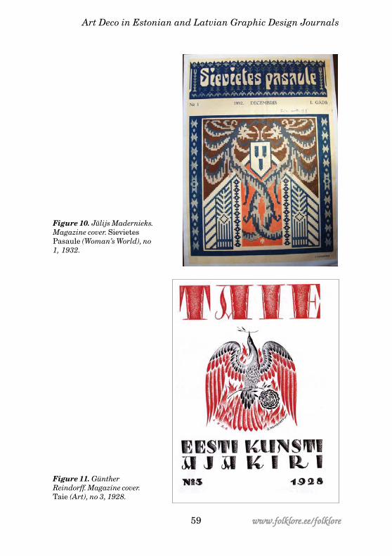
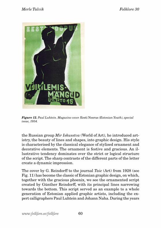
Speaking of works built on ornament, it is appropriate to speak oftwo artists, who used ornament in an artistic way, creating integralcompositions with it. They were Latvian Jūlijs Madernieks (1870–1955) and Estonian Günther Reindorff (1889–1974), both studentsof the Stieglitz Institute, who later trained in Europe with scholar-ships of the institute. J. Madernieks was a master of Latvian orna-ment, the founder of professional applied art. At first his style wasinfluenced by Jugend, later he developed his own characteristic style.He united elements of free improvisation and borrowed forms withgeometrical ornament. The block of colours (blue, red, brown andgrey) show a free association with folk embroidery. He changesfolkloric material into a powerful heroic image, as we can see onthe cover to Sievietes Pasaule (Woman’s World) issue no 23, 1935.Script is also intertwined with ornament, organically growing outof it (Fig. 10).
G. Reindorff, who in the 1920s and 1930s mostly worked as an ap-plied graphic artist, was employed by the Estonian State PrintingPlant (Riigi Trükikoda) as a consultant artist and also contributedto different advertising agencies. Influenced by the aesthetics of
Merle Talvik Folklore 30
57 www.folklore.ee/folklorewww.folklore.ee/folklorewww.folklore.ee/folklorewww.folklore.ee/folklorewww.folklore.ee/folklore
Figure 1. Niklavs Strunke.Magazine cover. Atpūhta(Vacation), no 208, 1928.
Figure 2. Near the Opera.Magazine cover of AleksandrsApsītis. Atpūhta (Vacation),no 360, 1932.
Art Deco in Estonian and Latvian Graphic Design Journals
58www.folklore.ee/folklorewww.folklore.ee/folklorewww.folklore.ee/folklorewww.folklore.ee/folklorewww.folklore.ee/folklore
Figure 3. Eugen Vaino.Magazine cover. Kodu (Home), no8, 1937.
Figure 5. SigismundsVidbergs. Magazine cover.Atpūhta (Vacation), no 163,1927.
Merle Talvik Folklore 30
59 www.folklore.ee/folklorewww.folklore.ee/folklorewww.folklore.ee/folklorewww.folklore.ee/folklorewww.folklore.ee/folklore
Figure 10. Jū lijs Madernieks.Magazine cover. SievietesPasaule (Woman’s World), no1, 1932.
Figure 11. GüntherReindorff. Magazine cover.Taie (Art), no 3, 1928.
Art Deco in Estonian and Latvian Graphic Design Journals
60www.folklore.ee/folklorewww.folklore.ee/folklorewww.folklore.ee/folklorewww.folklore.ee/folklorewww.folklore.ee/folklore
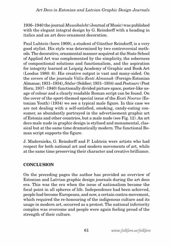
Figure 12. Paul Luhtein. Magazine cover. Eesti Noorus (Estonian Youth), specialissue, 1934.
the Russian group Mir Iskusstva (World of Art), he introduced art-istry, the beauty of lines and shapes, into graphic design. His styleis characterised by the classical elegance of stylised ornament anddecorative elements. The ornament is festive and gracious. An il-lustrative tendency dominates over the strict or logical structureof the script. The sharp contrasts of the different parts of the lettercreate a dynamic impression.
The cover by G. Reindorff to the journal Taie (Art) from 1928 (seeFig. 11) has become the classic of Estonian graphic design, on which,together with the gracious phoenix, we see the ornamented scriptcreated by Günther Reindorff, with its principal lines narrowingtowards the bottom. This script served as an example to a wholegeneration of Estonian applied graphic artists, including the ex-pert calligraphers Paul Luhtein and Johann Naha. During the years
Merle Talvik Folklore 30
61 www.folklore.ee/folklorewww.folklore.ee/folklorewww.folklore.ee/folklorewww.folklore.ee/folklorewww.folklore.ee/folklore
1936–1940 the journal Muusikaleht (Journal of Music) was publishedwith the elegant integral design by G. Reindorff with a heading initalics and an art deco ornament decoration.
Paul Luhtein (born 1909), a student of Günther Reindorff, is a verygood stylist. His style was determined by two controversial meth-ods. The decorative, ornamental manner acquired at the State Schoolof Applied Art was complemented by the simplicity, the sobernessof compositional solutions and functionalism, and the aspirationfor integrity learned at Leipzig Academy of Graphic and Book Art(Loodus 1980: 6). His creative output is vast and many-sided. Onthe covers of the journals Välis-Eesti Almanak (Foreign-EstonianAlmanac; 1931–1934), Sõdur (Soldier; 1931–1934) and Postisarv (PostHorn; 1937–1940) functionally divided picture space, poster-like us-age of colour and a clearly readable Roman script can be found. Onthe cover of the sport-themed special issue of the Eesti Noorus (Es-tonian Youth) (1934) we see a typical male figure. In this case weare not dealing with a self-satisfied, smoking, candy-eating con-sumer, as abundantly portrayed in the advertisement graphic artof Estonia and other countries, but a male nude (see Fig. 12). An artdeco male nude in graphic design is stylised and monumental, clas-sical but at the same time dramatically modern. The functional Ro-man script supports the figure.
J. Madernieks, G. Reindorff and P. Luhtein were artists who hadrespect for both national art and modern movements of art, whileat the same time preserving their character and creative brilliance.
CONCLUSION
On the preceding pages the author has provided an overview ofEstonian and Latvian graphic design journals during the art decoera. This was the era when the issue of nationalism became thefocal point in all spheres of life. Independence had been achieved,people had become Europeans, and now, a certain contra-movement,which required the re-honouring of the indigenous culture and itsusage in modern art, occurred as a protest. The national inferioritycomplex was overcome and people were again feeling proud of thestrength of their culture.
Art Deco in Estonian and Latvian Graphic Design Journals
62www.folklore.ee/folklorewww.folklore.ee/folklorewww.folklore.ee/folklorewww.folklore.ee/folklorewww.folklore.ee/folklore
But the aspiration for identity always requires both identificationand differentiation: on the one hand the European culture, the fol-lowing of fashion movements; on the other hand the security thatwas offered by the collective creation of the nation, ornaments thatwere considered as a national inheritance, combinations of formand colour. In the 1930s the influence of totalitarian regimes deep-ened in European countries including periphery and there was aninclination towards traditionalism in culture. Both, in Estonian andLatvian culture, the so-called silent era also brought out a submis-sive attitude. Here again two forces could collide – on the one handthe whole, forced to be homogeneous, a national or social great ideathat required personal submission, on the other hand a liberal art-ist, individualism and democracy.
Actually, it is not always possible to differentiate what is our ownand what is foreign, because the different influences are so inter-twined and styles of art are always international. Both Estonia andLatvia were open to the outside world in the 1930s and last of allour national ornamental art mostly stems from the treasuries ofBaroque art.
References
Abel, Tiina 1995. “Pallase” koolkonnast 1930. aastate kunstiprotsessidefoonil (Sissejuhatus koolkonna loomingu käsitlusse) [About the “Pallas”school on the background of the 1930s art processes (An introduction totreating the school’s works)]. Sarapik, Virve et al. (eds). Kunstiteaduslikkeuurimusi = Studies on art and architecture = Studien für Kunstwissen-schaft, 8. Tallinn: Eesti Kunstiteadlaste Ühing, pp. 143–166.
Bernstein, Boriss 1977. Kunsti rahvuslikust omapärast [On thenational uniqueness of art]. Lumiste, Mai (ed.). Töid kunstiteaduse jakriitika alalt, 2: Artiklite kogumik. Tallinn: Kunst, pp. 13–29.
Borsi, Franco 1987. The Monumental Era. European Architecture andDesign, 1929–1939. New York: Rizzoli.
Brancis, Māri. 1994. Jūgendstila ornamentika Latvijas žurnālos 19.gs. beigās un 20. gs. sākuma [Jugendstil ornaments in Latvian magazinesat the end of the 19th and the beginning of the 20th century]. Grosmane,Elita (ed.). Ornaments Latvijā : Materiā li mākslas vēsturei. Riga: Zinātne.
Grosa, Silvija (ed.) 1999. Jugend stils: Laiks un telpa: Baltijas jurasvalstis 19.–20.gs. mija = Art Noveau: Time and Space: The Baltic SeaCountries at the Turn of the 20th Century. Riga: Jumava.
Merle Talvik Folklore 30
63 www.folklore.ee/folklorewww.folklore.ee/folklorewww.folklore.ee/folklorewww.folklore.ee/folklorewww.folklore.ee/folklore
Hain, Jüri 1992. Mees, kes tahtis tulla Tartu [The man who wantedto come to Tartu]. Looming, 1, pp. 139–141.
Horsham, Michael 1997. ’20s and ’30s Style. London: Quantum Books.Howard, Jeremy 2004. From the Stieglitz Forward: The Snaking
Progress of Latvian Applied Art ca. 1900–1914. Centropa: A Journal ofEuropean Archtecture and Related Arts, 4 (3), pp. 267–280.
Kalm, Mart 1990. Riigi esiarhitekt Alar Kotli [The national grandarchitect Alar Kotli]. Kotshenovski, Oleg (ed.). Linnaehitus ja arhitektuur= Gradostroitelstvo i arkhitektura. Tallinn: Ehituse Teadusliku UurimiseInstituut, pp. 75–100.
Kalm, Mart 1994. Arhitekt Alar Kotli [The architect Alar Kotli]. Tallinn:Kunst.
Kodres, Krista 2001. Ilus maja, kaunis ruum: Kujundusstiile Vana-Egiptusest tänapäevani [Beautiful house, nice room: Decoration stylesfrom Old Egypt to today]. Tallinn: Prisma Prindi Kirjastus.
Komissarov, Eha 1992. Vabbe – helesinine ratsanik [Vabbe – a bluerider]. Kunst: Art in Estonia, 3, pp. 7–9.
Lamp, Ene 1976. Ado Vabbe ja moodne kunst [Ado Vabbe and modernart]. Sirp ja Vasar, May 22 & 28.
Loodus, Rein 1980. Paul Luhtein ja tema looming [Paul Luhtein andhis creative works]. Tallinn: Eesti Raamat.
Meggs, Philip B. 1998. A History of Graphic Design. 3rd Edition. NewYork: John Wiley & Sons.
Menten, Theodore 1975. Advertising Art in the Art Deco Style. NewYork: Dover Publications.
Paris, Rudolf Johannes 1939. Ado Vabbe. Varamu, 6, pp. 647–658.Peil, Mirjam 1989. Eesti naisteajakirjadest, seekord “Taluperenaisest”
[About Estonian women’s journals, thise time about “Taluperenaine”].Reede, 38, September 22, p. 8.
Rickards, Maurice 1988. Collecting Printed Ephemera. New York:Abbeville Press.
Solomõkova, Irina 1972. Ado Vabbe varasemast graafikast [About theearlier graphics of Ado Vabbe]. Kunst = Art in Estonia, 42 (2). Tallinn:Kunst, pp. 23–27.
Sternau, Susan A. 1997. Art Deco: Flights of Artistic Fancy. New York:Smithmark Publishers.
Talvik, Merle 2000. Mõningaid näiteid Eesti 1930-ndate aastatediplomite ja tunnistuste kujundusest [Some examples from the design ofdiplomas and sertificates from the 1930s Estonia]. Tuna: AjalookultuuriAjakiri, 3, pp. 30–36.
Varblane, Reet 1994. Ado Vabbe ja moodne kunst [Ado Vabbe andmodern art]. Sarapik, Virve et al. (eds.). Kunstiteaduslikke uurimusi, 7.Tallinn: Eesti Kunstiteadlaste Ühing, pp. 180–198.
Art Deco in Estonian and Latvian Graphic Design Journals
64www.folklore.ee/folklorewww.folklore.ee/folklorewww.folklore.ee/folklorewww.folklore.ee/folklorewww.folklore.ee/folklore
Merle Talvik Folklore 30