行動app開發管理實務 unit2
TRANSCRIPT
行動 APP 開發管理實務Button, TextView and EditText
尹君耀 Xavier Yin
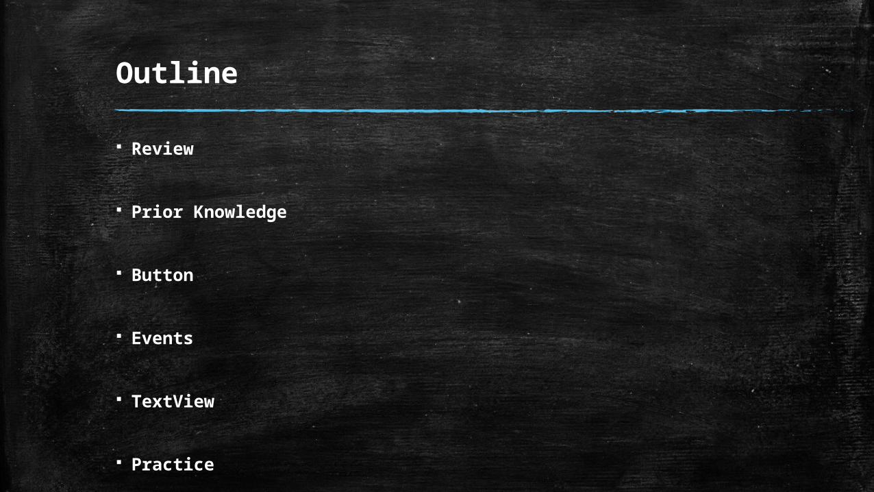
Outline
Review
Prior Knowledge
Button
Events
TextView
Practice
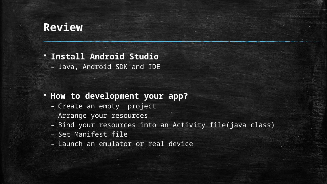
Review
Install Android Studio– Java, Android SDK and IDE
How to development your app?– Create an empty project– Arrange your resources– Bind your resources into an Activity file(java class)– Set Manifest file– Launch an emulator or real device
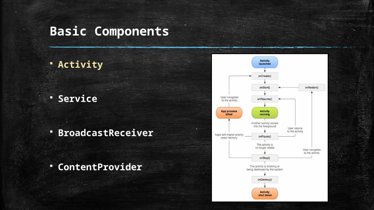
Basic Components
Activity
Service
BroadcastReceiver
ContentProvider
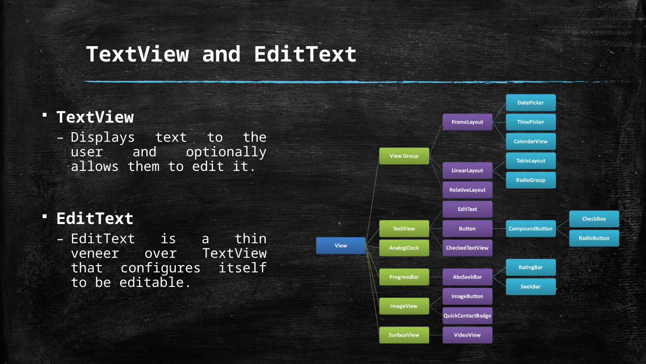
UI Components
View class– This class represents the basic
building block for user interface components.
ViewGroup class– The ViewGroup subclass is the
base class for layouts, which are invisible containers that hold other Views (or other ViewGroups) and define their layout properties.
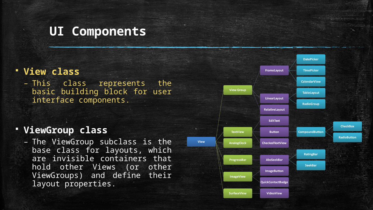
UI Components
View class– This class represents the basic
building block for user interface components.
ViewGroup class– The ViewGroup subclass is the
base class for layouts, which are invisible containers that hold other Views (or other ViewGroups) and define their layout properties.
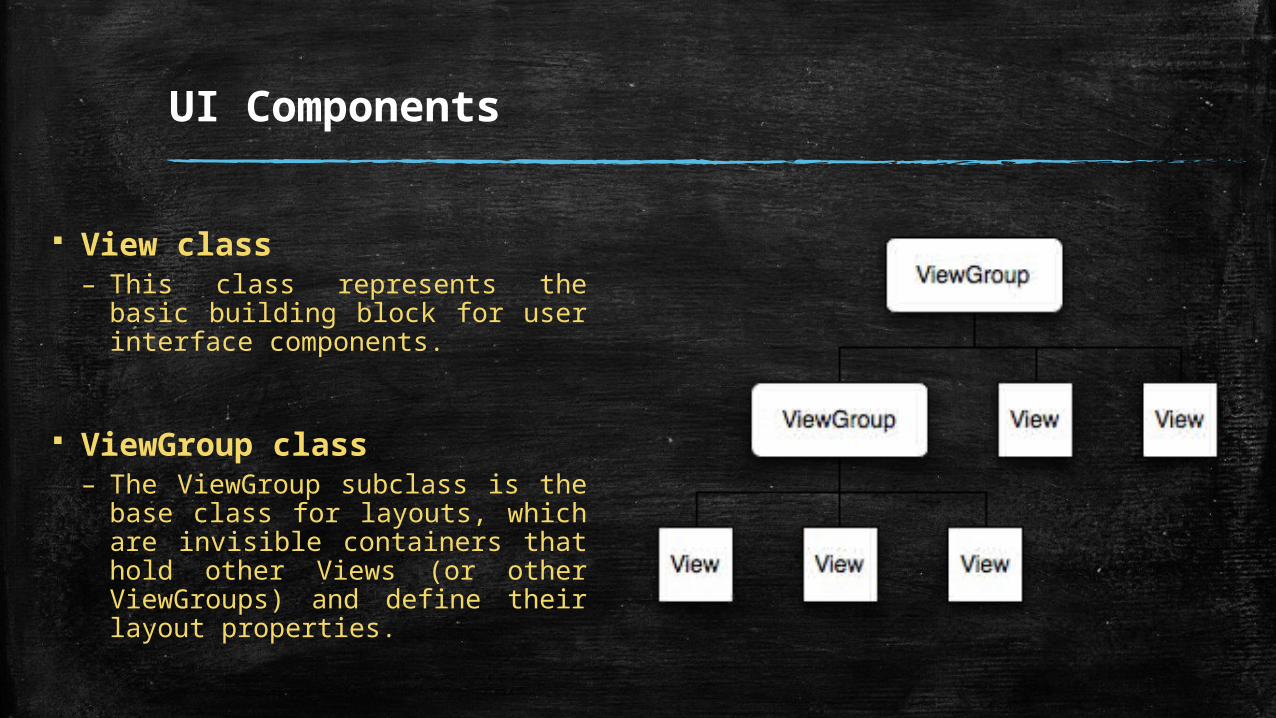
UI Components
View class– This class represents the basic
building block for user interface components.
ViewGroup class– The ViewGroup subclass is the
base class for layouts, which are invisible containers that hold other Views (or other ViewGroups) and define their layout properties.
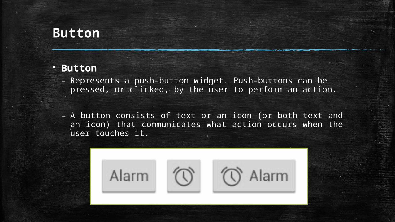
Button
Button – Represents a push-button widget. Push-buttons can be pressed,
or clicked, by the user to perform an action.
– A button consists of text or an icon (or both text and an icon) that communicates what action occurs when the user touches it.
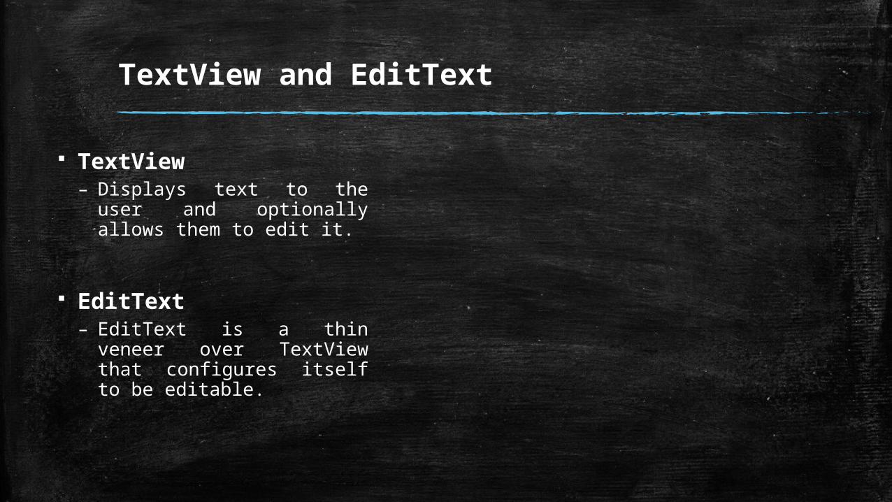
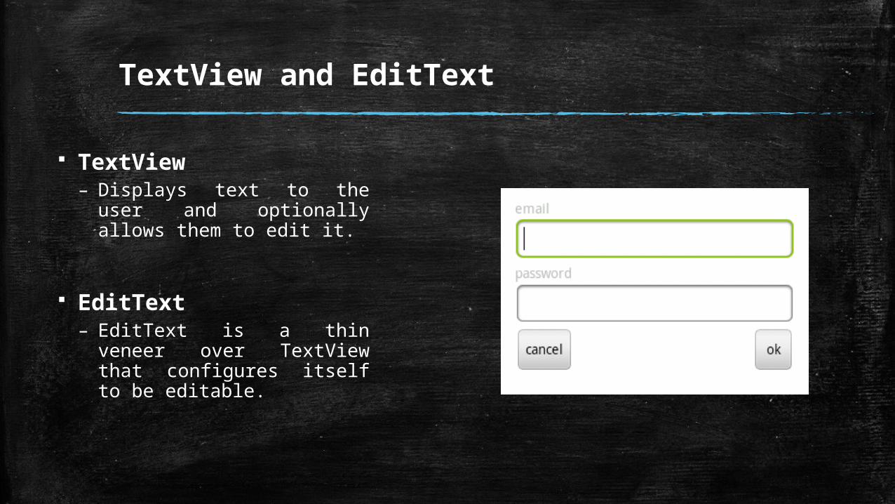
TextView and EditText
TextView– Displays text to the user and
optionally allows them to edit it.
EditText– EditText is a thin veneer
over TextView that configures itself to be editable.
TextView and EditText
TextView– Displays text to the user and
optionally allows them to edit it.
EditText– EditText is a thin veneer
over TextView that configures itself to be editable.
TextView and EditText
TextView– Displays text to the user and
optionally allows them to edit it.
EditText– EditText is a thin veneer
over TextView that configures itself to be editable.
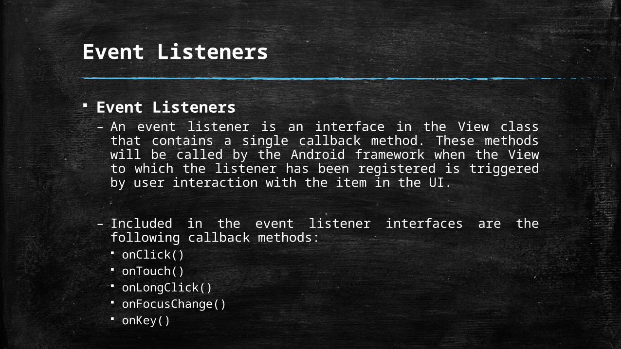
Event Listeners
Event Listeners– An event listener is an interface in the View class that contains a
single callback method. These methods will be called by the Android framework when the View to which the listener has been registered is triggered by user interaction with the item in the UI.
– Included in the event listener interfaces are the following callback methods: onClick() onTouch() onLongClick() onFocusChange() onKey()

Practice
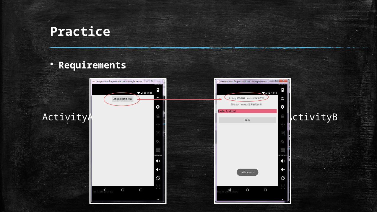
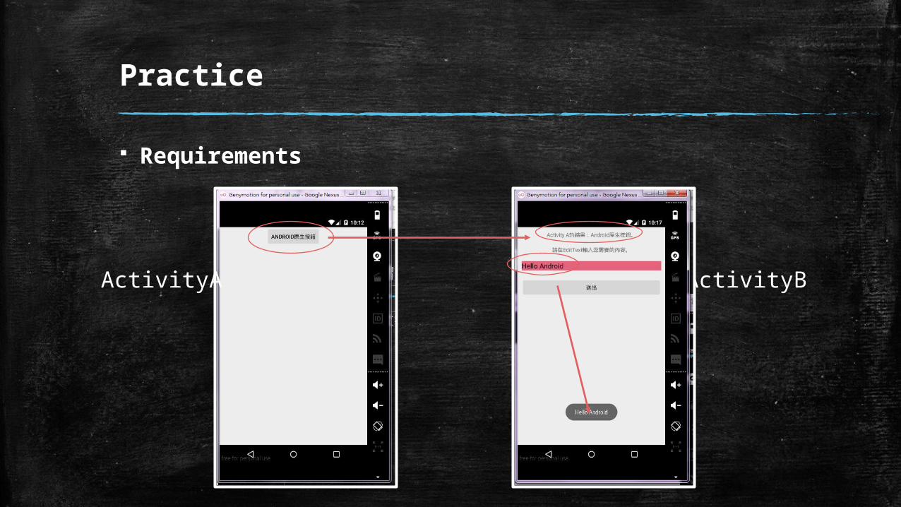
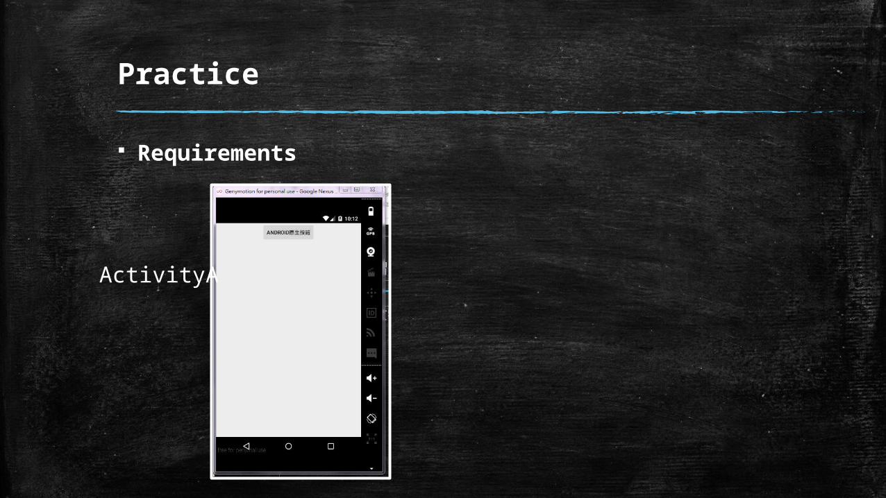
Requirements
ActivityA
Practice
Requirements
ActivityA ActivityB
Practice
Requirements
ActivityA ActivityB
Practice
Requirements
ActivityA
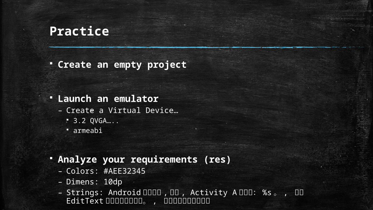
Practice
Create an empty project
Launch an emulator– Create a Virtual Device…
3.2”QVGA….. armeabi
Analyze your requirements (res)– Colors: #AEE32345– Dimens: 10dp– Strings: Android 原生按鈕 , 送出 , Activity A 的結果: %s 。 , 請在
EditText 輸入您需要的內容。 , 無法找到相對應的結果
Practice
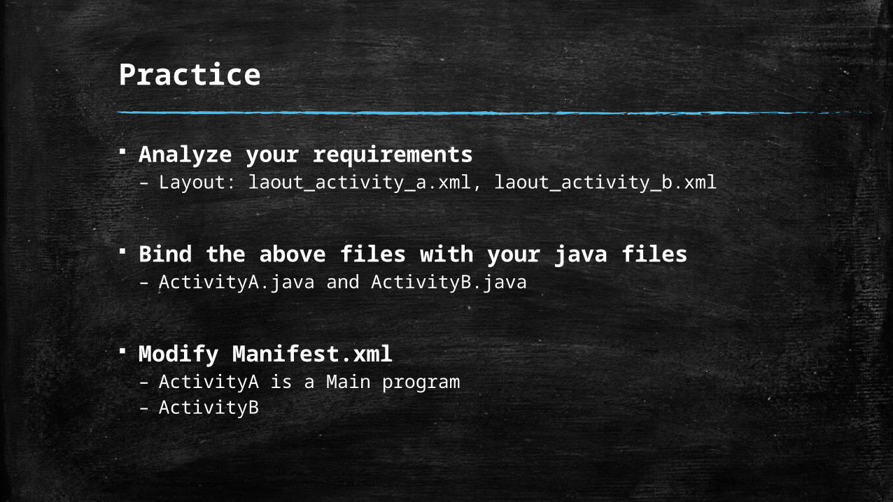
Analyze your requirements– Layout: laout_activity_a.xml, laout_activity_b.xml
Bind the above files with your java files– ActivityA.java and ActivityB.java
Modify Manifest.xml– ActivityA is a Main program– ActivityB
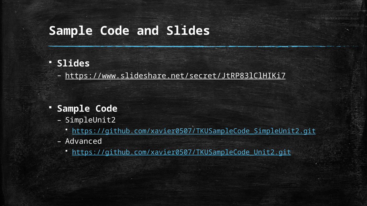
Sample Code and Slides
Slides– https://www.slideshare.net/secret/JtRP83lClHIKi7
Sample Code– SimpleUnit2
https://github.com/xavier0507/TKUSampleCode_SimpleUnit2.git
– Advanced https://github.com/xavier0507/TKUSampleCode_Unit2.git
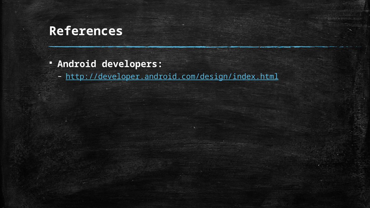
References
Android developers:– http://developer.android.com/design/index.html
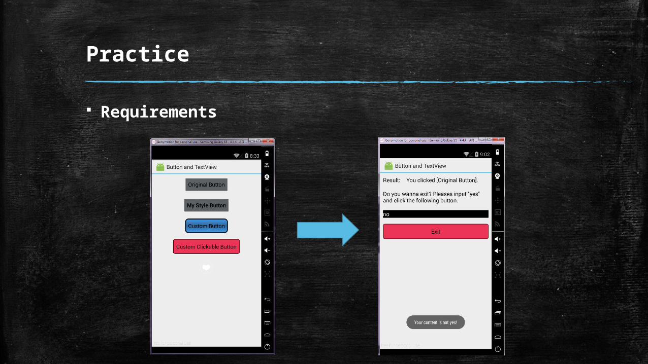
Practice
Requirements
Practice
Requirements

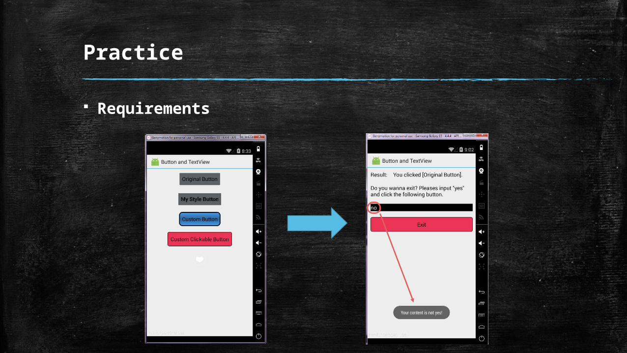
Practice
Requirements
Clicked
Practice
Requirements
Practice
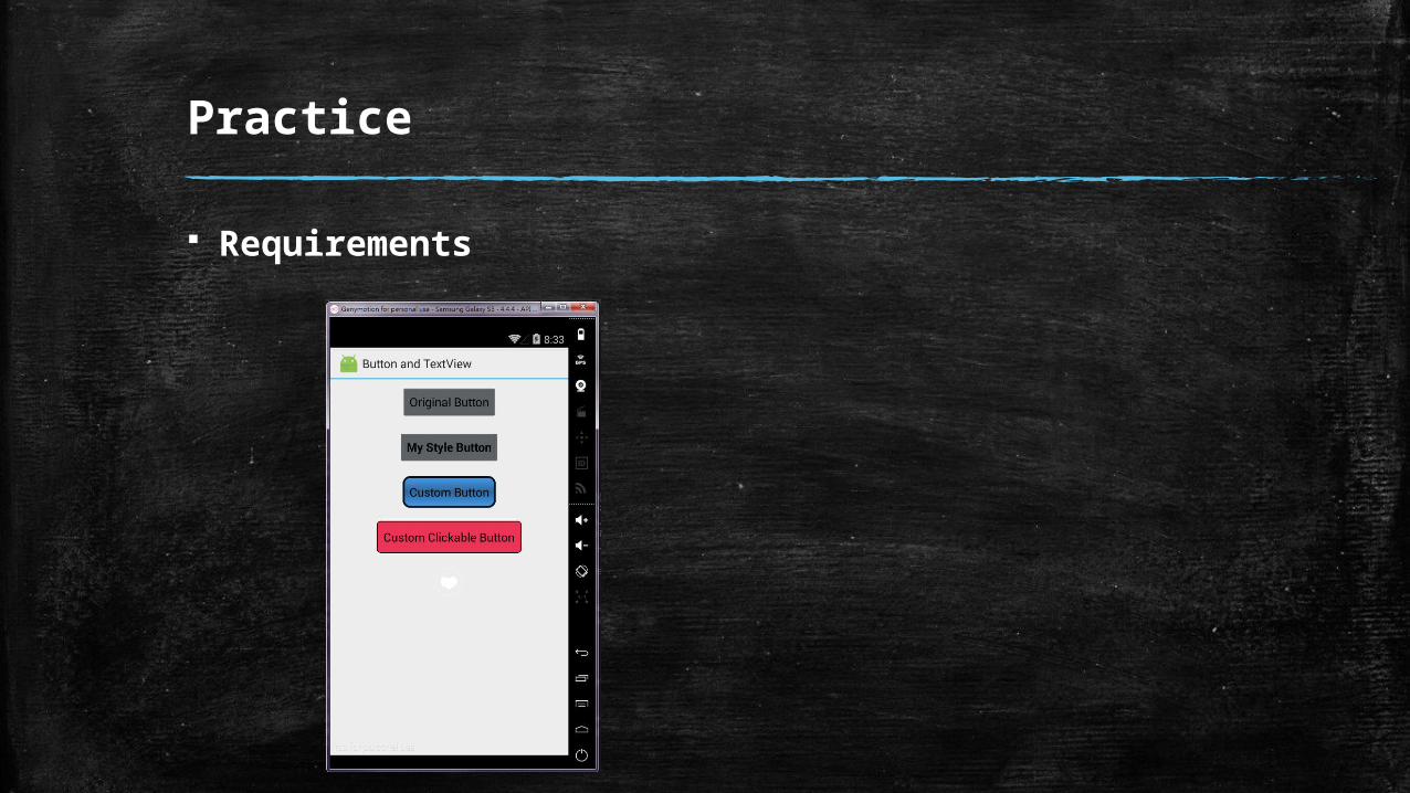
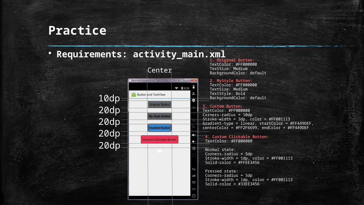
Requirements: activity_main.xml
10dp
Center
20dp20dp20dp20dp
1. Original Button:TextColor: #FF000000TextSize: MediumBackgroundColor: default
2. MyStyle Button:TextColor: #FF000000TextSize: MediumTextStyle: BoldBackgroundColor: default
3. Custom Button:TextColor: #FF000000Corners-radius = 10dpStroke-width = 3dp, color = #FF001113Gradient-type = linear, startColor = #FF449DEF,centerColor = #FF2F6699, endColor = #FF449DEF
4. Custom Clickable Button:TextColor: #FF000000
Normal state:Corners-radius = 5dpStroke-width = 1dp, color = #FF001113Solid-color = #FFEE3456
Pressed state:Corners-radius = 5dpStroke-width = 1dp, color = #FF001113Solid-color = #33EE3456
Practice
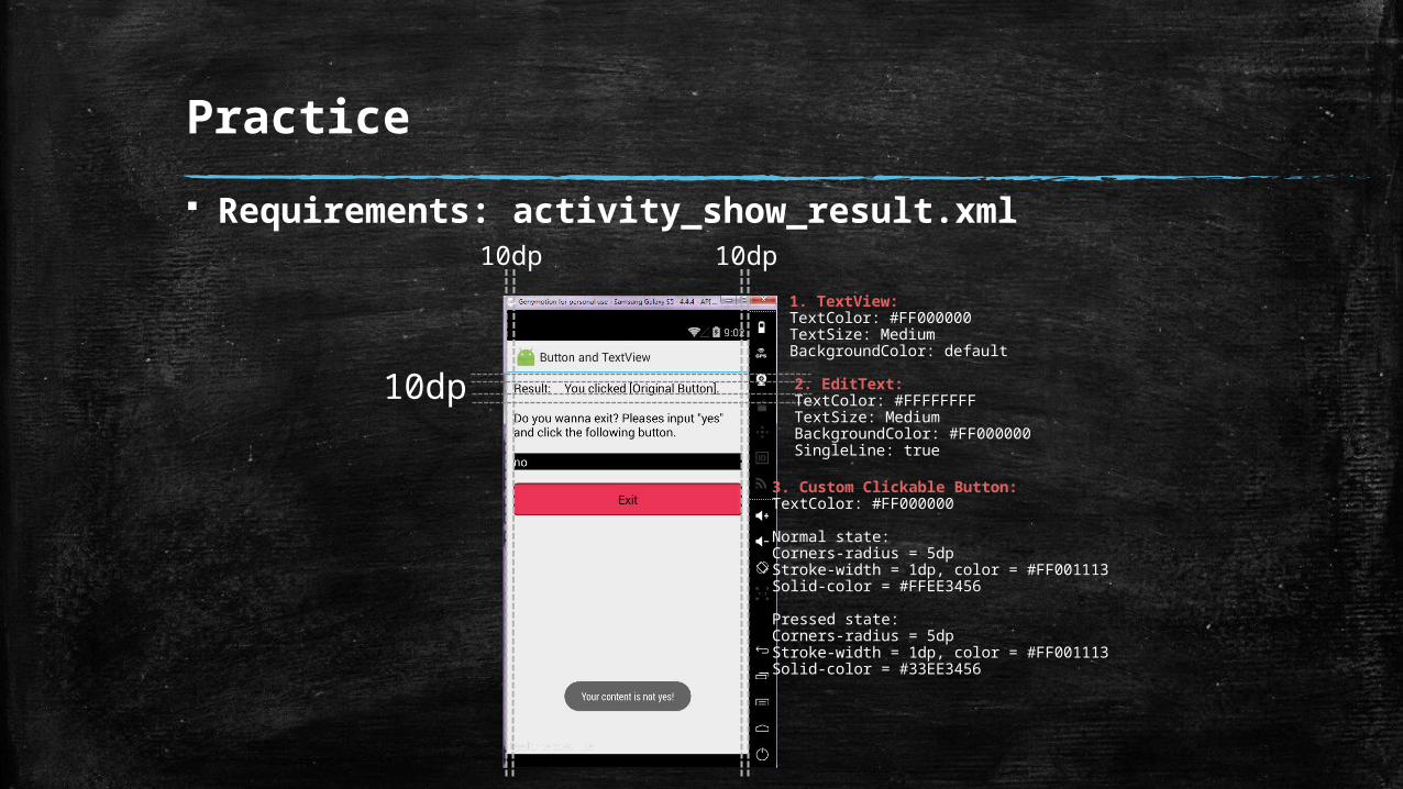
Requirements: activity_show_result.xml10dp
10dp
10dp
3. Custom Clickable Button:TextColor: #FF000000
Normal state:Corners-radius = 5dpStroke-width = 1dp, color = #FF001113Solid-color = #FFEE3456
Pressed state:Corners-radius = 5dpStroke-width = 1dp, color = #FF001113Solid-color = #33EE3456
1. TextView:TextColor: #FF000000TextSize: MediumBackgroundColor: default
2. EditText:TextColor: #FFFFFFFFTextSize: MediumBackgroundColor: #FF000000SingleLine: true
Practice
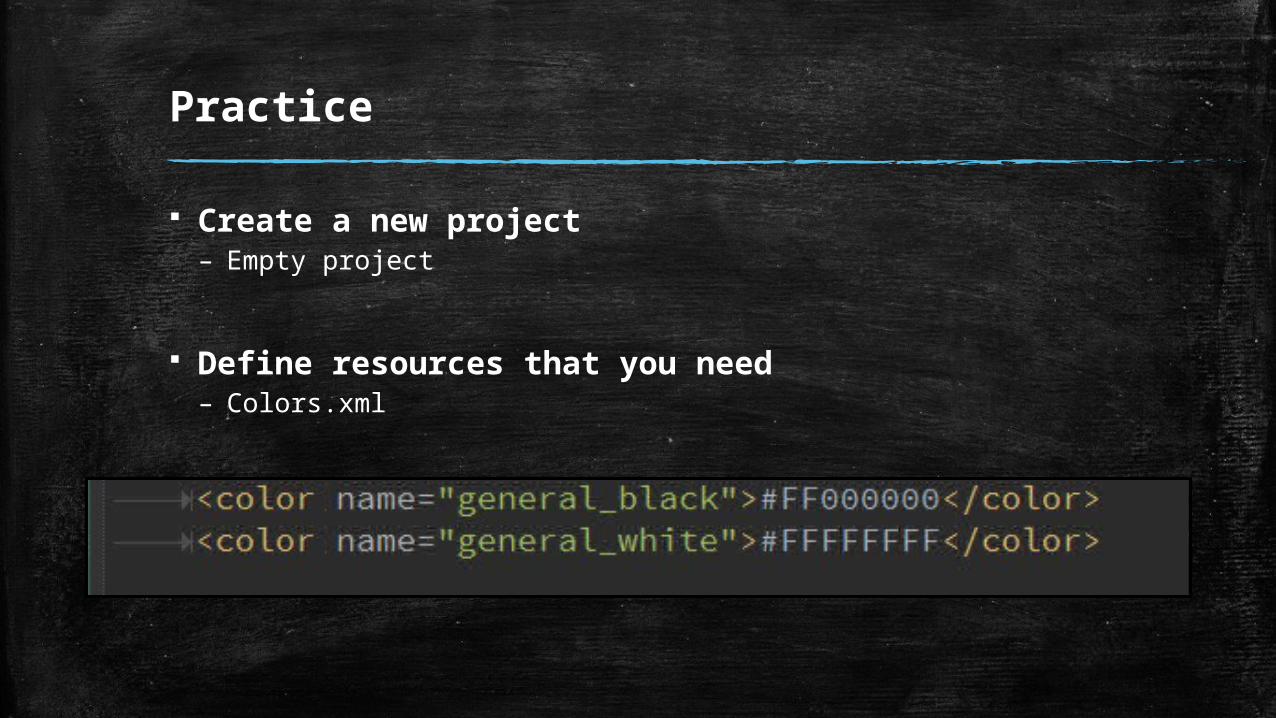
Create a new project– Empty project
Define resources that you need– Colors.xml
Practice
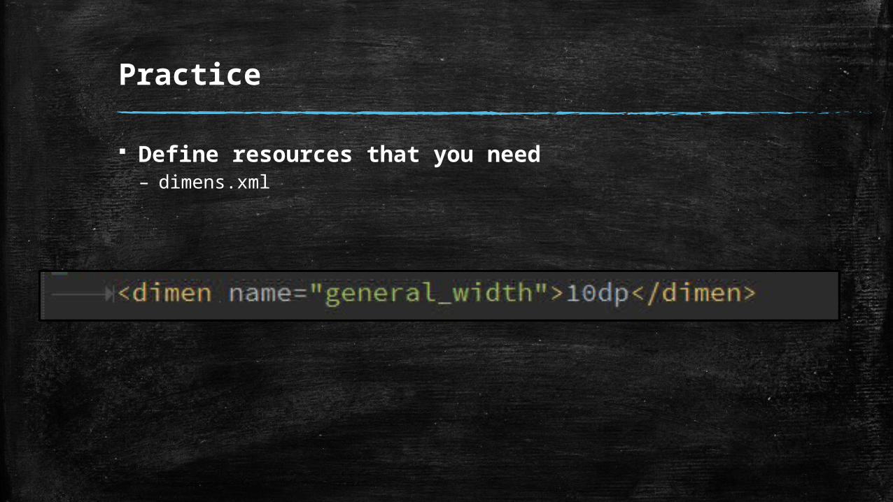
Define resources that you need– dimens.xml
Practice
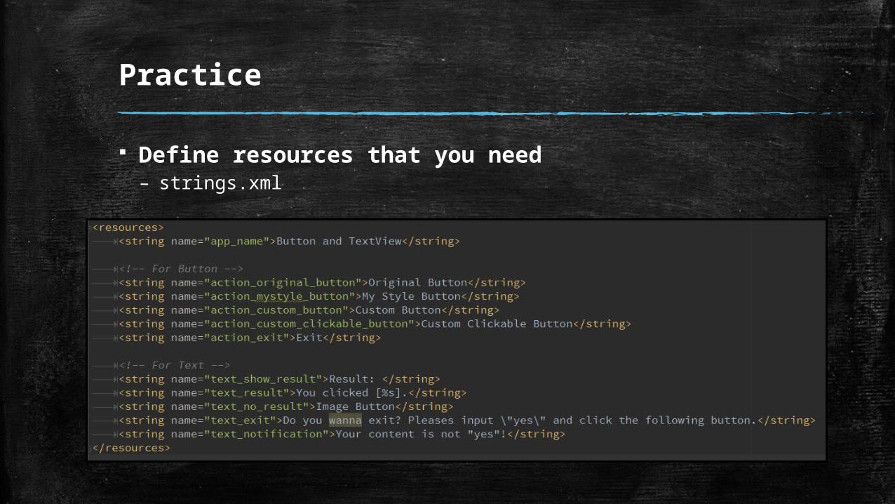
Define resources that you need– strings.xml
Practice
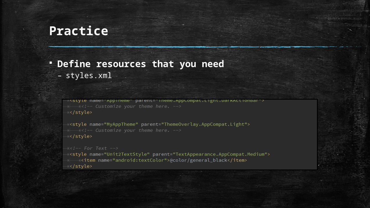
Define resources that you need– styles.xml
Practice
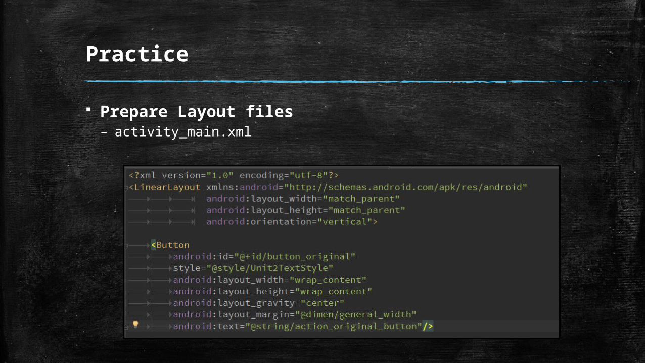
Prepare Layout files– activity_main.xml
Practice
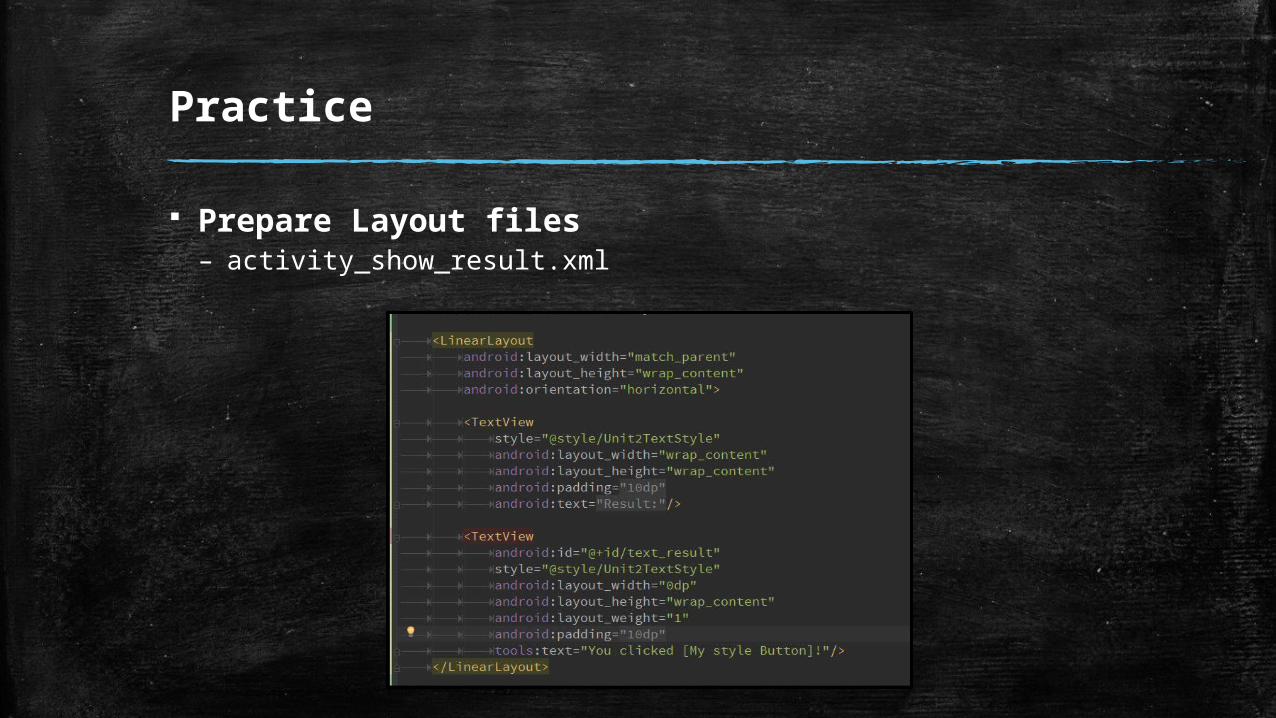
Prepare Layout files– activity_show_result.xml
Practice
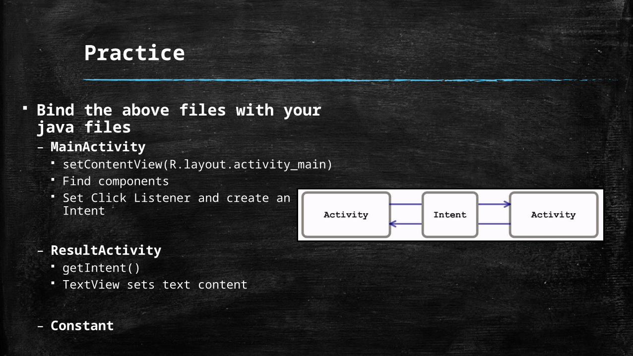
Bind the above files with your java files– MainActivity
setContentView(R.layout.activity_main) Find components Set Click Listener and create an Intent
– ResultActivity getIntent() TextView sets text content
– Constant
Practice
Define App Manifest file– Intent-filter– Add ResultActivity
Launch your App in a device or make other components.