analysis of other contents page's
TRANSCRIPT
Contents PageBY LUCY BENNETT
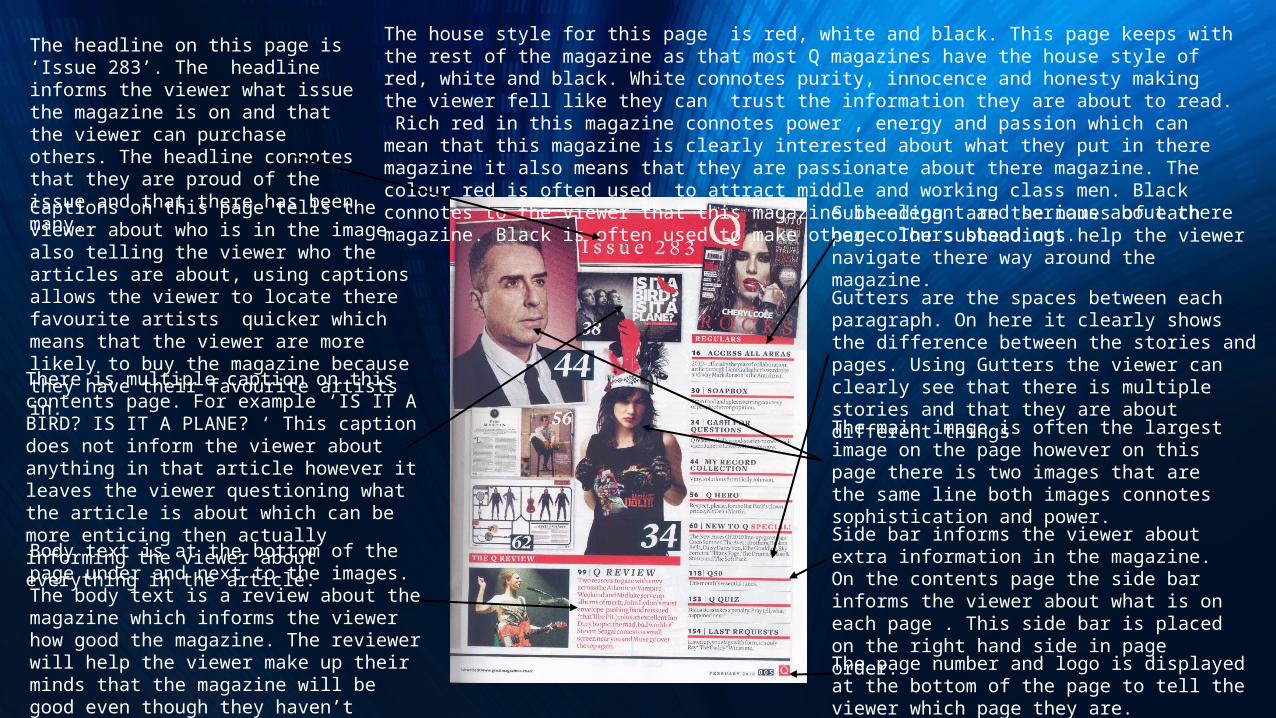
There is multiple caption on this contents page. For example ‘IS IT A BIRD? IS IT A PLANE? ‘ This caption does not inform the viewer about anything in that article however it leaves the viewer questioning what the article is about which can be more enticing then actually informing the viewer about everything in the article. Side bar informs the viewer about extra
information in the magazine. On the contents page the side bar informs the viewer about what is on each page . This side bar is placed on the right hand side in page order.
Captions on this page tells the viewer about who is in the image also telling the viewer who the articles are about, using captions allows the viewer to locate there favourite artists quicker which means that the viewer are more likely to buy the magazine because they have their favourite artists in.
Subheading are the names of each page. The subheadings help the viewer navigate there way around the magazine.
Gutters are the spaces between each paragraph. On here it clearly shows the difference between the stories and pages. Using Gutters the viewer can clearly see that there is multiple stories and that they are about different things
Body text is at the bottom of the page under and next to the images. The body text is a review about the magazine which informs the viewer how good the magazine. The reviewer will help the viewer make up their minds that the magazine will be good even though they haven’t started reading the articles yet.
The headline on this page is ‘Issue 283’. The headline informs the viewer what issue the magazine is on and that the viewer can purchase others. The headline connotes that they are proud of the issue and that there has been many.
The house style for this page is red, white and black. This page keeps with the rest of the magazine as that most Q magazines have the house style of red, white and black. White connotes purity, innocence and honesty making the viewer fell like they can trust the information they are about to read. Rich red in this magazine connotes power , energy and passion which can mean that this magazine is clearly interested about what they put in there magazine it also means that they are passionate about there magazine. The colour red is often used to attract middle and working class men. Black connotes to the viewer that this magazine is elegant and serious about there magazine. Black is often used to make other colours stand out.
The page number and logo is displayed at the bottom of the page to tell the viewer which page they are.
The main image is often the largest image on the page however on this page there is two images that are the same line both images connotes sophistication and power.
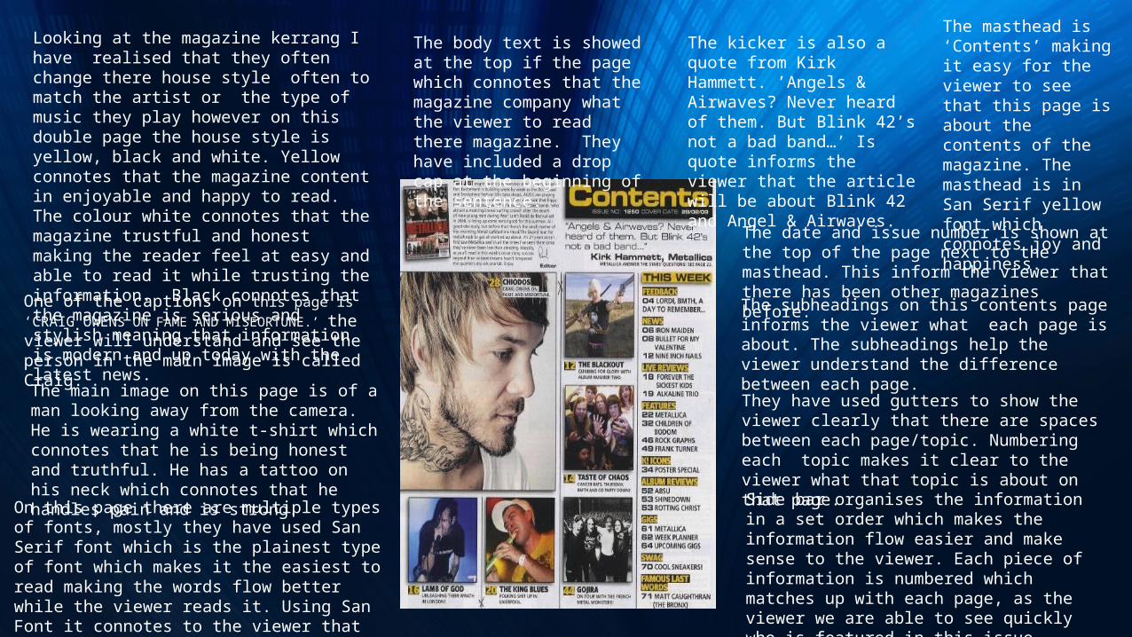
Looking at the magazine kerrang I have realised that they often change there house style often to match the artist or the type of music they play however on this double page the house style is yellow, black and white. Yellow connotes that the magazine content in enjoyable and happy to read. The colour white connotes that the magazine trustful and honest making the reader feel at easy and able to read it while trusting the information. Black connotes that the magazine is serious and stylish meaning that information is modern and up today with the latest news.
The main image on this page is of a man looking away from the camera. He is wearing a white t-shirt which connotes that he is being honest and truthful. He has a tattoo on his neck which connotes that he handles pain and is strong.
They have used gutters to show the viewer clearly that there are spaces between each page/topic. Numbering each topic makes it clear to the viewer what that topic is about on that page.
On this page there are multiple types of fonts, mostly they have used San Serif font which is the plainest type of font which makes it the easiest to read making the words flow better while the viewer reads it. Using San Font it connotes to the viewer that they want the viewer to read and understand the text.
The masthead is ‘Contents’ making it easy for the viewer to see that this page is about the contents of the magazine. The masthead is in San Serif yellow font which connotes joy and happiness.
The subheadings on this contents page informs the viewer what each page is about. The subheadings help the viewer understand the difference between each page.
The kicker is also a quote from Kirk Hammett. ’Angels & Airwaves? Never heard of them. But Blink 42’s not a bad band…’ Is quote informs the viewer that the article will be about Blink 42 and Angel & Airwaves.
The body text is showed at the top if the page which connotes that the magazine company what the viewer to read there magazine. They have included a drop cap at the beginning of the sentence.
One of the captions on this page is ‘CRAIG OWENS ON FAME AND MISEORTUNE.’ the viewer will understand and see the person in the main image is called Craig.
The date and issue number is shown at the top of the page next to the masthead. This inform the viewer that there has been other magazines before.
Side bar organises the information in a set order which makes the information flow easier and make sense to the viewer. Each piece of information is numbered which matches up with each page, as the viewer we are able to see quickly who is featured in this issue
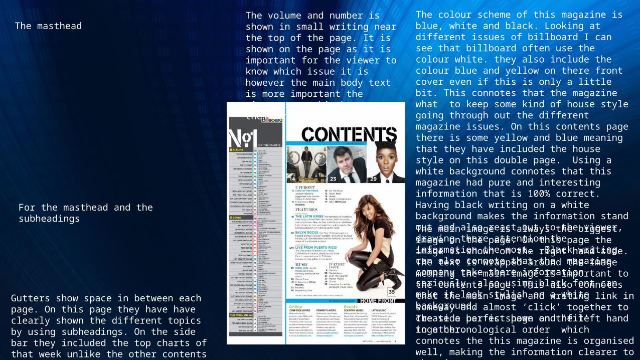
The colour scheme of this magazine is blue, white and black. Looking at different issues of billboard I can see that billboard often use the colour white. they also include the colour blue and yellow on there front cover even if this is only a little bit. This connotes that the magazine what to keep some kind of house style going through out the different magazine issues. On this contents page there is some yellow and blue meaning that they have included the house style on this double page. Using a white background connotes that this magazine had pure and interesting information that is 100% correct. Having black writing on a white background makes the information stand out and also react out to the viewer, drawing there attention the information the most. Black writing can also connote that the magazine company take there information seriously also using black font can make it look stylish on a white background.
The side bar is shown on the left hand in a chronological order which connotes the this magazine is organised well, making the information clearer to the viewer.
The main image is always the biggest image on the page. On this page the image is shown on the right hand side. The text is wrapped around the image meaning the main image is important to the contents page. This also connotes that the main image and writing link in someway and almost ‘click’ together to create a perfect page and ‘fit’ together.
The volume and number is shown in small writing near the top of the page. It is shown on the page as it is important for the viewer to know which issue it is however the main body text is more important the viewer sees this because the writing is bigger.
The masthead
Gutters show space in between each page. On this page they have have clearly shown the different topics by using subheadings. On the side bar they included the top charts of that week unlike the other contents pages.
For the masthead and the subheadings