analysing naplan results using smart - welcome to … list... · 2 analysing naplan results using...
TRANSCRIPT

Analysing NAPLAN results using SMART
Vers
ion
: 7 N
ov
em
be
r 2
011 V
ers
ion
: 7 N
ov
em
be
r 2
011
Vers
ion
: 14 J
un
e 2
01
2
2 Analysing NAPLAN results using SMART (Version: 14 June 2012)
TABLE OF CONTENTS
INTRODUCTION 2
Undertaking NAPLAN Analysis 2
o SMART data login 3
o About the Reports tab 4
o About the Data Analysis tool 6
o Percentage in Bands 7
o Trend data 7
o School Growth 8
o Student Growth 9
o Means and Standard Deviations 11
o Item Analysis 15
o Relative Achievement 16
Using The NAPLAN School Performance Analysis
Template
18
o Focus Questions For NAPLAN School
Performance Analysis – School
Sample
19
o Focus Questions For NAPLAN School
Performance Analysis - Template
32

Analysing NAPLAN results using SMART (Version: 14 June 2012) 3
INTRODUCTION
Analysing NAPLAN results using SMART provides schools with a resource to help better understand their performance on literacy and numeracy measures. It allows schools to critically evaluate their performance and contribute diagnostic information to the school’s evidence base. The diagnostic information will assist teachers to identify student learning needs. It is essential that data presented from NAPLAN must be analysed within the school’s broader context. Schools in the NSW DEC serve a great variety of types of communities and therefore operate in a variety of conditions that impact student achievement and school performance. The focus of school improvement is to increase the learning outcomes for all students. All schools have the potential to increase the learning outcomes of their students. An effective approach to analysing student achievement and school performance is to identify strengths and areas for improvement. This approach allows for the fact that the starting points for a school can be very different to other schools, including the schools located nearby. School performance in comparison to the state mean is not always a sufficient measure for analysing by itself. It is often helpful to analyse school performance in relation to other comparisons that take account of socio-economic and social-education factors. Against Index of Community Socio-Educational Advantage (ICSEA) values, a school might be performing much better than predicted or not as well as predicted. Therefore, consider using the statistically similar school group (SSG) comparisons in data analysis. Schools may be performing below the state mean but may have high growth between testing points in time. Growth is a valuable measure of school improvement that is specific to the students at the school and demonstrates what impact the school has had on student performance.
UNDERTAKING THE ANALYSIS
Analysis of NAPLAN using SMART can be undertaken by an individual or by a team of people, depending of the size of the school and the staff available to undertake the task. In larger schools there may be different staff members completing the analysis for each year level. For example a central school may have four staff members doing the analysis, one for each of Year 3, 5, 7 and 9. A primary school may have two staff members analysing, one each for Years 3 and 5. A high school may have staff members analysing for both Years 7 and 9. Schools will need to have access to the SMART website and a copy of the relevant analysis spreadsheets to analyse school performance in comparison with the state and other relevant comparison groups. The NAPLAN SMART data provides a wealth of information on student performance in literacy and numeracy. This resource aims to support principals, teachers and school self-evaluation teams to gain a deeper understanding of the data analysis functions in SMART. The data collected in the templates at the end of this document will/can be used by the school in
developing their findings. These findings can be added to the school’s evidence base which will assist
in determining future priorities, outcomes, targets, strategies and indicators.
4 Analysing NAPLAN results using SMART (Version: 14 June 2012)
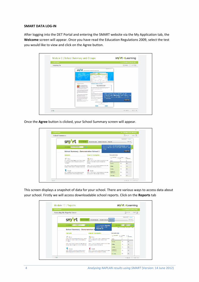
SMART DATA LOG-IN
After logging into the DET Portal and entering the SMART website via the My Application tab, the
Welcome screen will appear. Once you have read the Education Regulations 2009, select the test
you would like to view and click on the Agree button.
Once the Agree button is clicked, your School Summary screen will appear.
This screen displays a snapshot of data for your school. There are various ways to access data about
your school. Firstly we will access downloadable school reports. Click on the Reports tab

Analysing NAPLAN results using SMART (Version: 14 June 2012) 5
ABOUT THE REPORTS TAB
The screen shows a listing of all available Reports for the selected calendar year, test and school
year. By clicking on the name of the report (left side), the document will open as a PDF file.
School Report Screen Shot Description of Report
All Reports
Collection of all static table reports
School Summary
The School Summary report displays summary statistics of means, percentages in bands, item performance and non-participation.
Means and Standard Deviations
The Means and Standard Deviations section of the report displays the means and standard deviations for pre-defined standard school groups, across all test aspects. Scales scores between test aspects should not be compared, due to different skills being assessed in each test aspect. With each test aspect representing different skills, it is misleading to compare results across test aspects.
Percentage in Bands
The Percentage in Bands section of the report displays the percentage of students that are below national minimum standard (also listed by name). This table excludes exempt students. The report provides a summary of each of the bands and how your school is performing in comparison with the state, region and other groups.
6 Analysing NAPLAN results using SMART (Version: 14 June 2012)
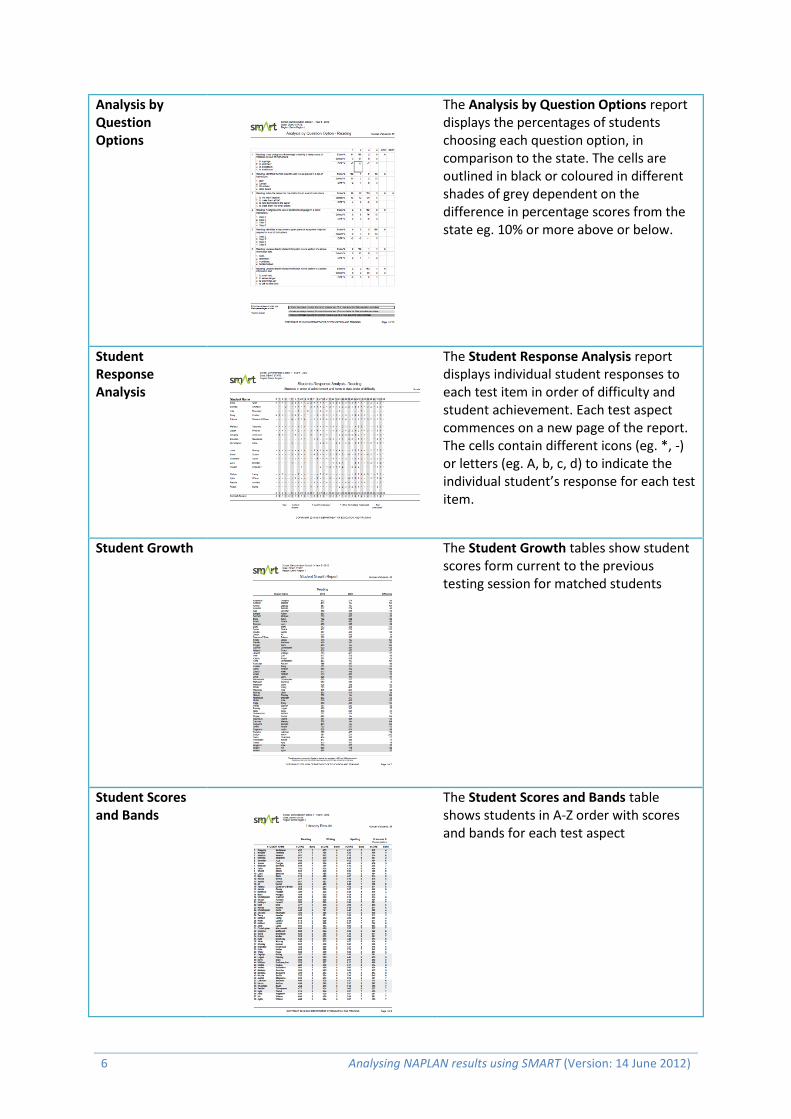
Analysis by Question Options
The Analysis by Question Options report displays the percentages of students choosing each question option, in comparison to the state. The cells are outlined in black or coloured in different shades of grey dependent on the difference in percentage scores from the state eg. 10% or more above or below.
Student Response Analysis
The Student Response Analysis report displays individual student responses to each test item in order of difficulty and student achievement. Each test aspect commences on a new page of the report. The cells contain different icons (eg. *, -) or letters (eg. A, b, c, d) to indicate the individual student’s response for each test item.
Student Growth
The Student Growth tables show student scores form current to the previous testing session for matched students
Student Scores and Bands
The Student Scores and Bands table shows students in A-Z order with scores and bands for each test aspect
Analysing NAPLAN results using SMART (Version: 14 June 2012) 7
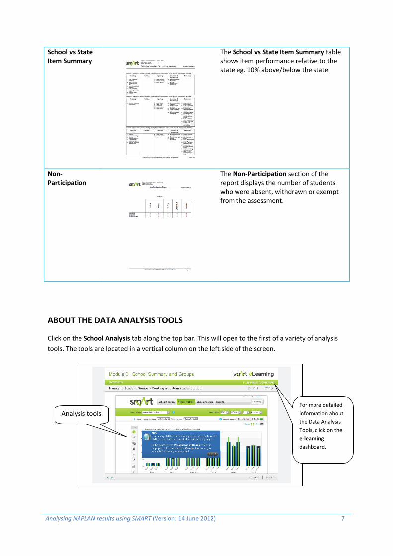
School vs State Item Summary
The School vs State Item Summary table shows item performance relative to the state eg. 10% above/below the state
Non-Participation
The Non-Participation section of the report displays the number of students who were absent, withdrawn or exempt from the assessment.
ABOUT THE DATA ANALYSIS TOOLS
Click on the School Analysis tab along the top bar. This will open to the first of a variety of analysis
tools. The tools are located in a vertical column on the left side of the screen.
Analysis tools For more detailed
information about
the Data Analysis
Tools, click on the
e-learning
dashboard.

8 Analysing NAPLAN results using SMART (Version: 14 June 2012)
Percentage in Bands
This analysis tool provides detailed information on student groups and their performance relative to
the region, state and other groups in specific performance bands. There are three years’ worth of
data displayed at once, which allows the school to see if there have been changes in the number of
students achieving in the various performance bands.
This graph can be important for schools that are performing below the state mean. The graphs may
show value added through the movement of students from lower bands into higher bands by
increased percentages in the higher bands.
Care must be taken when using this information with schools that have less than ten students being
assessed in the group. In schools with small numbers each individual student is worth a large
percentage and this may make using percentages in a band misleading.
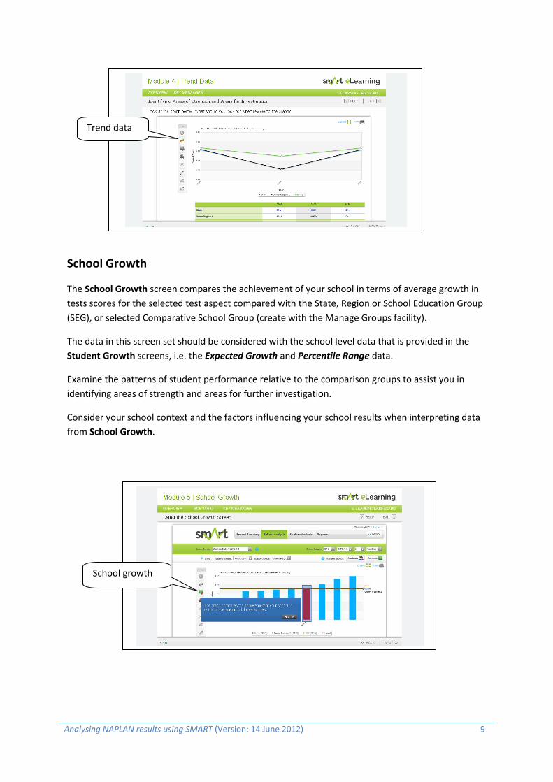
Trend Data
The Trend Data screen displays the trends in test means (averages) over time for your school, your
region and the state. You can analyse the data for each of the various test aspects.
There will be up to five years’ worth of data displayed, which allows your school to see if there have
been changes in trends over time.
These graphs, along with the others found in SMART, are designed to help your school consider the
factors that have contributed to its performance.
Comparing the patterns of performance in the Trend Data graphs for the various test aspects will
assist your school in identifying areas of strength and areas for further investigation.
Consider your school’s context and the factors influencing your school results when interpreting
Trend Data.
Percentage in Bands
Analysing NAPLAN results using SMART (Version: 14 June 2012) 9
School Growth
The School Growth screen compares the achievement of your school in terms of average growth in
tests scores for the selected test aspect compared with the State, Region or School Education Group
(SEG), or selected Comparative School Group (create with the Manage Groups facility).
The data in this screen set should be considered with the school level data that is provided in the
Student Growth screens, i.e. the Expected Growth and Percentile Range data.
Examine the patterns of student performance relative to the comparison groups to assist you in
identifying areas of strength and areas for further investigation.
Consider your school context and the factors influencing your school results when interpreting data
from School Growth.
School growth
Trend data

10 Analysing NAPLAN results using SMART (Version: 14 June 2012)
Student Growth
Data from this section is particularly important to all schools. Schools that are not achieving the state
mean may still be providing the environment for students to achieve the expected growth in literacy
and numeracy. Likewise a school that may be at the state mean or above may not have appropriate
growth occurring for their students.
Growth on the NAPLAN scales varies depending on prior scores and because of this, a measure
based on the percentage of students achieving expected growth is more useful for diagnostic and
school planning purposes than a measure based on average growth alone. In general, there is a
tendency for expected growth to be higher when you start with a low prior score than from a higher
prior score.
In using the growth data in SMART, it is important to recognise that:
most students have a growth figure in a relatively small range around the state average
the expected growth value thresholds should be considered interim until sufficient data (at
least 3 years) are available over time to provide confidence in the measure .
The Student Growth screen allows you to identify average scaled score growth, the percentages of
students in growth percentile ranges and the percentage of students achieving expected growth for
the selected test aspect. You can compare this information to a standard school group, state, region
or custom school group.
The Student Growth graph and table, along with the others found in SMART, are designed to help
you consider the factors that have led to student achievement being above or below the state and
/or region performance.
Examine the patterns of student performance relative to the comparison groups to assist you in
identifying areas of strength and areas for further investigation. Consider your school context and
the factors influencing your school results when interpreting Student Growth. After this, areas that
you wish to explore further may be identified.
The areas which you have undertaken for further analysis may highlight issues that have implications
for classroom teaching, school programming and the school plan.
Student growth

Analysing NAPLAN results using SMART (Version: 14 June 2012) 11
Each arrow on the Student Growth graph represents an individual student.
Look at the variation in the length of the arrow. From 2010 NAPLAN growth in SMART is calculated
using only NAPLAN data so it is different from previous years. Generally, the lower the starting point
scores that students’ have, the higher their expected growth will be.
Note that the scores that students need to achieve to display an orange arrow (i.e. achieve expected
growth) are greater towards the left of the graph than towards the right.
About the arrows:
Arrows that finish below the lower reference line indicates
that the students’ progress was amongst the lower 25% of
the State for students achieving the same result in the
previous assessment year.
Arrows that finish between the lower and upper reference
lines indicate that the student’s progress was amongst the
middle 50% of the State for students achieving the same
result in the previous assessment year.
Arrows that finish above the upper reference line indicate that the student’s progress was amongst
the higher 25% of the State for students achieving the same result in the previous assessment year.
Note: There should be caution in
drawing conclusions about growth
for students who have very high
prior and present achievements (i.e.
have achieved in the top band). Due
to the characteristics of the tests, a
small change in the number of
correct responses for these
students is likely to have a
disproportionate impact on their
growth, in comparison to students

12 Analysing NAPLAN results using SMART (Version: 14 June 2012)
demonstrating achievement in the
middle and lower bands.
For any atypical achievement, consider all factors influencing the student’s performance at both
testing points, as well as other school-based assessment information available.
Expected growth is a NSW calculation and may not necessarily reflect the national growth figure
produced by ACARA.
About the tables:
The data in the table will display the average
scaled score growth for the groups you have
selected e.g. the state, region and student
group.
The table also includes a summary of your
school’s students in each percentile range.
The Expected Growth section of the table shows
the percentage of students who achieved less
than the expected growth for their starting score
and the percentage of students whose growth
was equal to or above the expected growth for
their starting score.
Analysing NAPLAN results using SMART (Version: 14 June 2012) 13
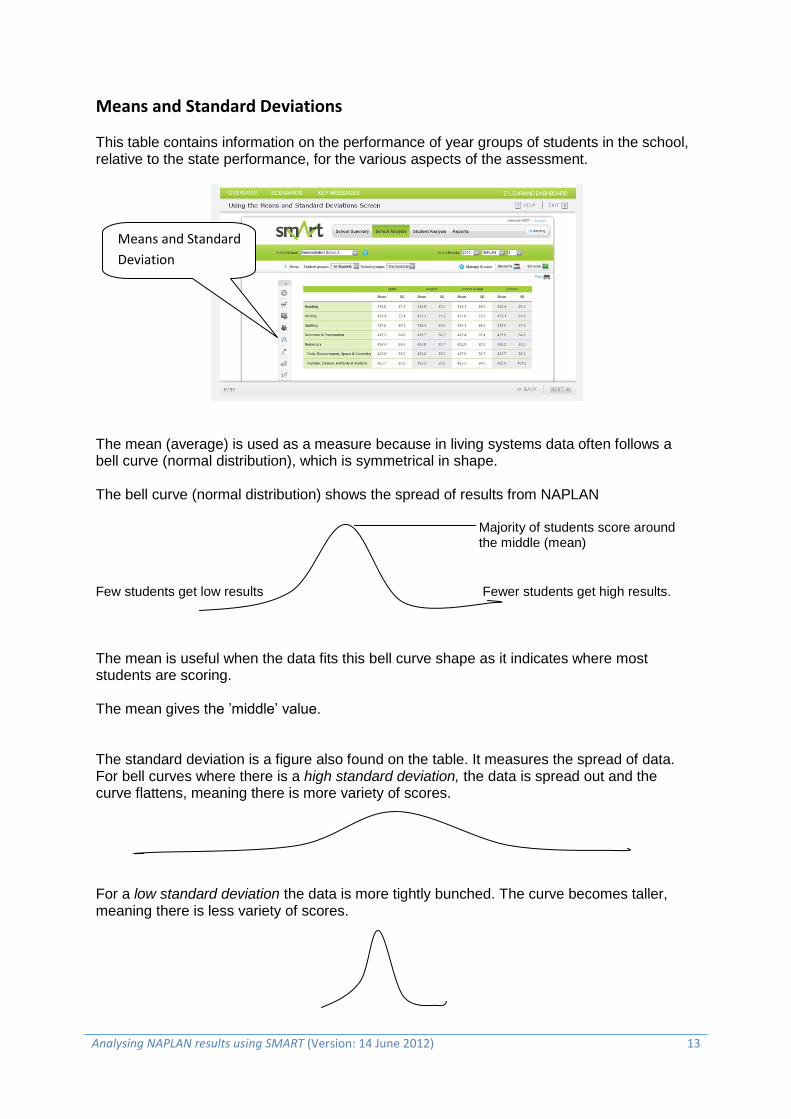
Means and Standard Deviations
This table contains information on the performance of year groups of students in the school, relative to the state performance, for the various aspects of the assessment.
The mean (average) is used as a measure because in living systems data often follows a bell curve (normal distribution), which is symmetrical in shape. The bell curve (normal distribution) shows the spread of results from NAPLAN
Majority of students score around the middle (mean)
Few students get low results Fewer students get high results.
The mean is useful when the data fits this bell curve shape as it indicates where most students are scoring. The mean gives the ’middle’ value. The standard deviation is a figure also found on the table. It measures the spread of data. For bell curves where there is a high standard deviation, the data is spread out and the curve flattens, meaning there is more variety of scores. For a low standard deviation the data is more tightly bunched. The curve becomes taller, meaning there is less variety of scores.
Means and Standard
Deviation

14 Analysing NAPLAN results using SMART (Version: 14 June 2012)
Issues with data Because the mean is a measure of the middle, half of all schools in the state will be below the mean. In NSW there are about 1600 government primary and 400 secondary schools. If your school is below the mean it does not mean it is a failure. Where schools are of concern is when they are below the state mean AND when the average growth for students is not at state or better.
If a Year group of students has fewer than ten students being assessed it is difficult to use the mean as it can be influenced by extreme results. For example one student performing exceptionally well or exceptionally poorly will have an impact.
Only Year groups of five or more students are given on the school average report and the same rule above applies
If the majority of students score at the extreme ends of NAPLAN, the shape of the graph may not look like a bell curve. In this case the mean is a meaningless measure.
Normal Distribution (Bell curve) with effect sizes

Analysing NAPLAN results using SMART (Version: 14 June 2012) 15
Calculation spreadsheet result and corresponding standard deviations with suggested response
Result on calculation spreadsheet
Range of Standard Deviations (σ) from state
School response
Well below state Below -0.5 σ External intervention may be required to address problem – Action plan may be needed
Below state Between -0.5 σ and -0.2 σ Action plan may be needed following analysis
Within state Between -0.2 σ and 0.2 σ Action plan to improve above state
Above state Between 0.2 σ and 0.5 σ Growth charts may need to be examined
Well above state More than 0.5 σ Growth charts may need to be examined
As NAPLAN has a scale from 0 to 1000, schools may find it difficult to interpret their results.
The data from the Means and Standard Deviation table can be entered into the calculation
spreadsheet, which will indicate if your school results are of concern or within state parameters. Just
because the school mean may be below state does not indicate there may be a problem.
To access the NAPLAN analysis spreadsheet go to eLearning at the top of the Means and SD page of SMART and click on Key Messages. Then click on next slide to access the link for Mean Calculations and scroll down to Means and Standard Deviations. This spreadsheet allows you to calculate the effect size of school means relative to the State and Region means to give an indication of whether the school is well above or well below. Using the calculation spreadsheet
Enter the data from the Means and Standard Deviation table into the spreadsheet. If you wish to do
it for individual groups you can copy the spreadsheet and enter, for example, the information for
boys, girls, ATSI etc.

16 Analysing NAPLAN results using SMART (Version: 14 June 2012)
Once you have entered the values from the table of results from the SMART data the spreadsheet
will indicate the performance of the school relative to the state mean for that year group.
The result for the above data indicates that the school has a problem in the reading aspect based on the school mean relative to the state.
Note: Remember the size of the group when interpreting results as mentioned in the section above
Item Analysis
The Item Analysis screen displays the details of an assessment item, including the skills
assessed, syllabus references and ESL scales. Each question from the test booklet can be
viewed.
When you click on a question (or on Expand) you can view which students answered the
question correctly or incorrectly, and access the Distractor Analysis (for Numeracy only) and
teaching strategy for each test item. Also analyse, sort and filter graphs of school
performance in each test aspect.
Examine the patterns of responses by groups of students to assist you in identifying areas of
strength and areas for further investigation.
Consider your school context and the factors influencing your school results when
interpreting data from Item Analysis. From this, identify areas that you wish to explore
further.
The areas which you have undertaken for further analysis may highlight issues that have
implications for classroom teaching, school programming and the school plan.
There are two tabs:
The Grid tab displays the test items and information about each item for the selected test
aspect, such as Difficulty, Band, School % Correct and Group % Correct, etc.
The Chart tab displays the test item data graphically.
Item analysis tool

Analysing NAPLAN results using SMART (Version: 14 June 2012) 17
Band Predictor
The Band Predictor screen shows how the percentage of students in the bands would change if the
results of every student who sat for the test, changed by the selected number of raw marks (using
the + or – buttons). The graph displays this prediction in the form of an additional column shared in
red.
Warning – The Band Predictor graph should be interpreted with caution. The graphs demonstrate
the effect that a set change in correct responses (raw marks) for every student would make to the
band distribution based on the results of the current year only.
Note – the number of additional questions a student needs to answer correctly in order to progress
to a higher band varies depending on the student’s current level of achievement and location within
the band.
Band Predictor is best used as a discussion starter. For example, in the case where students have
inadvertently missed some questions in the assessment, you may like to use the analysis provided
for reflection.
Band predictor tool

18 Analysing NAPLAN results using SMART (Version: 14 June 2012)
Relative Achievement
The Relative Achievement screen displays assessment results plotted for two selected test aspects.
The graph shows how each student in the selected group has performed in each of the two test
aspects.
The Relative Achievement graphs can be used to provide broad indicator differences in performance
for the selected tests in NAPLAN. It is recommended that the graphs be used as a general indicator
to consider a school’s or group’s performance in comparison to state performance patterns.
Examine the patterns of student performance relative to the comparison group to assist you in
identifying areas of strength and areas for further investigation.
Consider your school context and factors influencing your school results when interpreting data from
Relative Achievement. From this, identify areas that you wish to explore further.
The areas which you have undertaken for further analysis may highlight issues that have implications
for classroom teaching, school programming and the school plan.
The graph plots the achievements of individual students (represented by a circle) on the basis of
their achievement relative to two test aspects. The graphs also display bands for the two selected
tests.
The students’ scores are plotted in relation to the State Reference Line, which provides a measure of
relative achievement for students across the state.
If there is no State Reference Line this is an indication that there is a weak correlation between the
chosen test aspects. You should re-select the axes to be of a similar strand e.g. Reading and Writing.
Note
The test scales that comprise NAPLAN, namely Reading, Writing, Grammar and Punctuation, Spelling
and Numeracy, are developed on different scales and assess different skills. Because of this, it is not
appropriate to directly compare scaled scores for these different tests. The Relative Achievement
screen in SMART compares student achievement on one test scale with the average achievement of
Relative achievement
tool

Analysing NAPLAN results using SMART (Version: 14 June 2012) 19
all other students in the state across the range of scores, as represented by the State Reference
Line.
The Relative Achievement graphs then can be used to provide a broad indictor of differences in
performance for the selected tests in NAPLAN. It is recommended that the graphs be used as a
general indicator to consider a school’s or group’s performance in comparison to state performance
patterns.
USING THE NAPLAN SCHOOL PERFORMANCE ANALYSIS TEMPLATE
The school performance analysis template will allow schools to analyse their performance on
NAPLAN through a series of focus questions on the types of data that is available from the SMART
website.
When answering the questions the school will be able to identify areas of strengths and areas of
focus. The template can be used for a particular year level Year 3, 5, 7 or 9, or it may be used in
groups, Years 3 and 5, Years 5 and 7, Years 7 and 9. A sample filled-in template is included and the
information for this template comes from the demo school data that is in the SMART system.
As the focus questions are completed the sections on area of strength (where results are better
relative to the state or sections have good results) are completed. The areas of focus (where results
are worse relative to the state) are completed.
The combinations of the responses in these two areas form the findings from the NAPLAN school
performance analysis.

20 Analysing NAPLAN results using SMART (Version: 14 June 2012)

Analysing NAPLAN results using SMART (Version: 14 June 2012) 21
FOCUS QUESTIONS FOR NAPLAN SCHOOL PERFORMANCE ANALYSIS
SAMPLE SCHOOL: Large primary school in regional NSW
Number of students 63 x Year 5 students
Aspect Reading
Cropped screen shots have been taken from the online SMART Reports tab and inserted in the relevant sections below.
REPORTS TAB
Focus Questions Results
Area of Strength Area of Focus
School vs State Item Performance Summary
Which questions were answered well by the school? Which questions were poorly answered? Were there common errors made by the students?
60% of the state achieved the correct response for question 17. The school had 70% achieve the correct response.
Priority questions for investigation 11: state 74%, school 52% 12: state 43%, school 33% * 16: state78%, school 67% 19: state 53%, school 43% 20: state 56%, school 46% 34: state 23%, school 6% * 12: state 43%, school 33%, 37% chose the same alternative response 14: state 81%, school 75%, 17% chose the same alternative response 21: state 61%, school 52%, 24% chose the same alternative response 34: state 23%, school 6%,
Correct response 10 or more above state population
percentage
17 Identifies a character's attitude
Correct response 10 or more below state population
percentage –
11 Recognises the purpose of a text feature
12 Links information/ Recognises main idea
16 Generalises about a character
19 Identifies a common point of view
20 Makes links
34 Interprets effect of a character's words
Incorrect response 10 or more above state population
percentage –
12 Links information/ Recognises main idea
14 Makes inference about a character

22 Analysing NAPLAN results using SMART (Version: 14 June 2012)
49% chose the same alternative response
Means and Standard Deviations
Group (Above / below) ATSI (Above / below) Within normal? Problem? Size of group less than 10?
The school is below state and region mean. Boys are significantly below state and region mean. Girls are below state and close to region mean. Insufficient numbers of Aboriginal and LBOTE students to provide data.
Student Results
Students in highest band
Students in lowest band
Band 8 Reading: B,T,S,C,K,J Band 3 Reading: I,Z,B,C,J,J,T
2010 - 7 students in lowest band, similar to 2009. Both years higher than 2008.
2010 - 6 students in highest band compared to 3 in 2009. However still lower than 2008 where there were 7 students in Band 8.
Analysing NAPLAN results using SMART (Version: 14 June 2012) 23
Percentages in Bands
Movement of students’ in bands across years? Different groups performing better relative to state?
Increase the percentage of students in Band 8. Reduce the percentage of students in lower bands.
Band 8 – Below SSG, state, region and SEG
Band 7 – Similar to SSG and region, lower than state, same
as SEG
Band 6 – Similar to SSG, state, region and SEG
Band 5 – Higher than state, one lower than SSG, region and
SEG
Band 4 – Higher representation in this band compared to
SSG, state, region and SEG
Band 3 - Higher representation in this band compared to
SSG, state, region and SEG

24 Analysing NAPLAN results using SMART (Version: 14 June 2012)
Analysis by Question Options
Incorrect answers State: The percentage of students achieving the correct response was below 75% for 22 of the 35 questions. School: The percentage of students achieving the correct response was below 75% for 27 of the 35 questions. Questions requiring attention: 2, 10, 11, 12, 13, 15, 16, 17, 18, 19, 20, 21, 22, 23, 24, 25, 26, 27, 28, 29, 30, 31, 32, 33, 34, 35 Alternative answers: Question 23 – state 72%, school 79% Question 28 – state 83%, school 79% Other questions where the school percentage choosing the correct response was 9 below the State population percentage include: 24, 26, 27, 30, 32,
Correct answers State: 13 questions were answered correctly by more than 75% of students in NSW School: 8 questions were answered correctly by more than 75% of the school Questions - 1, 3, 4, 5, 6, 7, 8, 9, 14,

Analysing NAPLAN results using SMART (Version: 14 June 2012) 25

26 Analysing NAPLAN results using SMART (Version: 14 June 2012)

Analysing NAPLAN results using SMART (Version: 14 June 2012) 27
ANALYSIS TOOLS
Focus Questions Results Area of Strength Area of Focus
Percentage in Bands Movement of students in bands across years? Different groups performing better relative to state?
Reduce the number of students performing in the bottom bands. Increase the number of students performing in the proficiency bands.
Increased number of students in top band in 2010
Increased number of students in lower bands
Bands 3, 4, 5 above state percentage
Bands 6, 7, 8 below state percentages

28 Analysing NAPLAN results using SMART (Version: 14 June 2012)
Trend Data What directions are the school trend lines moving? What directions are the state and region trend lines moving in relation to the school trend lines? Are specific aspects moving in a particular direction?
School trend is in an upward direction. State and region trend is in a downward direction. Trend for boys is in an upward direction Trend for girls is in an upward direction – more significant increase than boys.
While there has been an improvement from 2009 to 2010, the school is still below 2008 levels.
All students
Girls
Boys

Analysing NAPLAN results using SMART (Version: 14 June 2012) 29
School Growth
The school shows growth above the state, region and ¾ of the schools in its SEG.
Student Growth What is the average scaled score growth of the school compared to state and region? What is the proportion of students in each percentile band? Are students showing expected growth?
Average scaled score growth is well above the state and region.
Less than 15% of students are in the less than 25th percentile range.
More than 60% of students are in the 25th to 75th percentile range.
More than 20% of students are in the 75th and above percentile range.
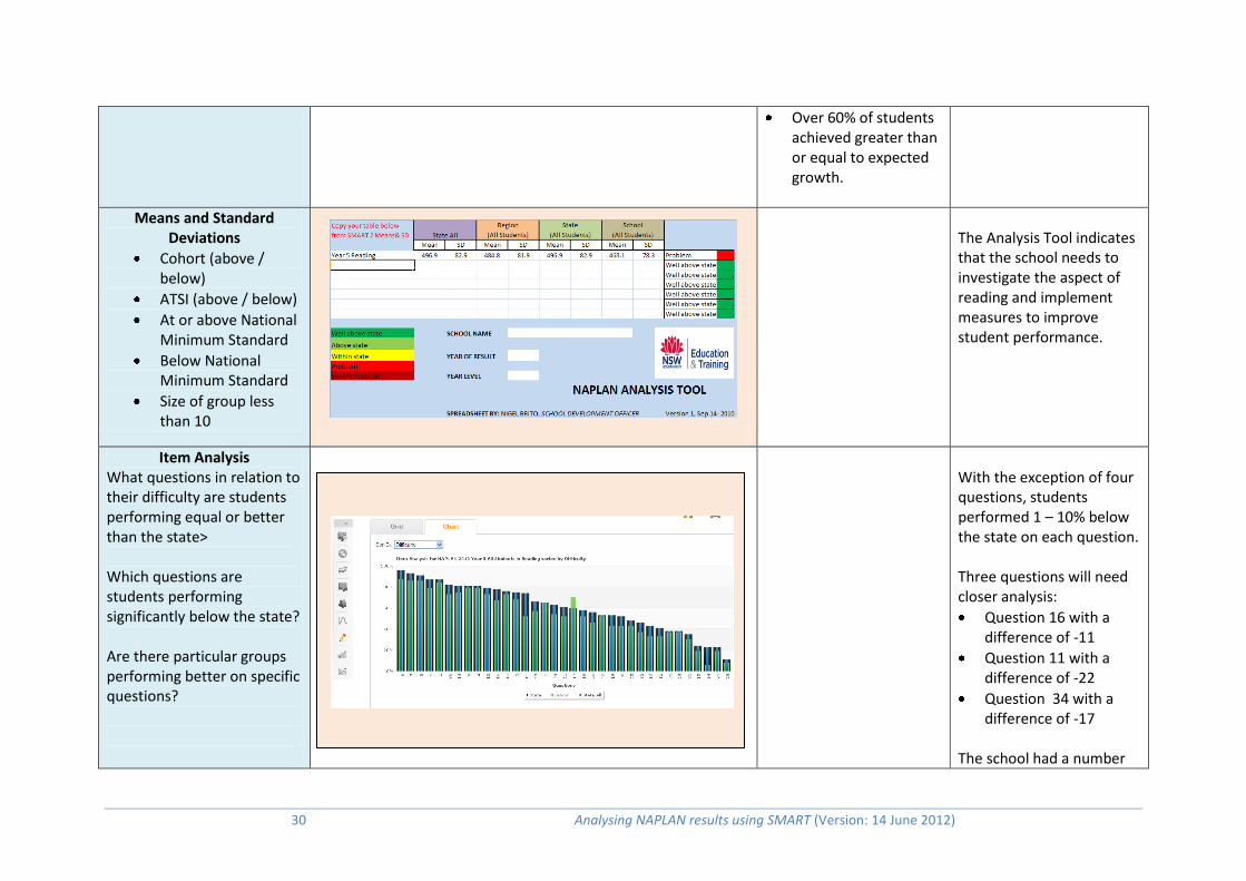
30 Analysing NAPLAN results using SMART (Version: 14 June 2012)
Over 60% of students achieved greater than or equal to expected growth.
Means and Standard Deviations
Cohort (above / below)
ATSI (above / below)
At or above National Minimum Standard
Below National Minimum Standard
Size of group less than 10
The Analysis Tool indicates that the school needs to investigate the aspect of reading and implement measures to improve student performance.
Item Analysis What questions in relation to their difficulty are students performing equal or better than the state> Which questions are students performing significantly below the state? Are there particular groups performing better on specific questions?
With the exception of four questions, students performed 1 – 10% below the state on each question. Three questions will need closer analysis:
Question 16 with a difference of -11
Question 11 with a difference of -22
Question 34 with a difference of -17
The school had a number
Analysing NAPLAN results using SMART (Version: 14 June 2012) 31
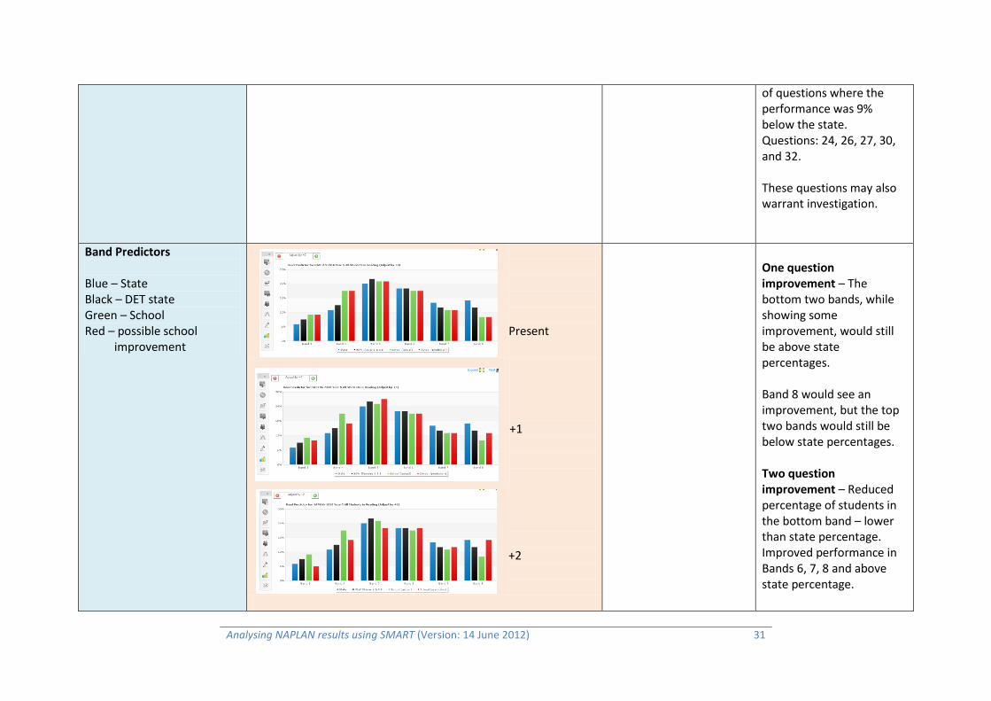
of questions where the performance was 9% below the state. Questions: 24, 26, 27, 30, and 32. These questions may also warrant investigation.
Band Predictors
Blue – State Black – DET state Green – School Red – possible school improvement
Present
+1 +2
One question improvement – The bottom two bands, while showing some improvement, would still be above state percentages. Band 8 would see an improvement, but the top two bands would still be below state percentages. Two question improvement – Reduced percentage of students in the bottom band – lower than state percentage. Improved performance in Bands 6, 7, 8 and above state percentage.

32 Analysing NAPLAN results using SMART (Version: 14 June 2012)
+3
Three question improvement – significant reduction in Bands 3, 4, 5. Improved performance in Bands 6, 7, 8 – resulting in performance well above state percentages in Band 6 and 8.
Relative Achievement What aspects are performing better in the school compared to others?

Analysing NAPLAN results using SMART (Version: 14 June 2012) 33
FOLLOW UP TO NAPLAN
Data Results Area of Strength Area of Focus
Teaching Strategies What teaching strategies from the NAPLAN support materials are already being implemented in the schools? What teaching strategies can be implemented to support learning?
Implementation of literacy programs –
Literacy on Track,
Best Start
Accelerated Literacy
Language, Learning and Literacy L3
Reading Recovery
SLST programs
Question 11: Applied Comprehension Question 34: Inferring meaning Question 16: Connecting Ideas Question 12: Connecting Ideas Question 19: Connecting Ideas Question 20: Connecting Ideas
The question with the
largest state difference
has been selected for
investigation.
Double click on the
description to reveal
question details. Click on stimulus to
access a copy of the
NAPLAN resource.
Teaching strategies
can be used to help
teachers explicitly
teach skills.
34 Analysing NAPLAN results using SMART (Version: 14 June 2012)
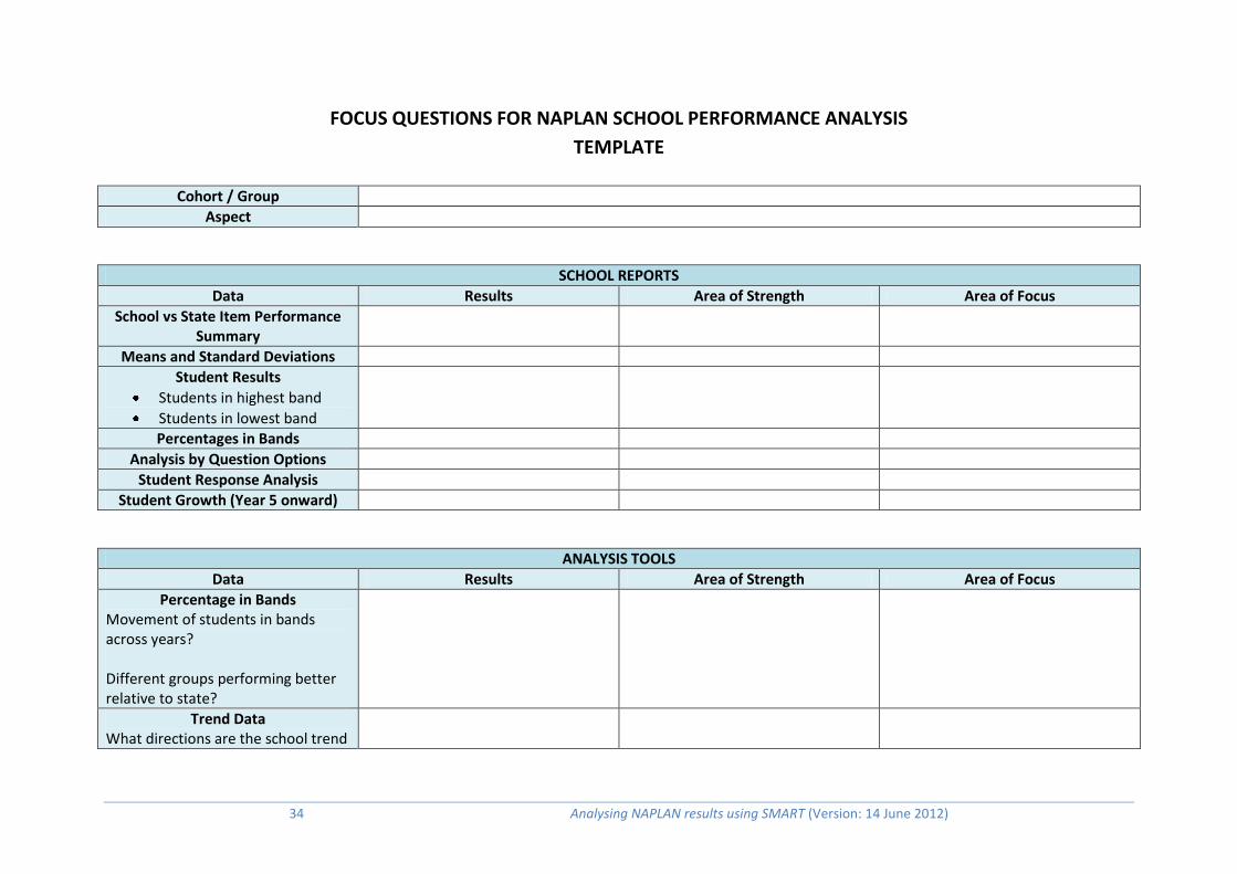
FOCUS QUESTIONS FOR NAPLAN SCHOOL PERFORMANCE ANALYSIS
TEMPLATE
Cohort / Group
Aspect
SCHOOL REPORTS
Data Results Area of Strength Area of Focus
School vs State Item Performance Summary
Means and Standard Deviations
Student Results
Students in highest band
Students in lowest band
Percentages in Bands
Analysis by Question Options
Student Response Analysis
Student Growth (Year 5 onward)
ANALYSIS TOOLS
Data Results Area of Strength Area of Focus
Percentage in Bands Movement of students in bands across years? Different groups performing better relative to state?
Trend Data What directions are the school trend

Analysing NAPLAN results using SMART (Version: 14 June 2012) 35
lines moving? What directions are the school and region trend lines moving in relation to the school trend lines? Are specific aspects moving in a particular direction?
School Growth
Student Growth
Means and Standard Deviations
Cohort (above / below)
ATSI (above / below)
At or above National Minimum Standard
Below National Minimum Standard
Size of group less than 10
Item Analysis What questions in relation to their difficulty are students performing equal or better than the state> Which questions are students performing significantly below the state?
Band Predictors
Relative Achievement What aspects are performing better in the school compared to others?

36 Analysing NAPLAN results using SMART (Version: 14 June 2012)
FOLLOW UP TO NAPLAN
Data Results Area of Strength Area of Focus
Teaching Strategies What teaching strategies from the NAPLAN support materials are already being implemented in the schools? What teaching strategies can be implemented to support learning?