an analysis of airline cost curves for us carriers ... · an analysis of airline cost curves for us...
TRANSCRIPT

Economics Honours Thesis Kanoria, Samvit P. Airline Cost Curves & MES
- 1 -
An Analysis of Airline Cost Curves for US Carriers: Determining Minimum Efficient Scale
Economics Honours Thesis
Stanford University Economics Department
Advisor: Professor Geoffrey Rothwell
17-December-2007
--- Samvit Prabhat Kanoria ---
Economics Honours Thesis Kanoria, Samvit P. Airline Cost Curves & MES
- 2 -
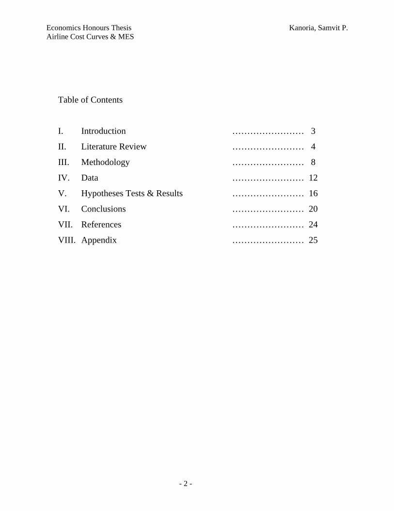
Table of Contents
I. Introduction …………………… 3
II. Literature Review …………………… 4
III. Methodology …………………… 8
IV. Data …………………… 12
V. Hypotheses Tests & Results …………………… 16
VI. Conclusions …………………… 20
VII. References …………………… 24
VIII. Appendix …………………… 25
Economics Honours Thesis Kanoria, Samvit P. Airline Cost Curves & MES
- 3 -
I. Introduction
There are few industries that have undergone as much financial struggle in the last
decade than aviation. With 110 airlines operating scheduled service in the United States,
there seems to be some overcrowding with the lion’s share of the market being split
among the major carriers – American, Southwest, United, Delta, Continental, Northwest,
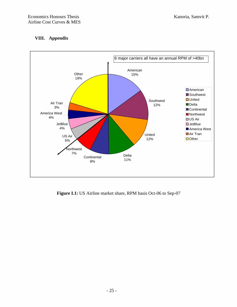
US Airways, JetBlue, America West, and Air Tran – that make up about 80% of the
market, as measured by Revenue per Passenger Mile flown (see Figure I.1). Following
seven years of good profitability that stemmed from a relatively long period of world
economic prosperity between 1994 and 2000, the industry suffered a huge setback in the
post 9/11 world. Cumulative net losses of the world’s scheduled airlines amounted to
$20.3billion between 1990 and 1993, followed with a net profit of $40billion between
1995 and 2000 (Morrell 2007). There is evidence of an upswing in airlines’ profitability
following increasing demand from 2005 onwards but the longer term health of the
industry still remains unproven.
In this continually changing landscape, this paper seeks to draw on existing
economic literature on the cost curves of airlines, use updated financial performance from
the last two decades, and estimate an average-cost & output-quantity model. The general
shape of the AC-Q model is expected to give us insights into what the minimum efficient
scale in the airline industry is, and try to justify the reason for a bi-polar industry with
small regional carriers and large international ones serving similar markets. Finally, this
paper will make recommendations for further research, to improve on what is presented
herewith, and to more accurately determine the economies of scale in the airline business.
Before diving in however a sincere word of gratitude to my thesis advisor,
Professor Geoffrey Rothwell, for all his guidance and continued support during this
endeavour. Also deserving of thanks is the Bureau of Transportation Statistics who was
very prompt with its emails, and in helping me access to the data-set used in this paper.

Economics Honours Thesis Kanoria, Samvit P. Airline Cost Curves & MES
- 4 -
II. Literature Review
Unsurprisingly, there is a lot of pre-existing literature on cost comparisons across
airlines. However, in this section, I will try and motivate the methodology used in this
paper, and use historical literature to create a benchmarked understanding of the airline
cost function.
Under the Federal Aviation Act, the Department of Transportation, enforces some
lose control over the cost categories that airlines need to report. It is important to
understand what these cost considerations are, but more importantly understand what the
drivers of efficiency really are before making comparisons across time periods and across
airlines. As O’Connor points out, flying operations includes crew wages and fuel while
direct maintenance covers the cost of labour and raw materials directly attributable to the
repair and upkeep of aircrafts. The three service categories – passenger, aircraft, and
traffic – involve the costs of cabin attendants, routine servicing by cleaning personnel,
and ticketing and baggage handling, respectively. Administrative costs are subdivided
into the self-explanatory categories of reservation and sales, advertising and publicity,
and general and administrative. Finally, a depreciation and amortization cost that
involves paying off the huge capital investment in the actual aircraft, is another cost
category.
It is important to consider what the drivers of these costs are, and how airlines
operating on similar routes have a very different cost structure (Straszheim 1969):
Plane Type, Routing & Scheduling Systems, and Stage Length – Over the two
decades preceding the 1970s, seat-mile costs1 have continuously declined with the
advent of bigger, faster planes with greater fuel efficiency and lower labour
requirements. Jet engines are able to fly 6,000 hours before engine overhaul
requirements and their 10 hour utilisation rates are 60% higher than the formerlu
used piston engines. The longer range of contemporary aircrafts including the 1 Cost Per Available Seat Mile (CASM), a commonly used unit cost used to compare airlines. CASM is expressed in cents to operate each seat mile offered, and is determined by dividing operating costs by Available Seat Miles. This number is frequently used to allow a cost comparison between different airlines. In theory, the lower the CASM the more profitable the airline should be.

Economics Honours Thesis Kanoria, Samvit P. Airline Cost Curves & MES
- 5 -
Boeing 777-300ER and the Airbus 330 series increases the average stage length2
which decreases the number of take-offs and landings thereby allowing for easier
scheduling and lower personnel cost. Thus, a plot of direct operating costs and
stage length reflects a decreasing function (Figure II.1). A theoretical argument
can be made that suggests a rising portion of the cost curve with increasing stage
length because increasing payload must be traded off for increased fuel cost
holding but in practice few airlines operate at such excessive stage lengths.
Airline Size – A cross section comparison of international airline costs
(Straszheim 1969) suggests a decrease in costs with increasing airline size (Figure
II.2). Economies of scale are considered to be the general explanation behind this
phenomenon. But, these costs are statistically different between regional and
international carriers only for the direct operating costs already mentioned above.
No scale effects are seen with regard to indirect costs although the larger carriers
enjoy a much better negotiation position with regard to labour and fuel wages that
form the majority of these airlines’ cost (Figure II.3).
o In 1979, scheduled airlines in the US employed 330,393 people (of which
27,000 were pilots and co-pilots) at a total cost of $9.7billion. Relative to
that number, the 2007 total employee number for the six largest airlines at
311,6603 does not seem all that significant. Yet, the problems with airline
costs do not arise purely from the volume of employed labour, but in the
strengths of the unions that negotiate their wages and the working rules of
its members’ contracts. Moreover, no single labour union works to protect
all airline employees – they are very fragmented and their membership is
driven by the type of task that each airline employee fulfils. The ability of
the larger airlines to negotiate more effectively with the unions and for
smaller airlines to employ non-unionised workers is a major driver of cost
reduction.
o In 1969 jet fuel cost about 11cents per gallon which had grown to 58cents
by 1979. Fast forwarding to present times, the price of jet fuel was 40cents
2 Stage length is the length of the average flight – from takeoff to landing – of a particular airline. 3 Smart Skies Website <http://www.smartskies.org/About/Carriers/>

Economics Honours Thesis Kanoria, Samvit P. Airline Cost Curves & MES
- 6 -
per gallon in 1999, jumped to 75cents in January of 2000 increasing its
share of total cost from 12 to 30%. Hugely volatile over a small time-
period, the price of aviation fuel reached 107cents during the summer of
2000, closing the year at 75cents. In 2004 and 2006 there were spurts of
increases too when prices reached 157cent and 223cents respectively
(Morrell 2007). Although such rapidly fluctuating oil prices has a
universal impact on all airlines, the location of refuelling and the
negotiating power with oil suppliers may have a marginal impact on the
cost economics.
A pan-industry study conducted in 1993 sheds some more insight into how
different airlines stack up on a cost-comparison basis. The results show differences that
are not significantly large but important enough in a very low-margin business.
Continental enjoyed a 12% cost competitiveness relative to American, driven largely by
labour prices. Northwest enjoyed a 5% cost advantage relative to AA, with United and
Delta coming in at about parity. A 17% lower efficiency number and 3% higher input
prices put US Air at a 20% disadvantage relative to the AA benchmark. On the
international arena, Asian carriers significantly outperformed the benchmark with
Singapore, Korean, Cathay and Thai enjoying a 12, 23, 4 and 9% advantage. The
converse was true of European carriers where British Airways, Lufthansa, Air France,
SAS and Iberia were 7, 21, 21, 42 and 32% less cost-effective than AA (Forsyth et al
2002). Over time, these cost difference remained relatively stable, but the regional
clustering of cost similarities will have an important corollary later in this paper.
There exists, in airline economics, a great difficulty in disaggregating all the
aforementioned effects and obtain true cost estimate for various airline characteristics.
Thus, as Straszheim points out, most explanations have settled for relating costs to a
single variable – usually some measure of firm size. A summary of the existing model,
whose components aggregate to the total cost function, is presented herewith. But the
basic reasoning of looking at cost purely as a function of output quantity forms the
bedrock of the econometric work of this paper too.
Economics Honours Thesis Kanoria, Samvit P. Airline Cost Curves & MES
- 7 -
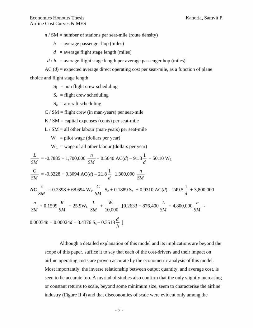
n / SM = number of stations per seat-mile (route density)
h = average passenger hop (miles)
d = average flight stage length (miles)
d / h = average flight stage length per average passenger hop (miles)
AC (d) = expected average direct operating cost per seat-mile, as a function of plane
choice and flight stage length
Sl = non flight crew scheduling
Sc = flight crew scheduling
Sa = aircraft scheduling
C / SM = flight crew (in man-years) per seat-mile
K / SM = capital expenses (cents) per seat-mile
L / SM = all other labour (man-years) per seat-mile
WP = pilot wage (dollars per year)
WL = wage of all other labour (dollars per year)
SML = -0.7885 + 1,700,000
SMn + 0.5640 AC(d) – 91.8
d1 + 50.10 WL
SMC = -0.3228 + 0.3094 AC(d) – 21.8
d1 1,300,000
SMn
ACSMc = 0.2398 + 68.694 WP
SMC Sc + 0.1889 Sc + 0.9310 AC(d) – 249.5
d1 + 3,800,000
SMn + 0.1599
SMK + 25.9WL
SML +
000,10LW
.[0.2633 + 876,400SML + 4,800,000
SMn -
0.00034h + 0.00024d + 3.4376 Sc – 0.3513hd ]
Although a detailed explanation of this model and its implications are beyond the
scope of this paper, suffice it to say that each of the cost-drivers and their impact on
airline operating costs are proven accurate by the econometric analysis of this model.
Most importantly, the inverse relationship between output quantity, and average cost, is
seen to be accurate too. A myriad of studies also confirm that the only slightly increasing
or constant returns to scale, beyond some minimum size, seem to characterise the airline
industry (Figure II.4) and that diseconomies of scale were evident only among the
Economics Honours Thesis Kanoria, Samvit P. Airline Cost Curves & MES
- 8 -
smallest firms. Moreover, while thinking of the optimal size of the airline industry
(thereby allowing one to arrive at conclusions on minimum efficient scale), historical
data suggests a “shift downward over time” allowing smaller carriers with regional
pockets of concentration to effectively compete with the larger airlines too (Biederman
1982). In the methodology and results sections ahead, I will borrow from this finding,
and establish an AC-Q relationship of my own thereby allowing me to derive a minimum
efficient scale statistic.
III. Methodology
The manner of modelling the cost curves in the airline industry is not different
from a traditional factor model used both in the study of labour economics, and in firm
theory. An airline, like any other operational firm, faces the same production constraints
– of limited resources that involves a vector of input costs, revenues generated both
directly and indirectly from these incurred costs, and a profit stream that calculates the
difference. Moreover, in the neoclassical formulation of this model, technology can either
be input agnostic or create a skew in the equilibrium ratio of one factor of production to
another. A brief discussion of the cost function is presented herewith, in order to motivate
the more relevant topic of cost curves to which I will turn to shortly.
From Intriligator (1996) and Johnston (1997) the following cost function
methodology is devised: In the general case of a firm producing a single output from two
inputs (x1, x2), the entire set of possible outputs (y) is defined by a functional relationship
y = f (x1, x2). Therefore, the profit maximising function (π) that the firm seeks to
maximise is
max π = pf(x1, x2) – w1x1 – w2x2 with w1 and w2 being the input costs for the respective
factors of production.
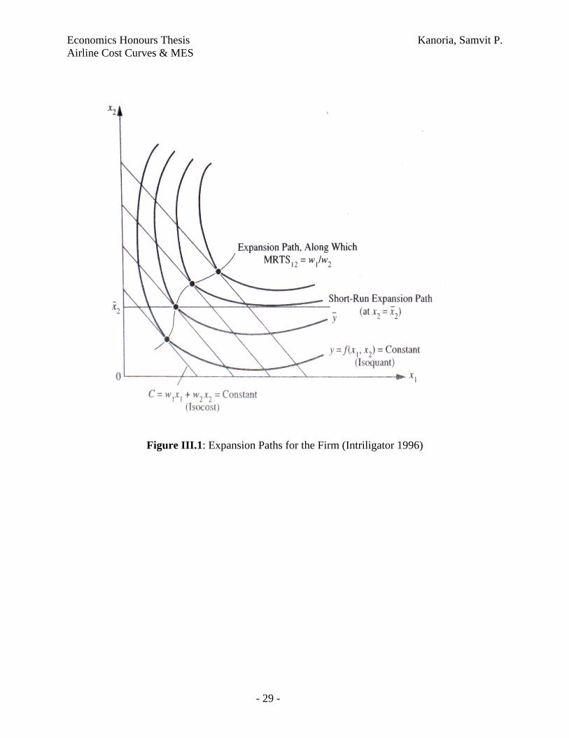
A graphic representation of these constraint can be showed by the isocost, a locus
of input combinations (x1, x2) for which cost C, the total payment to both costs inputs is
constant: C = w1x1 + w2x2 = constant. And, in order to determine the geometric

Economics Honours Thesis Kanoria, Samvit P. Airline Cost Curves & MES
- 9 -
equilibrium of the market, the other curve used is the isoquant that represents a locus of
input combinations for which the output is fixed, algebraically thought of as a production
level curve: y = f(x1, x2) = constant. (Figure III.1).
In Figure III.2, along the expansion path of increasing costs there exist multiple
points of equilibrium with a given output y from the isoquant¸ and a corresponding level
of cost C, from the isocost. The set of all possible combinations of these output-cost pairs
give rise to the notion of a cost curve.
C = C(y),
in this case the long-run total cost curve, since it represents total cost:
C = w1x1 + w2x2
where the long run is economically defined as a period in which all the factors of
production can be freely varied. A short-run cost curve is defined using an alternative
expansion path that reflects whatever factors are fixed in any particular constrained time
period. An example would be the expansion path defined by the horizontal line at x2,
where the second input is fixed at a certain level, and the other input is free to vary. The
short-run cost curve defined by y and C along such an alternative expansion path Cs(y)
must satisfy
Cs(y) ≥ C(y)
since at every point the short run cost must be higher or equal to the longer-run cost in
which all the factors are variable. Since, this is the total cost function the average costs
merely divide the total cost by the output both in the short and longer run:
AC(y) = C(y) , ACs(y) = Cs(y)
y ys
And, the marginal cost curves are defined as the derivative of the total cost function:
MC(y) = dC(y) , MCs(y) = dCs(y)
dy dys
The geometric relationship between the total, marginal, and average cost curves
are seen in the second half of Figure III.2. There are a few key relationship elements that
merit a highlight:

Economics Honours Thesis Kanoria, Samvit P. Airline Cost Curves & MES
- 10 -
Since all inputs are flexible in the long run, the long run total cost function indicates a 0
cost at 0 output. So, C(0) = 0
Long and short term cost functions are monotonic as costs increase with increased output
The shape of the cost curve represents technological assumptions and when labour
specialization occurs
Geometrically, the average cost is the slope of a ray connecting the origin and a point on
the total cost curve, while the marginal cost is the slope of the total cost curve itself.
An algebraic estimation of the total cost curve depicted in Figure III.2 is a cubic curve where
C = a0 + a1y + a2y2 + a3y3 where a0, a1, a2, and a3 are given parameters. The average cost
curve associated with this cubic total cost curve is derived by dividing the entire equation by
output:
AC = a0 + a1 + a2y + a3y2
y
and marginal cost is given by taking the derivative of the total cost function with respect
to output
MC = a1 + 2a2y + 3a3y2
For U-shaped average an marginal cost curves as illustrated in Figure III.2, the
parameters must satisfy the restrictions:
a0 ≥ 0, a1>0, a2<0, a3>0 where a0 is the fixed cost at zero output.
Empirical studies of cost curves typically estimate a long-run curve using cross-sectional
data on firms in the industry, specifically using data on total costs, output, and other relevant
variables. Assuming that the same technology applies to all firms, that observed outputs are close
to planned outputs, and that firms are seeking to minimize costs at each planned output level, it
follows that the cost curve estimated from a scatter diagram of cost-output points represents an
accurate estimate. In the long-run case, a0 in the cubic cost curve above that represents fixed
costs vanishes to give an average cost equation of
AC = a1 + a2y + a3y2
This quadratic long-run average cost curve has been estimated for many industries. But, as
mentioned above, the estimated shape of the curve, as described in Figure III.2, is based on

Economics Honours Thesis Kanoria, Samvit P. Airline Cost Curves & MES
- 11 -
certain technological advances, changing economies of scale, and altering effects on labour
specialization. There are several nested models of AC that can be derived from the generalized
cubic TC function.
(1) Simple Constant: k + Q0 or a1
(2) Linear: k + Q0 + Q1 or a1 + a2y
(3) Quadratic: k + Q0 + Q1 + Q2 or a1 + a2y + a3y2
(4) Inverse: Q-1 + k + Q0 or a0 y-1 + a1
(5) Inverse + Linear: Q-1 + k + Q0 + Q1 or a0 y-1 + a1 + a2y
All these nested functional forms are derived from the TC function in Intriligator and
represent the general consideration that AC = f (Q-1 + Q0 + Q1 + Q2). Specifically what the
functional relationship is, does not seem to be very clear and one might try all different
combinations of a log-log, semi-log and log-linear assumptions to fit the data accurately.
For a wide variety of industries, including manufacturing, mining, distribution, transportation,
and trade, it has been found that the long-run average cost curves are L-shaped rather than U-
shaped and this is the reason why the inverse function mentioned above becomes relevant. It is
important to understand the implications of the L-shaped curve which forms the bedrock of this
paper. As illustrated in Figure III.3, average cost initially falls sharply then reaches (or
asymptotically approaches) a certain minimum level AC0 at a critical level of output, y0, and
remains flat after this level of output. The critical level of output y0 is the minimum efficient
scale; it is the point at which there is a “knee” in the average cost curve. By calculating the
empirical constant at which the K/Q line reflects the asymptote to average cost – the lowest
possible cost achieved with the existing technology – we get an estimate of what the MES in the
airline industry is and a possible recommendation at what scale airlines ought to operate at.
In the results section, I will test the hypothesis that the inverse function better represents
the data than the quadratic function. The assumption is that quadratic function has an upturn –
representing a region of increasing AC – and, if there is indeed this upturn then there is an
optimal size to the industry or for a given firm size. However, if the generalized model is not
significantly different from the inverse function, then we assume that there is no explicit optimal
size but a region of continually decreasing or flat average costs. In this case, of the inverse
function holding true, extending Intriligator and previous literature, the minimum efficient scale

Economics Honours Thesis Kanoria, Samvit P. Airline Cost Curves & MES
- 12 -
is that output quantity where the estimated AC is within two standard errors of the constant
asymptote.
The hypotheses that I will be testing is whether or not the general model
Q-1 + k + Q0 + Q1 + Q2 or a0 y-1 + a1 + a2y + a3y2
is significantly different from the two nested models of an inverse and a quadratic function. This
is an empirical question, to which I will now turn.
IV. Data
As discussed in the methodology section, the cost curve has two main
considerations – average cost and output quantity. In order to arrive at average cost, the total cost
function used in this paper was Total Operating Cost. This financial data was available for all US
based airlines from 1990 – 2007 on the Bureau of Transportation Statistics website4 hosted by
the U.S. Department of Transportation (DOT). Specifically, data is made available by The
Research and Innovative Technology Administration (RITA), the division that coordinates the
DOT’s research programs and is charged with advancing the deployment of cross-cutting
technologies to improve America’s national transportation system. Before calculating AC from
this TC number, the nominal dollar figures were adjusted to 1995 Dollars using the GDP deflator
figures from the Economic Report of the President. Eventually then, the cost figures are made
comparable across years by adjusting for inflation and any structural changes to economy that
are reflected in the GDP deflator numbers.
Aside from the TC measure, a quantity measure was also obtained from the Bureau of
Transportation Statistics website. In the airline industry, and specifically for passenger carriers, it
makes sense to consider two different output quantities that are capacity measures as well.
Revenue per Passenger Mile (RPM)5 – One paying passenger flown one mile. It is the
principal measure of airline passenger traffic.
Available Seat Mile (ASM) – One seat flown one mile. An airliner with 100 seats flown
1000 miles represents 10,000 ASMs. This is a capacity measure and the difference with
4 Bureau of Transportation Statistic website <http://www.transtats.bts.gov/homepage.asp> 5 Airline Glossary < http://www.avjobs.com/history/airline-glossary.asp>

Economics Honours Thesis Kanoria, Samvit P. Airline Cost Curves & MES
- 13 -
RPM is the non-revenue generating load factor such as passengers with free tickets,
airline employees etc.
In the data that were made available, quarterly breakdowns were aggregated to
obtain yearly figures. Moreover, airline operations were separated based on the region of
service, and these data were also aggregated to obtain total costs and output quantities for all
the major carriers. Care was taken to ensure that freight-only carriers were removed from the
data set because the ASM and RPM numbers are meaningless for such carriers. The air cargo
business is completely different from the transit-passenger business and although the
RPM/ASM equivalents are Revenue per Tonne Mile (RTM) and Available Tonne Mile
(ATM), there is no evidence to suggest that the modus operandi of passenger and freight
airlines is similar in anyway.
However, the quality of the data, and hence that of the results, is made slightly
spurious because the Operating Cost number (used as a proxy for TC) includes freights and
charter operations of the airlines too. As the charter business also involves passenger
transportation, it poses less of a problem than the inclusion of freight transportation cost in
the TC number, especially since those costs are being compared against passenger traffic data
(RPM and ASM) only. There is much complexity in trying to disaggregate the passenger and
freight component of each airline’s business. Fortunately, the average figure of 80% revenues
coming from passenger traffic6 has little variance across the airlines under consideration.
Thus, this nuance is ignored and Operating Expense is considered to be effectively passenger
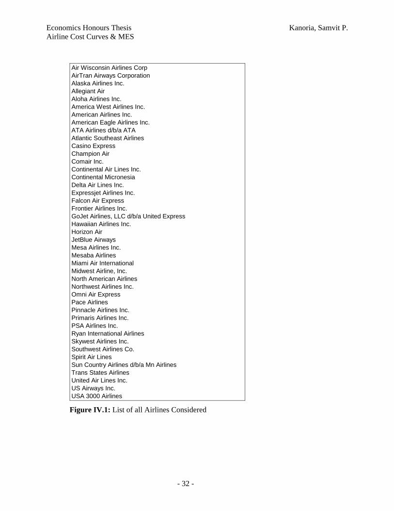
traffic driven. Figure IV.1 lists the universe set of all airlines studied in this paper, but data
were not available for each of these airlines in every given year.
In order to make the sampling between these years representative of structural
changes to the airline industry and the macro-economy, four years were considered – 1990,
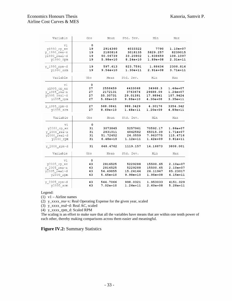
1995, 2000 and 2005. The summary statistics of operating expenses, real AC, RPM and ASM
for these years is presented in Figure IV.2 And, although initially I had imagined running all
the tests for both quantity variables (RPM and ASM), the high correlation between these two
6 Air Transport Association – Airline Handbook, Chapter 4 < http://www.airlines.org/products/AirlineHandbookCh4.htm>

Economics Honours Thesis Kanoria, Samvit P. Airline Cost Curves & MES
- 14 -
variables (ranging from 0.9983 in 1990 to 0.9992 in 1995) makes both these measures
virtually identical. Since RPM is a measure of the actual quantity purchased as opposed to
the quantity produced and that the cost of the marginal traveller is non-negative (additional
fuel, administrative expenses, negative utility to co-passengers etc) albeit low, the RPM
measure is favoured over the ASM measure, throughout this paper.
Purely as a first approximation to what the AC-Q plot looks like, the data for each
of the aforementioned years is plotted on a scatter-plot as seen in Figure IV.3 While the large
number of data points does not reveal anything significant as such, a pure-eye ball indicates a
downward trend – that of decreasing AC with increasing Q – similar to Figure II.4. This eye-
ball approximation will be accurately tested in the section on results, and with further
granularity in this chapter too.
In order to test the hypothesis that two nested models that of the quadratic and
inverse are substantially different from the general model, it is first essential to run the
regressions of all possible nested models. These regressions are not only essential for the
sake of achieving completeness, but the residual sum of squares for each regression (RSS)
will eventually be useful in conducting the f-tests in the subsequent chapter. The following
regressions, using standard Ordinary Least Squares (OLS), are conducted by regressing AC
on:
Q0 + Q1
Q0 + Q2
Q0 + Q3
Q-1 + Q0
Q0 + Q1 + Q2
Q0 + Q1 + Q3
Q-1 + Q0 + Q1
Q0 + Q1 + Q2 + Q3
Q-1 + Q0 + Q1 + Q2
Q-1 + Q0 + Q1 + Q3
Q-1 + Q0 + Q1 + Q2 + Q3

Economics Honours Thesis Kanoria, Samvit P. Airline Cost Curves & MES
- 15 -
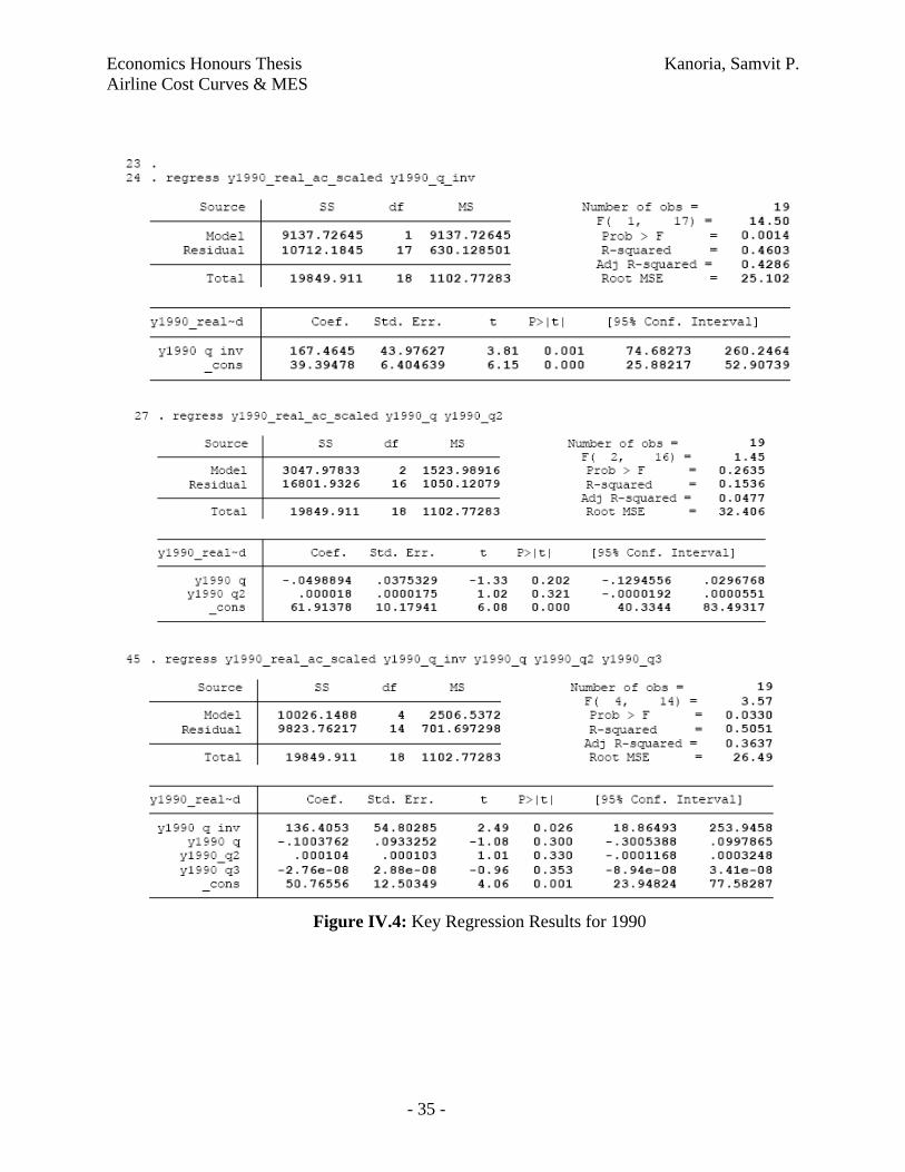
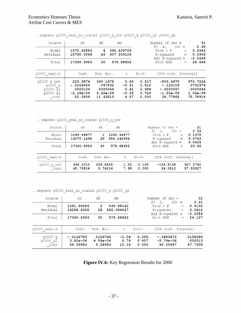
Since we really only care about the bolded equations above, i.e. the inverse, the
quadratic, and the most general model, the regression results for only these equations (for each of
the four years) is presented in Figures IV.4-7. In each of these regression results, the t-statistic
corresponding to the Q-1 independent variable is larger (i.e. “more significant”) than that
corresponding to the Q1 or Q2 variable. Of course, looking at the t-statistic is not entirely
accurate when there is more than one independent variable, but this eye-ball further leads
strengthens our conviction that the inverse function is a closer approximation to the generalised
equation than the quadratic one.
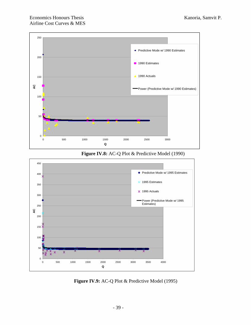
Despite these econometric results, a graphical representation of the data further
proves the eye-ball estimates mentioned above. In each of the charts depicted in Figures
IV.8-11 the following four series are plotted:
Year Actuals: AC-Q directly from the data set and scaled to make a proportionate
comparison
Year Estimates: Considering the regression parameters as depicted in Figures
IV.4-7, and the given Q from the data-set, what predicted values of AC can be
extrapolated (using the inverse relationship).
Predictive Model w/ Year Estimates: For the entire range of Q on which the data
sits, use arbitrarily incremental values of Q and back out the corresponding AC
values based on the inverse relationship, and the calculated regression parameters.
Power: Fitting a 1/Q power trend-line across the entire data set that provides an
envelope curve which theoretically, should bind all the data points above it.
Again, suffice it to say that the eye-ball estimate suggests that the inverse function
is a relatively good estimator of the data. I have not run any f-tests yet, but the graphical
approximations suggest that I am on the right track.
Aside from these simple AC-Q plots, Figures IV.12-15 contain a Log(AC)-
Log(Q) plot for each of the years too. In general, the intermediary conclusions from the data
are that the inverse function is the closest approximation to the generalised model but the f-
tests need to be conducted, to which I know turn my attention.

Economics Honours Thesis Kanoria, Samvit P. Airline Cost Curves & MES
- 16 -
V. Hypotheses Tests & Results
In the data section, I discussed several pieces of evidence that pointed in the same
direction – the AC-Q plots and the regressions – to the inverse function being a closer mirror
of the generalised function than the quadratic one. The f-tests are a way to concretise this
assumption, and make accurate conclusions on whether the eye-ball results hold statistical
weight. Before discussing the results though, a quick word on the f-tests, and the procedure
used.
Per Gujarati, the Restricted Least Squares (RLS) procedure involves testing a model
with any number of explanatory variables and more than one linear restriction. In order to
determine whether or not the restriction is valid (i.e. if the two restricted and unrestricted
equations are effectively the same), the f-statistic is calculated using the following equation:
)/(/)(
knRSSmRSSRSS
FUR
URR
−−
=
= )/(
/)(
ˆˆˆ
2
22
kn
m
uuu
UR
URR
−
−
∑∑∑
∑uRˆ2 = Restricted Least Squares (RSS) of the restricted regression
∑uURˆ2 = RSS of the unrestricted regression
m = number of linear restrictions
k = number of parameters in the unrestricted regression
n = number of observations
This f-statistic follows the f-distribution with m, (n-k) degrees of freedom.
For all the nested regressions discussed and outlined in the Data section, the RSS is
calculated and presented in Figure V.1. Moreover, using these RSS numbers and taking into
consideration all the nested regression pairs, various combinations of restricted and
unrestricted equations are tested to check if they are statistically different from each other or
not. The findings from these f-tests are presented in Figures V.2-5 for each of the 4 time
periods. The cells that are shaded yellow represent those significant f-statistics in which the

Economics Honours Thesis Kanoria, Samvit P. Airline Cost Curves & MES
- 17 -
restriction imposed on the unrestricted equation is statistically invalid. For example, in
looking at the first shaded cell in Figure V.2, we see that the unrestricted equation is Q-1 + Q0
+ Q1 + Q2 + Q3 and the restricted equation is Q0 + Q1 + Q2 + Q3. Therefore, the single
restriction imposed on the unrestricted equation is Q-1 = 0. But, because the f-statistic is
significant at the 95% confidence interval, we reject the null hypotheses that the restricted
and unrestricted equations are the same. The conclusion then, of an invalid restriction
(whereby Q-1 = 0), must be seen in all the other nested regressions pairs in which Q-1 is
present in the unrestricted equation, but not in the restricted case. For the data in 1990, in
every case when the f-statistic was found to be significant at the 95% level, there is the single
restriction of Q-1 = 0 further substantiating all our initial hypotheses from the data section.
Unfortunately, this is not a robust finding across all the years sampled. In 1995, no
restriction has a significant f-statistic and in 2000, in only one of the nested equations is this
restriction considered invalid. It is important to mention however that although there is no
substantial proof of the aforementioned conclusion in the 1995 and 2000 data sets, there is no
evidence to disprove the claim either. Since no other restricted variables result in significant
f-statistics, there are no other candidates to claim greater resemblance to the general model
than the inverse function. In 2005 however, all the significant f-statistics involve a restriction
on Q-1 leading to a further claim that at least in this year and in 1990, the inverse function
statistically resembles the fully generalised model more than the quadratic function does. For
1995 and 2000, this finding is not conclusive, but there is no evidence that disproves the
aforementioned claim.
Aside from proving the functional form of the average cost curve in the airline
industry, this paper was written with the idea of deriving the industry’s Minimum Efficient
Scale (MES) output quantity. Simply defined, the MES is “the smallest quantity at which the
long-run average cost curve attains its minimum point (Besanko 2002).” And, considering
that we have confidence in the inverse function as proven with the f-tests, the MES can be
backed out as well. The inverse equation that we have parameter estimates for is AC = k +
β(Q-1). In an L-shaped curve, the MES represents the kink in the curve and the AC
corresponding to that MES is the asymptotic value to which the function tends, in its limit.
Economics Honours Thesis Kanoria, Samvit P. Airline Cost Curves & MES
- 18 -
Hence, the 95% confidence interval for the asymptotic AC, from the above
equation, is k ± 2 x s.e. (k). But, considering the fact that the average cost curve represents a
floor below which it is not possible for any airline to operate in the long run (keeping in mind
that no airline is large enough to completely dictate input prices that are either fixed by the
government, or negotiated by labour unions, or priced in an internationally competitive
market with no substitutes) it does not make sense to consider the k – 2.s.e (k) values. In
Figure V.6, all the asymptotic ACs (i.e. the base case and with 1/2 standard errors above) are
calculated for each of the years under consideration. Moreover, the corresponding Q values
are also backed out, using the inverse relationship mentioned above and the parameter
estimates for every specific year. These results are presented in Figure V.6 too with several
interesting results discussed herewith:
Asymptotic AC closely resembles Mean AC – Almost by construction, the
calculation of the asymptotic AC, based on the description above, very closely
mirrors the mean AC numbers calculated empirically from the data set. In fact, for
each of the relevant years the Mean AC, as observed empirically, lies within the
lower bound of the asymptotic AC and the upward bound found by adding two
standard errors to the asymptotic AC number. Averaging across the four years, the
asymptotic band is seen to be between $46 - $56m at the 95% confidence interval
with the aforementioned restriction that prevents the AC from being below the
asymptote. The mean AC number for the entire period is $53m which fits smack in
the middle of the predicted range.
Little difference in AC across airlines – At $53m, the mean AC number is only
slightly different from the median number of $43m. Considering this, it seems that
there is an almost universal-cost constraint faced by all airlines that serve the US
passenger market. This finding is exactly in line with pre-existing historical finding as
discussed in the Literature Review section. The largest variance between costs
competitiveness was the 20% between US Airways and American. The median
number found here is about 23% different from the calculated mean. The three largest
costs of an airlines’ operating business are labour, fuel, and aircrafts each of which
are highly negotiated either by governments, unions or large corporations. Needless
Economics Honours Thesis Kanoria, Samvit P. Airline Cost Curves & MES
- 19 -
to say (and as the literature suggests), volume discounts certainly help create a
decreasing cost curve with increasing size. But, these costs advantages are not
substantial and several experienced diseconomies of scale for the larger carriers,
make their cost structures not wholly different from that of the smaller regional
airlines. Thus, the data show little difference between the mean and median AC
numbers.
Expected MES mimics median, not mean Q – Reverse calculating the inflection
point quantity, assuming an L-shaped AC-Q plot and an inverse function, yields a
minimum efficient scale number ranging from 2,010 – 4,020m RPM. In comparison,
across the time period studied, the mean output at which airlines operate is a
staggering >10x different at 58,972m RPM. At first, this huge discrepancy seems to
indicate that the inverse function is a poor mechanism to derive the industry’s
minimum efficient scale number. But, it is important to keep in mind just how skewed
this average number really is. There are six major national carriers in the US with an
RPM >40,000m and these airlines – American, United, Delta, Continental, Southwest
and Northwest – constitute over 65% of the market share. All the other carriers are
significantly smaller and serve either a combination of route-pairs or have a regional
geographical footprint. The 6-carrier RPM average is 280,505m clearly outstripping
the mean number, and that of the regional carriers too. In order to determine whether
or not the average quantity number is heavily skewed or not, the median values across
the time frame are also calculated. Median RPM is 9,650m which is less than one-
quarter of the average quantity number mentioned earlier. Considering the dual-sized
nature of the US market, where few large gorillas co-exist along with much smaller
regional carriers, this difference between the mean and median quantity numbers
makes complete sense.
Implications of relatively small MES – The upward bound on the MES number is
4,020m and with certain assumptions of the US aviation market, I am able to estimate
an MES fleet size number too. About 64% of passengers fly <1000miles on an
average flight (Huang 2000), so I have roughly estimated the number of miles per
passenger per flight to be 800miles. This number is corroborated with the Bureau of
Transportation Statistics that says the average passenger trip-length was 868miles in
Economics Honours Thesis Kanoria, Samvit P. Airline Cost Curves & MES
- 20 -
20047. The MTC estimates that there will be 134 seats on average daily flight by 2010.
So, for present-day estimates I have used a 130 seat number for the average aircraft,
which is expected to fly at about 65% capacity8 thereby reducing the number of
revenue paying passengers per flight to about 85. Dividing the RPM number by the
number of daily passenger miles (365 x 800 x 85) we get the number of daily flights
that an airline must operate to be at MES, at 161. At 800miles per flight, the average
flying time, accounting for landing delays due to air traffic clearance delays, is about
two hours. And, aircraft utilisation is estimated to be 10 hours per day; reasonable
considering the best-in-class JetBlue does about 12.5 hours, and Southwest at 11.7
claims it is 14% higher than industry average. Therefore, the total fleet size
requirement, to achieve minimum efficient scale, is a meagre 8 aircrafts! This
surprising result is not un-conditional however; it merits further explanation and
greater investigation, to which I shall now turn.
VI. Conclusions
The key findings of this research and its consequent implications have already been
discussed toward the end of the previous section. As a conclusion though, it would be
pertinent to elaborate on them in slightly further detail, lay open the possibilities for
future research, and summarize the main arguments made thus far.
Almost all historic economic literature suggests that scale has a decreasing effect
on average cost, both in the transportation industry generally and in aviation specifically.
Using graphical methods as first approximations, followed through with regressions and
f-tests, this conclusion was seen to be valid in the US passenger airline market in years
1990, and 2005. The research was conducted by modelling all possible functional forms
of the output quantity, using revenue per passenger mile as the measure, on the average
cost of airline operations. The inverse functional form was seen to most closely resemble
7 http://www.bts.gov/press_releases/2005/bts012_05/html/bts012_05.html 8 Load factor in September, 2007 is 76.8% but historically, this is a busy month for travel, and airline data has been looking brighter for 2007 that any year post-9/11. Considering that this MES evaluation has been averaged since 1990-2005, a more conservative load factor number is essential to consider. <http://www.airtransportnews.aero/article.pl?categ=&id=7969>

Economics Honours Thesis Kanoria, Samvit P. Airline Cost Curves & MES
- 21 -
the generalised model relative to the quadratic functional form, the latter of which would
denote clear eventual diseconomies of scale. Since, the inverse functional form was
shown (with complete certainty for 1990 and 2005) to hold true, the implication was that
there was no upward sloping part of the AC curve when plotted against Q, as the
quadratic functional form might suggest. Thus, there is no single equilibrium output
quantity that is potentially profit maximising for an airline carrier. Once minimum
efficient scale is achieved, adding greater capacity may only increase management risk of
operational failure without substantially reducing cost but there is no evidence of
impending diseconomies either.
From the data set, procured from the Bureau of Transportation Statistics, the
derived MES was found to be a fleet size of 8 aircrafts. This is a relatively low barrier to
entry in the already competitive airline market, and may actually provide an explanation
as to why 110 airlines actually choose to fly in the American skies. The general estimate
of this fleet size number is believable considering previous literature on the dual-sized
nature of the airline industry and empirical evidence that suggests such co-existence of
large-small airlines even today. However, the specific estimate ought to be viewed with
some degree of scepticism. Firstly, the data set only includes half of the total airlines
under operations and the smallest ones, arguably with the highest cost, are completely left
out. Their presence in the data set would change the results. Secondly, I had mentioned
how the Operating Cost number was not exactly accurate since it took into consideration
charter and freight services of the airline too. The difficulty of isolating only scheduled
passenger operations for the airline introduces an added degree of artificiality to the result.
Thirdly, the asymptotic constant (k) was assumed to provide a lower bound to the costs
faced by all airlines. Individual firm effects were not considered in the model that may
have resulted in specific airlines operating below this artificially created boundary.
Finally, although firm size has the single most significant effect on AC (Section II) there
are several other factors such as aircraft type and route selection that have a differential
impact on AC too, and therefore on the MES calculation.
Economics Honours Thesis Kanoria, Samvit P. Airline Cost Curves & MES
- 22 -
The low barriers to entry however, create several interesting opportunities for the
future of US aviation. A speculative result of my own is for large international carriers
such as Lufthansa, and British Airways to possibly create subsidiary organisations that
remain detached from the parent company but operate only specific routes either in a
third-party country or internationally to their own hub-destination. This is exactly what
Virgin American has done – using its existing expertise from Virgin Atlantic, the
partially owned American subsidiary operates only on specific lucrative routes in the US.
Part of the brand name is carried, but the operational costs are completely distinct. With a
dozen aircrafts, this model might actually prove to be profitable in the longer run.
Although it is impossible right now, considering the presence of only sixth freedom
regulation, this low MES could allow for airlines to create more Special Purpose Vehicles
(SPVs) that service alternative international routes without tapping into the pre-existing
network and create additional scheduling difficulties. The key difference here is that a
larger airline’s expansion does not have to increase the size of the existing network – it
can modularise its airline operations based on geography to create separate regional
clusters with airlines that operate with their own P&Ls. Increasing network size creates
added complications and increases risk without much benefit, if the airline is already
operating on the asymptotic part of the average cost curve.
There are several further areas of research that could build upon the existing work:
Demographic Concentration – Rather than thinking of areas of service as
specific geographical regions, this research could be used to test if airlines
serving specific a demography (such as old age people or the business
traveller) would face similar cost curves and low scale requirements.
Charter & Freight Services, Other Countries – A natural extension of the
existing research would be to use a similar procedure to establish the size
recommendation for freight and charter airlines too. Moreover, this paper
is solely for US based airlines but the methodology can be applied to
international carriers in other regional clusters too. In order to increase the
Economics Honours Thesis Kanoria, Samvit P. Airline Cost Curves & MES
- 23 -
accuracy of results, more frequent sampling (i.e. adding more years to the
data set) of a more complete set of airlines would be required.
Different Cost and Quantity Measures – This paper used Average
Operating Cost and RPM data, but there are several other measures such
as fleet size, number of aircrafts, unit-seat-mile costs etc that ought to be
modelled too, and the conclusions of this paper verified. Moreover, cost
and quantity are both vector functions, and individual input-pairs (such as
regressing number total wage cost on number of employees) may help to
disaggregate specific input-effects too, once adjusted for with the omitted
variable bias.
Firm Specific Effects – This paper aggregates data for all US airlines, but
a clustering of this research for a given size of aircrafts will increase the
accuracy of the results. For individual airlines, this model could be used
for a comparative statics prediction of their own cost structure. It is
beyond the scope of this paper to discuss individual firm performance,
relative to the benchmark, but this study can easily be extended in that
direction. Instead of cross-sectional data, an individual firm could use its
own time-series data with a similar methodology for its own cost
allocation and resource planning.
Overall, the scope of airline cost curve and MES research is massive. This paper has
merely scratched the surface with its two main conclusions. Firstly, that US based airlines
experience an inverse cost function for their passenger operations. And, secondly, the barrier
to entry from a fleet standpoint, as measured by minimum efficient scale, is relatively small.

Economics Honours Thesis Kanoria, Samvit P. Airline Cost Curves & MES
- 24 -
VII. References
Besanko, David A. and Ronald R. Braeutigam. Microeconomics: an integrated approach. New Jersey: John, Wiley & Sons, Inc., 2002. Biederman, Paul. The US Airline Industry. New York: Praeger, 1982. Forsyth, Peter, et al. Air Transport. Northhampton, MA: Edward Elgar Publishing, 2002. Gujrati, Damodar N.. Basic Economics: Third Edition: Mc.Graw-Hill, Inc., 1995. Intriligator, Michael D., et al. Econometric Models, Techniques, and Applications. New Jersey: Prentice Hall-Inc,1996. James, George W.. Airline Economics. Lexington: Lexington Books, 1982. Johnston, John. Econometric Methods. : McGraw Hill, Inc., 1984. Morrell, Peter S.. Airline Finance. Burlington: Ashgate, 2007. O'Connor, William E.. An Introduction to Airline Economics. New York: Praeger Publishers, 1985. Straszheim, Mahlon R. The International Airline Industry. Washington DC: The Brookings Institution, 1969. Online Resources Airline Handbook Chapter. -1 2005. . 14 Dec. 2007. <http://www.airlines.org/products/AirlineHandbookCh4.htm>. Airline Glossary. -1 2004. . 14 Dec. 2007. <http://www.avjobs.com/history/airline-glossary.asp>. MTC -- Planning -- Regional Airport. -1 2004. . 14 Dec. 2007. <http://www.mtc.ca.gov/planning/air_plan/air_plan_forecasts.htm#operations>. RITA | BTS | Transt. -1 2007. . 14 Dec. 2007. <http://www.transtats.bts.gov/homepage.asp>. Sheng-Chen Alex Huang, "An Analysis of Air Passenger Average Trip Lengths and Fare Levels in US Domestic Markets" (February 1, 2000). Institute of Transportation Studies. Working Papers. <http://repositories.cdlib.org/its/papers/triplengths>
Economics Honours Thesis Kanoria, Samvit P. Airline Cost Curves & MES
- 25 -
American15%
Southwest12%
United12%
Delta11%
Continental8%
Northwest7%
US Air5%
JetBlue4%
America West4%
Air Tran3%
Other19%
AmericanSouthwestUnitedDeltaContinentalNorthwestUS AirJetBlueAmerica WestAir TranOther
6 major carriers all have an annual RPM of >40bn
VIII. Appendix
Figure I.1: US Airline market share, RPM basis Oct-06 to Sep-07

Economics Honours Thesis Kanoria, Samvit P. Airline Cost Curves & MES
- 26 -
Figure II.1: Direct Operating Cost Estimates for Selected Aircrafts, US Domestic Experience, 1965 (Straszheim 1969)

Economics Honours Thesis Kanoria, Samvit P. Airline Cost Curves & MES
- 27 -
Figure II.2: Average Operating Costs of Sample of Carriers, by Seat-Miles Flown and by Cost Component, 1962 – (Straszheim 1969)

Economics Honours Thesis Kanoria, Samvit P. Airline Cost Curves & MES
- 28 -
Some Principal Cost Categories in 1983, Majors and Nationals
Labour46%
Fuel31%
Depreciation & Amortization
9%
Traffic Commissions9%
Interest Expense5%
LabourFuelDepreciation & AmortizationTraffic CommissionsInterest Expense
Source: Air Transport Association of America (O'Connor)
Figure II.3: Major cost categories for US-based carriers
Figure III.4: Average Unit Costs by Airline Size, Domestic Airlines – 1980 (Biederman 1982)
Economics Honours Thesis Kanoria, Samvit P. Airline Cost Curves & MES
- 29 -
Figure III.1: Expansion Paths for the Firm (Intriligator 1996)

Economics Honours Thesis Kanoria, Samvit P. Airline Cost Curves & MES
- 30 -
\
Figure III.2: Cost Curves & Equilibrium Levels of Output (Intriligator 1996)

Economics Honours Thesis Kanoria, Samvit P. Airline Cost Curves & MES
- 31 -
Figure III.3: Estimated Average Cost Curve (Intriligator 1996)
Economics Honours Thesis Kanoria, Samvit P. Airline Cost Curves & MES
- 32 -
Air Wisconsin Airlines CorpAirTran Airways CorporationAlaska Airlines Inc.Allegiant AirAloha Airlines Inc.America West Airlines Inc.American Airlines Inc.American Eagle Airlines Inc.ATA Airlines d/b/a ATAAtlantic Southeast AirlinesCasino ExpressChampion AirComair Inc.Continental Air Lines Inc.Continental MicronesiaDelta Air Lines Inc.Expressjet Airlines Inc.Falcon Air ExpressFrontier Airlines Inc.GoJet Airlines, LLC d/b/a United ExpressHawaiian Airlines Inc.Horizon AirJetBlue AirwaysMesa Airlines Inc.Mesaba AirlinesMiami Air InternationalMidwest Airline, Inc.North American AirlinesNorthwest Airlines Inc.Omni Air ExpressPace AirlinesPinnacle Airlines Inc.Primaris Airlines Inc.PSA Airlines Inc.Ryan International AirlinesSkywest Airlines Inc.Southwest Airlines Co.Spirit Air LinesSun Country Airlines d/b/a Mn AirlinesTrans States AirlinesUnited Air Lines Inc.US Airways Inc.USA 3000 Airlines Figure IV.1: List of all Airlines Considered
Economics Honours Thesis Kanoria, Samvit P. Airline Cost Curves & MES
- 33 -
Legend: (1) v1 – Airline names (2) y_xxxx_rea~x: Real Operating Expense for the given year, scaled (3) y_xxxx_real~d: Real AC, scaled (4) y_xxxx_rpm_d: Scaled RPM The scaling is an effort to make sure that all the variables have means that are within one tenth power of each other, thereby making comparisons across them easier and meaningful. Figure IV.2: Summary Statistics

Economics Honours Thesis Kanoria, Samvit P. Airline Cost Curves & MES
- 34 -
AC-Q (Select Data Points)
0
20
40
60
80
100
120
140
160
0 20 40 60 80 100 120 140 160
Scaled Q (RPM)
Scal
ed A
C (O
pEx
/ RPM
) in
2005
$
1990
2000
2005
1995
Figure IV.3: AC-Q Scatter Plot for all relevant years
Economics Honours Thesis Kanoria, Samvit P. Airline Cost Curves & MES
- 35 -
Figure IV.4: Key Regression Results for 1990

Economics Honours Thesis Kanoria, Samvit P. Airline Cost Curves & MES
- 36 -
Figure IV.5: Key Regression Results for 1995
Economics Honours Thesis Kanoria, Samvit P. Airline Cost Curves & MES
- 37 -
Figure IV.6: Key Regression Results for 2000

Economics Honours Thesis Kanoria, Samvit P. Airline Cost Curves & MES
- 38 -
Figure IV.7: Key Regression Results for 2005
Economics Honours Thesis Kanoria, Samvit P. Airline Cost Curves & MES
- 39 -
0
50
100
150
200
250
0 500 1000 1500 2000 2500 3000
Q
AC
Predictive Mode w/ 1990 Estimates
1990 Estimates
1990 Actuals
Power (Predictive Mode w/ 1990 Estimates)
0
50
100
150
200
250
300
350
400
450
0 500 1000 1500 2000 2500 3000 3500 4000
Q
AC
Predictive Mode w/ 1995 Estimates
1995 Estimates
1995 Actuals
Power (Predictive Mode w/ 1995Estimates)
Figure IV.8: AC-Q Plot & Predictive Model (1990)
Figure IV.9: AC-Q Plot & Predictive Model (1995)

Economics Honours Thesis Kanoria, Samvit P. Airline Cost Curves & MES
- 40 -
0
50
100
150
200
250
300
350
400
450
500
0 500 1000 1500 2000 2500 3000 3500 4000 4500
Q
AC
Predictive Mode w/ 2000 Estimates
2000 Estimates
2000 Actuals
Power (Predictive Mode w/ 2000 Estimates)
0
20
40
60
80
100
120
140
160
180
200
0 500 1000 1500 2000 2500 3000 3500 4000 4500 5000
Q
AC
Predictive Mode w/ 2005 Estimates
2005 Estimates
2005 Actuals
Power (Predictive Mode w/ 2005 Estimates)
Figure IV.10: AC-Q Plot & Predictive Model (2000)
Figure IV.11: AC-Q Plot & Predictive Model (2005)

Economics Honours Thesis Kanoria, Samvit P. Airline Cost Curves & MES
- 41 -
Log-Log Plot - 1990
0
0.5
1
1.5
2
2.5
0 500 1000 1500 2000 2500
Log Q
Log
AC
Log-Log Plot for 1995
0
0.5
1
1.5
2
2.5
0 500 1000 1500 2000 2500 3000 3500 4000
Log Q
Log
AC
Figure IV. 12: Log(AC)-Log(Q) Plot for 1990
Figure IV. 13: Log(AC)-Log(Q) Plot for 1995

Economics Honours Thesis Kanoria, Samvit P. Airline Cost Curves & MES
- 42 -
Log-Log Plot for 2000
0
0.5
1
1.5
2
2.5
3
3.5
4
4.5
0 500 1000 1500 2000 2500 3000 3500 4000
Log Q
Log
AC
Log-Log Plot for 2005
0
0.5
1
1.5
2
2.5
3
3.5
0 500 1000 1500 2000 2500 3000 3500 4000 4500
Log Q
Log
AC
Figure IV. 14: Log(AC)-Log(Q) Plot for 2000
Figure IV. 15: Log(AC)-Log(Q) Plot for 2005

Economics Honours Thesis Kanoria, Samvit P. Airline Cost Curves & MES
- 43 -
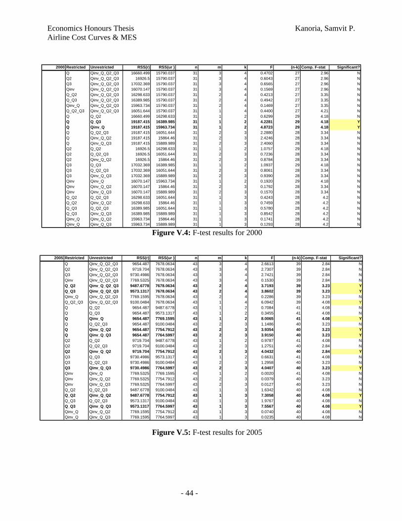
RSS by regressing AC on Q Q2 Q3 Qinv Q_Q2 Q_Q3 Qinv_Q Q_Q2_Q3 Qinv_Q_Q2 Qinv_Q_Q3 Qinv_Q_Q2_Q31990 17904.68 18657.31 18913.57 10712.19 16801.93 17273.59 10590.01 14170.93 10471.39 10539.57 9823.761995 19187.42 20379.56 20716.26 18345.53 17287.62 17932.94 17483.03 15422.75 16552.31 16918.01 15232.702000 16660.50 16926.50 17032.37 16070.15 16298.63 16389.99 15963.73 16051.64 15864.46 15889.99 15790.042005 9654.49 9719.70 9730.50 7769.53 9487.68 9573.13 7769.16 9100.05 7754.79 7764.60 7678.06
1990 Restricted Unrestricted RSS(r) RSS(ur ) n m k F (n-k) Comp. F-stat Significant?Q Qinv_Q_Q2_Q3 17904.676 9823.7622 19 3 4 2.2566 15 3.29 NQ2 Qinv_Q_Q2_Q3 18657.307 9823.7622 19 3 4 2.3673 15 3.29 NQ3 Qinv_Q_Q2_Q3 18913.566 9823.7622 19 3 4 2.4030 15 3.29 NQinv Qinv_Q_Q2_Q3 10712.185 9823.7622 19 3 4 0.4147 15 3.29 NQ_Q2 Qinv_Q_Q2_Q3 16801.933 9823.7622 19 2 4 3.1149 15 3.68 NQ_Q3 Qinv_Q_Q2_Q3 17273.593 9823.7622 19 2 4 3.2346 15 3.68 NQinv_Q Qinv_Q_Q2_Q3 10590.007 9823.7622 19 2 4 0.5427 15 3.68 NQ_Q2_Q3 Qinv_Q_Q2_Q3 14170.929 9823.7622 19 1 4 4.6015 15 4.54 YQ Q_Q2 17904.676 16801.933 19 1 2 1.0470 17 4.45 NQ Q_Q3 17904.676 17273.593 19 1 2 0.5992 17 4.45 NQ Qinv_Q 17904.676 10590.007 19 1 2 6.9451 17 4.45 YQ Q_Q2_Q3 17904.676 14170.929 19 2 3 1.6683 16 3.63 NQ Qinv_Q_Q2 17904.676 10471.394 19 2 3 3.3213 16 3.63 NQ Qinv_Q_Q3 17904.676 10539.568 19 2 3 3.2908 16 3.63 NQ2 Q_Q2 18657.307 16801.933 19 1 2 1.6906 17 4.45 NQ2 Q_Q2_Q3 20379.556 14170.929 19 2 3 2.4372 16 3.63 NQ2 Qinv_Q_Q2 16926.5 10471.394 19 2 3 3.0509 16 3.63 NQ3 Q_Q3 18913.566 17273.593 19 1 2 1.4740 17 4.45 NQ3 Q_Q2_Q3 18913.566 14170.929 19 2 3 2.0060 16 3.63 NQ3 Qinv_Q_Q3 18913.566 10539.568 19 2 3 3.5420 16 3.63 NQinv Qinv_Q 10712.185 10590.007 19 1 2 0.1939 17 4.45 NQinv Qinv_Q_Q2 10712.185 10471.394 19 2 3 0.1798 16 3.63 NQinv Qinv_Q_Q3 10712.185 10539.568 19 2 3 0.1289 16 3.63 NQ_Q2 Q_Q2_Q3 16801.933 14170.929 19 1 3 2.5054 16 4.49 NQ_Q2 Qinv_Q_Q2 16801.933 10471.394 19 1 3 6.0284 16 4.49 YQ_Q3 Q_Q2_Q3 17273.593 14170.929 19 1 3 2.8739 16 4.49 NQ_Q3 Qinv_Q_Q3 17273.593 10539.568 19 1 3 6.2375 16 4.49 YQinv_Q Qinv_Q_Q2 10590.007 10471.394 19 1 3 0.1792 16 4.49 NQinv_Q Qinv_Q_Q3 10590.007 10539.568 19 1 3 0.0762 16 4.49 N
1995 Restricted Unrestricted RSS(r) RSS(ur ) n m k F (n-k) Comp. F-stat Significant?Q Qinv_Q_Q2_Q3 19187.415 15232.699 27 3 4 1.5802 23 3.3 NQ2 Qinv_Q_Q2_Q3 20379.556 15232.699 27 3 4 1.9362 23 3.3 NQ3 Qinv_Q_Q2_Q3 20716.256 15232.699 27 3 4 2.0294 23 3.3 NQinv Qinv_Q_Q2_Q3 18345.525 15232.699 27 3 4 1.3009 23 3.3 NQ_Q2 Qinv_Q_Q2_Q3 17287.617 15232.699 27 2 4 1.3670 23 3.42 NQ_Q3 Qinv_Q_Q2_Q3 17932.935 15232.699 27 2 4 1.7316 23 3.42 NQinv_Q Qinv_Q_Q2_Q3 17483.029 15232.699 27 2 4 1.4802 23 3.42 NQ_Q2_Q3 Qinv_Q_Q2_Q3 15422.752 15232.699 27 1 4 0.2834 23 4.28 NQ Q_Q2 19187.415 17287.617 27 1 2 2.4753 25 4.24 NQ Q_Q3 19187.415 17932.935 27 1 2 1.6345 25 4.24 NQ Qinv_Q 19187.415 17483.029 27 1 2 2.2207 25 2.24 NQ Q_Q2_Q3 19187.415 15422.752 27 2 3 2.3545 24 3.4 NQ Qinv_Q_Q2 19187.415 16552.307 27 2 3 1.6480 24 3.4 NQ Qinv_Q_Q3 19187.415 16918.006 27 2 3 1.4193 24 3.4 NQ2 Q_Q2 20379.556 17287.617 27 1 2 3.7929 25 4.24 NQ2 Q_Q2_Q3 20379.556 15422.752 27 2 3 2.9187 24 3.4 NQ2 Qinv_Q_Q2 20379.556 16552.307 27 2 3 2.2536 24 3.4 NQ3 Q_Q3 20716.256 17932.935 27 1 2 3.3589 25 4.24 NQ3 Q_Q2_Q3 20716.256 15422.752 27 2 3 3.0663 24 3.4 NQ3 Qinv_Q_Q3 20716.256 16918.006 27 2 3 2.2002 24 3.4 NQinv Qinv_Q 18345.525 17483.029 27 1 2 1.1753 25 4.24 NQinv Qinv_Q_Q2 18345.525 16552.307 27 2 3 1.1730 24 3.4 NQinv Qinv_Q_Q3 18345.525 16918.006 27 2 3 0.9338 24 3.4 NQ_Q2 Q_Q2_Q3 17287.617 15422.752 27 1 3 2.5889 24 4.26 NQ_Q2 Qinv_Q_Q2 17287.617 16552.307 27 1 3 1.0208 24 4.26 NQ_Q3 Q_Q2_Q3 17932.935 15422.752 27 1 3 3.3594 24 4.26 NQ_Q3 Qinv_Q_Q3 17932.935 16918.006 27 1 3 1.3583 24 4.26 NQinv_Q Qinv_Q_Q2 17483.029 16552.307 27 1 3 1.2777 24 4.26 NQinv_Q Qinv_Q_Q3 17483.029 16918.006 27 1 3 0.7756 24 4.26 N
Figure V.1: RSS results for each nested regression
Figure V.2: F-test results for 1990
Figure V.3: F-test results for 1995
Economics Honours Thesis Kanoria, Samvit P. Airline Cost Curves & MES
- 44 -
2000 Restricted Unrestricted RSS(r) RSS(ur ) n m k F (n-k) Comp. F-stat Significant?Q Qinv_Q_Q2_Q3 16660.499 15790.037 31 3 4 0.4702 27 2.96 NQ2 Qinv_Q_Q2_Q3 16926.5 15790.037 31 3 4 0.6043 27 2.96 NQ3 Qinv_Q_Q2_Q3 17032.369 15790.037 31 3 4 0.6565 27 2.96 NQinv Qinv_Q_Q2_Q3 16070.147 15790.037 31 3 4 0.1569 27 2.96 NQ_Q2 Qinv_Q_Q2_Q3 16298.633 15790.037 31 2 4 0.4213 27 3.35 NQ_Q3 Qinv_Q_Q2_Q3 16389.985 15790.037 31 2 4 0.4942 27 3.35 NQinv_Q Qinv_Q_Q2_Q3 15963.734 15790.037 31 2 4 0.1469 27 3.35 NQ_Q2_Q3 Qinv_Q_Q2_Q3 16051.644 15790.037 31 1 4 0.4400 27 4.21 NQ Q_Q2 16660.499 16298.633 31 1 2 0.6299 29 4.18 NQ Q_Q3 19187.415 16389.985 31 1 2 4.2281 29 4.18 YQ Qinv_Q 19187.415 15963.734 31 1 2 4.8723 29 4.18 YQ Q_Q2_Q3 19187.415 16051.644 31 2 3 2.2880 28 3.34 NQ Qinv_Q_Q2 19187.415 15864.46 31 2 3 2.4246 28 3.34 NQ Qinv_Q_Q3 19187.415 15889.989 31 2 3 2.4060 28 3.34 NQ2 Q_Q2 16926.5 16298.633 31 1 2 1.0757 29 4.18 NQ2 Q_Q2_Q3 16926.5 16051.644 31 2 3 0.7236 28 3.34 NQ2 Qinv_Q_Q2 16926.5 15864.46 31 2 3 0.8784 28 3.34 NQ3 Q_Q3 17032.369 16389.985 31 1 2 1.0937 29 4.18 NQ3 Q_Q2_Q3 17032.369 16051.644 31 2 3 0.8061 28 3.34 NQ3 Qinv_Q_Q3 17032.369 15889.989 31 2 3 0.9390 28 3.34 NQinv Qinv_Q 16070.147 15963.734 31 1 2 0.1920 29 4.18 NQinv Qinv_Q_Q2 16070.147 15864.46 31 2 3 0.1792 28 3.34 NQinv Qinv_Q_Q3 16070.147 15889.989 31 2 3 0.1570 28 3.34 NQ_Q2 Q_Q2_Q3 16298.633 16051.644 31 1 3 0.4243 28 4.2 NQ_Q2 Qinv_Q_Q2 16298.633 15864.46 31 1 3 0.7459 28 4.2 NQ_Q3 Q_Q2_Q3 16389.985 16051.644 31 1 3 0.5780 28 4.2 NQ_Q3 Qinv_Q_Q3 16389.985 15889.989 31 1 3 0.8542 28 4.2 NQinv_Q Qinv_Q_Q2 15963.734 15864.46 31 1 3 0.1741 28 4.2 NQinv_Q Qinv_Q_Q3 15963.734 15889.989 31 1 3 0.1293 28 4.2 N
2005 Restricted Unrestricted RSS(r) RSS(ur ) n m k F (n-k) Comp. F-stat Significant?Q Qinv_Q_Q2_Q3 9654.487 7678.0634 43 3 4 2.6613 39 2.84 NQ2 Qinv_Q_Q2_Q3 9719.704 7678.0634 43 3 4 2.7307 39 2.84 NQ3 Qinv_Q_Q2_Q3 9730.4986 7678.0634 43 3 4 2.7421 39 2.84 NQinv Qinv_Q_Q2_Q3 7769.5325 7678.0634 43 3 4 0.1530 39 2.84 NQ_Q2 Qinv_Q_Q2_Q3 9487.6778 7678.0634 43 2 4 3.7193 39 3.23 YQ_Q3 Qinv_Q_Q2_Q3 9573.1317 7678.0634 43 2 4 3.8602 39 3.23 YQinv_Q Qinv_Q_Q2_Q3 7769.1595 7678.0634 43 2 4 0.2286 39 3.23 NQ_Q2_Q3 Qinv_Q_Q2_Q3 9100.0484 7678.0634 43 1 4 6.0942 39 4.08 YQ Q_Q2 9654.487 9487.6778 43 1 2 0.7084 41 4.08 NQ Q_Q3 9654.487 9573.1317 43 1 2 0.3455 41 4.08 NQ Qinv_Q 9654.487 7769.1595 43 1 2 8.0065 41 4.08 YQ Q_Q2_Q3 9654.487 9100.0484 43 2 3 1.1486 40 3.23 NQ Qinv_Q_Q2 9654.487 7754.7912 43 2 3 3.9354 40 3.23 YQ Qinv_Q_Q3 9654.487 7764.5997 43 2 3 3.9150 40 3.23 YQ2 Q_Q2 9719.704 9487.6778 43 1 2 0.9787 41 4.08 NQ2 Q_Q2_Q3 9719.704 9100.0484 43 2 3 1.2751 40 2.84 NQ2 Qinv_Q_Q2 9719.704 7754.7912 43 2 3 4.0432 40 2.84 YQ3 Q_Q3 9730.4986 9573.1317 43 1 2 0.6631 41 4.08 NQ3 Q_Q2_Q3 9730.4986 9100.0484 43 2 3 1.2958 40 3.23 NQ3 Qinv_Q_Q3 9730.4986 7764.5997 43 2 3 4.0407 40 3.23 YQinv Qinv_Q 7769.5325 7769.1595 43 1 2 0.0020 41 4.08 NQinv Qinv_Q_Q2 7769.5325 7754.7912 43 2 3 0.0379 40 3.23 NQinv Qinv_Q_Q3 7769.5325 7764.5997 43 2 3 0.0127 40 3.23 NQ_Q2 Q_Q2_Q3 9487.6778 9100.0484 43 1 3 1.6342 40 4.08 NQ_Q2 Qinv_Q_Q2 9487.6778 7754.7912 43 1 3 7.3058 40 4.08 YQ_Q3 Q_Q2_Q3 9573.1317 9100.0484 43 1 3 1.9767 40 4.08 NQ_Q3 Qinv_Q_Q3 9573.1317 7764.5997 43 1 3 7.5567 40 4.08 YQinv_Q Qinv_Q_Q2 7769.1595 7754.7912 43 1 3 0.0740 40 4.08 NQinv_Q Qinv_Q_Q3 7769.1595 7764.5997 43 1 3 0.0235 40 4.08 N
Figure V.4: F-test results for 2000
Figure V.5: F-test results for 2005

Economics Honours Thesis Kanoria, Samvit P. Airline Cost Curves & MES
- 45 -
Q (AC+1s.e.)
Q (AC+2s.e) Mean AC Median AC Mean Q Median Q
26.15 13.07 50.07 36.07 597.61 134.8434.96 17.48 55.31 40.33 568.08 35.0669.00 34.50 51.72 42.47 648.48 91.9730.69 15.35 54.50 52.96 544.71 124.12
1990199520002005
k s.e.(k ) β s.e.(β) Asymp. ACAsymp. AC +
1s.e.Asymp. AC +
2s.e.
1990 39.39478 6.404639 167.4645 43.97627 39.39 45.80 52.201995 46.55871 6.560328 229.3714 104.4104 46.56 53.12 59.682000 45.79524 5.74216 396.2312 259.6505 45.80 51.54 57.282005 51.74434 2.265038 69.51408 21.46668 51.74 54.01 56.27
Asymp. ACAsymp. AC +
1s.e.Asymp. AC +
2s.e.Q
(AC+1s.e.)
Scaled Averages 45.87 51.12 56.36 40.20Un-scaled Averages (in millions) 46$ 51$ 56$ 4,020
Q (AC+2s.e) Mean AC Median AC Mean Q Median Q
20.10 52.90 42.96 589.72 96.502,010 53$ 43$ 58,972 9,650
Scaled AveragesUn-scaled Averages (in millions)
Figure V.6: MES Calculations & Results