a few design ideas. f1, ctrl+alt+del, alt tab “is the side navigation menu a dead feature?”
TRANSCRIPT
A Few Design Ideas
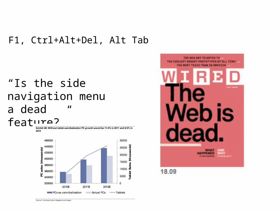
F1, Ctrl+Alt+Del, Alt Tab
“Is the side navigation menu a dead feature?”
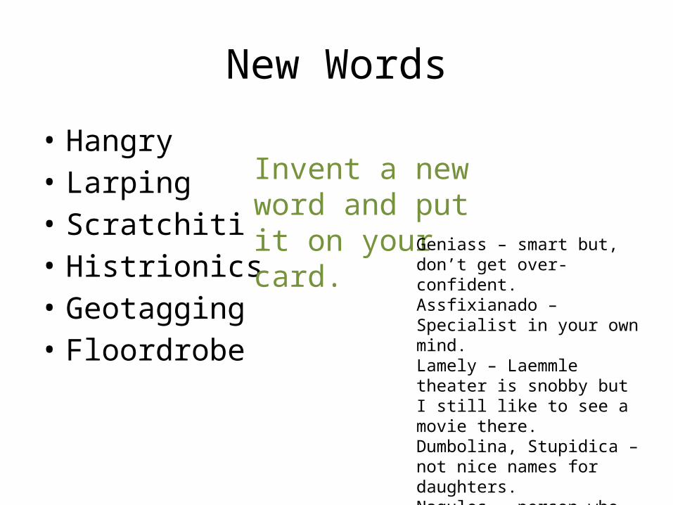
New Words
• Hangry• Larping• Scratchiti• Histrionics• Geotagging• Floordrobe
Invent a new word and put it on your card. Geniass – smart but, don’t get
over-confident.Assfixianado – Specialist in your own mind.Lamely – Laemmle theater is snobby but I still like to see a movie there.Dumbolina, Stupidica – not nice names for daughters. Nagules – person who nags like Hercules.itis – an affliction postfix
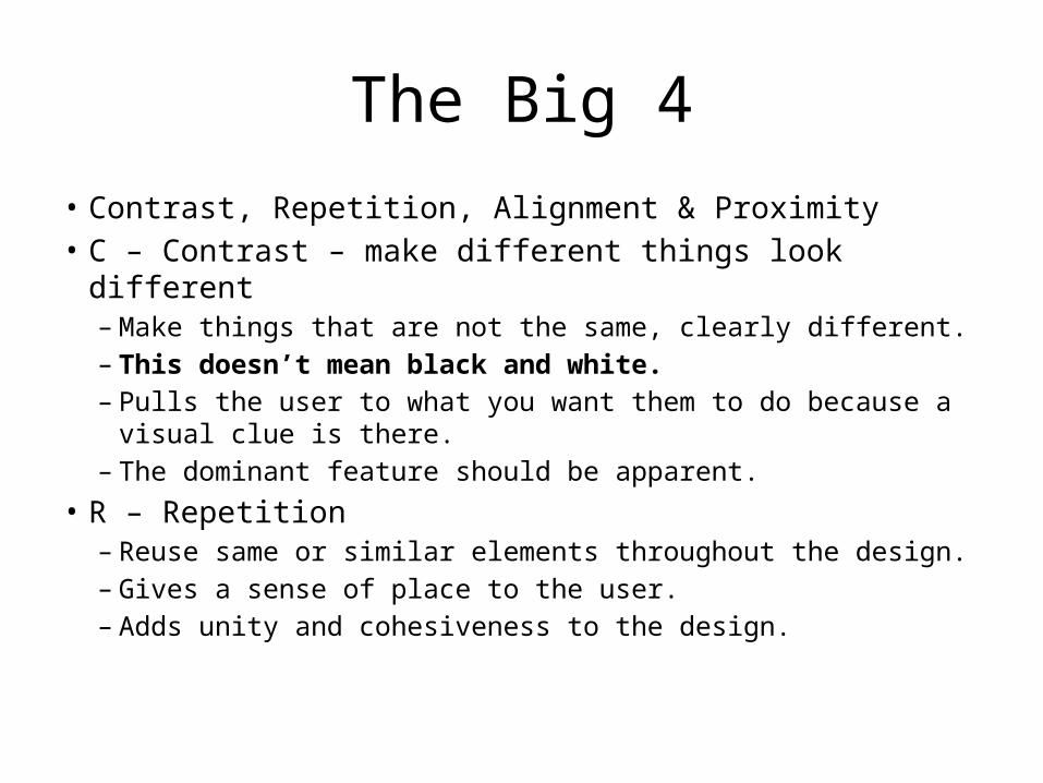
The Big 4
• Contrast, Repetition, Alignment & Proximity• C – Contrast – make different things look different
– Make things that are not the same, clearly different.– This doesn’t mean black and white.– Pulls the user to what you want them to do because a visual
clue is there.– The dominant feature should be apparent.
• R – Repetition– Reuse same or similar elements throughout the design.– Gives a sense of place to the user.– Adds unity and cohesiveness to the design.
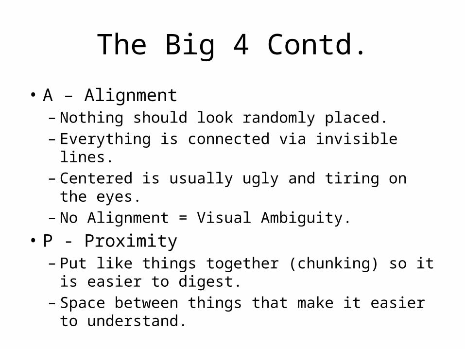
The Big 4 Contd.
• A – Alignment– Nothing should look randomly placed.– Everything is connected via invisible lines.– Centered is usually ugly and tiring on the eyes.– No Alignment = Visual Ambiguity.
• P - Proximity– Put like things together (chunking) so it is easier to
digest.– Space between things that make it easier to
understand.
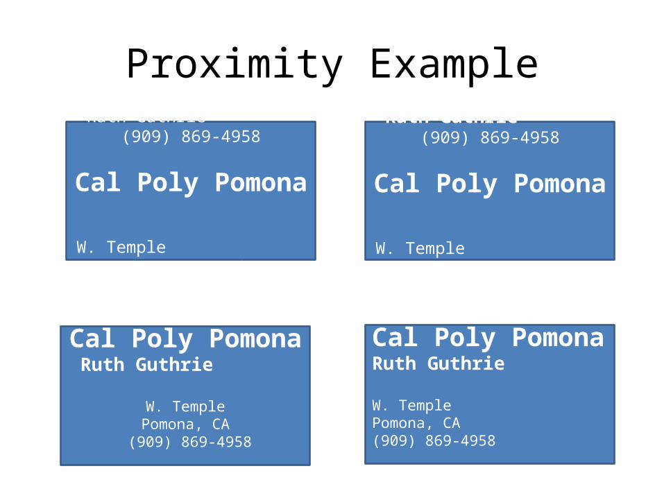
Proximity Example
Ruth Guthrie (909) 869-4958
Cal Poly Pomona
W. Temple Pomona, CA
Ruth Guthrie (909) 869-4958
Cal Poly Pomona
W. Temple Pomona, CA
Cal Poly PomonaRuth Guthrie
W. TemplePomona, CA
(909) 869-4958
Cal Poly PomonaRuth Guthrie
W. TemplePomona, CA(909) 869-4958
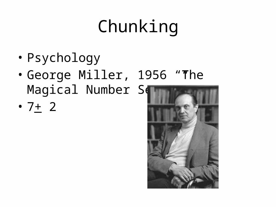
Chunking
• Psychology• George Miller, 1956 “The Magical Number
Seven”• 7+ 2
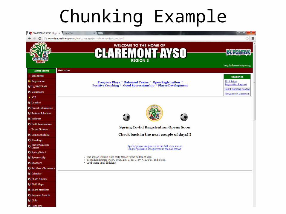
Chunking Example
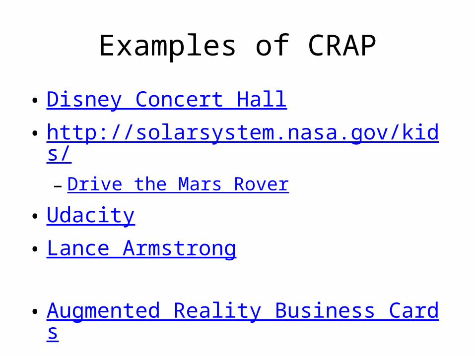
Examples of CRAP
• Disney Concert Hall• http://solarsystem.nasa.gov/kids/– Drive the Mars Rover
• Udacity• Lance Armstrong
• Augmented Reality Business Cards
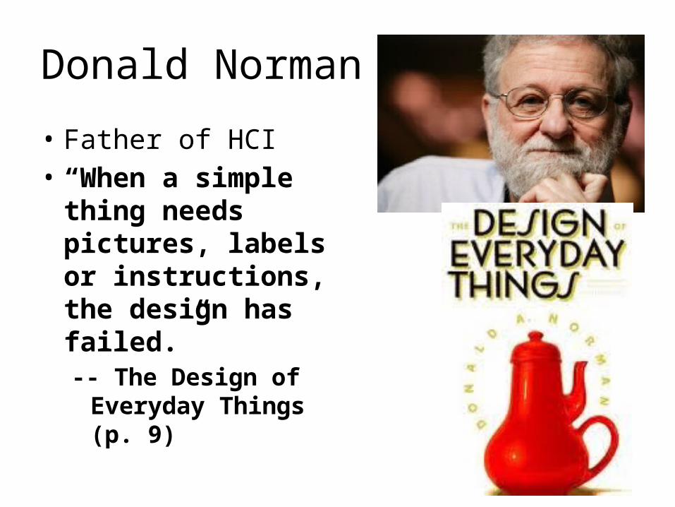
Donald Norman
• Father of HCI• “When a simple thing
needs pictures, labels or instructions, the design has failed.” -- The Design of
Everyday Things (p. 9)
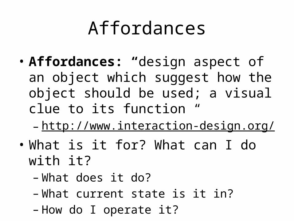
Affordances
• Affordances: “design aspect of an object which suggest how the object should be used; a visual clue to its function “– http://www.interaction-design.org/
• What is it for? What can I do with it? – What does it do?– What current state is it in?– How do I operate it?
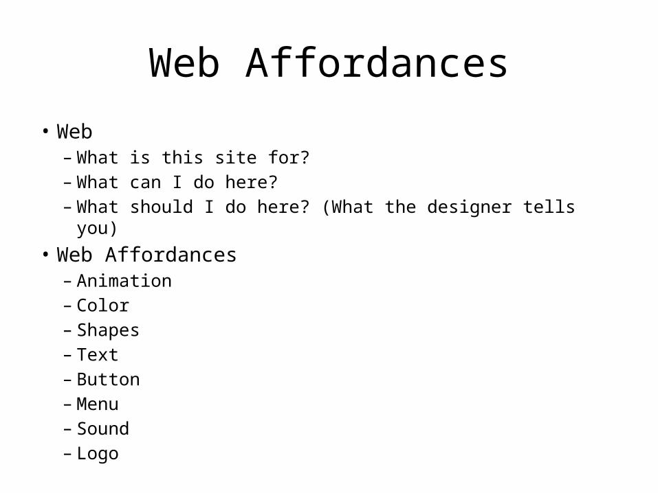
Web Affordances
• Web – What is this site for?– What can I do here?– What should I do here? (What the designer tells you)
• Web Affordances – Animation– Color– Shapes– Text– Button– Menu– Sound– Logo
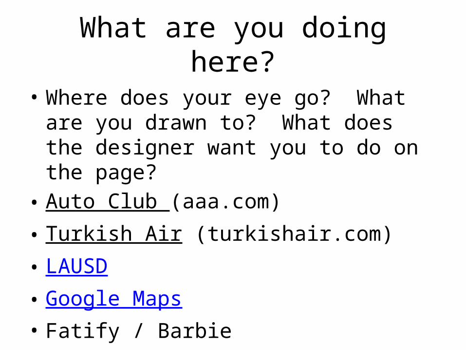
What are you doing here?
• Where does your eye go? What are you drawn to? What does the designer want you to do on the page?
• Auto Club (aaa.com)• Turkish Air (turkishair.com)• LAUSD• Google Maps• Fatify / Barbie
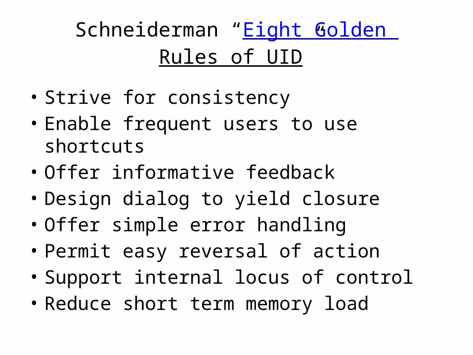
Schneiderman “Eight Golden Rules of UID”
• Strive for consistency• Enable frequent users to use shortcuts• Offer informative feedback• Design dialog to yield closure• Offer simple error handling• Permit easy reversal of action• Support internal locus of control• Reduce short term memory load
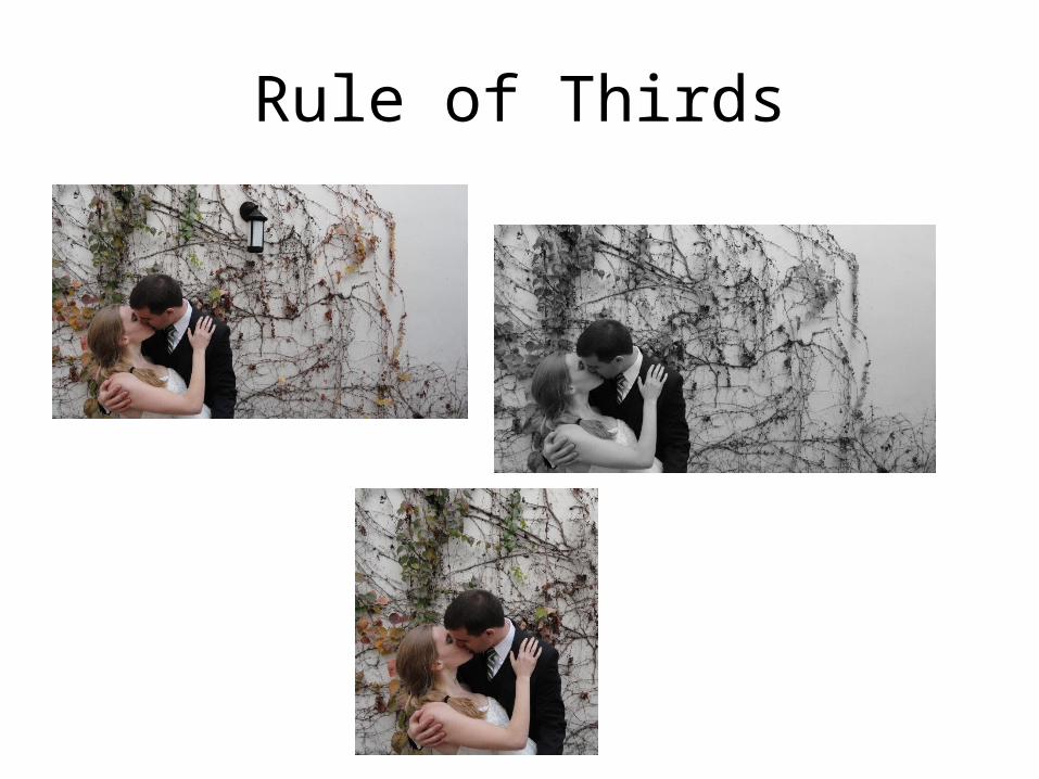
Rule of Thirds
Anthropomorphic Design
• http://www.youtube.com/watch?v=cO1xxafO59Y
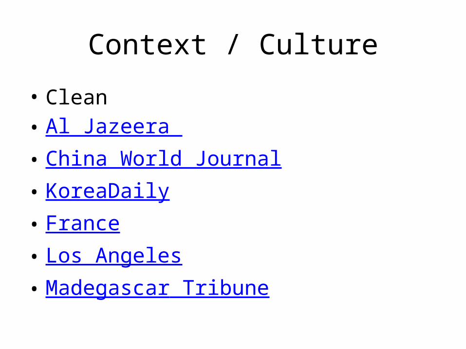
Context / Culture
• Clean• Al Jazeera • China World Journal• KoreaDaily• France• Los Angeles• Madegascar Tribune
• HTML5 & CSS Makes Design so Easy and Expected that none of it Matters