2014 ux/ui trends for mobile solutions
TRANSCRIPT
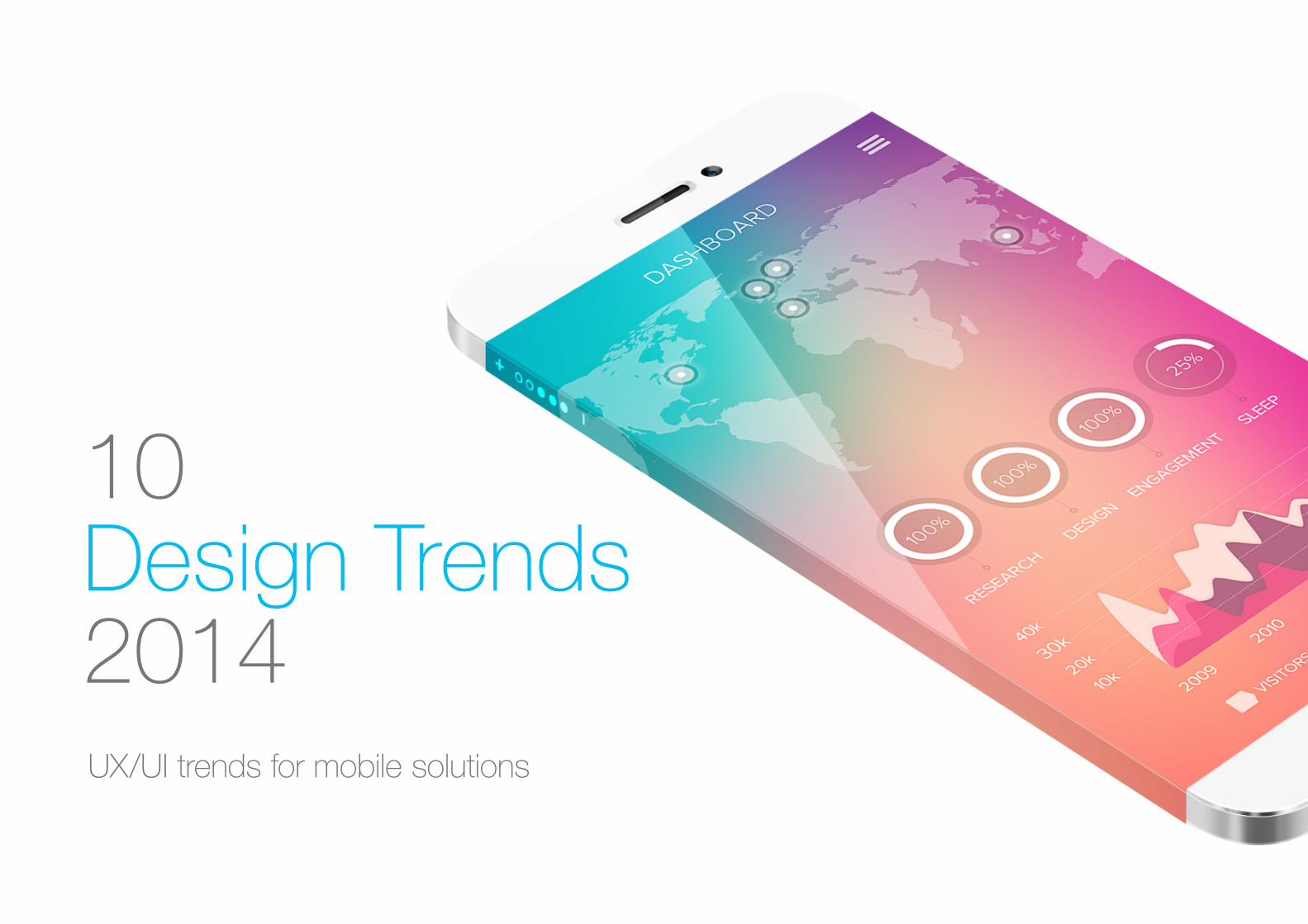
10 Design Trends2014UX/UI trends for mobile solutions

In the past year we have seen less and less skeumorphic design
but this doesn’t mean that we’re moving towards two dimensional
interfaces. On the contrary, interfaces will become more layered and
taking full advantage of the z-axis. This approach gives a sense of
depth to the interface making the experience more tangible.
1. Layered Interfaces
Why do it?
Done right, this approach gives a real sense of 3D depth and will
establish a clear relationship between elements and interactions. This
is achieved by putting elements not in use at the back while placing
current interaction at the front.
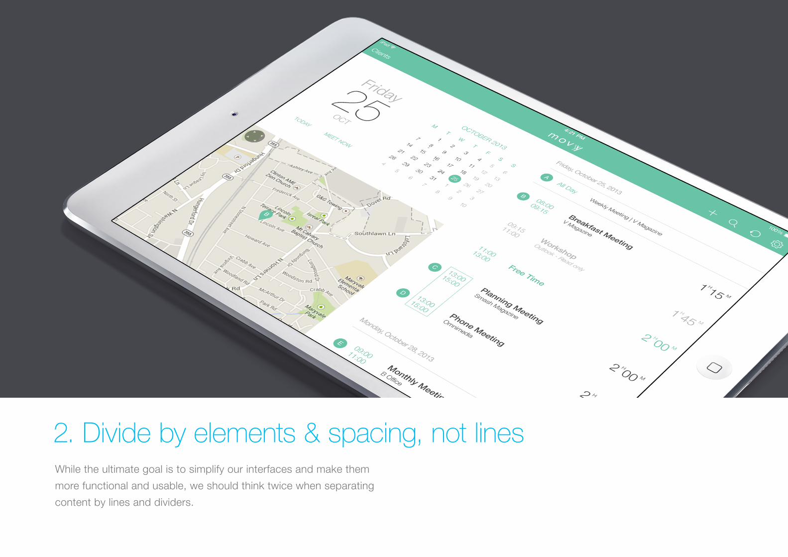
While the ultimate goal is to simplify our interfaces and make them
more functional and usable, we should think twice when separating
content by lines and dividers.
2. Divide by elements & spacing, not lines
Why do it?
UI design is moving towards removing any unnecessary elements to
focus much more on functionality. Less lines and dividers will always
give your interface a cleaner, modern and more functional feel.
Always remember that there are other ways to separate content with
methods such as using blocks, spacing or different colors.
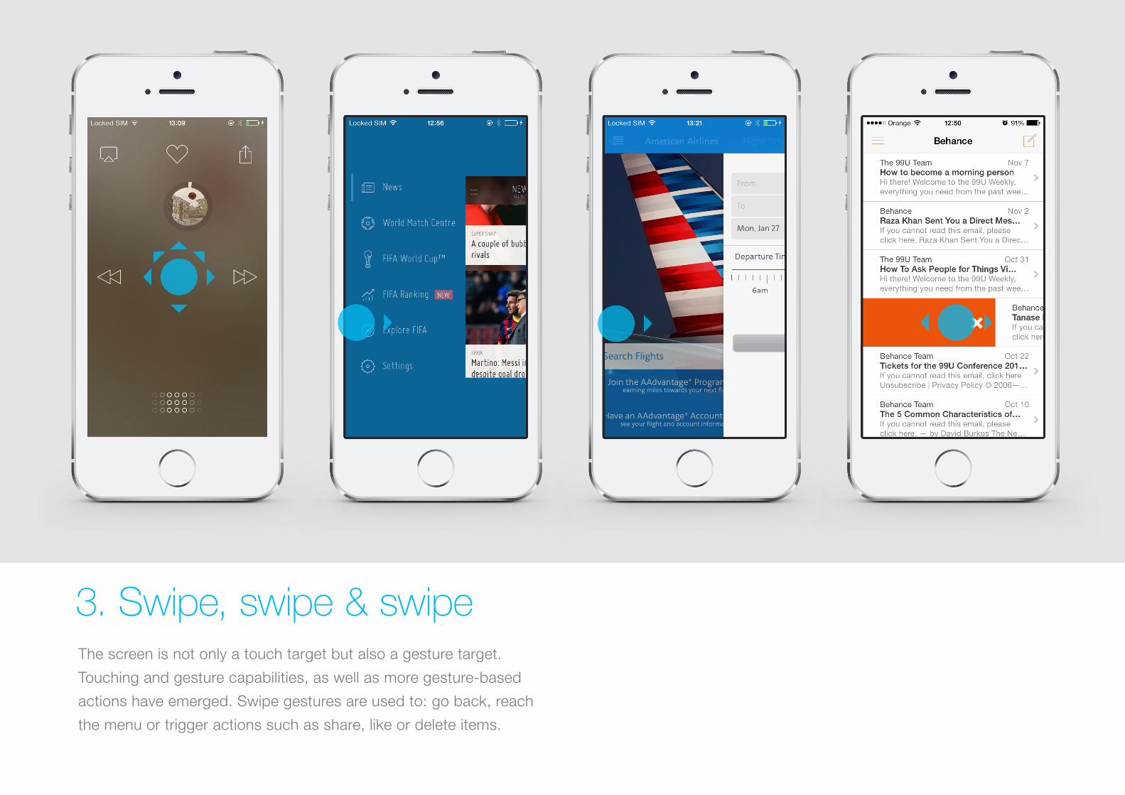
The screen is not only a touch target but also a gesture target.
Touching and gesture capabilities, as well as more gesture-based
actions have emerged. Swipe gestures are used to: go back, reach
the menu or trigger actions such as share, like or delete items.
3. Swipe, swipe & swipe
Why do it?
Although it may not be entirely self-evident initially, a gesture, once
discovered and learned, can become a delight to use and can bring
“magic” to the user experience, reducing steps in the user flow while
interacting with the interface. This allows for a quicker, more efficient
and comfortable experience for hand gestures since a larger area of
the screen is used for a function.
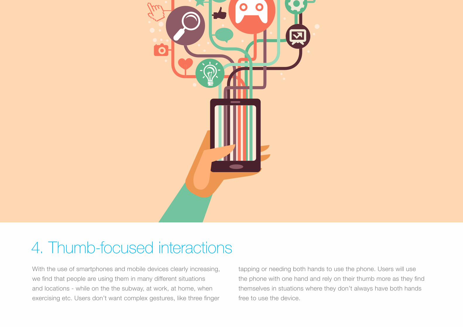
With the use of smartphones and mobile devices clearly increasing,
we find that people are using them in many different situations
and locations - while on the the subway, at work, at home, when
exercising etc. Users don’t want complex gestures, like three finger
tapping or needing both hands to use the phone. Users will use
the phone with one hand and rely on their thumb more as they find
themselves in stuations where they don’t always have both hands
free to use the device.
4. Thumb-focused interactions

Why do it?
When designing, take into consideration that your app will be used
in several contexts, people will not always be in the situation where
they can use more than one finger or both hands to interact with
your interface. Design for the lazy, this can increase the usage
of your app!
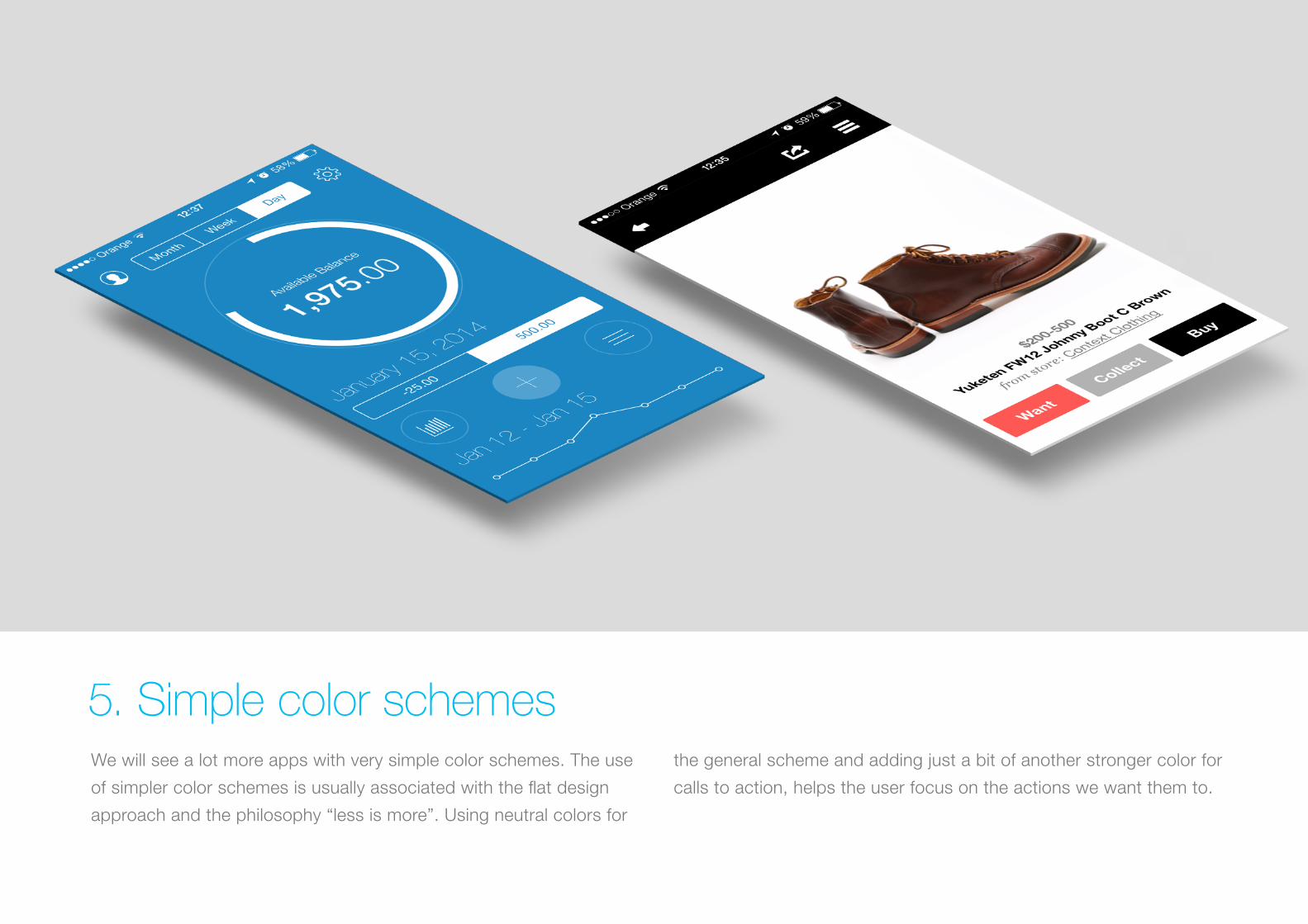
We will see a lot more apps with very simple color schemes. The use
of simpler color schemes is usually associated with the flat design
approach and the philosophy “less is more”. Using neutral colors for
the general scheme and adding just a bit of another stronger color for
calls to action, helps the user focus on the actions we want them to.
5. Simple color schemes
Why do it?
Simplifying the interface improves the user experience while having
too many colors can have a negative impact upon it. A good use of
colors highlights the action you want your users to carry out.
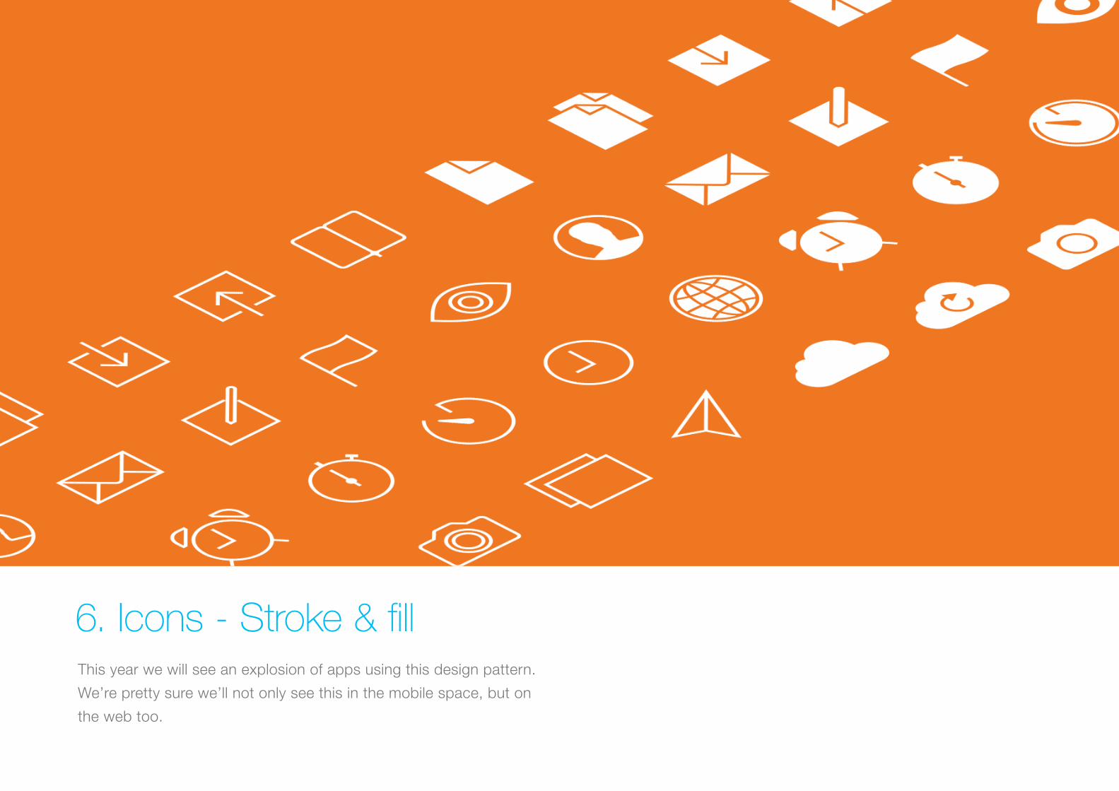
This year we will see an explosion of apps using this design pattern.
We’re pretty sure we’ll not only see this in the mobile space, but on
the web too.
6. Icons - Stroke & fill
Why do it?
This gives better contrast between active and inactive sections.
Recognition of active tabs, controls and toolbars is more straightforward.
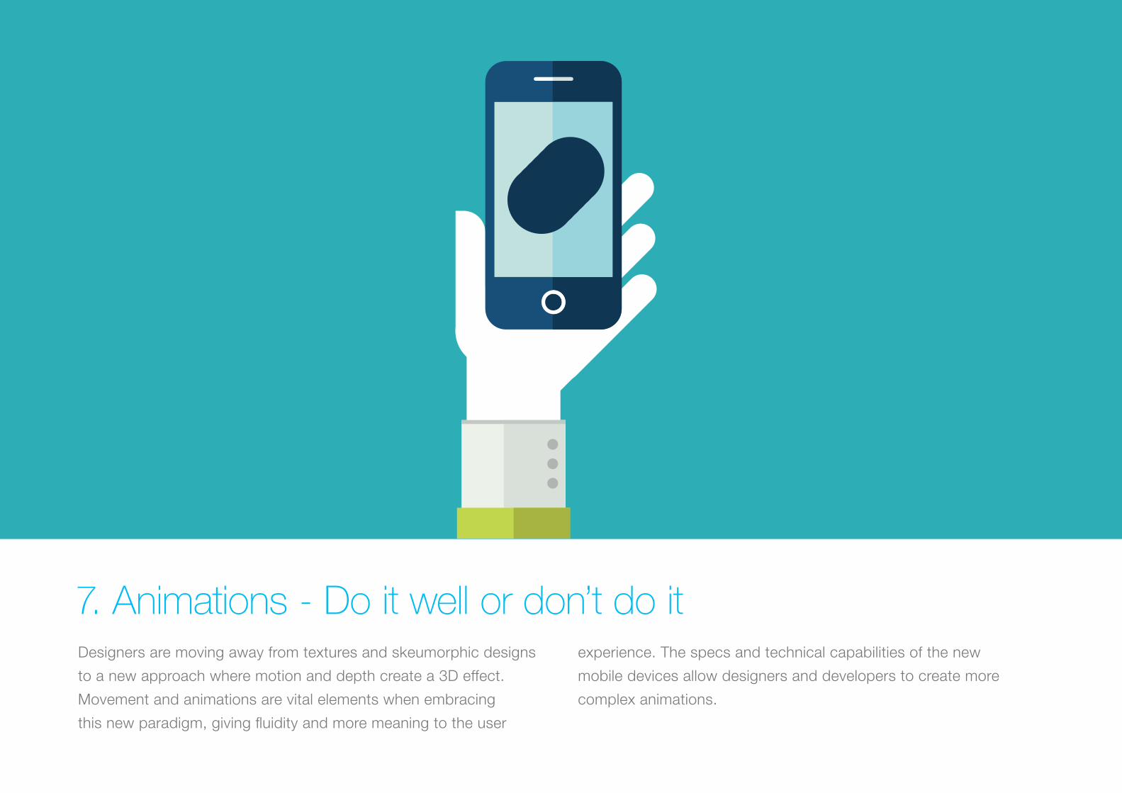
Designers are moving away from textures and skeumorphic designs
to a new approach where motion and depth create a 3D effect.
Movement and animations are vital elements when embracing
this new paradigm, giving fluidity and more meaning to the user
experience. The specs and technical capabilities of the new
mobile devices allow designers and developers to create more
complex animations.
7. Animations - Do it well or don’t do it
Why do it?
Animated demo tutorials are a great way to capture users’ attention
while educating them on how best to use the app for the first time.
But don’t animate just for the sake of it, have a clear motivation
behind the animation effects, the abuse of motion effects can
completely ruin the experience.
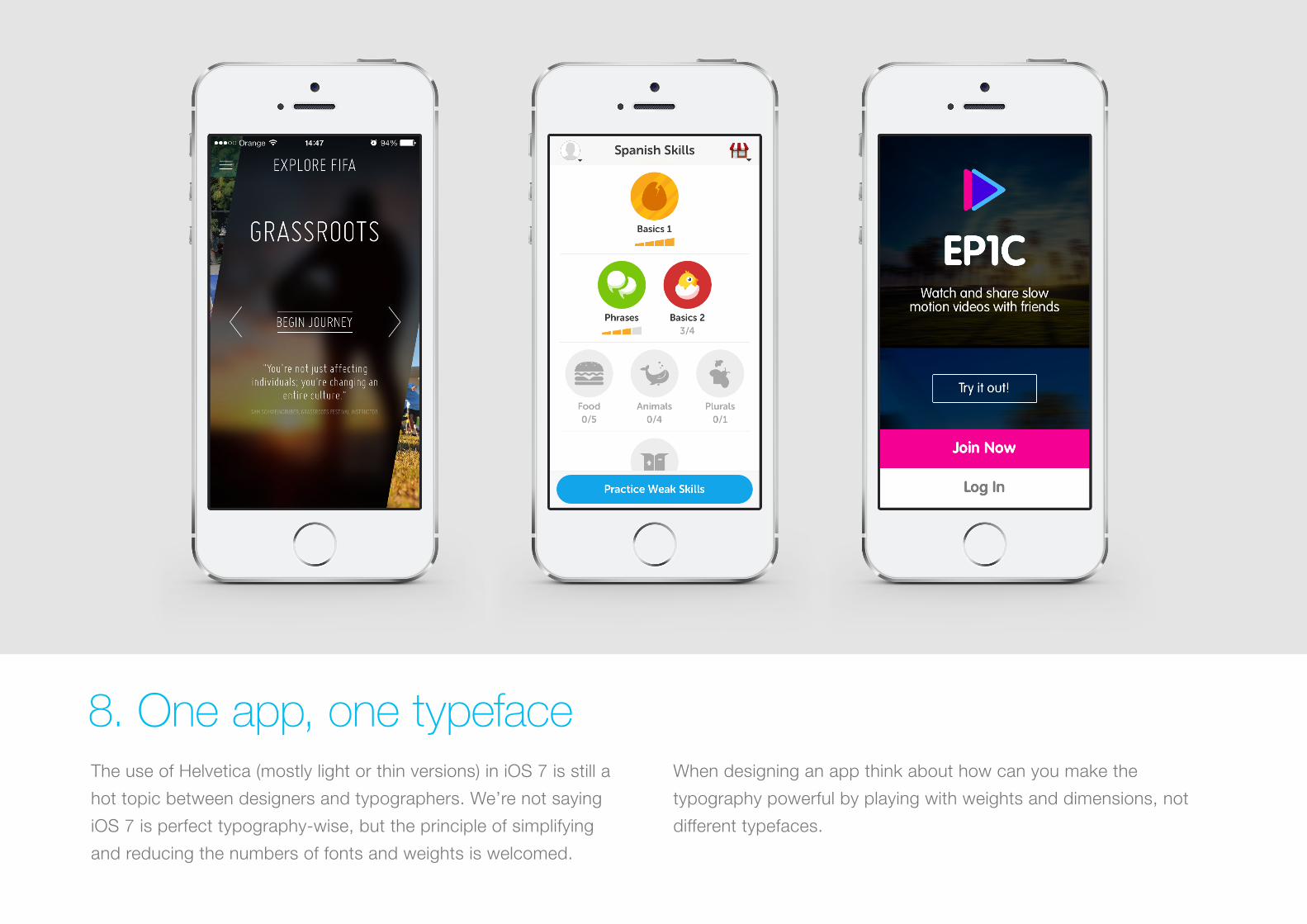
The use of Helvetica (mostly light or thin versions) in iOS 7 is still a
hot topic between designers and typographers. We’re not saying
iOS 7 is perfect typography-wise, but the principle of simplifying
and reducing the numbers of fonts and weights is welcomed.
When designing an app think about how can you make the
typography powerful by playing with weights and dimensions, not
different typefaces.
8. One app, one typeface

Why do it?
This one goes hand in hand with simplifying color schemes and user
elements, as well as using space as dividers. The ultimate goal is
simplicity, functionality and usability.
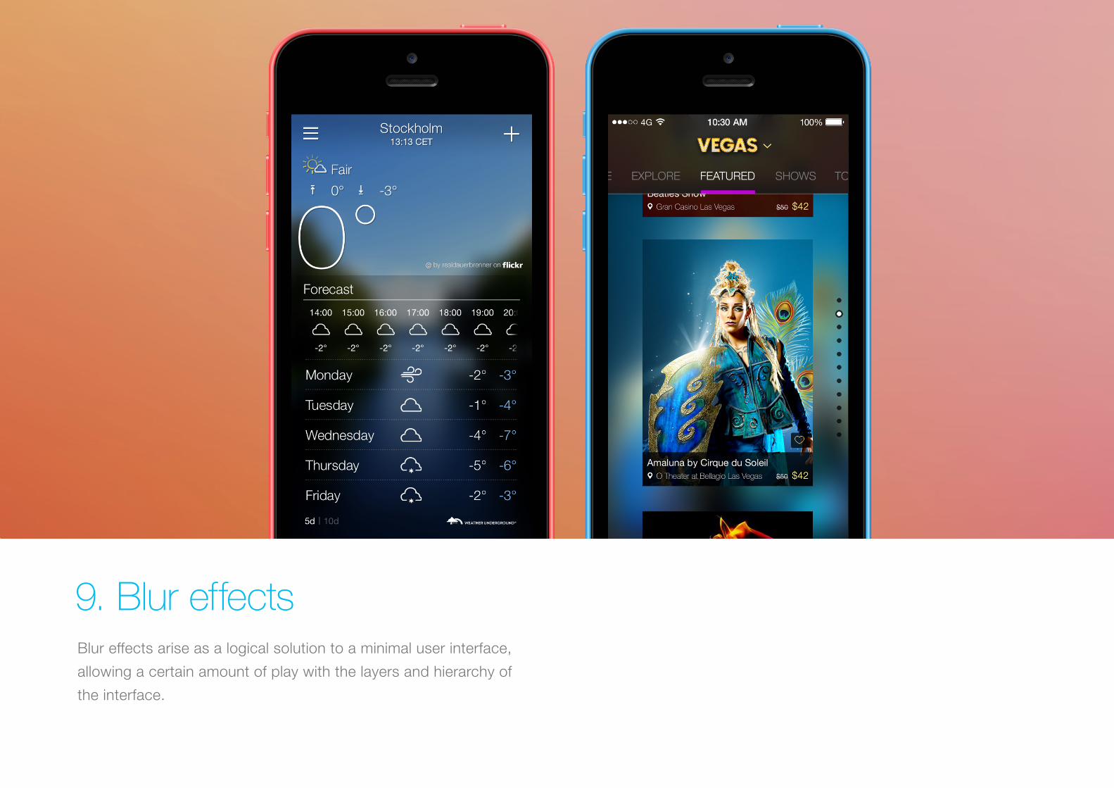
Blur effects arise as a logical solution to a minimal user interface,
allowing a certain amount of play with the layers and hierarchy of
the interface.
9. Blur effects
Why do it?
It’s a very efficient solution when working with layered UX/UI since
it gives the user a clear understanding of the mobile solution’s
flow and hierarchy. This also gives designers a perfect opportunity
to explore different menu and overlay solutions. Even though we
eventually might grow tired of the effect it is an effective solution at
the present time.
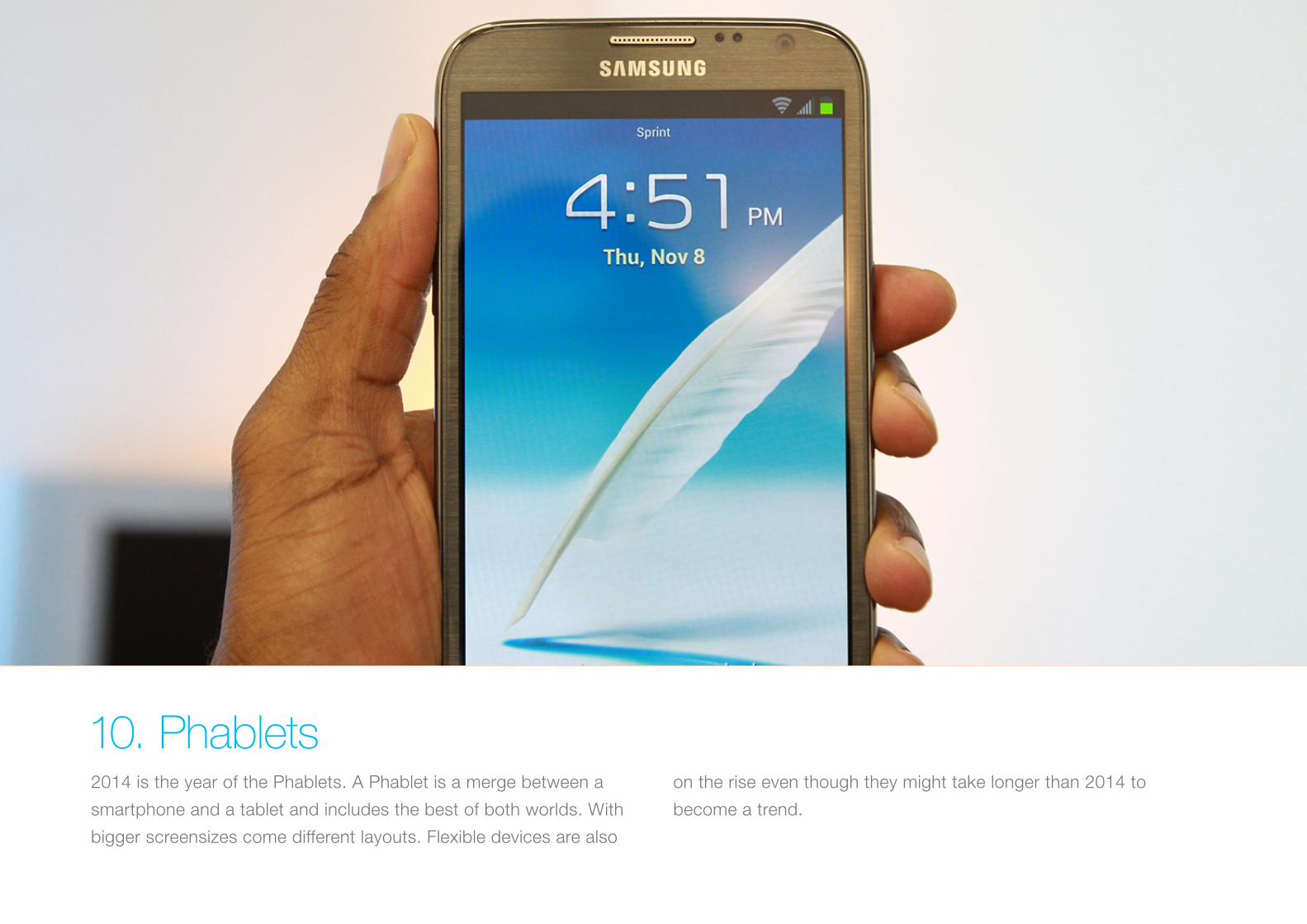
2014 is the year of the Phablets. A Phablet is a merge between a
smartphone and a tablet and includes the best of both worlds. With
bigger screensizes come different layouts. Flexible devices are also
on the rise even though they might take longer than 2014 to
become a trend.
10. Phablets
Why do it?
The introduction and rise of Phablets will allow for layout adaptation
and UX solutions which perhaps were only previously taken into
consideration for tablets. Android devices are already on the
market with the Galaxy Note 3, while Apple and Windows will, in all
likelihood, shortly follow with their own devices.
web www.goldengekko.com email [email protected]
Fighting for a world full of mobile solutionssince 2005