2010 senior portfolio
DESCRIPTION
BFA Student Portfolio - 2010 Academy of Art University San FranciscoTRANSCRIPT

wonder? yes
b y e

$$$
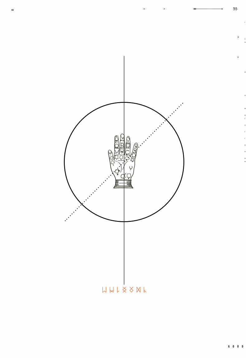
Good Feelings
Other:
i n c a s e o f l o s s , p l e a s e r e t u r n t o r e w a r d
g o o d
3no

w o n d e r ? yes
g o o d b y e

g o o d
no
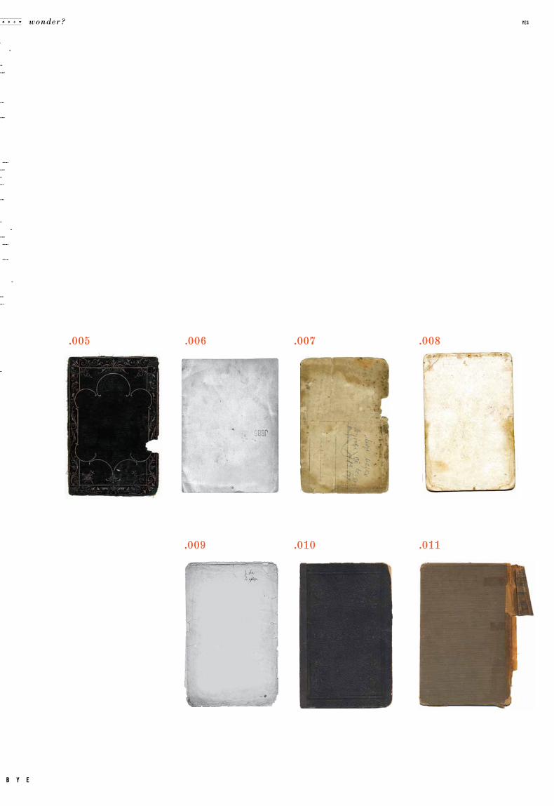
.009 .010
.005
.011
.006 .007 .008
wonder? yes
b y e
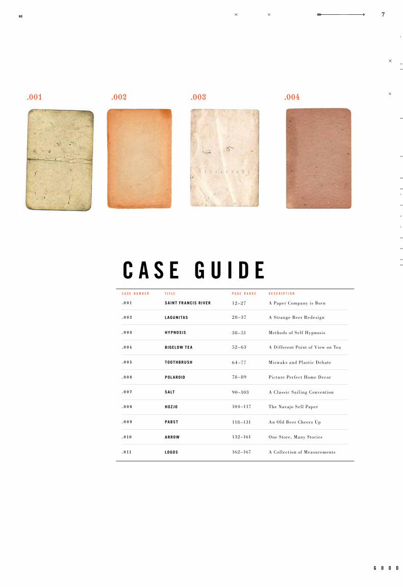
c a s e n u m b e r p a g e r a n g e d e s c r i p t i o nt i t l e
c a s e g u i d e
.003.001 .002 .004
.001
. 0 03
. 0 05
. 0 07
. 0 09
. 0 02
. 0 04
. 0 0 6
. 0 08
. 010
. 011
A Paper Company is Born
Methods of Sel f Hypnosis
Miswaks and Plast ic Debate
A Classic Sail ing Convent ion
An Old Beer Cheers Up
A Strange Beer Redesign
A Dif ferent Point of View on Tea
Picture Per fect Home Decor
The Navajo Sel l Paper
One Store, Many Stor ies
A Col lect ion of Measurements
12–27
38 – 51
64 –77
90 –103
118 –131
28 – 37
52– 63
78 – 89
104 –117
132–161
162–167
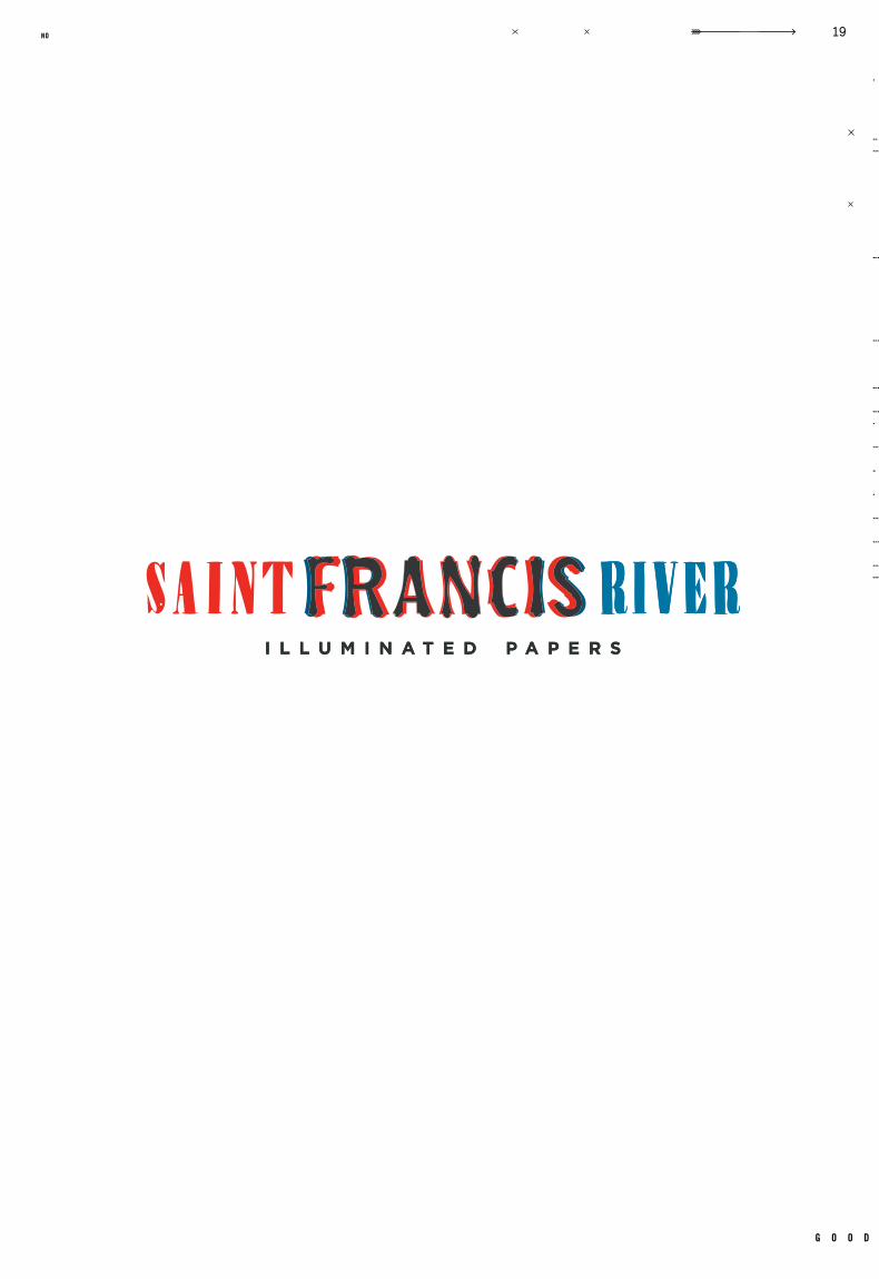
SA INT FR ANCIS R IVER
hypNoSIS
TooThbRuSh
SAlT
pAbST
l AguNITAS
bIgElow TE A
pol ARoId
hoz jo
ARRow
logoS
g o o d
7no

kr
is
te
n h
af
f
wonder? yes
b y e
po
rt
fo
li
o
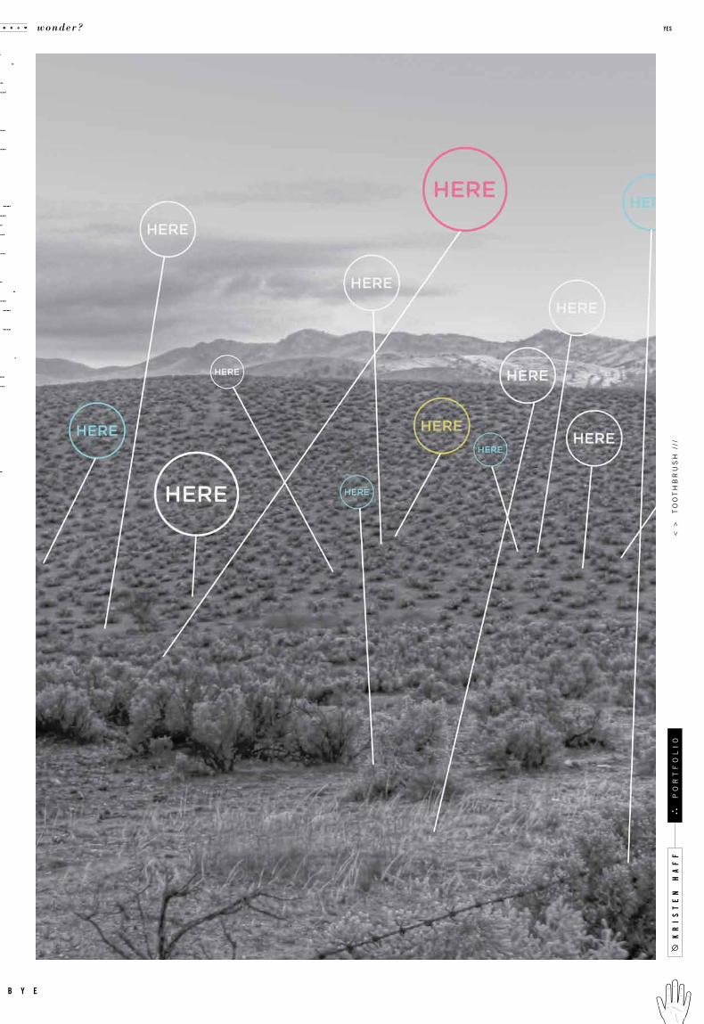
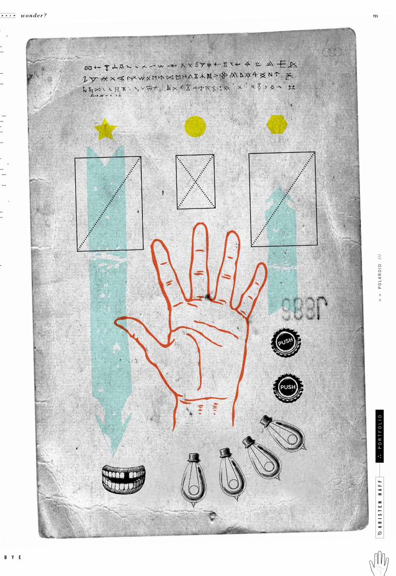
curiosit y transforms the world from ordinary to extraordinary. always be astonished
at what each day holds. even in the mundane, there are delicacies and secrets we must
continue to look for. from discarded tickets and reciepts, to the delicious hand lettering
on old store fronts, things we might never give a second glance hold a rich story we so
often miss. always be curious, nurture that sense of awe we came with as children. with
these eyes the world holds only mystery and strange be aut y. strive to marvel. ga ze
openmouthed. look for jewels in dust and footprints. this way our dreams are realized.
“Wonder, rather than doubt, is the root of all knowledge” –Abraham Heschel
n o t e s
q u o t e i c o n
c o n c e p t
g o o d
9no


c a s e
Identity
Packaging
GR 327
Graphic Design 2Fal l 20 08
Saint Francis River Paper Co.
Max Spector Misc. Woodblock Type, Bodoni, Gotham, Rosewood
Ident ity, Business System, Swatchbook Covers, Adver t isement , Invitat ion, Promotional Item, Giveaway
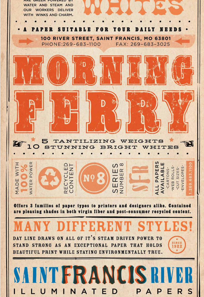
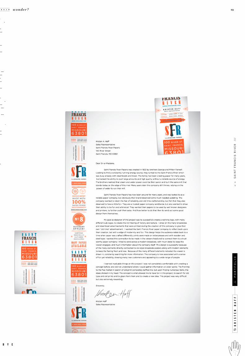
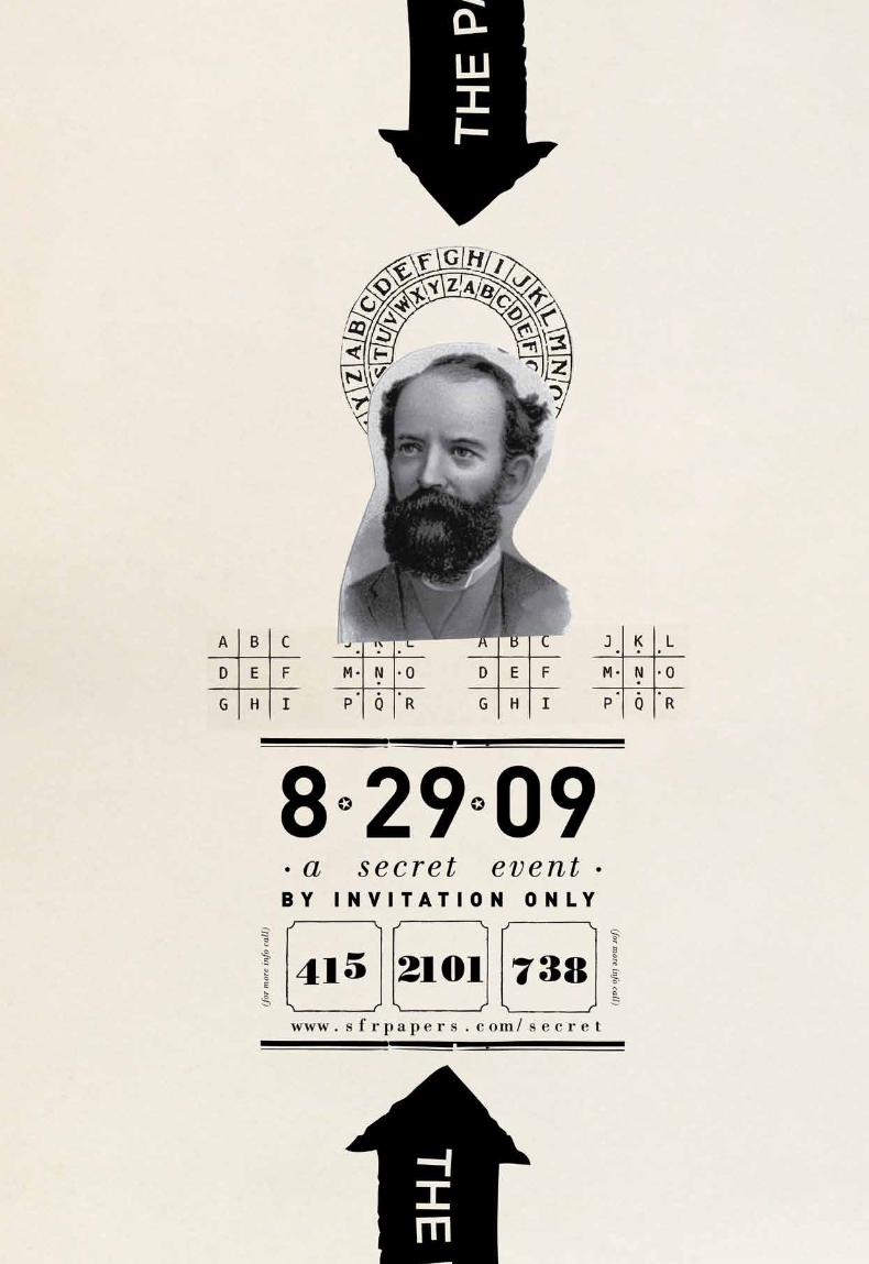
a fictitious paper company named saint francis river was drawn from a hat. the assignment
given was to create a complete identit y for the company, along with creating a set of
three swatch card covers. af ter the identit y was complete, the assigment transl ated
into designing a part y for the company, including posters, invitations, and giveaways.
a rich story had to be created about the company in order to begin concepting. before
a n y d esign wa s a l lo w ed, a h isto ri c pa per h a d to be w rit t en a b o u t t he c o mpa n y ’ s
background and owners. from this story many ide as and mysterys evolved. the group
was encouraged to dig deep into found t ypography at flea markets and old book shops.
from these finds a beautiful narrative developed, and saint francis river paper emerged.
c a s e t i t l e
o b j e c t i v e
c l a s s n u m b e r
d e l i v e r a b l e s
i n s t r u c t o r t y p e f a c e s
r e m a r k s g e n r e
d a t e c l a s s
.001
kr
is
te
n h
af
f
wonder? yes
b y e
po
rt
fo
li
o<
>
sa
int
fr
an
cis
riv
er
//
/
g o o d
13no
kr
is
te
n h
af
f
wonder? yes
b y e
po
rt
fo
li
o<
>
sa
int
fr
an
cis
riv
er
//
/

kr
is
te
n h
af
f
wonder? yes
b y e
po
rt
fo
li
o<
>
sa
int
fr
an
cis
riv
er
//
/
g o o d
19no
kr
is
te
n h
af
f
wonder? yes
b y e
po
rt
fo
li
o<
>
sa
int
fr
an
cis
riv
er
//
/

g o o d
21no
g o o d
23no
kr
is
te
n h
af
f
wonder? yes
b y e
po
rt
fo
li
o
g o o d
25no
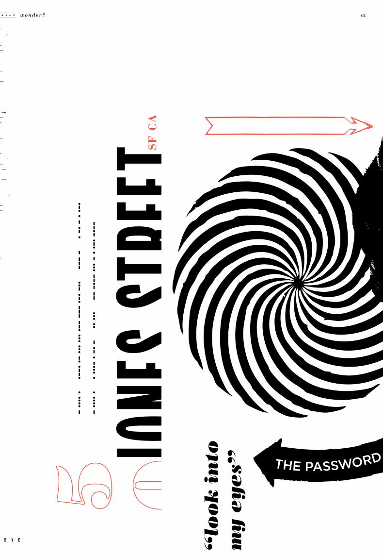
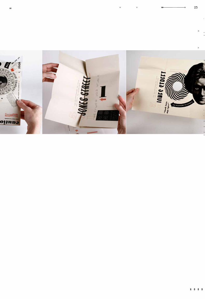
jone
s str
eet
wonder? yes
b y e

g o o d
27no
kr
is
te
n h
af
f
wonder? yes
b y e
po
rt
fo
li
o<
>
la
gu
nit
as
//
/
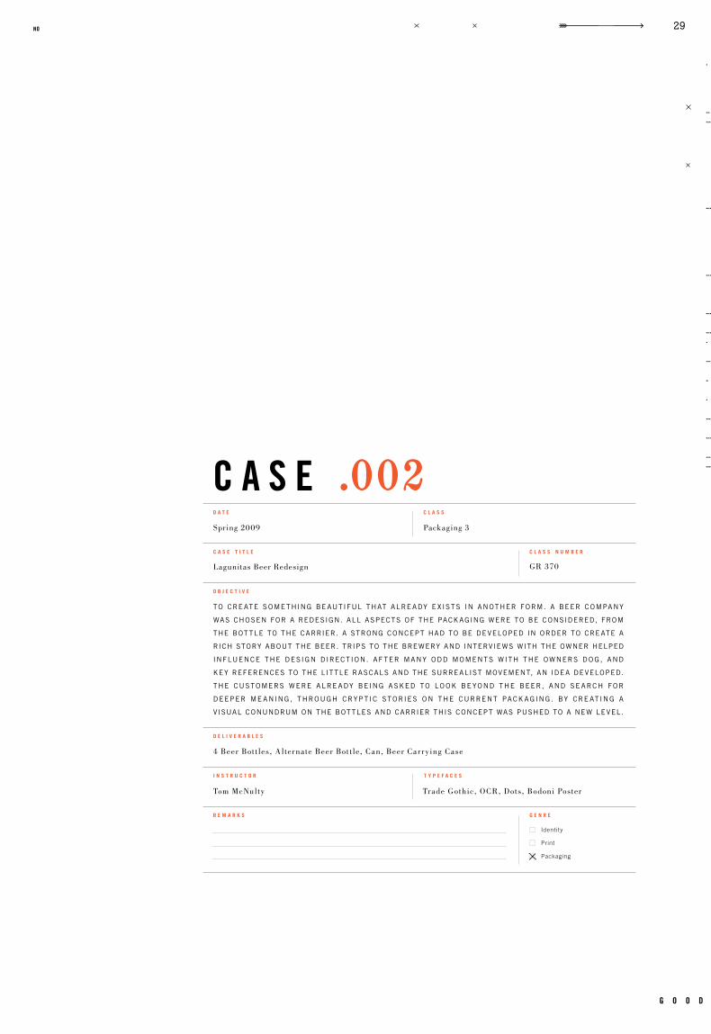
c a s e
Identity
Packaging
GR 370
Packaging 3Spring 2009
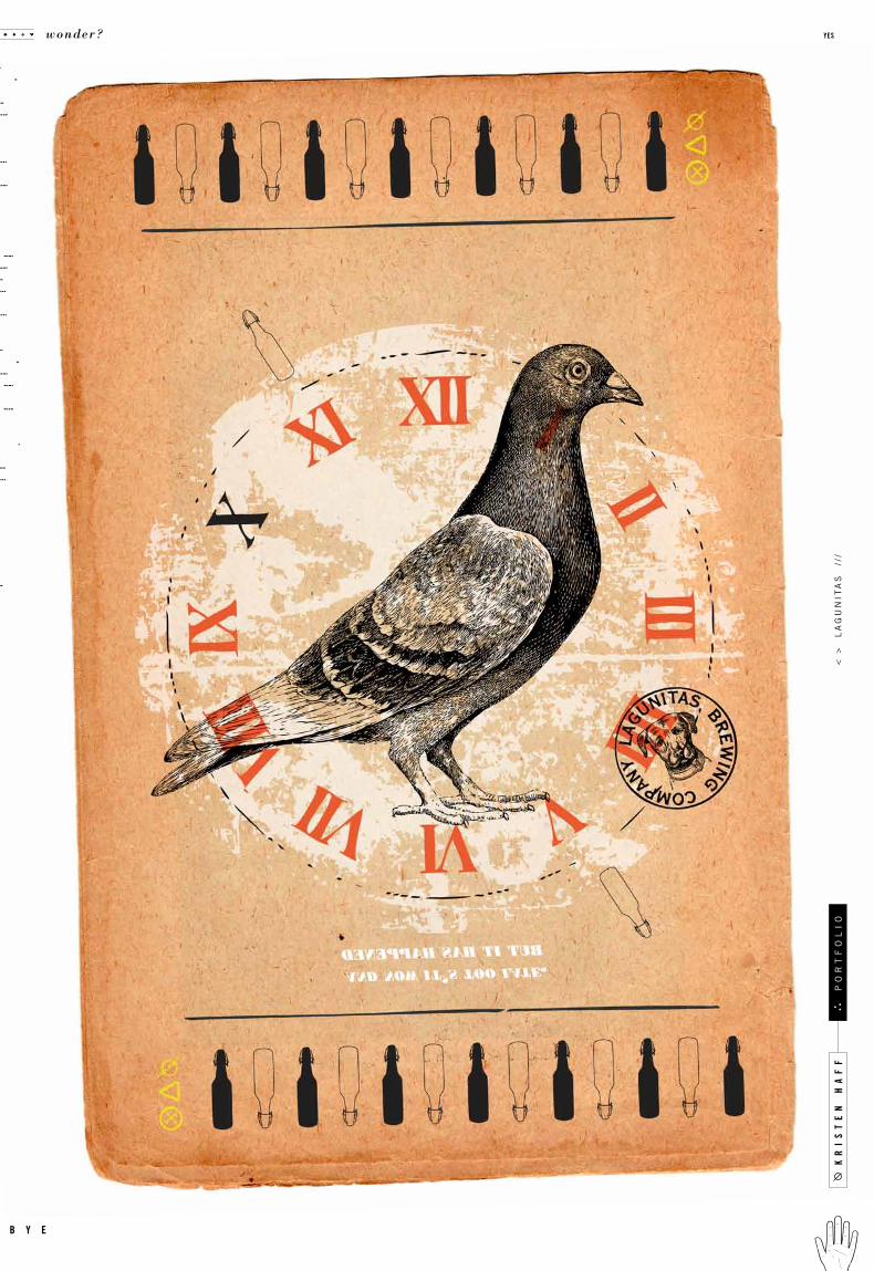
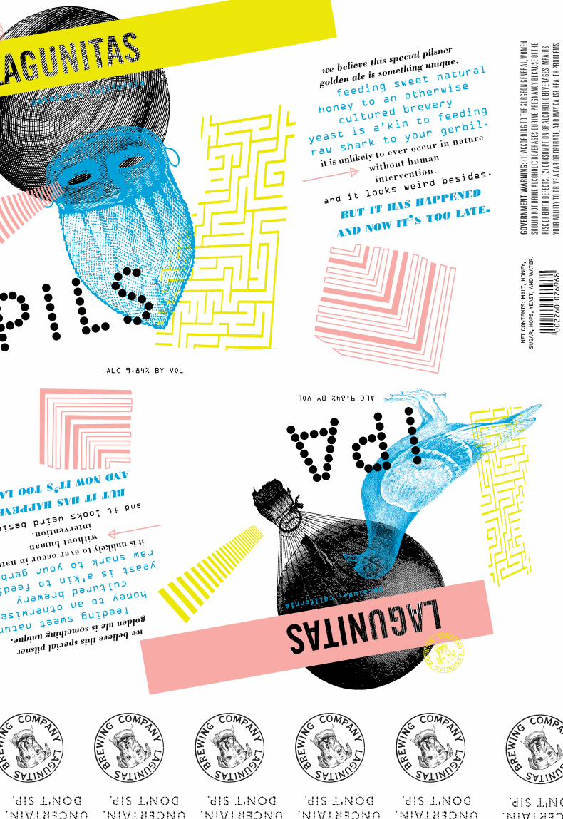
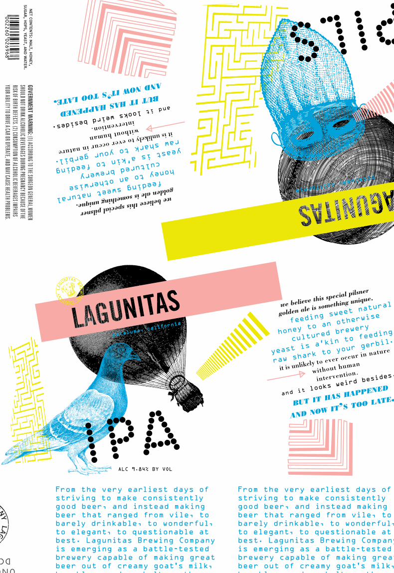
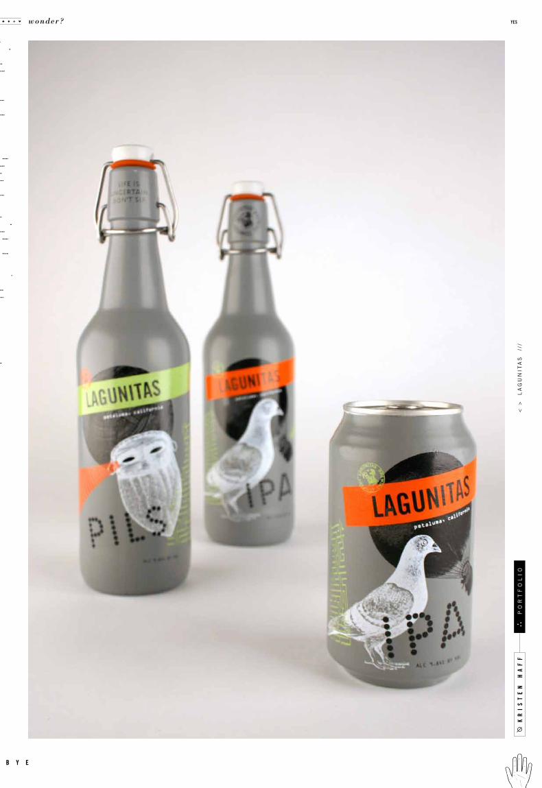
Lagunitas Beer Redesign
Tom McNulty Trade Gothic, OCR, Dots, Bodoni Poster
4 Beer Bot t les, Alternate Beer Bot t le, Can, Beer Car rying Case
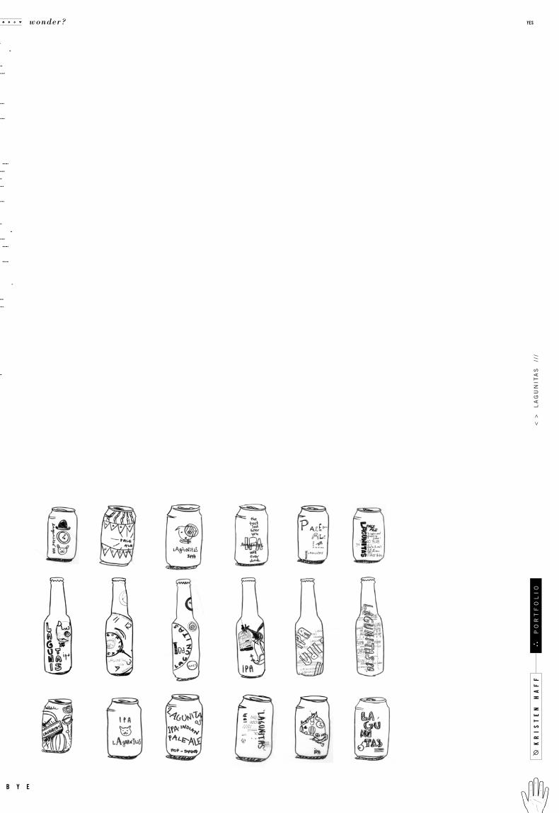
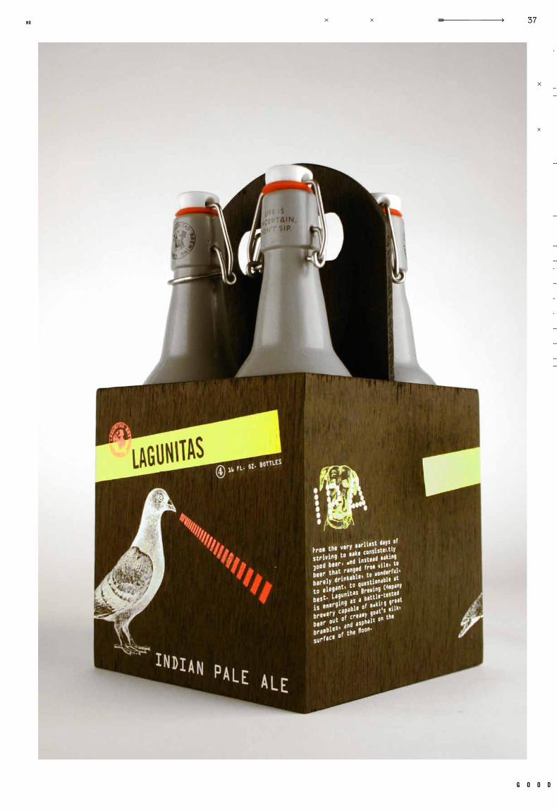
to cre ate some thing be autiful that alre ady e x ists in another form. a beer company
was chosen for a redesign. all aspects of the pack aging were to be considered, from
the bot tle to the carrier. a strong concept had to be developed in order to cre ate a
rich story about the beer. trips to the brewery and interviews with the owner helped
influence the design direct ion. af ter many odd moment s with the owners d o g , and
key references to the lit tle rascals and the surrealist movement, an idea developed.
the customers were alre ady being asked to lo ok be yond the beer, and se arch for
deeper me aning , through cry p t ic sto ries on the current pack aging . by cre at ing a
visual conundrum on the bot tles and carrier this concept was pushed to a new level.
c a s e t i t l e
o b j e c t i v e
c l a s s n u m b e r
d e l i v e r a b l e s
i n s t r u c t o r t y p e f a c e s
r e m a r k s g e n r e
d a t e c l a s s
.002
g o o d
29no
kr
is
te
n h
af
f
wonder? yes
b y e
po
rt
fo
li
o<
>
la
gu
nit
as
//
/

g o o d
33no
kr
is
te
n h
af
f
wonder? yes
b y e
po
rt
fo
li
o<
>
la
gu
nit
as
//
/
g o o d
35no
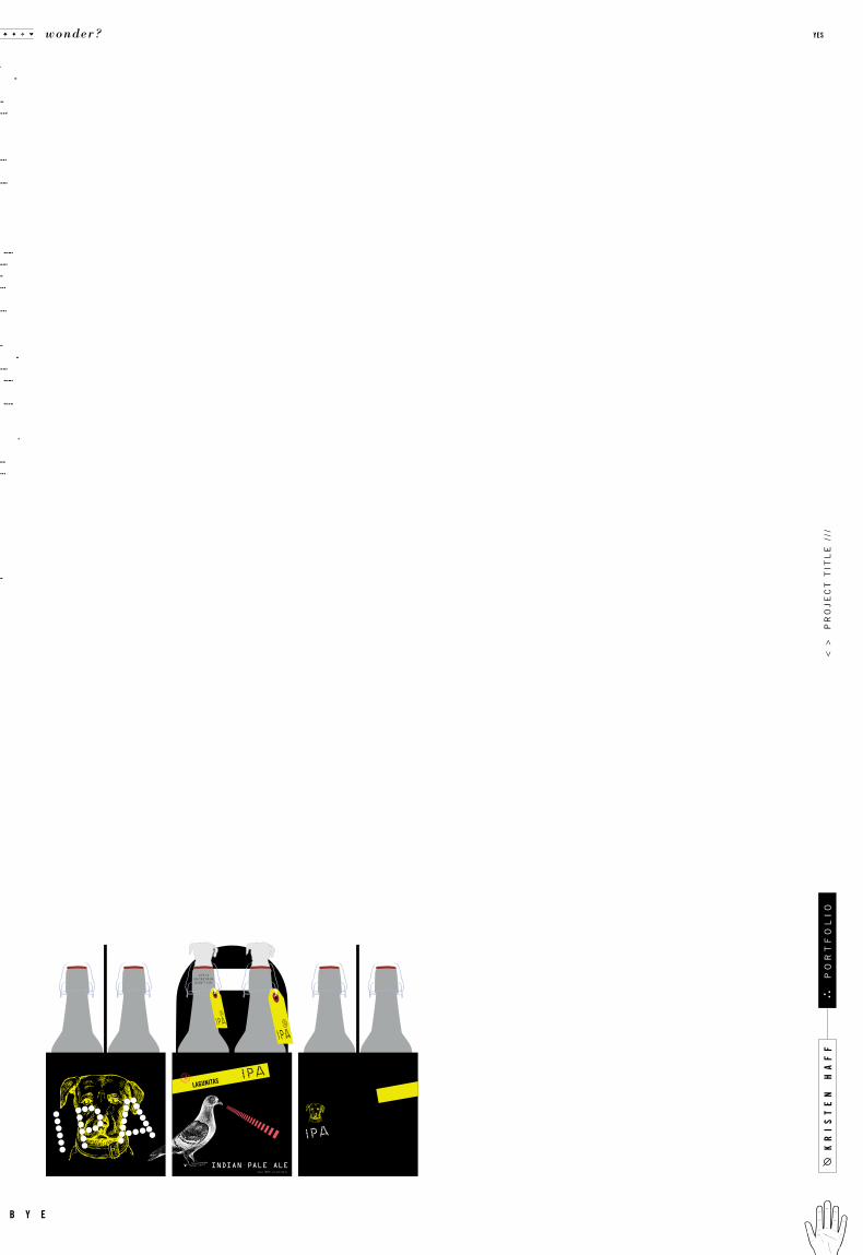
INDIAN PALE ALEf o u r 16 f l . o z . b o t t l e s
kr
is
te
n h
af
f
wonder? yes
b y e
po
rt
fo
li
o<
>
pr
oj
ec
t t
itl
e /
//
g o o d
37no

c a s e
Identity
Packaging
GR 330
Typography 3Spr ing 20 09
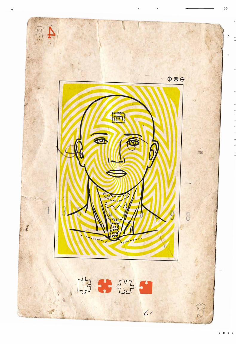
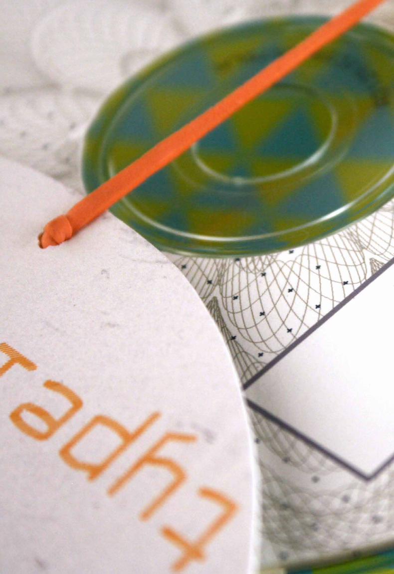
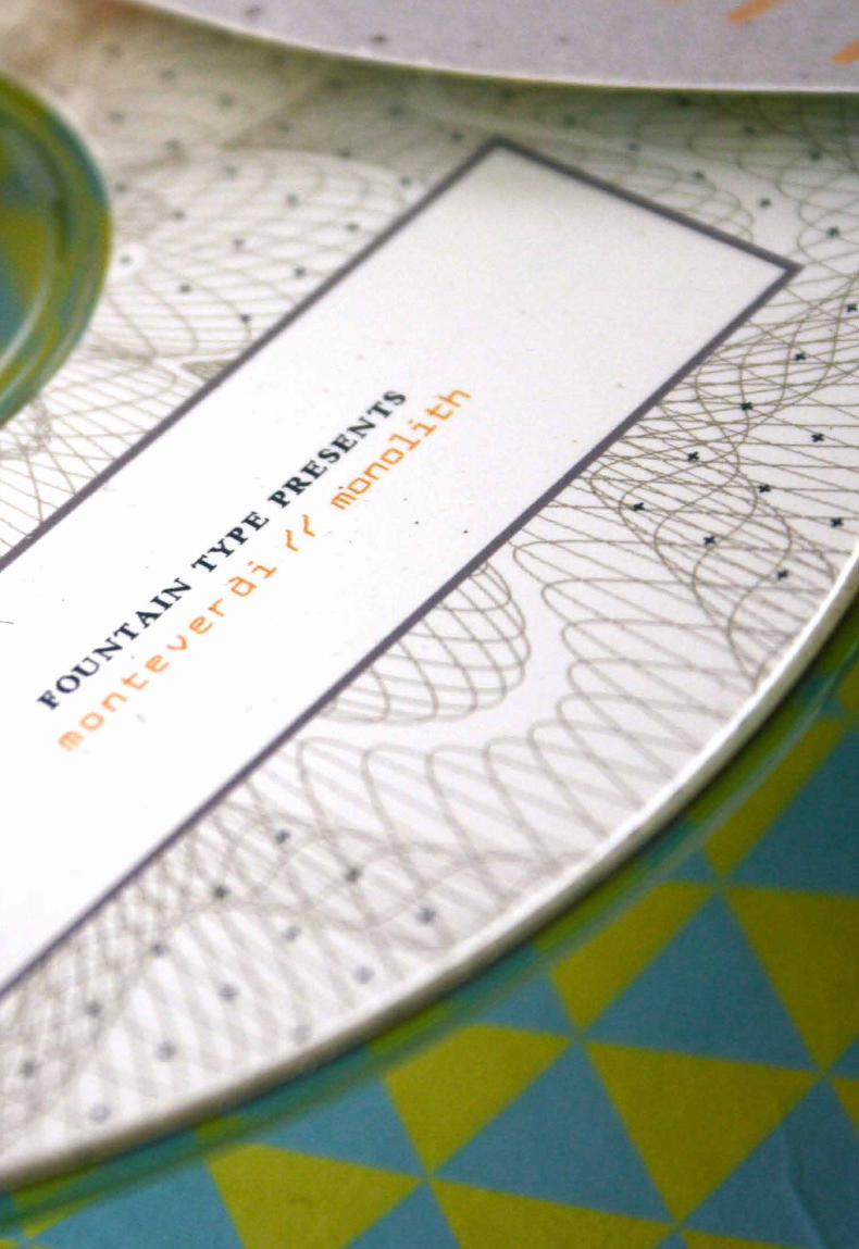
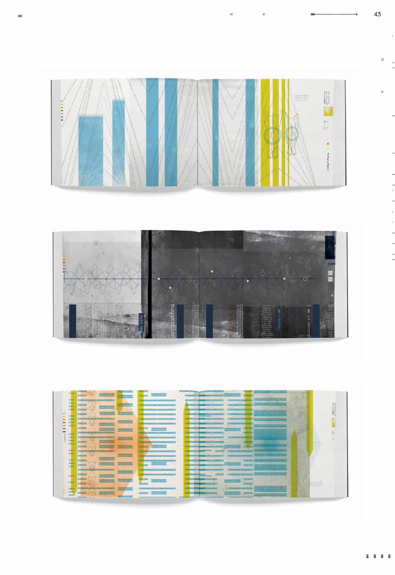
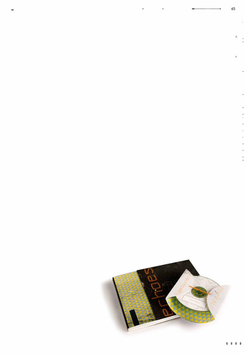
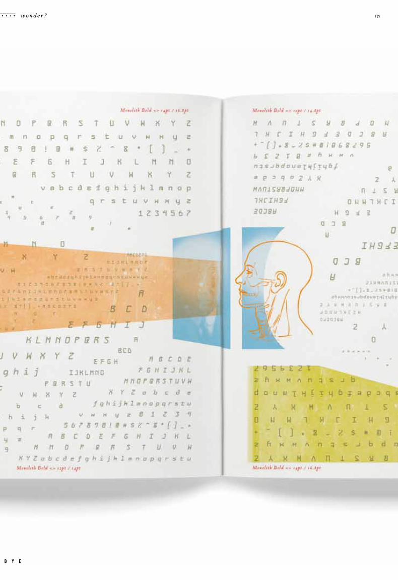
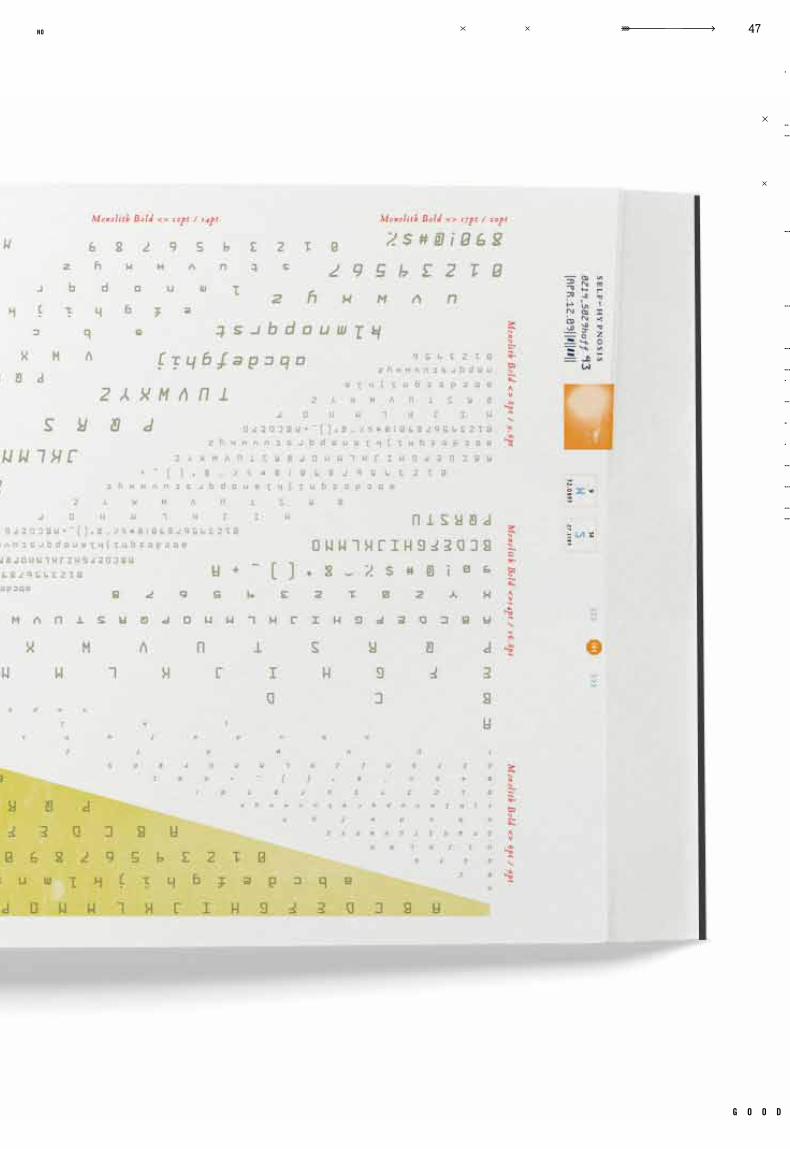
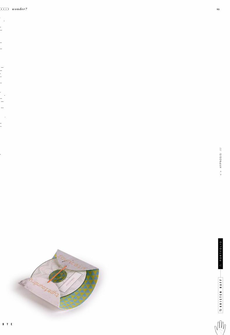
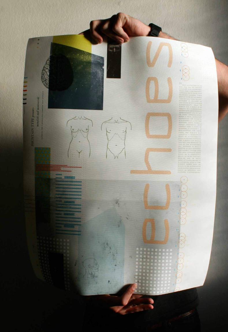
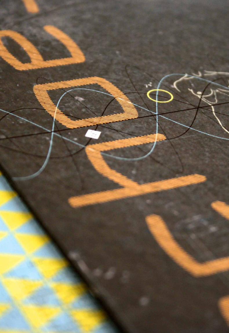
A Study of Sel f Hypnosis
Ar iel Grey Monolith, Vendetta
Paper Promotion Book, Typeface Specimen Book, CD Cover and Packaging, Promotional Poster
to cre ate a promotional kit fo r a specif ic t y pefound ry, in this instan ce foun ta in
t ype. the promotional kit consisted of a book of 2 parts, a l are poster, and a cd with
pack aging . all element s were to me ant to e x plore the cho sen t y peface through a
concept driven design. the book showcased the t ypefaces st yles and characteristics,
while explaining the concept. the second half was a t ype specimen section, showing all
weights and families of the t ypeface. e xperimental t ype was encouraged to reinforce
the mood. a l arge poster was then designed following the book, and a cd intended to
accompany the book also needed to be designed along with the appropriate packaging.
e very aspect of this project was carefully considered to cre ate a specif ic feeling.
c a s e t i t l e
o b j e c t i v e
c l a s s n u m b e r
d e l i v e r a b l e s
i n s t r u c t o r t y p e f a c e s
r e m a r k s g e n r e
d a t e c l a s s
.003
kr
is
te
n h
af
f
wonder? yes
b y e
po
rt
fo
li
o<
>
hy
pn
os
is
///
g o o d
39no
kr
is
te
n h
af
f
wonder? yes
b y e
po
rt
fo
li
o<
>
hy
pn
os
is
///
g o o d
43no

g o o d
45no
wonder? yes
b y e
g o o d
47no
kr
is
te
n h
af
f
wonder? yes
b y e
po
rt
fo
li
o<
>
hy
pn
os
is
///
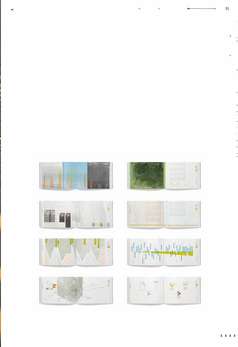
g o o d
51no
kr
is
te
n h
af
f
wonder? yes
b y e
po
rt
fo
li
o<
>
big
el
ow
//
/
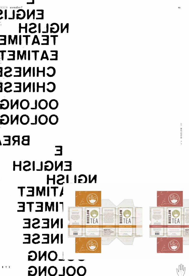
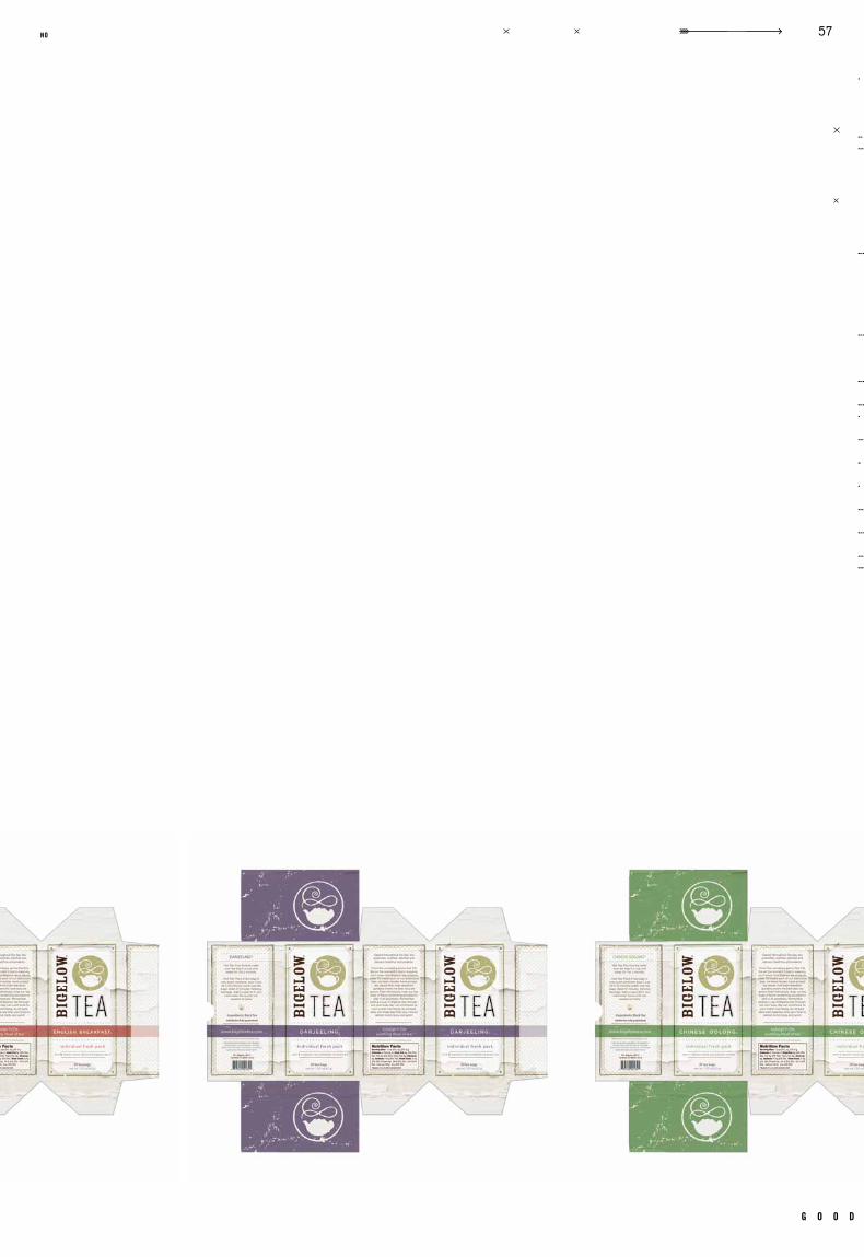
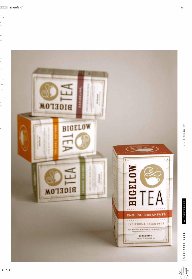
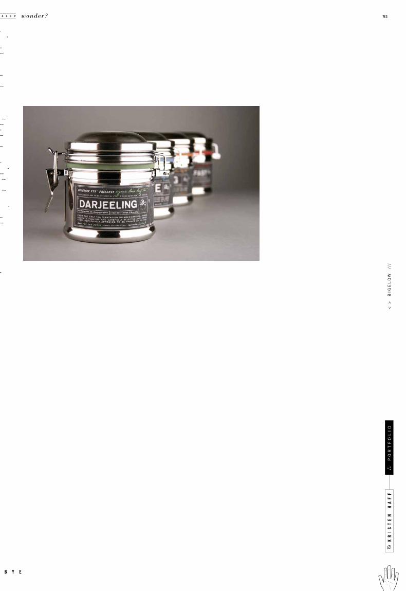
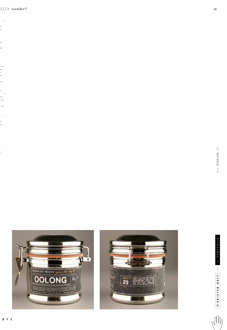
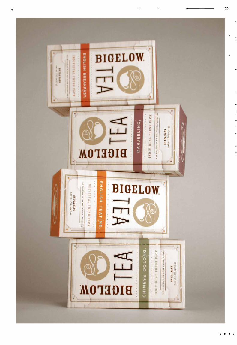
c a s e
Identity
Packaging
GR 322
Packaging 2Spring 2009
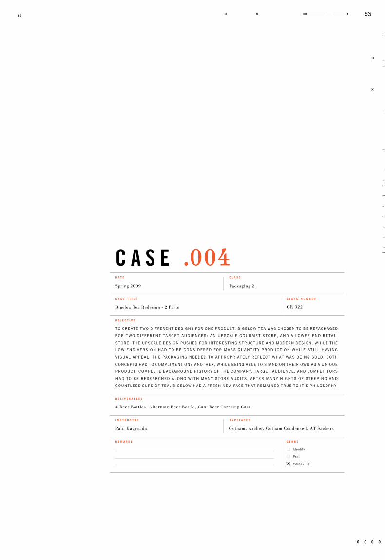
Bigelow Tea Redesign - 2 Parts
Paul Kagiwada Gotham, Archer, Gotham Condensed, AT Sackers
4 Beer Bot t les, Alternate Beer Bot t le, Can, Beer Car rying Case
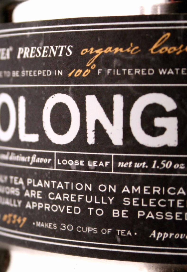
to create two different designs for one product. bigelow tea was chosen to be repackaged
for t wo different target audiences : an upscale gourmet store, and a lower end retail
store. the upscale design pushed for interesting structure and modern design, while the
low end version had to be considered for mass quantit y production while still having
visual appeal. the packaging needed to appropriately reflect what was being sold. both
concepts had to compliment one another, while being able to stand on their own as a unique
product. complete background history of the company, target audience, and competitors
had to be researched along with many store audits. af ter many nights of steeping and
countless cups of tea, bigelow had a fresh new face that remained true to it ’s philosophy.
c a s e t i t l e
o b j e c t i v e
c l a s s n u m b e r
d e l i v e r a b l e s
i n s t r u c t o r t y p e f a c e s
r e m a r k s g e n r e
d a t e c l a s s
.004
g o o d
53no

wonder? yes
b y e
< >
b
ige
lo
w
///
g o o d
57no
kr
is
te
n h
af
f
wonder? yes
b y e
po
rt
fo
li
o<
>
big
el
ow
//
/
g o o d
59no
kr
is
te
n h
af
f
wonder? yes
b y e
po
rt
fo
li
o<
>
big
el
ow
//
/

g o o d
61no
kr
is
te
n h
af
f
wonder? yes
b y e
po
rt
fo
li
o<
>
big
el
ow
//
/
g o o d
63no

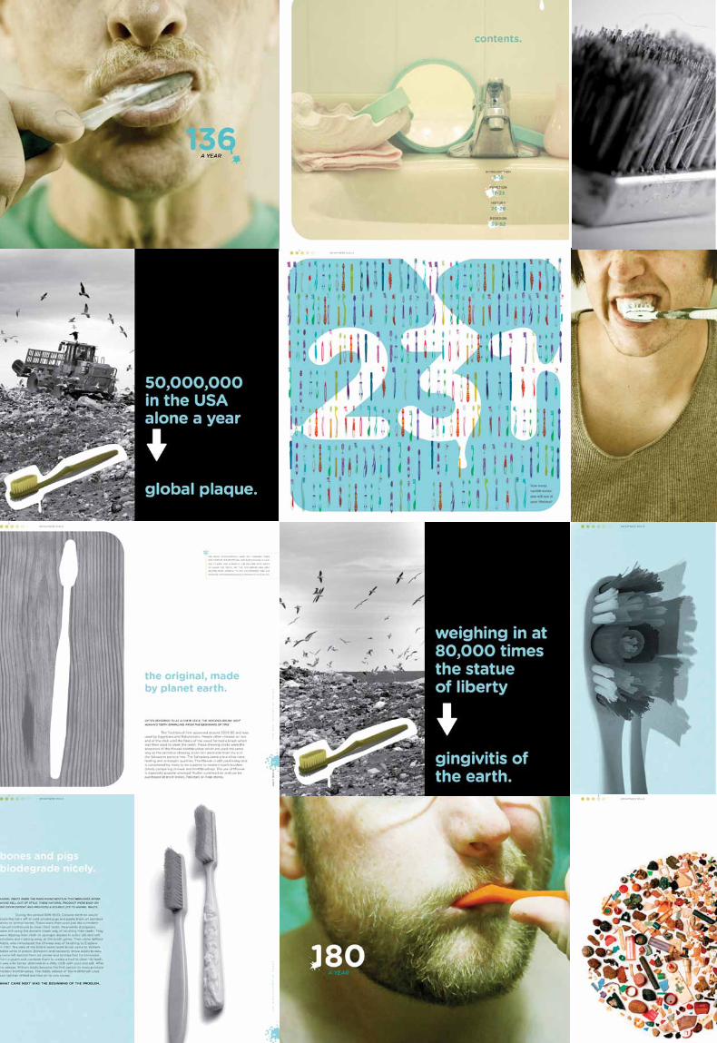
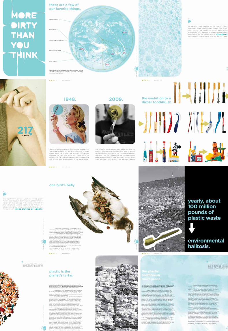
c a s e
Identity
Packaging
GR 425
Pr int 2Fal l 20 09
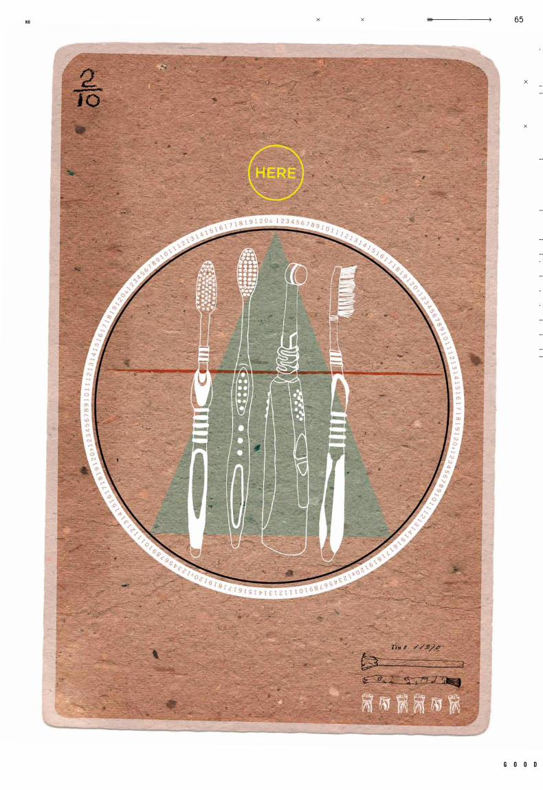
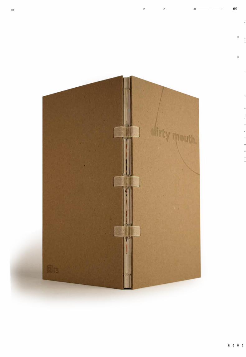
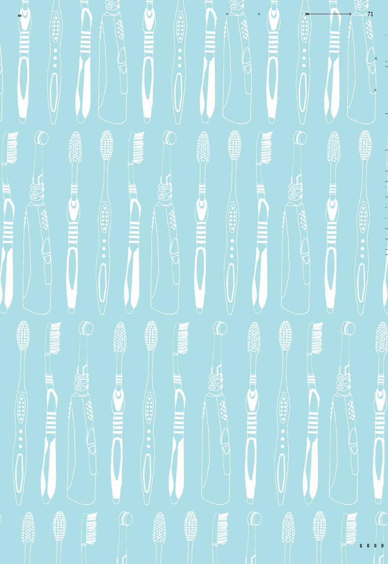
R3 Toothbrush Redesign
Tom Sieu Gotham Rounded
R3 Book, 2 Posters Showcasing Redesign
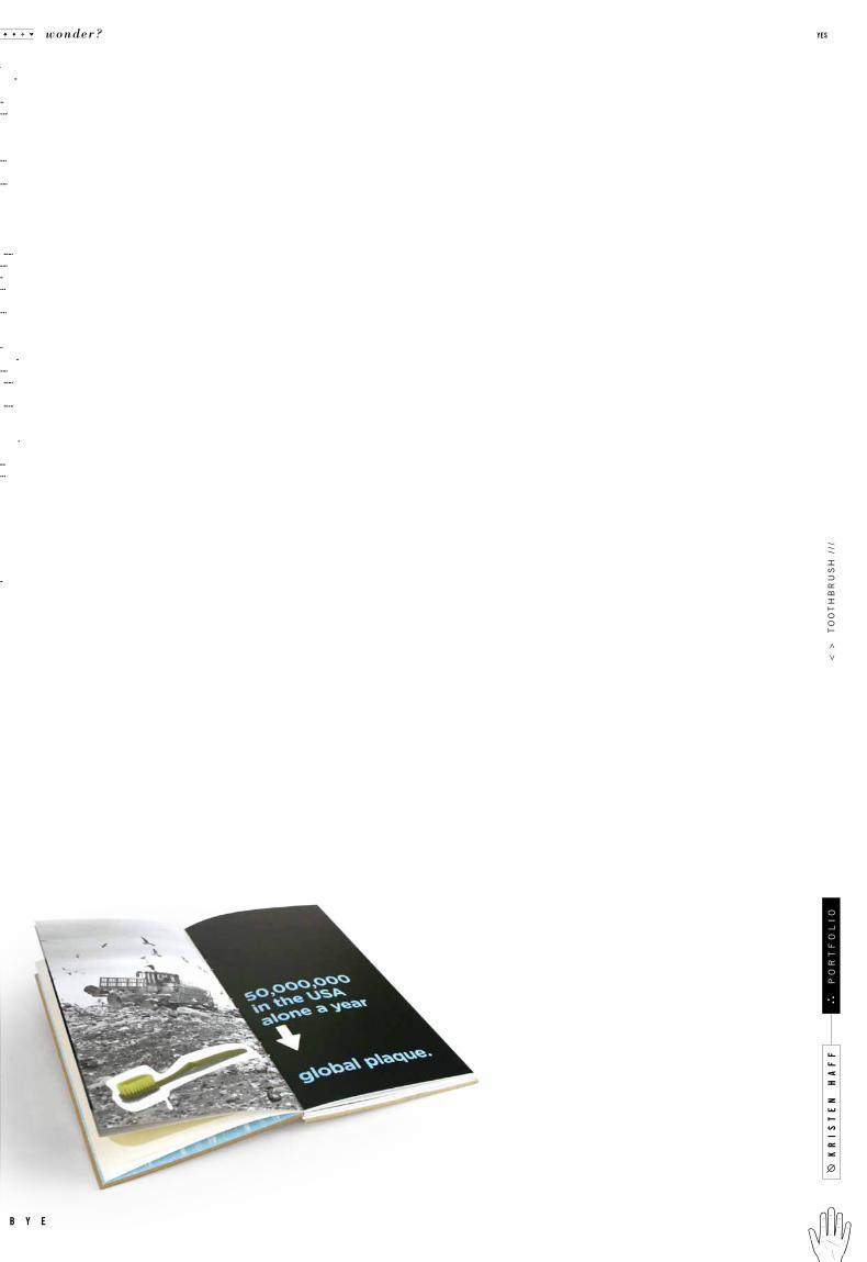
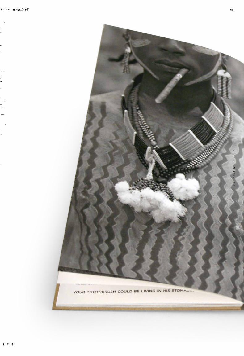
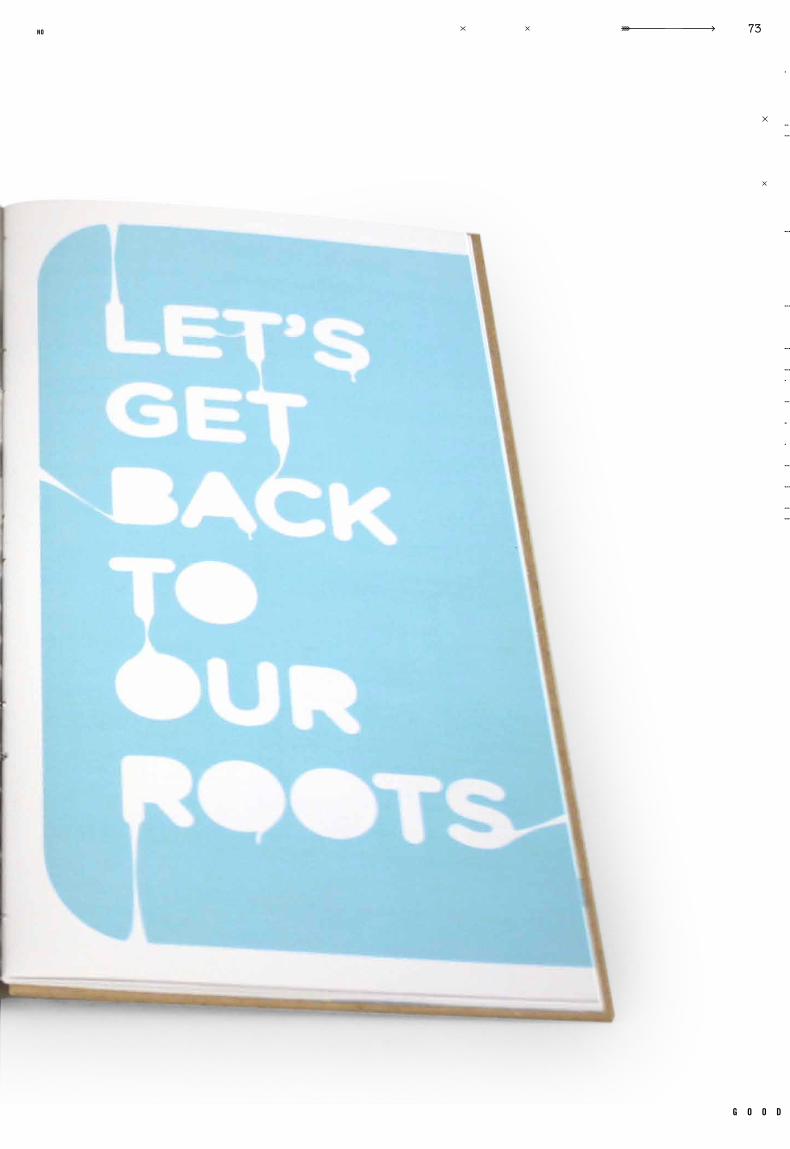
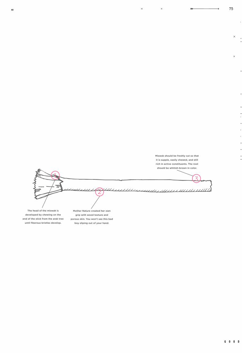
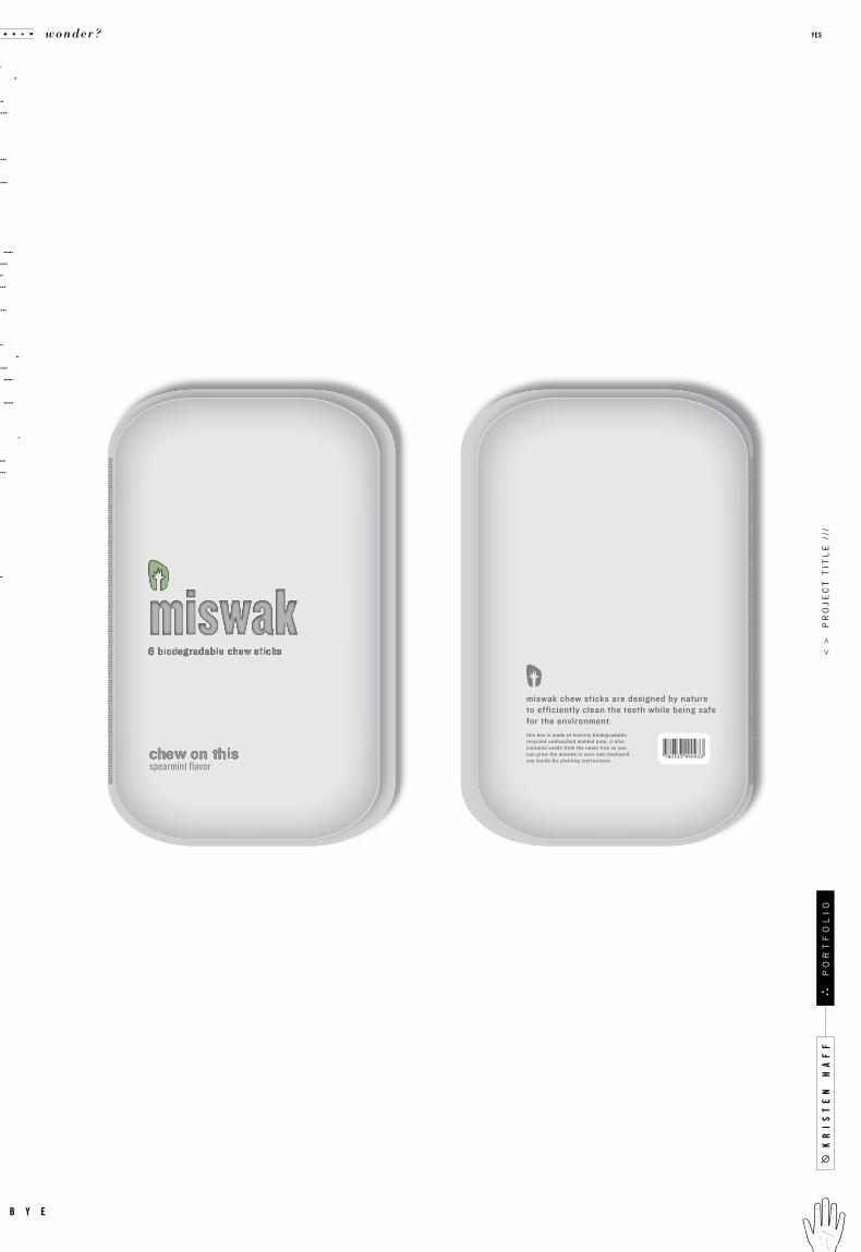
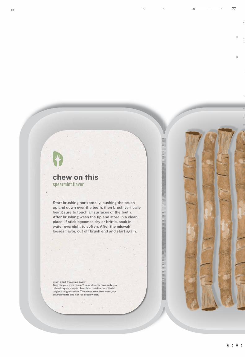
what happens to something when we throw it away? something as small as a toothrbrush
can have a enormous impact on our environment. many small , seemingly unimportant
objects, could benefit from a major redesign. why hasn’t the toothbrush changed, knowing
what we know today about plastic? r3 is a company focused on getting people to ask these
questions about what they buy and why. this class forced us to re-examine products in our
daily lives, and to redesign them in a manner more appropriate for our day and age. new
designs for printers, bikes, lightbulbs, and shampoo all were carefully considered. we are
responsible for the world around us, we have been taught to think carefully. as designers,
our work can extend to our life around us, why not work to change it for the bet ter?
c a s e t i t l e
o b j e c t i v e
c l a s s n u m b e r
d e l i v e r a b l e s
i n s t r u c t o r t y p e f a c e s
r e m a r k s g e n r e
d a t e c l a s s
.005
kr
is
te
n h
af
f
wonder? yes
b y e
po
rt
fo
li
o<
>
to
ot
hb
ru
sh
///
g o o d
65no
kr
is
te
n h
af
f
wonder? yes
b y e
po
rt
fo
li
o<
>
to
ot
hb
ru
sh
///
g o o d
69no
kr
is
te
n h
af
f
wonder? yes
b y e
po
rt
fo
li
o<
>
to
ot
hb
ru
sh
///
g o o d
71no
< >
p
ro
je
ct
tit
le
///
wonder? yes
b y e
g o o d
73no
kr
is
te
n h
af
f
wonder? yes
b y e
po
rt
fo
li
o<
>
to
ot
hb
ru
sh
///
g o o d
75no
kr
is
te
n h
af
f<
>
pr
oj
ec
t t
itl
e /
//
wonder? yes
b y e
po
rt
fo
li
o
g o o d
77no
kr
is
te
n h
af
f
wonder? yes
b y e
po
rt
fo
li
o<
>
po
la
ro
id
///

c a s e
Identity
Packaging
GR 370
Packaging 3Fall 2009
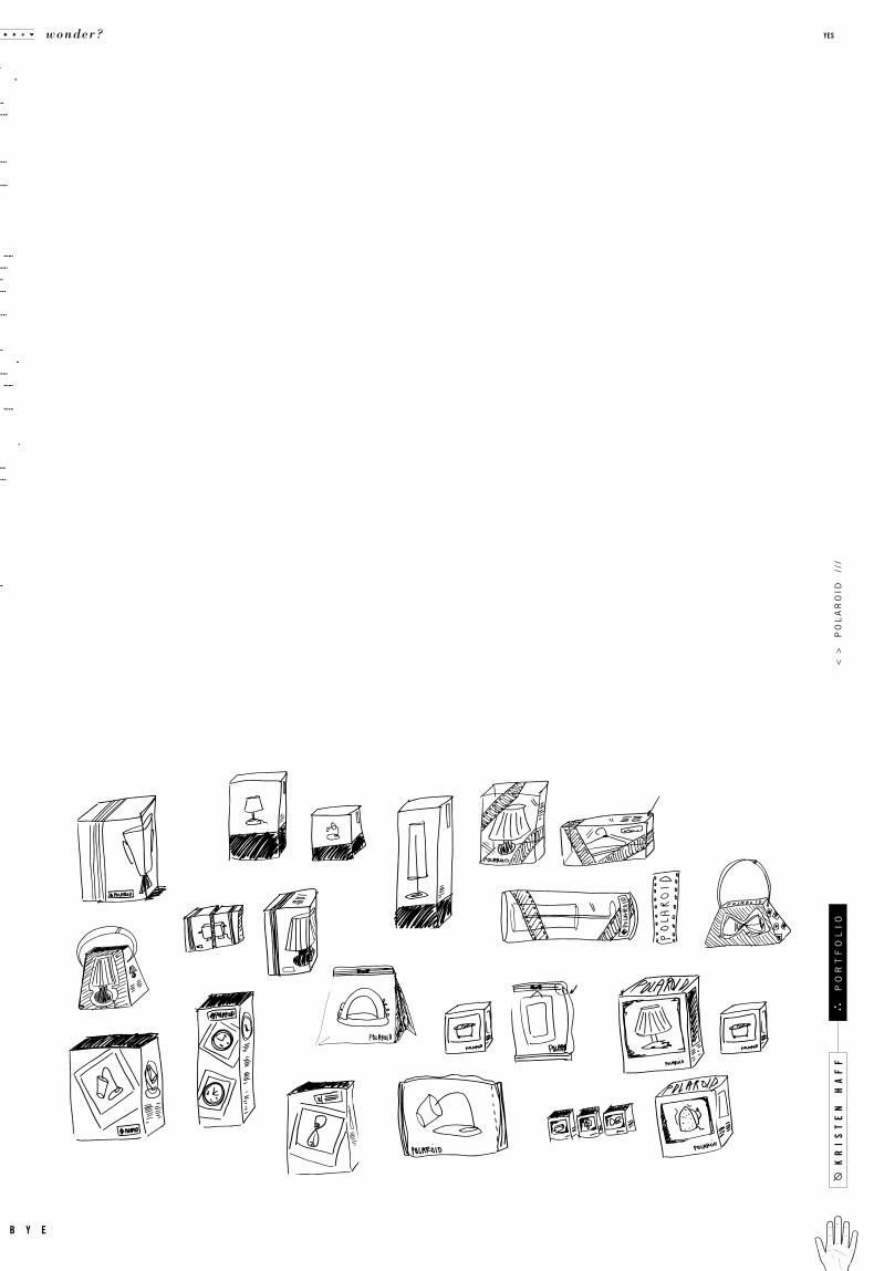
Polaroid Home Appliance Line
Tom McNulty ITC Lubalin Graph, Trade Gothic,
Packaging for 5 Di f ferent Appliances
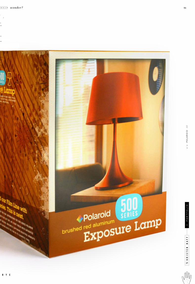
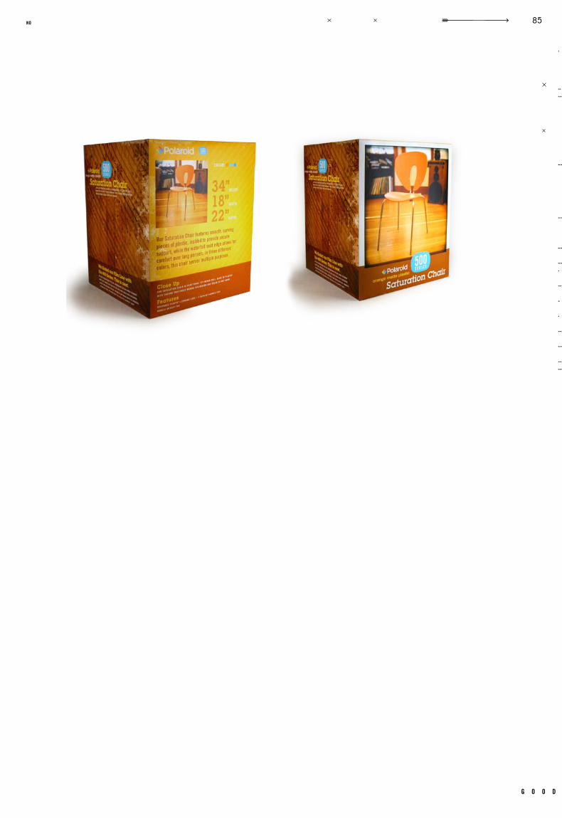
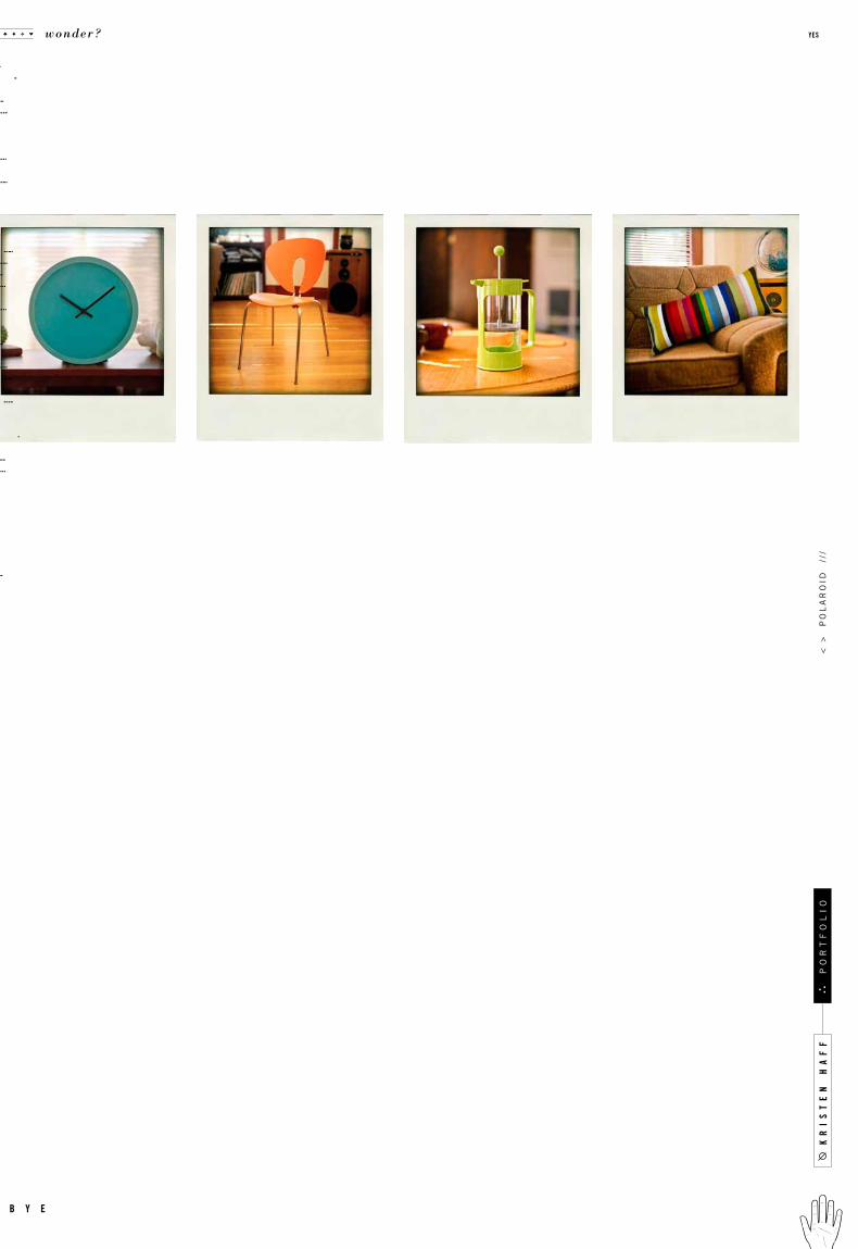
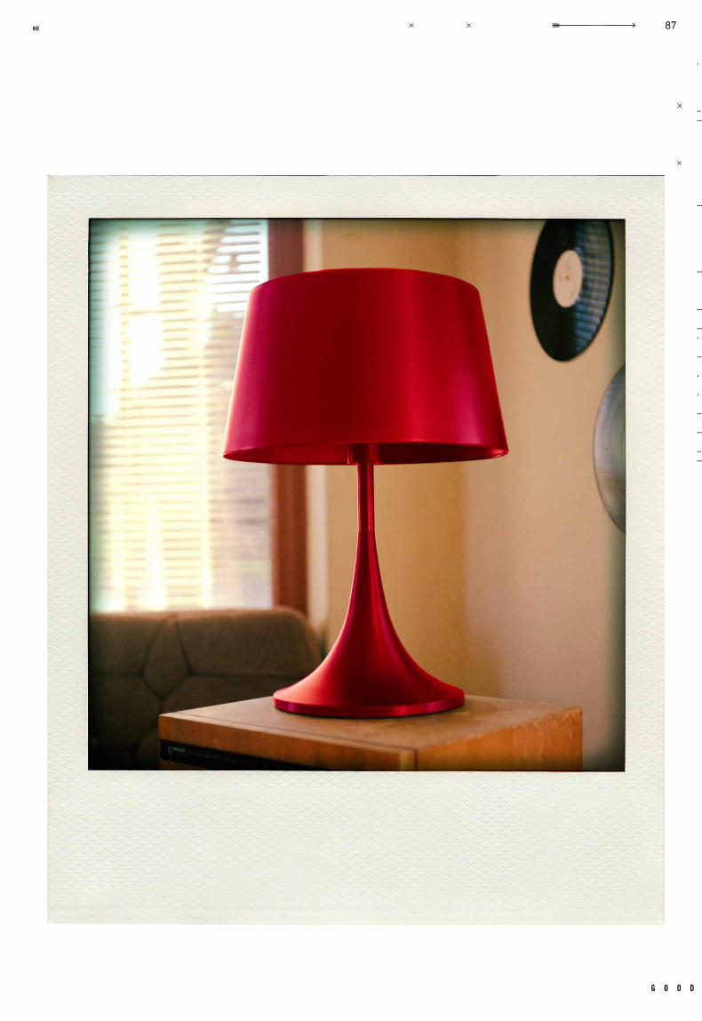
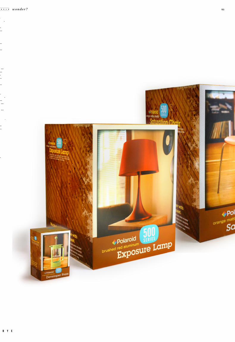
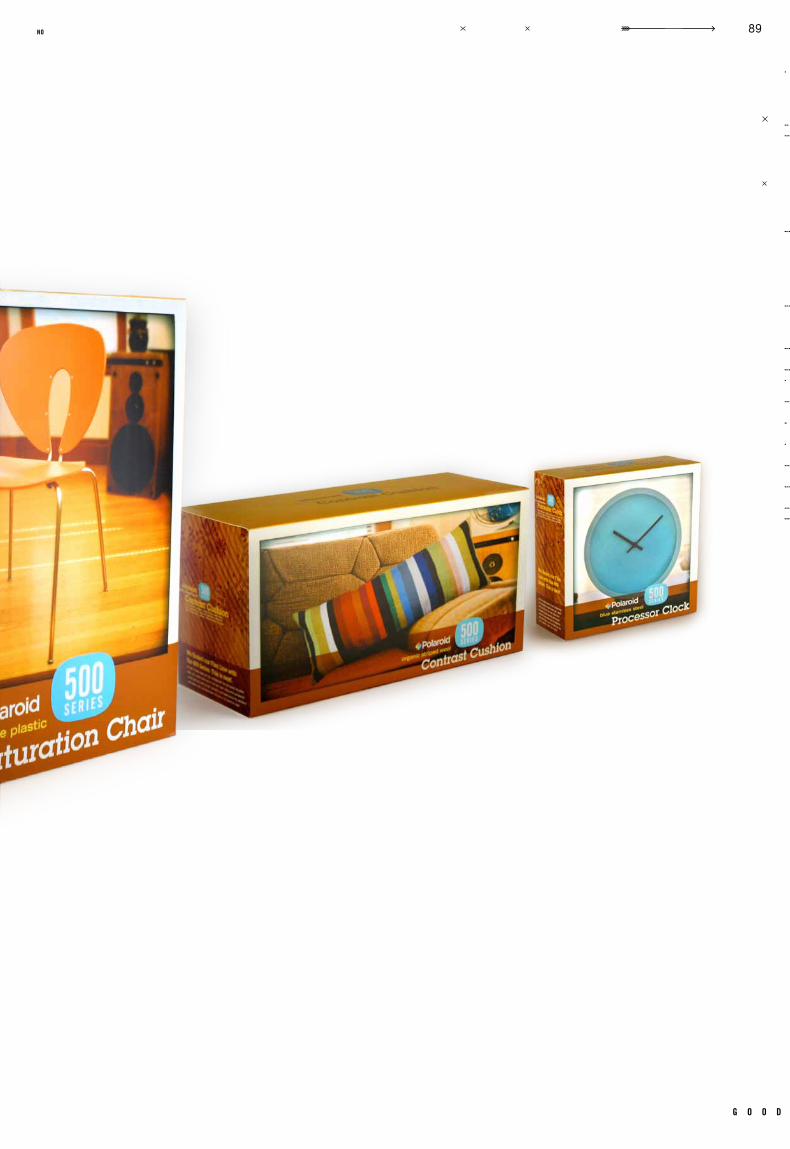
brands of ten e x tend be yond their main focus. to know a brand is to understand the
attributes and feelings behind them. this project’s goal was to take a company currently
known for one specific product, and redirect it towards home appliances. if ferrari made
blenders, how would they look? in this case, if polaroid made a french press, what would
it look like, and what kind of packaging would it go in? not only did package structure have
to be considered, the products themselves had to be carefully selected to make sure to
maintain brand equity. every element of this project had to reinforce a specific brand, in
a new light. polaroid has a very strong look and feel, and a very specific target audience.
all aspects were carefully considered as the pol aroid home appliance line developed.
c a s e t i t l e
o b j e c t i v e
c l a s s n u m b e r
d e l i v e r a b l e s
i n s t r u c t o r t y p e f a c e s
r e m a r k s g e n r e
d a t e c l a s s
.006
g o o d
79no
kr
is
te
n h
af
f
wonder? yes
b y e
po
rt
fo
li
o<
>
po
la
ro
id
///
g o o d
83no
kr
is
te
n h
af
f
wonder? yes
b y e
po
rt
fo
li
o<
>
po
la
ro
id
///
g o o d
85no
kr
is
te
n h
af
f
wonder? yes
b y e
po
rt
fo
li
o<
>
po
la
ro
id
///
g o o d
87no
wonder? yes
b y e
g o o d
89no

c a s e
Identity
Packaging
GR 360
Graphic Design 3Fal l 20 08
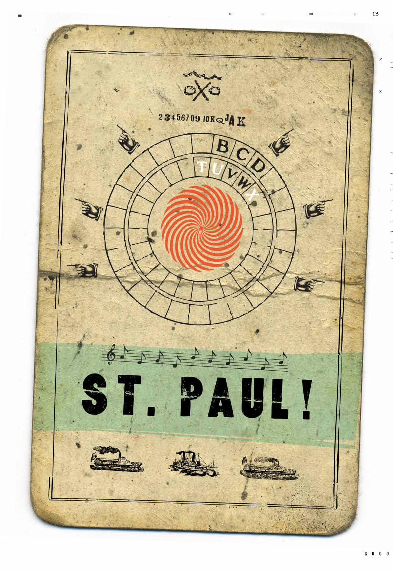
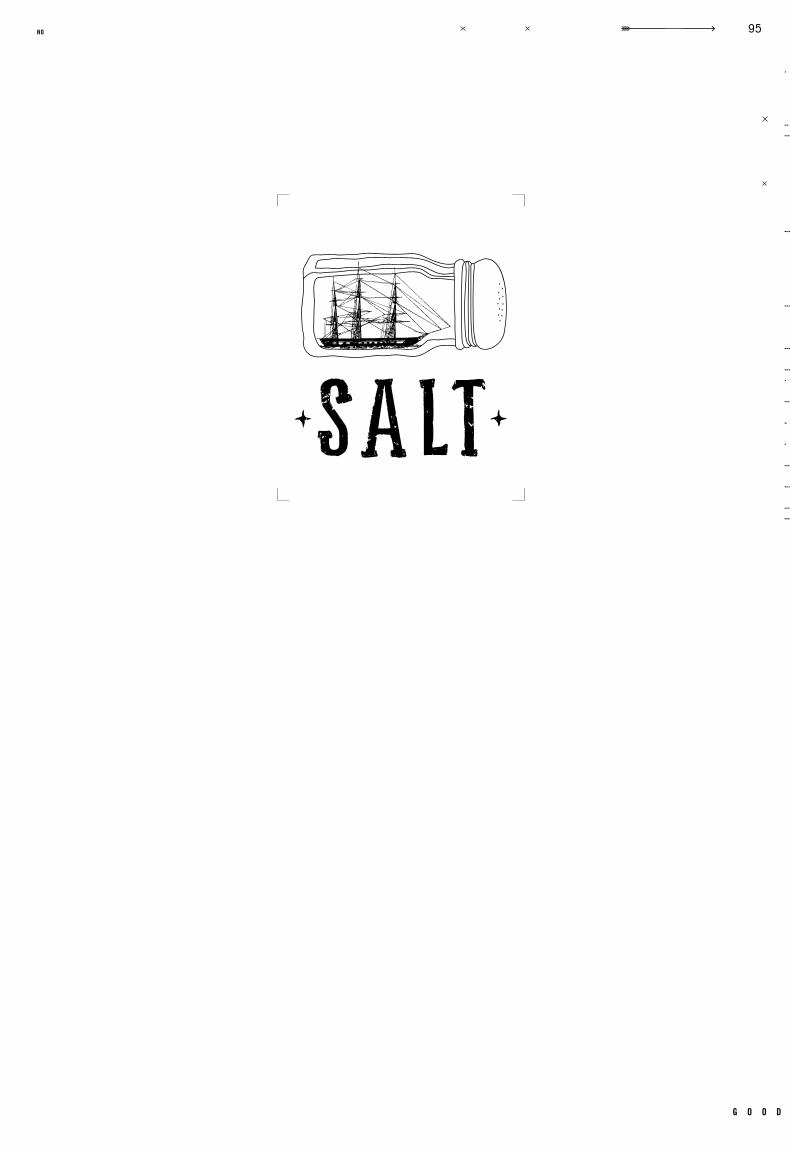
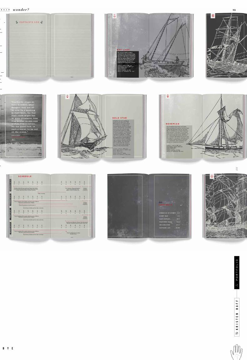
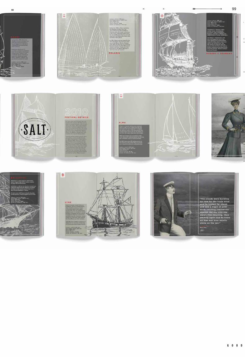
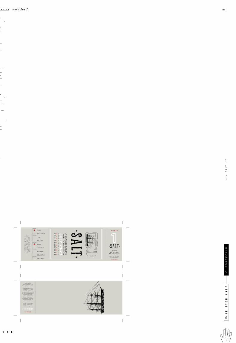
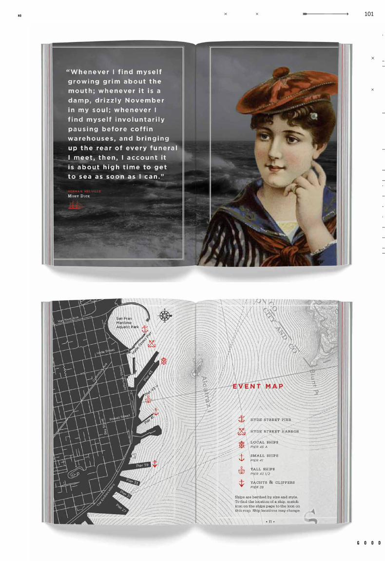
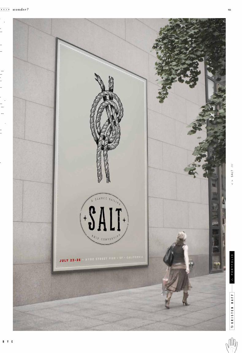
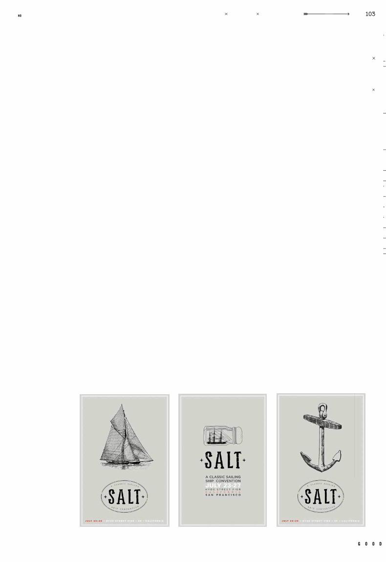
Salt–A Classic Sail ing Ship Convent ion
Nicole F lores Gotham, Hand Let ter ing, Var ious Woodblock Type
Logo, Ticket , Brochure, Nametag, Invite, 4 Posters, Giveaway, 3 Website Pages, Environment Shots
a fictitious sailing convention consisting of all wooden cl assic sailing ships was set
in san francisco at the hyde stree t pier. the convention was named salt as most of
the ships featured sailed on salt water because of their massive size. maps had to be
made, environment shots rendered, and a complicated system of design created. a whole
convention had to be planned before any actual design could take place, a detailed schedule
outlined, and events booked. not only was the event ornate, the concept and design behind
it had to be as well. the concept had to be applied to all collateral and pulled through
to all of the many elements. when at last it seemed all resources were exhausted, salt
finally arrived at the shore. the ocean can teach you things you can’t learn anywhere else.
c a s e t i t l e
o b j e c t i v e
c l a s s n u m b e r
d e l i v e r a b l e s
i n s t r u c t o r t y p e f a c e s
r e m a r k s g e n r e
d a t e c l a s s
.007
kr
is
te
n h
af
f
wonder? yes
b y e
po
rt
fo
li
o<
>
sa
lt
//
/
g o o d
91no


kr
is
te
n h
af
f
wonder? yes
b y e
po
rt
fo
li
o<
>
sa
lt
//
/
g o o d
95no

kr
is
te
n h
af
f
wonder? yes
b y e
po
rt
fo
li
o<
>
sa
lt
//
/
g o o d
97no
kr
is
te
n h
af
f
wonder? yes
b y e
po
rt
fo
li
o<
>
sa
lt
//
/
g o o d
99no
front
back
front
back
kr
is
te
n h
af
f
wonder? yes
b y e
po
rt
fo
li
o<
>
sa
lt
//
/
g o o d
101no
kr
is
te
n h
af
f
wonder? yes
b y e
po
rt
fo
li
o<
>
sa
lt
//
/
g o o d
103no
kr
is
te
n h
af
f
wonder? yes
b y e
po
rt
fo
li
o<
>
ho
zj
o
///
c a s e
Identity
Packaging
GR 434
Typography 4Spring 2010
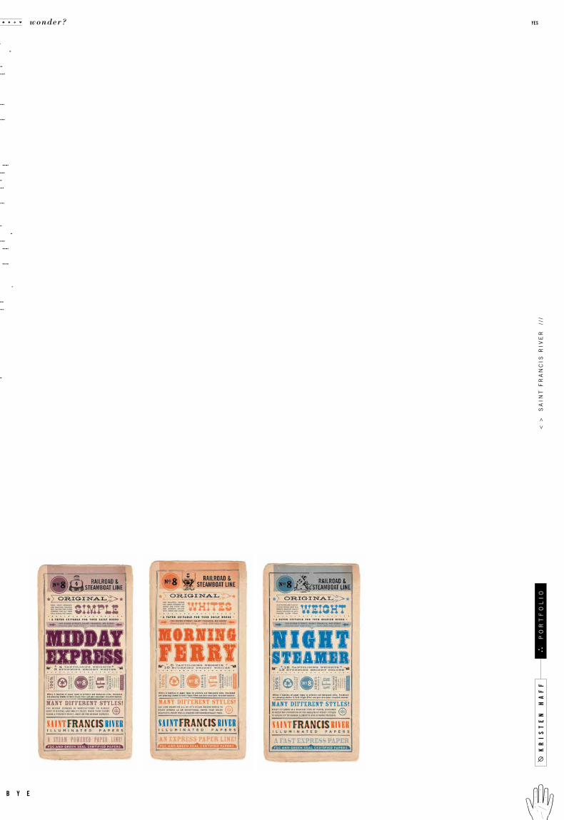
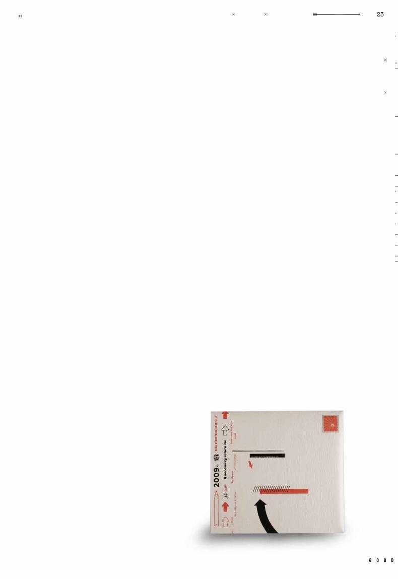
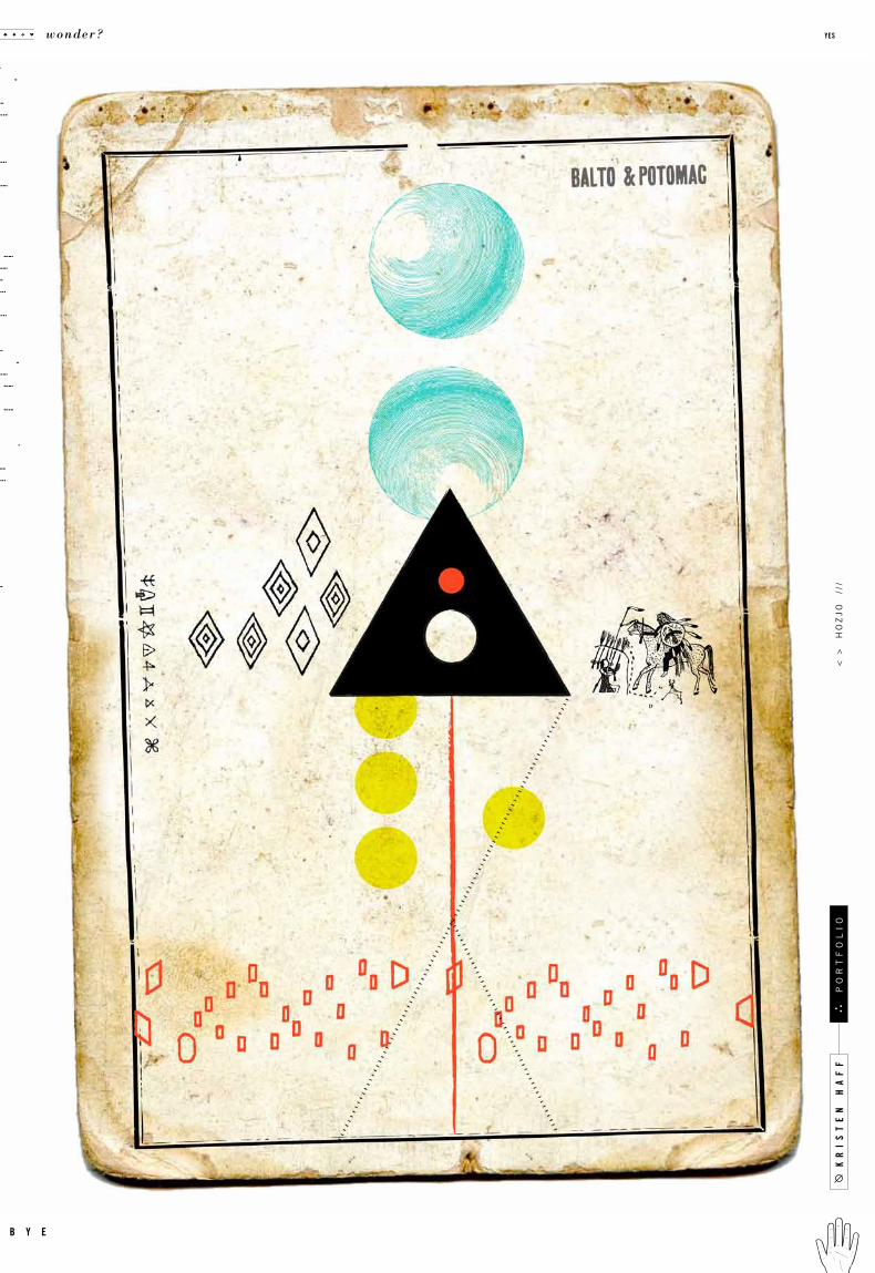
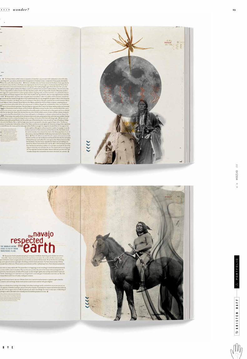
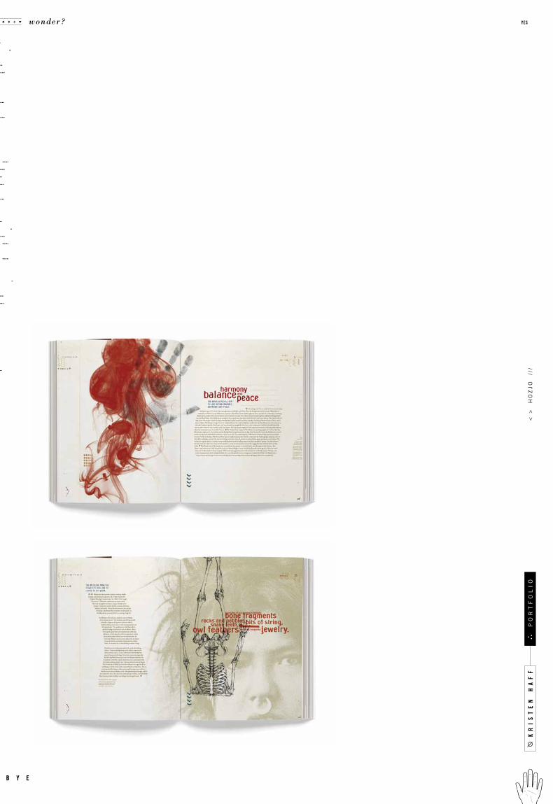
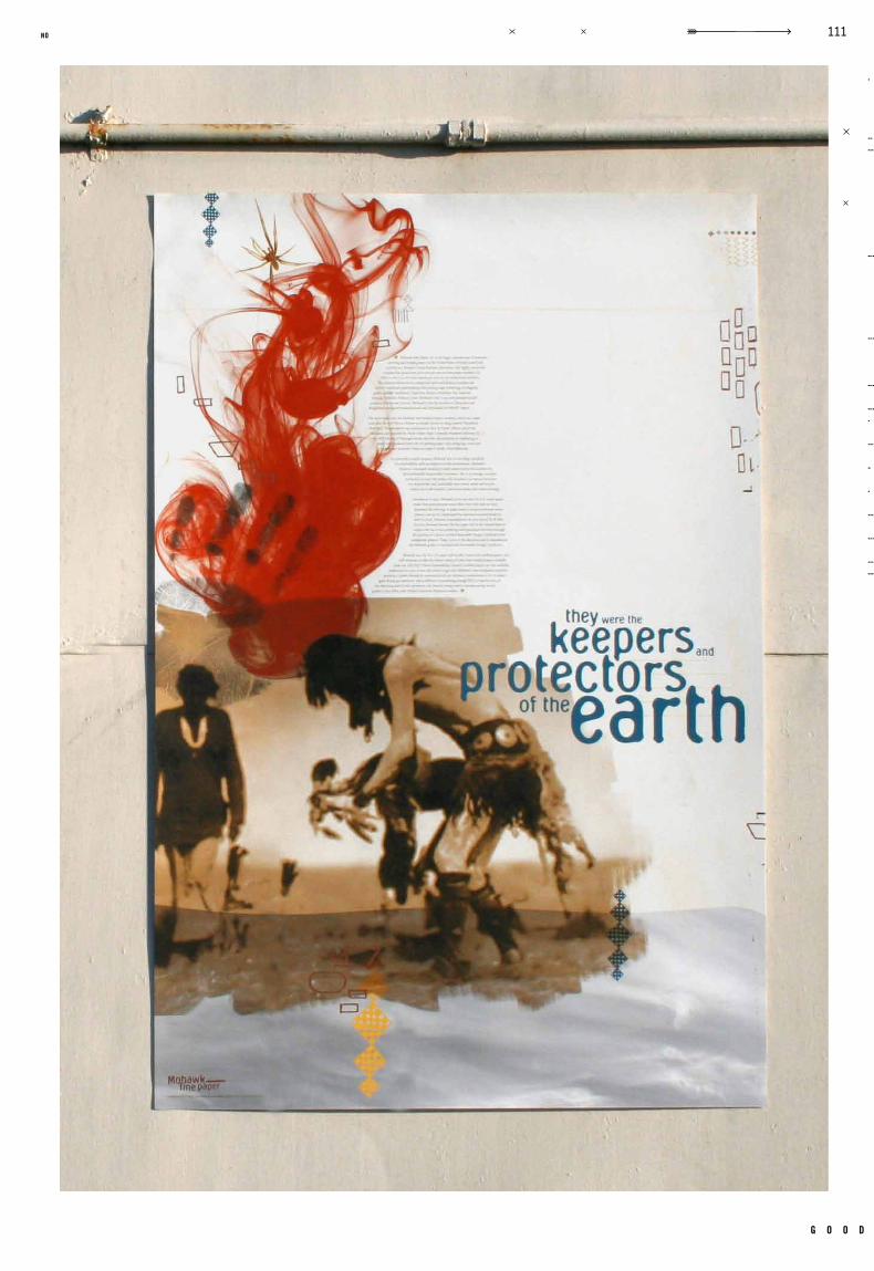
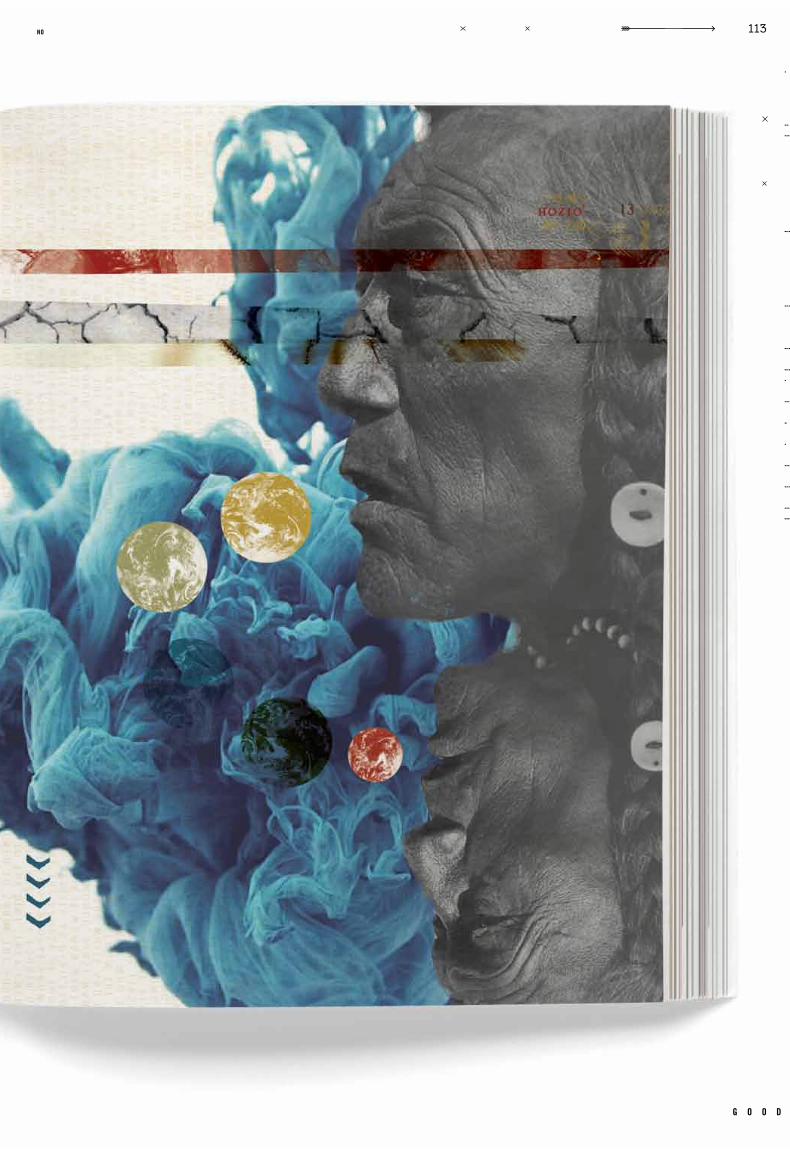
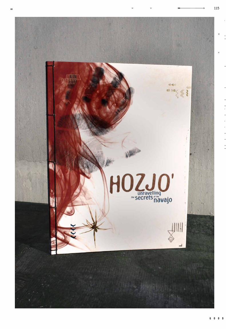
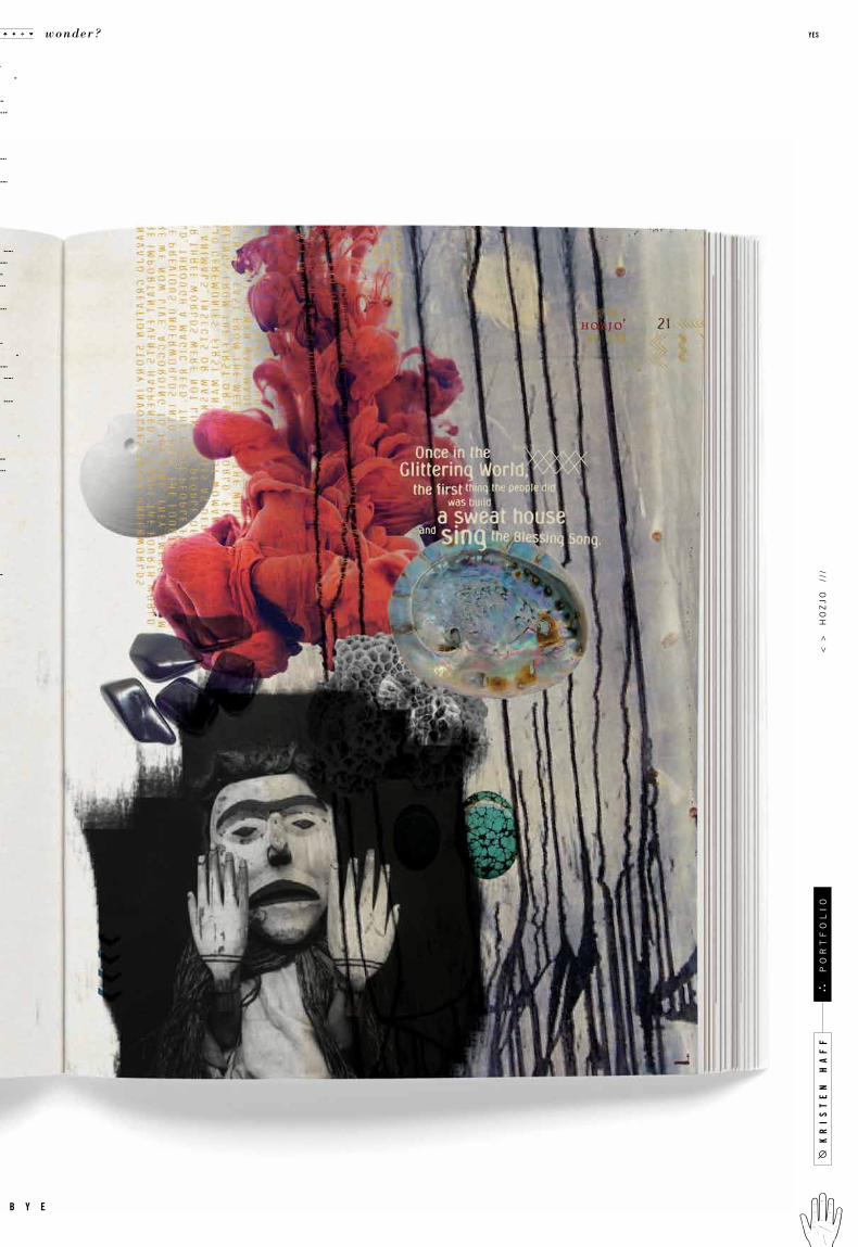
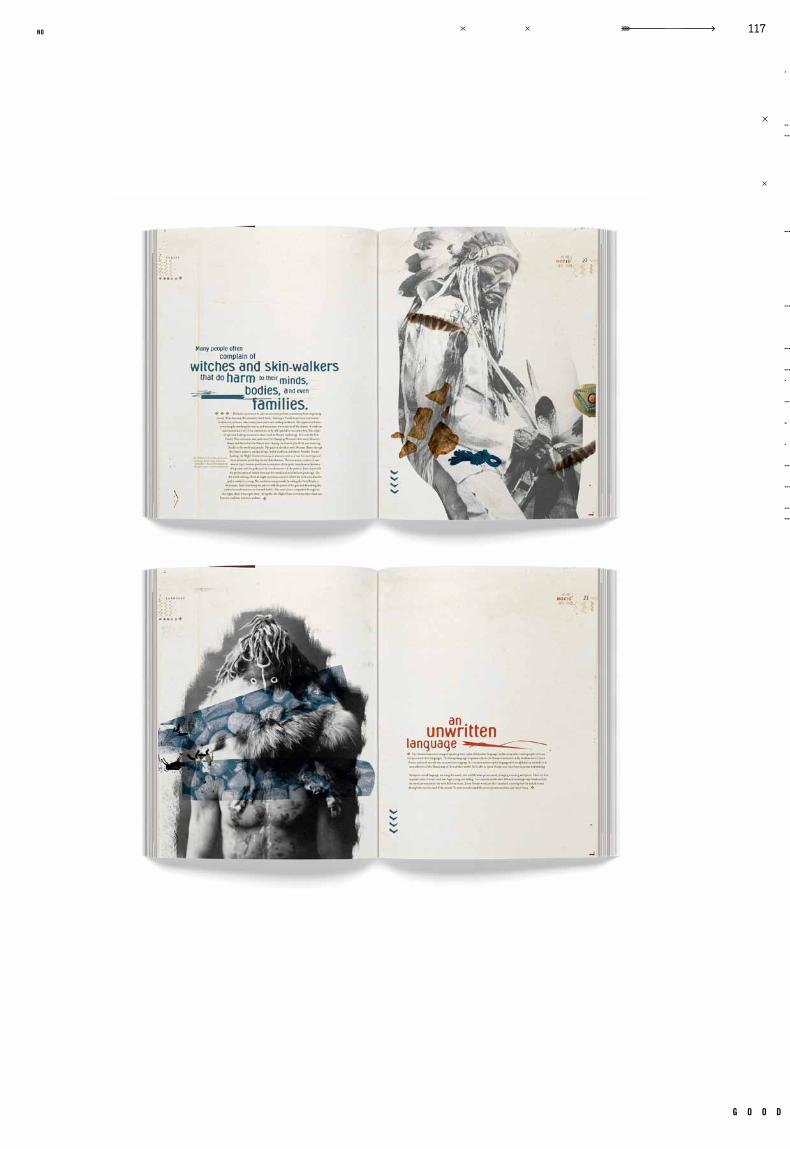
Hozjo–A Mohawk Paper Promotion
Ar iel Grey Vendetta , Ocular
Paper Promotional Book, 24 Swatch Cards, Swatch Card Holder, 3 Website Pages
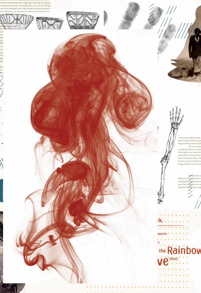
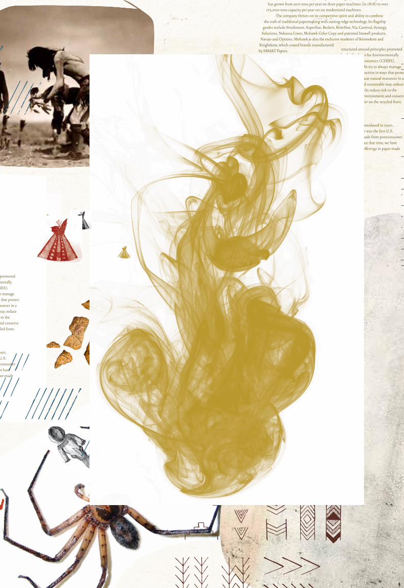
paper companies advertise to businesses by sending out samples of their work. one way to
do this is to create a book showcasing the different styles of paper and tests of how they
accept different printing methods. this was the project assigned, to create concept driven
paper promotional for mohawk papers. included in the design was a set of 24 swatchcards
showcasing the different weights and colors of the paper. along with the swatchcards and
holder, a website was also designed. the paper chosen was navajo by mohawk, and the concept
became an exploration of the navajo indians and their native culture. by studying the rich
history of the navajo, a visual narrative developed and was able to drive the creation of
a book. the use of experimental t ype was encouraged to appropriately match the project.
c a s e t i t l e
o b j e c t i v e
c l a s s n u m b e r
d e l i v e r a b l e s
i n s t r u c t o r t y p e f a c e s
r e m a r k s g e n r e
d a t e c l a s s
.008
g o o d
105no
kr
is
te
n h
af
f
wonder? yes
b y e
po
rt
fo
li
o<
>
ho
zj
o
///

g o o d
109no
kr
is
te
n h
af
f
wonder? yes
b y e
po
rt
fo
li
o<
>
ho
zj
o
///
g o o d
111no
wonder? yes
b y e
g o o d
113no
kr
is
te
n h
af
f
wonder? yes
b y e
po
rt
fo
li
o<
>
ho
zj
o
///
g o o d
115no
kr
is
te
n h
af
f
wonder? yes
b y e
po
rt
fo
li
o<
>
ho
zj
o
///
g o o d
117no
c a s e
Identity
Packaging
GR 365
Ident ity 2Fal l 20 09
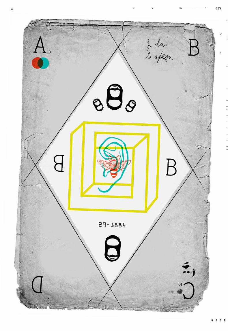
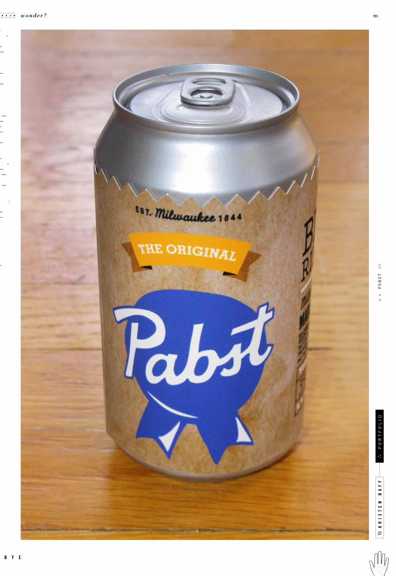
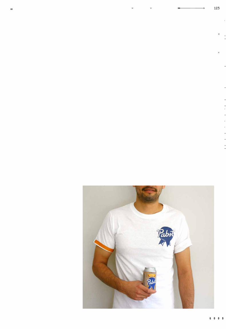
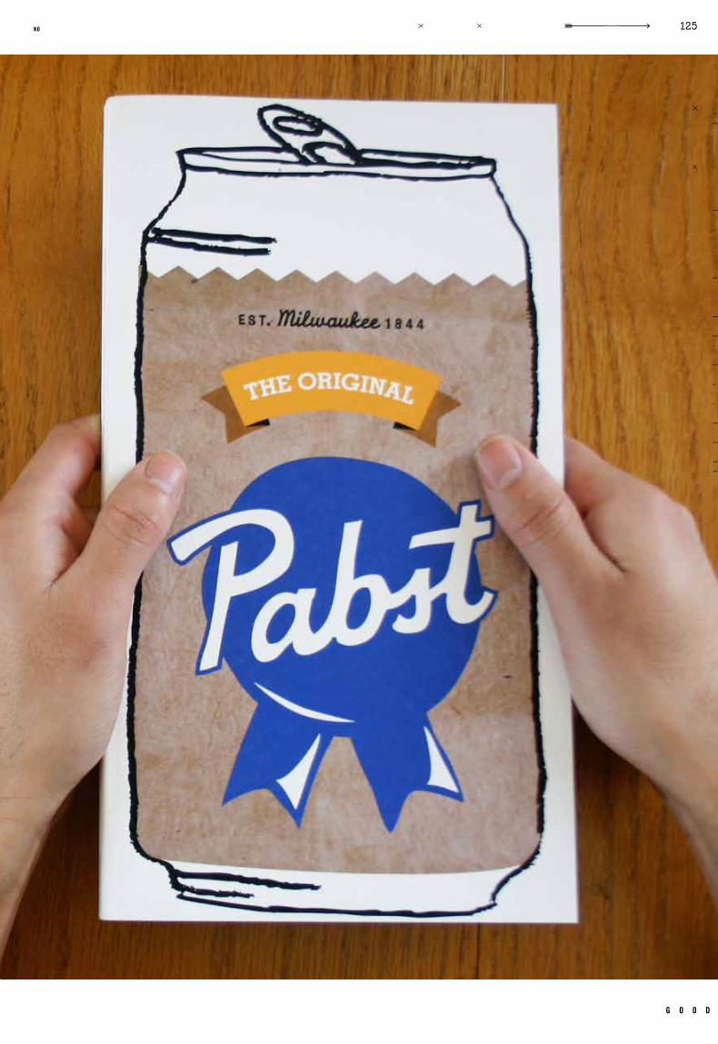
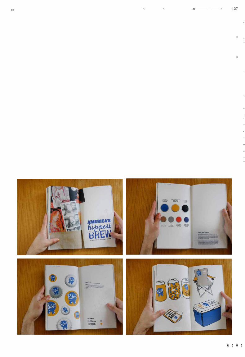
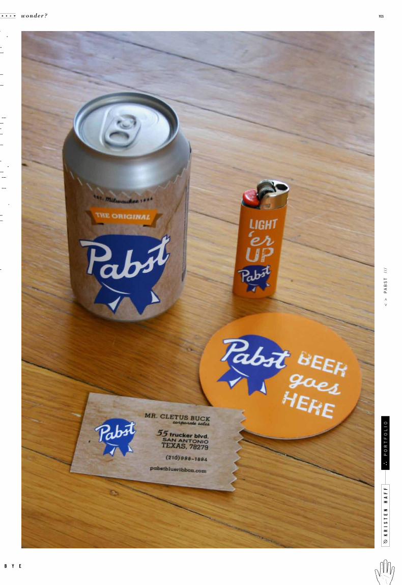
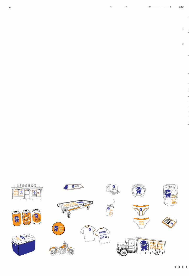
Pabst Beer Redesign
Todd Hedgpeth Gotham, Hand Cancel led, Knockout , Monoline
Logo, Standards Manual , Applicat ions, 3 Fina l Applicat ions, 3 Website Pages
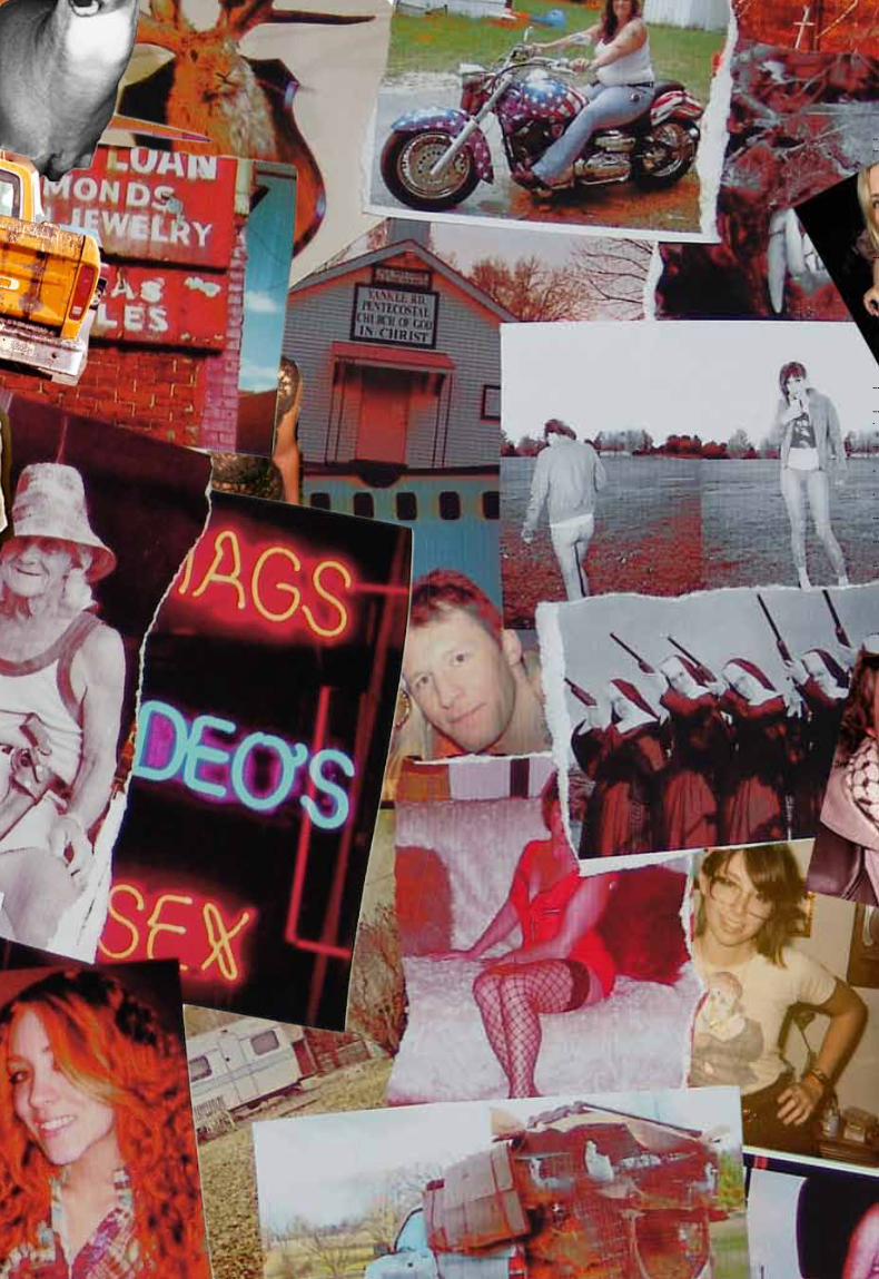
to rebrand a company in need of a fresh face. we were encouraged to choose a company
that we were interested in and had the potential for a upgrade. pabst blue ribbon has
a cult following, and their l abel has never been touched. pabst has a unique history
and an interesting fan base, making it an exciting company to rebrand. drawing on the
faithfulness of it ’s followers, a unique concept to develop, revolving around rednecks,
hipsters, and those who hold che ap beer de ar to their he arts. in order to maintain
consistency with the brand, a manual had to be created outlining all of the uses and
specifics, such as color, typefaces, etc. along with the manual, website, and applications,
even the beer can was redesigned. the result was a brand new look for a 100 year old beer.
c a s e t i t l e
o b j e c t i v e
c l a s s n u m b e r
d e l i v e r a b l e s
i n s t r u c t o r t y p e f a c e s
r e m a r k s g e n r e
d a t e c l a s s
.009
kr
is
te
n h
af
f
wonder? yes
b y e
po
rt
fo
li
o<
>
pa
bs
t
///
g o o d
119no

kr
is
te
n h
af
f
wonder? yes
b y e
po
rt
fo
li
o<
>
pa
bs
t
///
g o o d
123no
wonder? yes
b y e
g o o d
125no
kr
is
te
n h
af
f
wonder? yes
b y e
po
rt
fo
li
o<
>
pa
bs
t
///
g o o d
127no
kr
is
te
n h
af
f
wonder? yes
b y e
po
rt
fo
li
o<
>
pa
bs
t
///
g o o d
129no
kr
is
te
n h
af
f
wonder? yes
b y e
po
rt
fo
li
o<
>
ar
ro
w
///
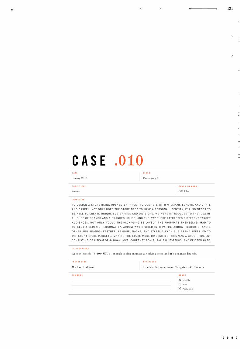
c a s e
Identity
Packaging
GR 434
Packaging 4Spring 2010
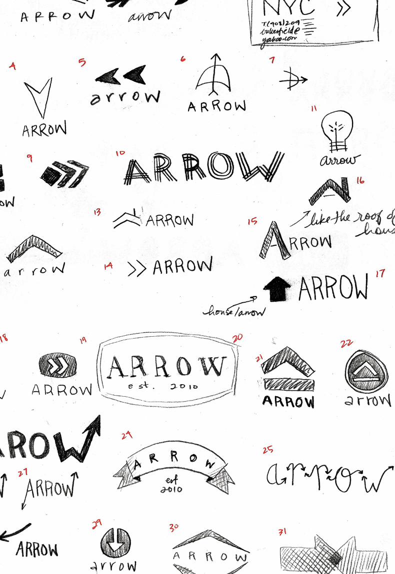
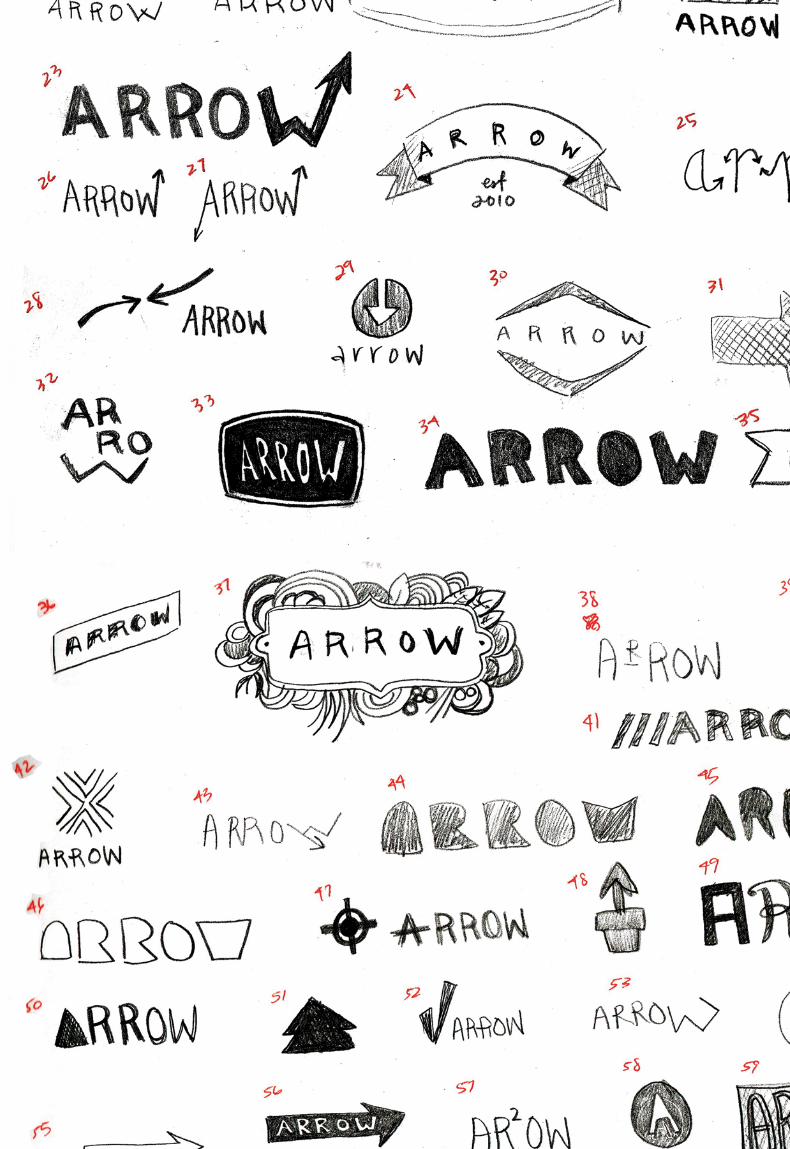
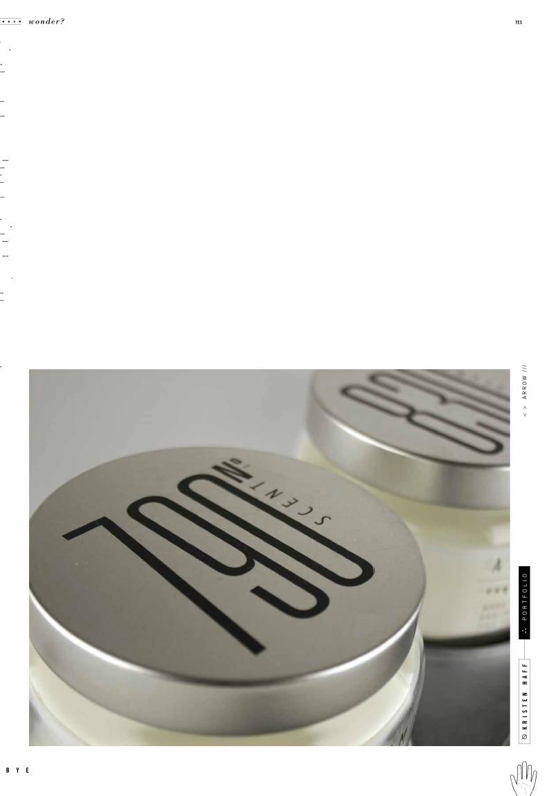
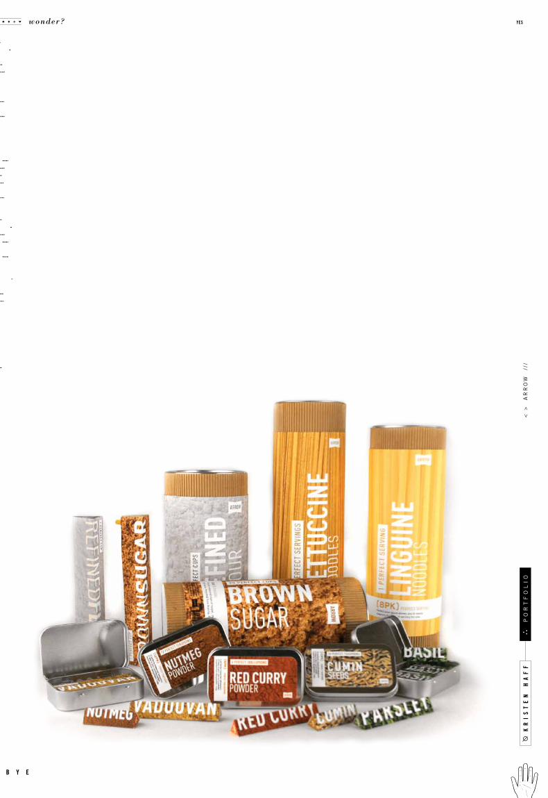
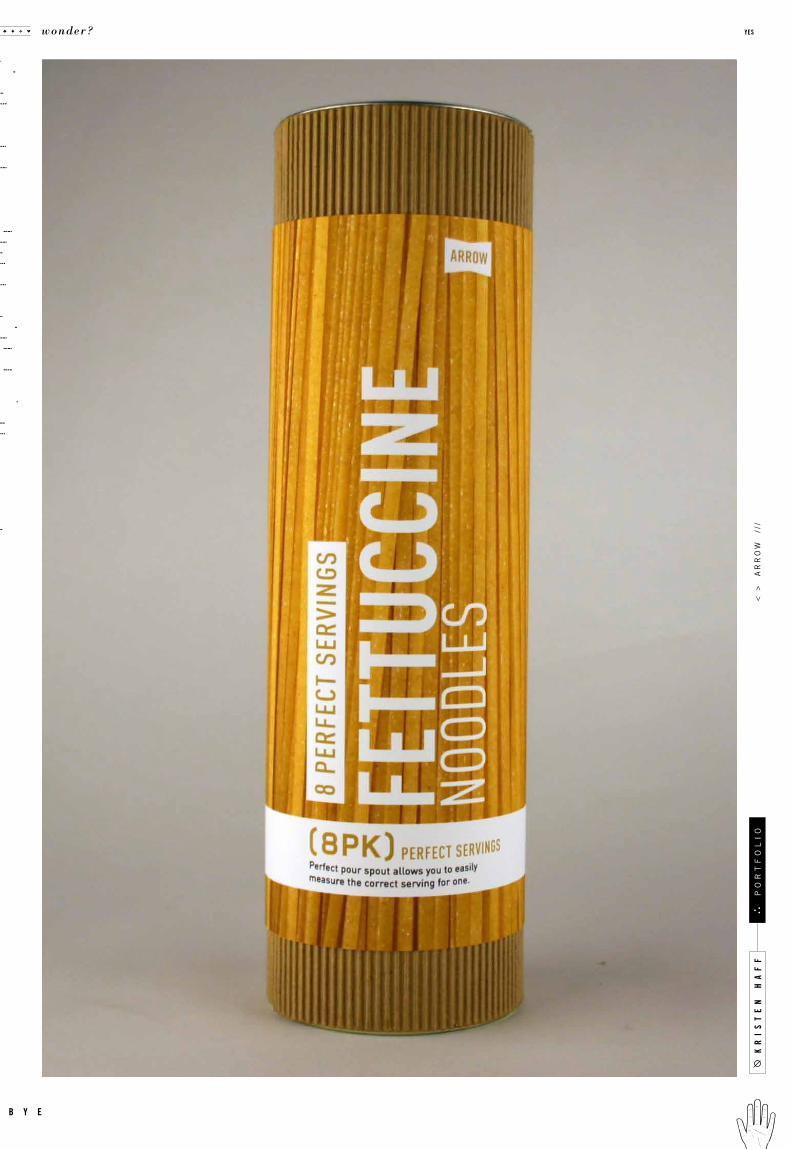
Arrow
Michael Osborne Blender, Gotham, Arno, Tungsten, AT Sackers
Approximately 75 -10 0 SKU’s, enough to demonstrate a working store and it ’s separate brands.
to design a store being opened by target to compete with williams sonoma and crate
and barrel. not only does the store need to have a personal identit y, it also needs to
be able to create unique sub brands and divisions. we were introduced to the idea of
a house of brands and a branded house, and the way these at tracted different target
audiences. not only would the pack aging be lovely, the products themselves had to
reflect a certain personalit y. arrow was div ided into parts, arrow products, and 4
other sub brands : fe ather, armour, nacks, and startup. e ach sub brand appe aled to
different niche markets, making the store more diversified. this was a group project
consisting of a team of 4 : noah love, courtney boyle, sal ballesteros, and kristen haff.
c a s e t i t l e
o b j e c t i v e
c l a s s n u m b e r
d e l i v e r a b l e s
i n s t r u c t o r t y p e f a c e s
r e m a r k s g e n r e
d a t e c l a s s
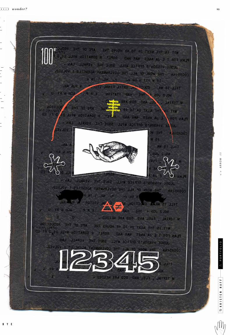
.010
g o o d
131no
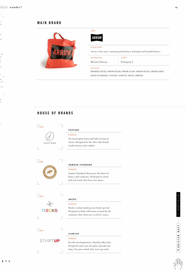
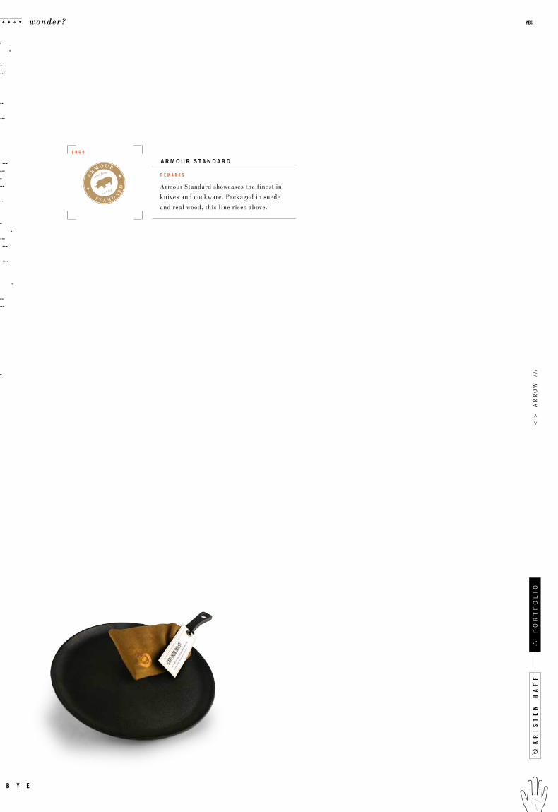
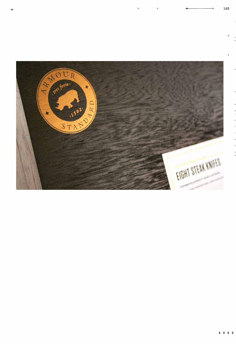
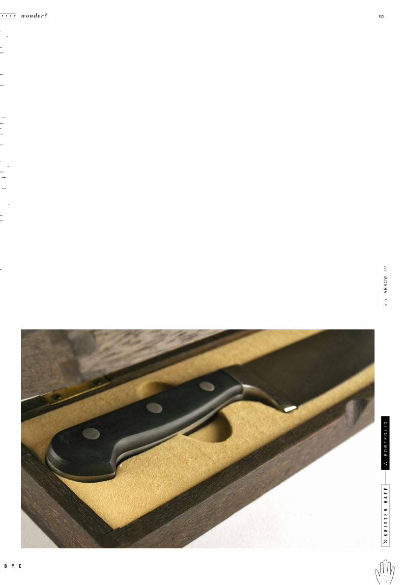
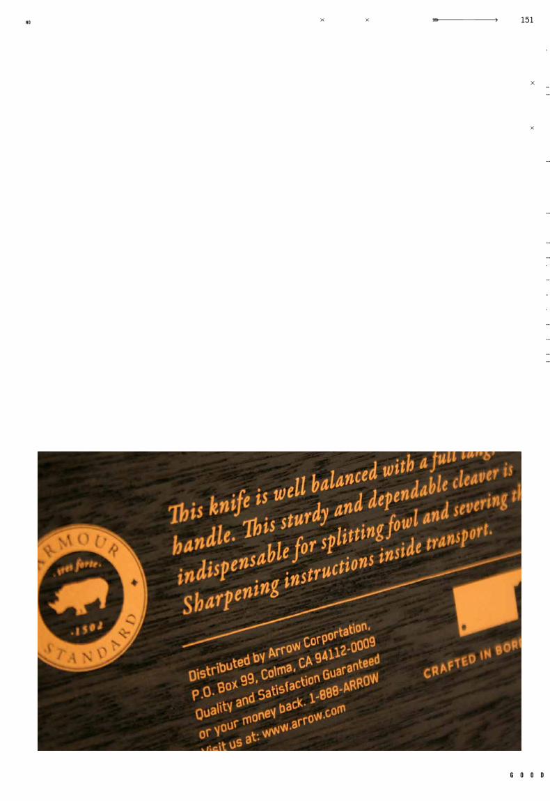
Armour Standard showcases the f inest in
knives and cookware. Packaged in suede
and real wood, this line r ises above.
An extravagant linen and bath section of
Arrow. Designed for the elite, this brand
exudes luxury and comfort.
Nacks is about making your home special.
Designed to hold collections created by the
customer, they showcase ecclectic tastes.
For the new homeowner, Star tUp offers kits
designed to get your new place up and run-
ning. Vaccum sealed, they never go stale.
r e m a r k s
r e m a r k s
r e m a r k s
r e m a r k s
branded house: arrow decor, arrow clean, arrow spices, arrow cakes
house of brands: feather, startup, nacks, armour
Michael Osborne Packaging 4
Arrow is the store containing both house of brands and branded house.
d e s c r i p t o r
i n s t r u c t o r
d i v i s i o n
l o g o
c l a s s
h o u s e o f b r a n d s
m a i n b r a n d
F e a t h e r
a r m o u r s t a n d a r d
n a c k s
s t a r t u p
l o g o
l o g o
l o g o
l o g o
kr
is
te
n h
af
f
wonder? yes
b y e
po
rt
fo
li
o

Not only do they look clean, their design is
so fresh. Average priced cleaning products
available to the detail oriented consumer.
Per fect measurements of spices make
cooking easy, Arrow thinks outside of
the box. Spice up your life.
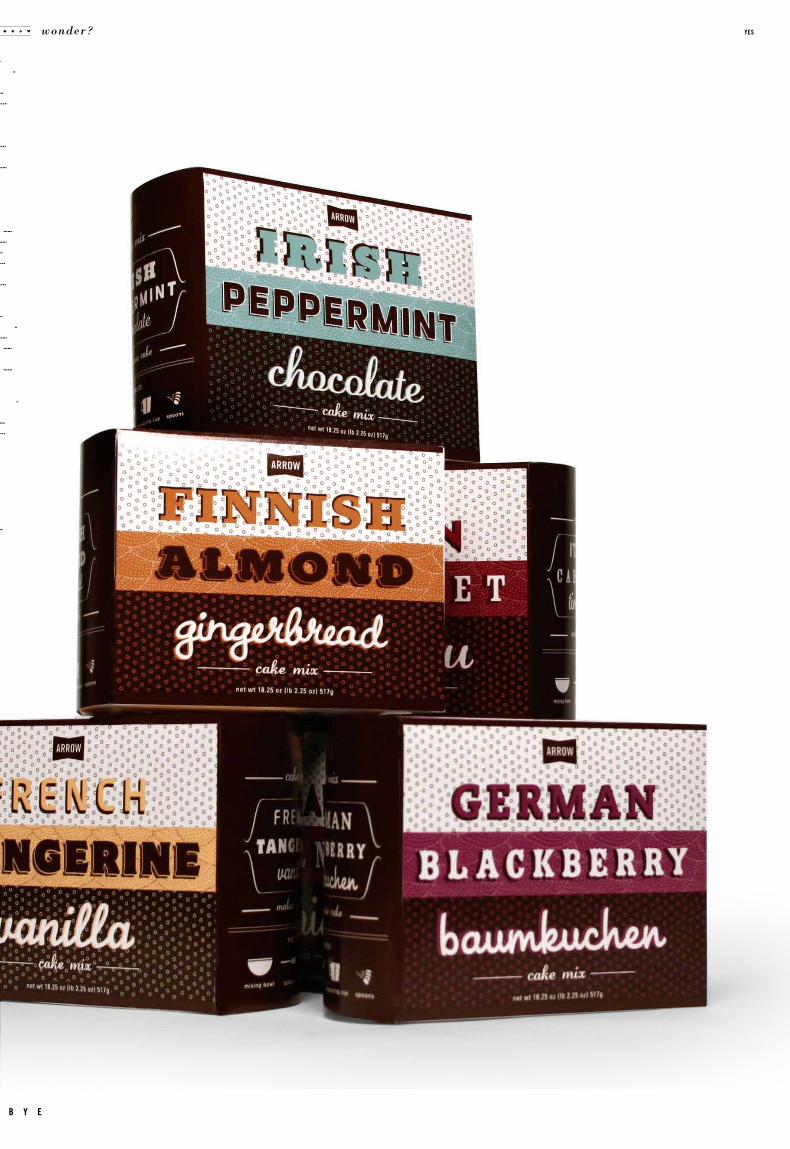
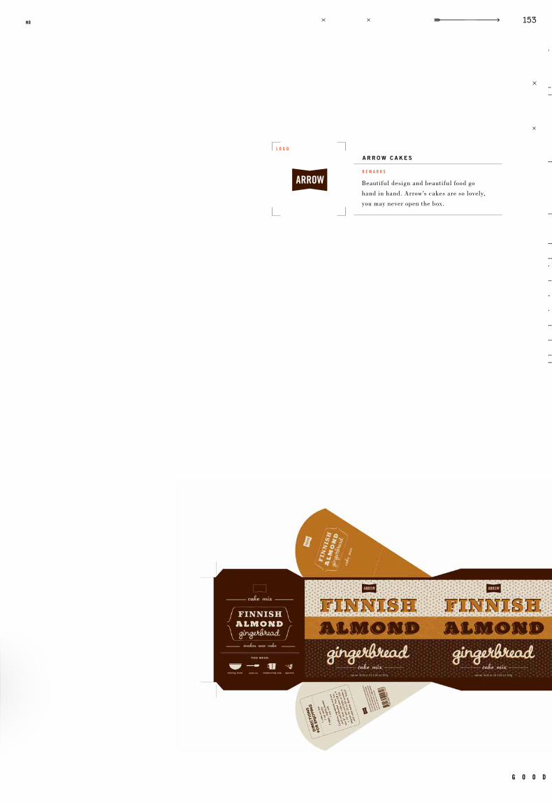
Beautiful design and beautiful food go
hand in hand. Arrow’s cakes are so lovely,
you may never open the box.
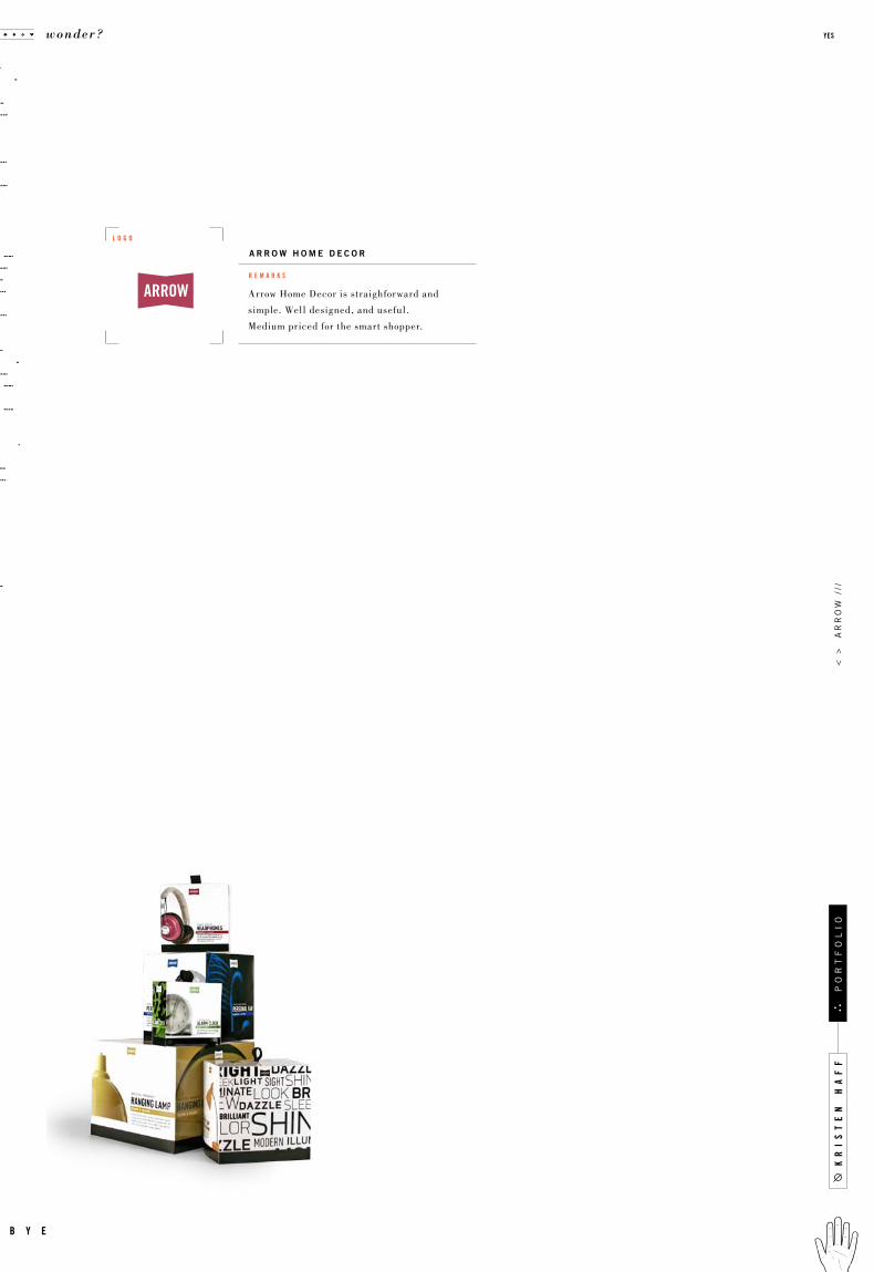
Arrow Home Decor is straighforward and
simple. Well designed, and useful.
Medium priced for the smart shopper.
r e m a r k s
r e m a r k s
r e m a r k s
r e m a r k s
b r a n d e d h o u s e
a r r o w c l e a n
a r r o w s p i c e s
a r r o w c a k e s
a r r o w h o m e d e c o r
l o g o
l o g o
l o g o
l o g o
g o o d
135no
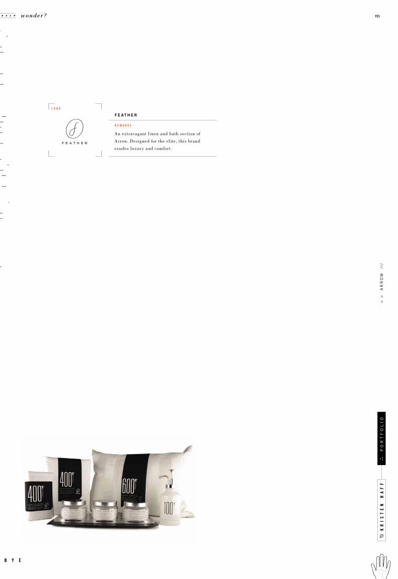
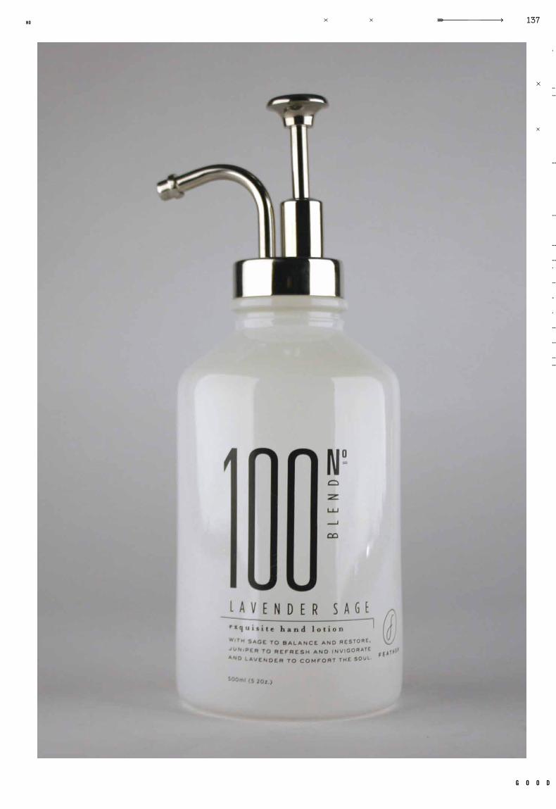
An extravagant linen and bath section of
Arrow. Designed for the elite, this brand
exudes luxury and comfort.
r e m a r k s
F e a t h e r
l o g o
kr
is
te
n h
af
f
wonder? yes
b y e
po
rt
fo
li
o<
>
ar
ro
w
///
g o o d
137no
kr
is
te
n h
af
f
wonder? yes
b y e
po
rt
fo
li
o<
>
ar
ro
w /
//
kr
is
te
n h
af
f
wonder? yes
b y e
po
rt
fo
li
o<
>
ar
ro
w
///

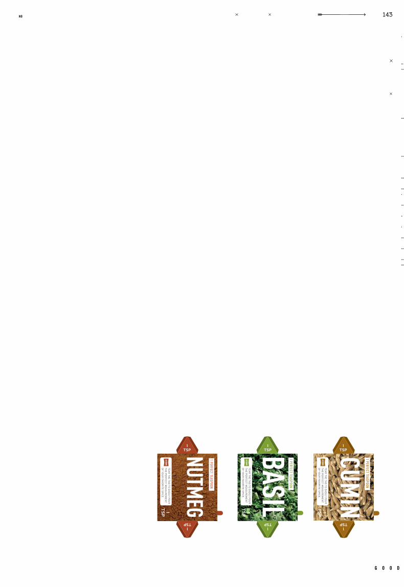
Perfect measurements of spices make
cooking easy, Arrow thinks outside of
the box. Spice up your life.
r e m a r k s
a r r o w s p i c e s
l o g o
g o o d
141no
kr
is
te
n h
af
f
wonder? yes
b y e
po
rt
fo
li
o<
>
ar
ro
w
///
g o o d
143no
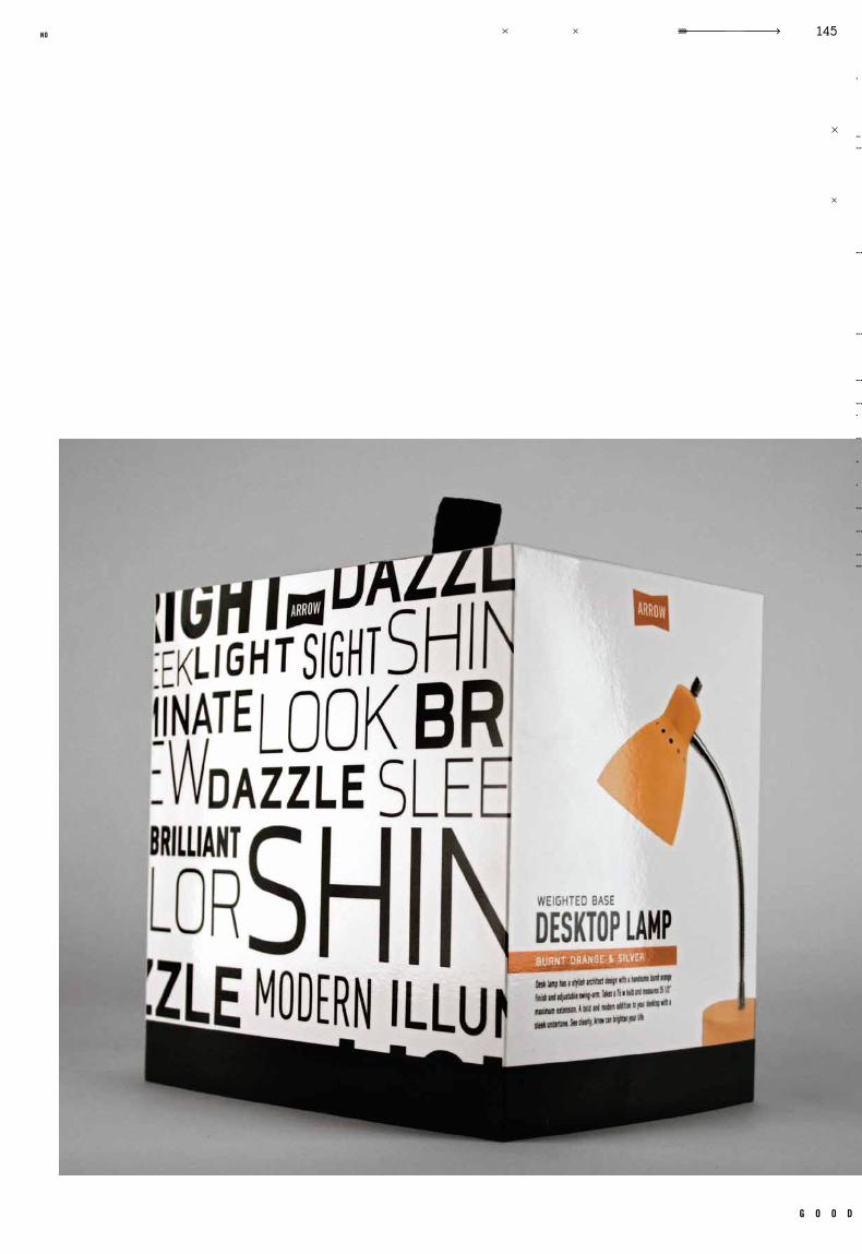
Arrow Home Decor is straighforward and
simple. Well designed, and useful.
Medium priced for the smart shopper.
r e m a r k s
a r r o w h o m e d e c o r
l o g o
kr
is
te
n h
af
f
wonder? yes
b y e
po
rt
fo
li
o<
>
ar
ro
w /
//
g o o d
145no
kr
is
te
n h
af
f
wonder? yes
b y e
po
rt
fo
li
o<
>
ar
ro
w
///

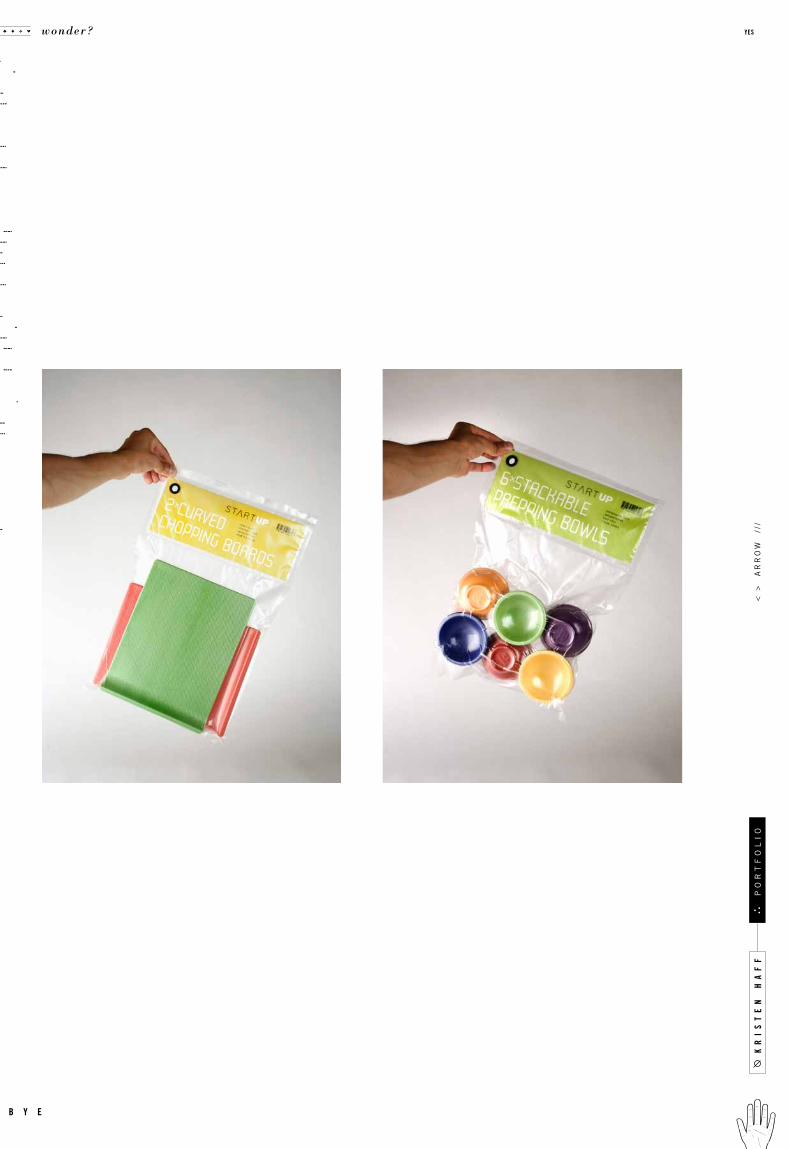
For the new homeowner, Star tUp offers kits
designed to get your new place up and run-
ning. Vaccum sealed, they never go stale.
r e m a r k s
s t a r t u p
l o g o
g o o d
147no
Armour Standard showcases the f inest in
knives and cookware. Packaged in suede
and real wood, this line r ises above.
r e m a r k s
a r m o u r s t a n d a r d
l o g o
kr
is
te
n h
af
f
wonder? yes
b y e
po
rt
fo
li
o<
>
ar
ro
w
///
g o o d
149no
kr
is
te
n h
af
f
wonder? yes
b y e
po
rt
fo
li
o<
>
ar
ro
w
///
g o o d
151no
wonder? yes
b y e
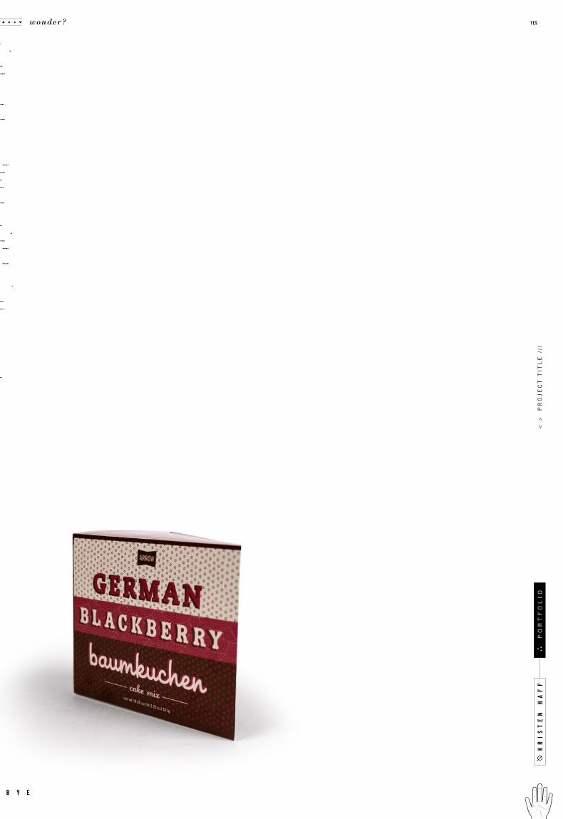
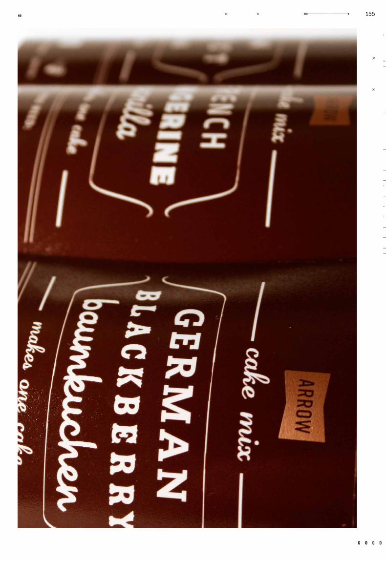
Beautiful design and beautiful food go
hand in hand. Arrow’s cakes are so lovely,
you may never open the box.
r e m a r k s
a r r o w c a k e s
l o g o
g o o d
153no
kr
is
te
n h
af
f<
>
pr
oj
ec
t t
itl
e /
//
wonder? yes
b y e
po
rt
fo
li
o
g o o d
155no
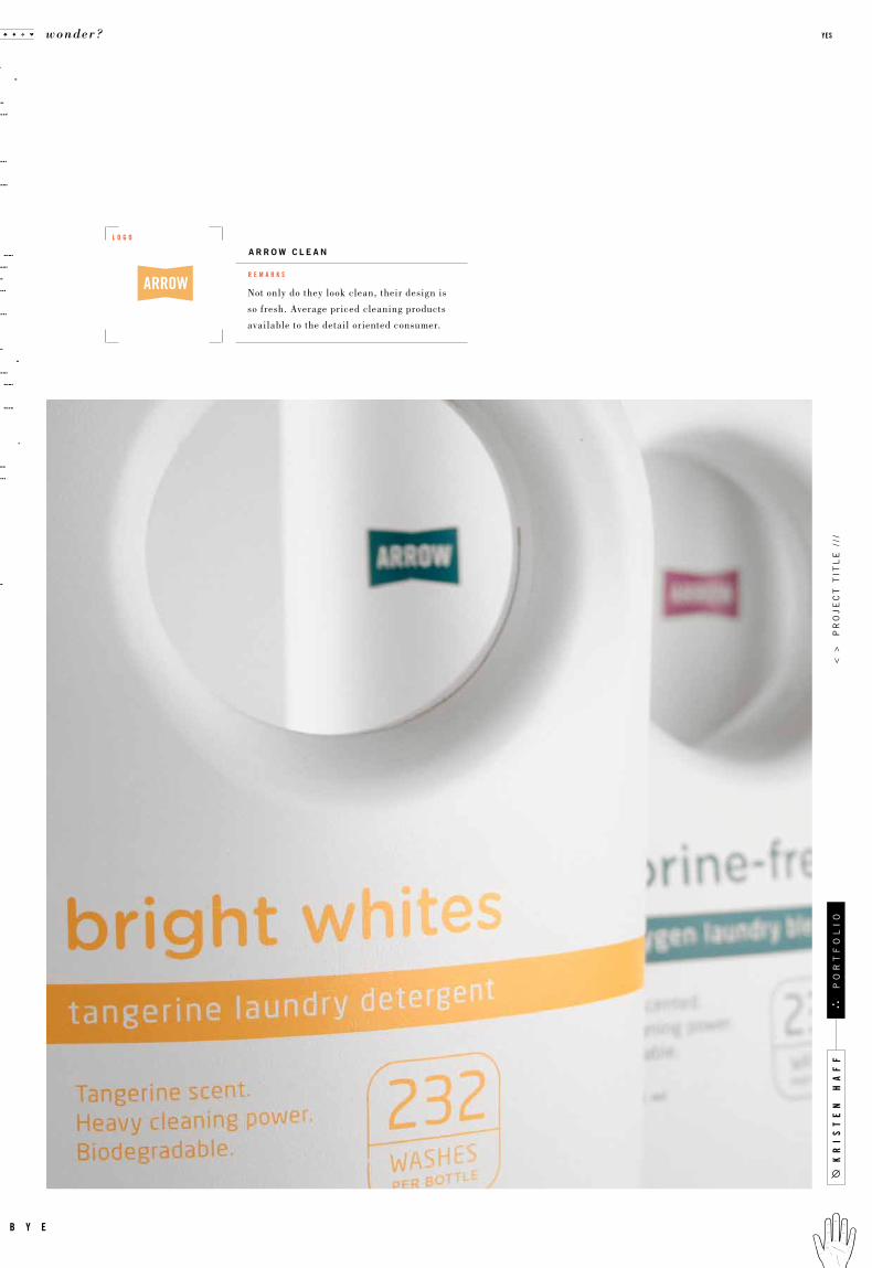
Not only do they look clean, their design is
so fresh. Average priced cleaning products
available to the detail oriented consumer.
r e m a r k s
a r r o w c l e a n
l o g o
kr
is
te
n h
af
f<
>
pr
oj
ec
t t
itl
e /
//
wonder? yes
b y e
po
rt
fo
li
o
g o o d
157no
kr
is
te
n h
af
f<
>
pr
oj
ec
t t
itl
e /
//
wonder? yes
b y e
po
rt
fo
li
o
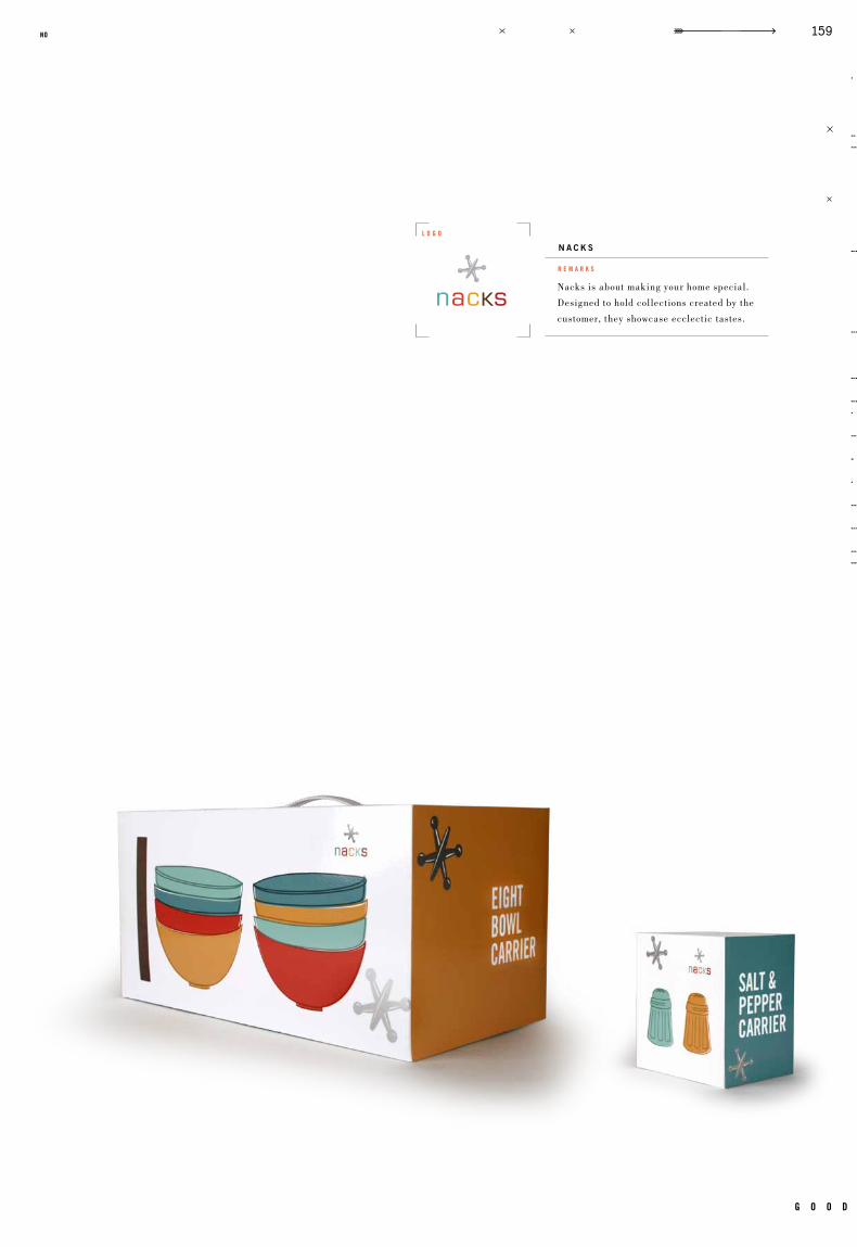
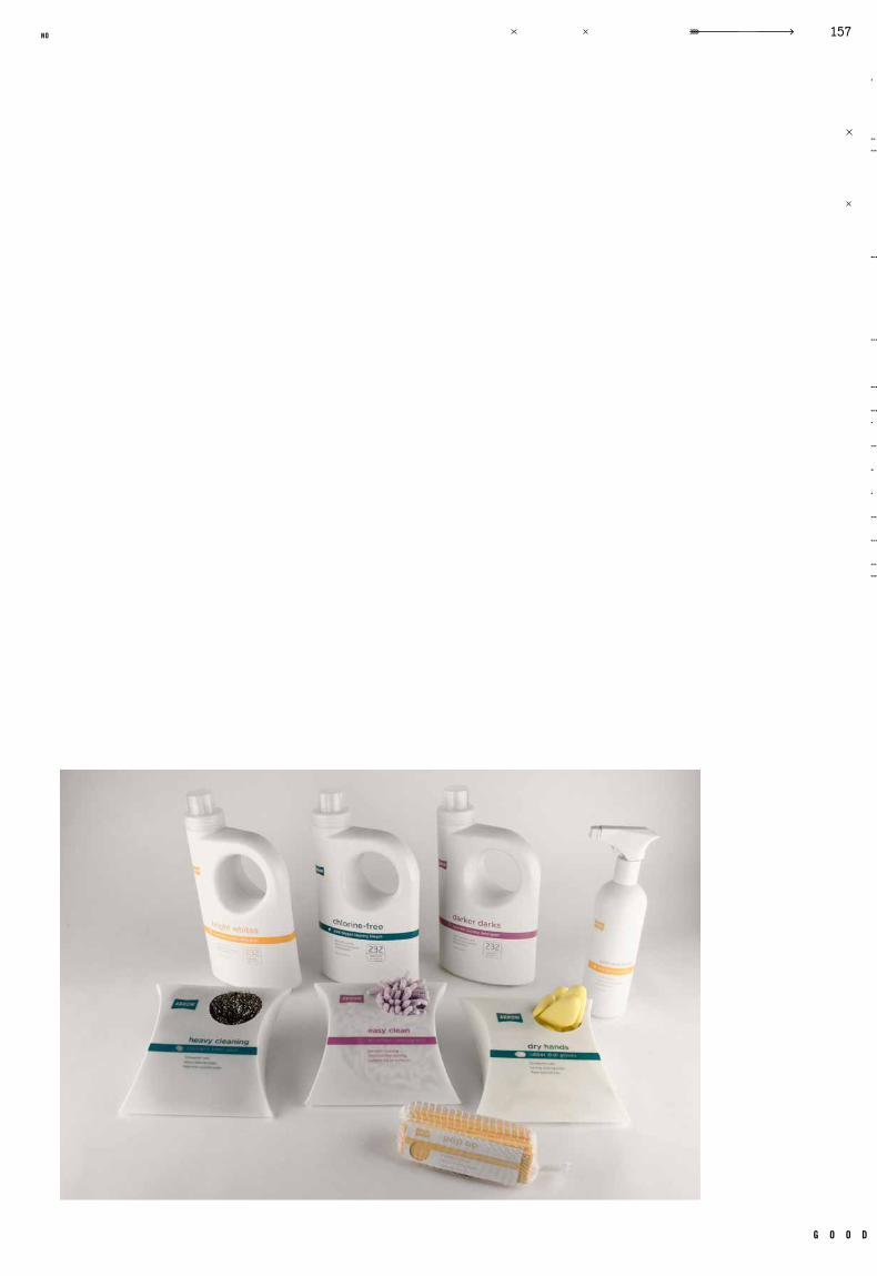
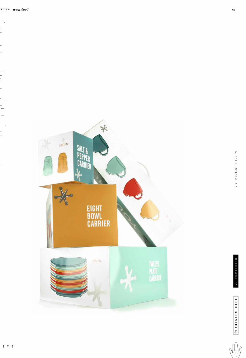
Nacks is about making your home special.
Designed to hold collections created by the
customer, they showcase ecclectic tastes.
r e m a r k s
n a c k s
l o g o
g o o d
159no
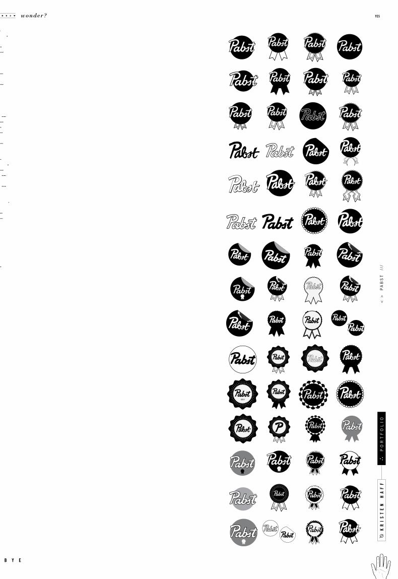
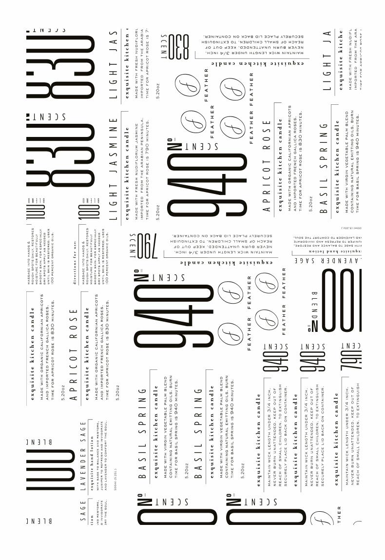
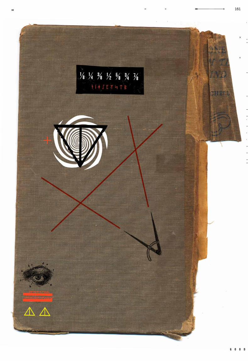
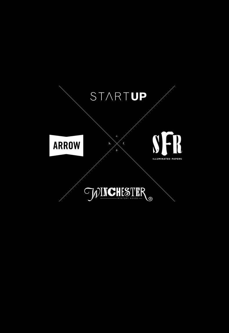
c a s e .011
Identity
Packaging
Ident ity
N /AIn Progress
Logos and Miscel lany
N/A N/A
N/A
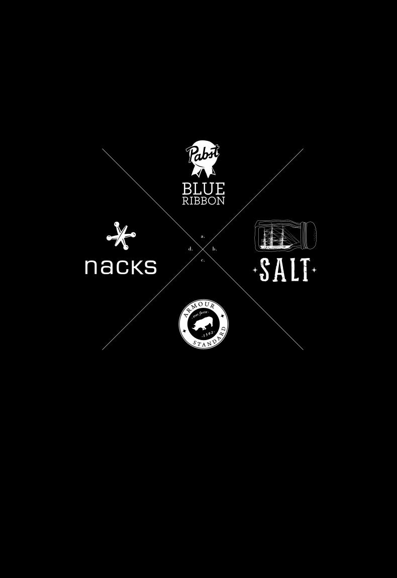
a collection of logos designed during my studies at the academy of art. presented in color
and black and white, these logos are designed to be the strongest, simplest statement
about a c ompany. though the y seem simple, e ach design is l abored over and deeply
researched. any logo is a vital element of an identit y, and must effectively represent
what the company views it ’s core values to be. though small, they introduce the company
to the public, and when meeting the public, one must look sharp.
c a s e t i t l e
o b j e c t i v e
c a t e g o r y
d e l i v e r a b l e s
i n s t r u c t o r t y p e f a c e s
r e m a r k s g e n r e
d a t e c l a s s
kr
is
te
n h
af
f
wonder? yes
b y e
po
rt
fo
li
o<
>
lo
go
s
///
g o o d
161no
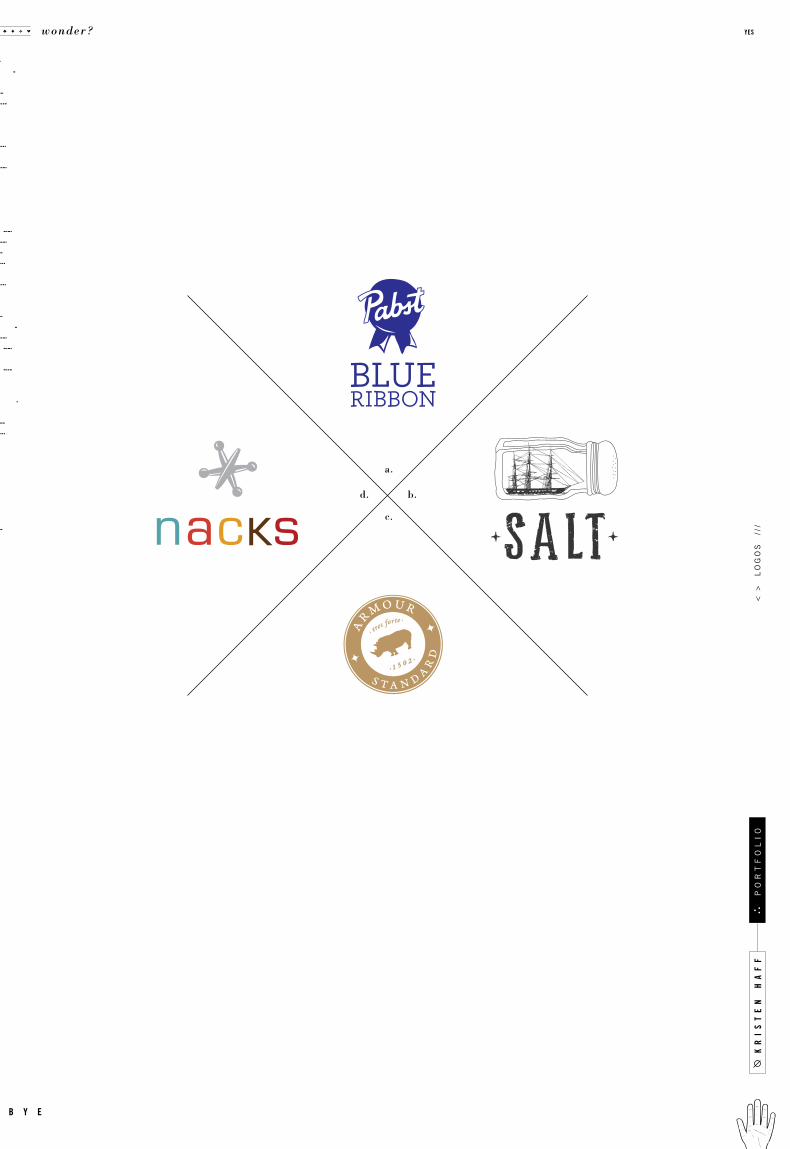
a.
b.
c.
d.
kr
is
te
n h
af
f
wonder? yes
b y e
po
rt
fo
li
o<
>
lo
go
s
///
a.
b.
c.
d.
g o o d
163no
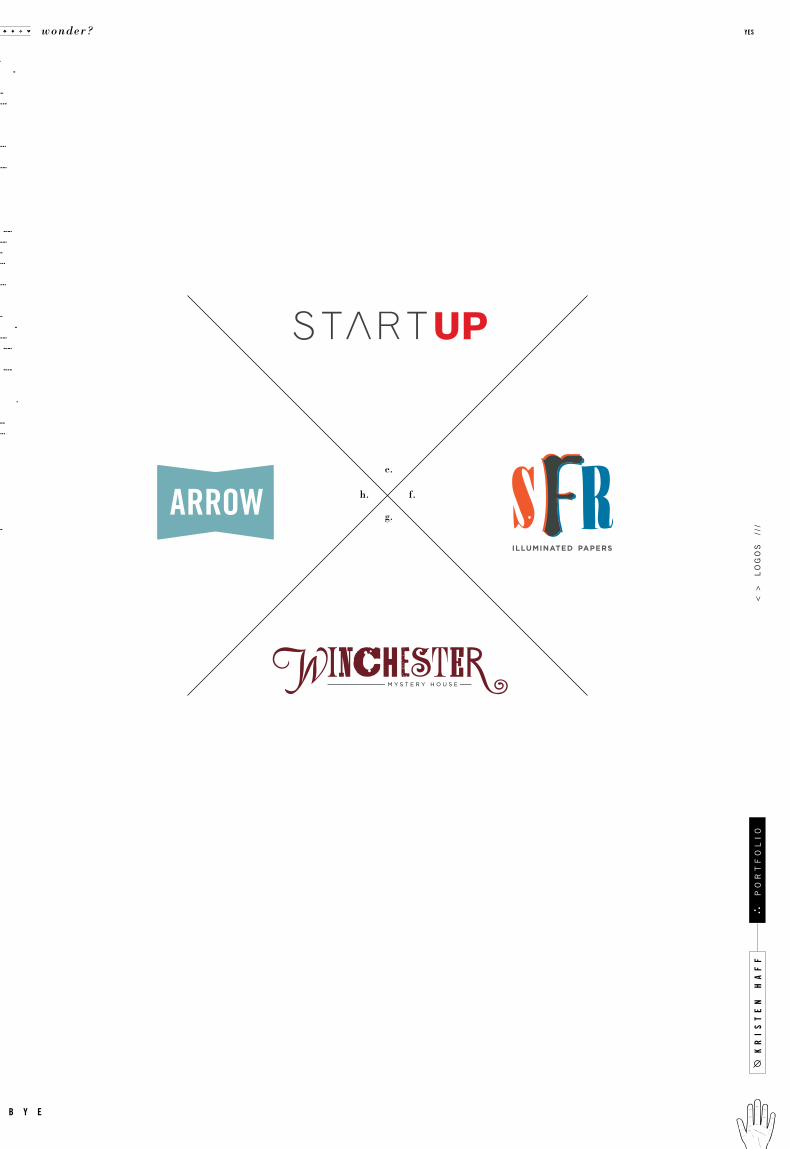
e.
f.
g.
h.
kr
is
te
n h
af
f
wonder? yes
b y e
po
rt
fo
li
o<
>
lo
go
s
///
e.
f.
g.
h.
g o o d
165no


kr
is
te
n h
af
f
wonder? yes
b y e
po
rt
fo
li
o

$$$
Beer and/or Shot
Super Burrito
Back Massage
No Time, No Money
A Business Card
Big Time
Other:
t h a n k y o u i o w e y o u
mom and dad, brother and sister, aunties , c ousins , uncles ,
grandmas, and poppa . my absinthe family. my de arest friends,
especially cnobbs2, jelly, marco, noah love, tee taw, patsy and
goldylocks. thank you roomies and guineas. thank you teachers
for all your time and love, thank you mary, thank you michael,
to m, m a x , ro l a nd, a nd nic o le . t h a nk you c o f fee , t h a nk you
sunshine, thank you bicycle. thank you fog for keeping me inside
when i wanted to go out. thank you sf.
g o o d
169no
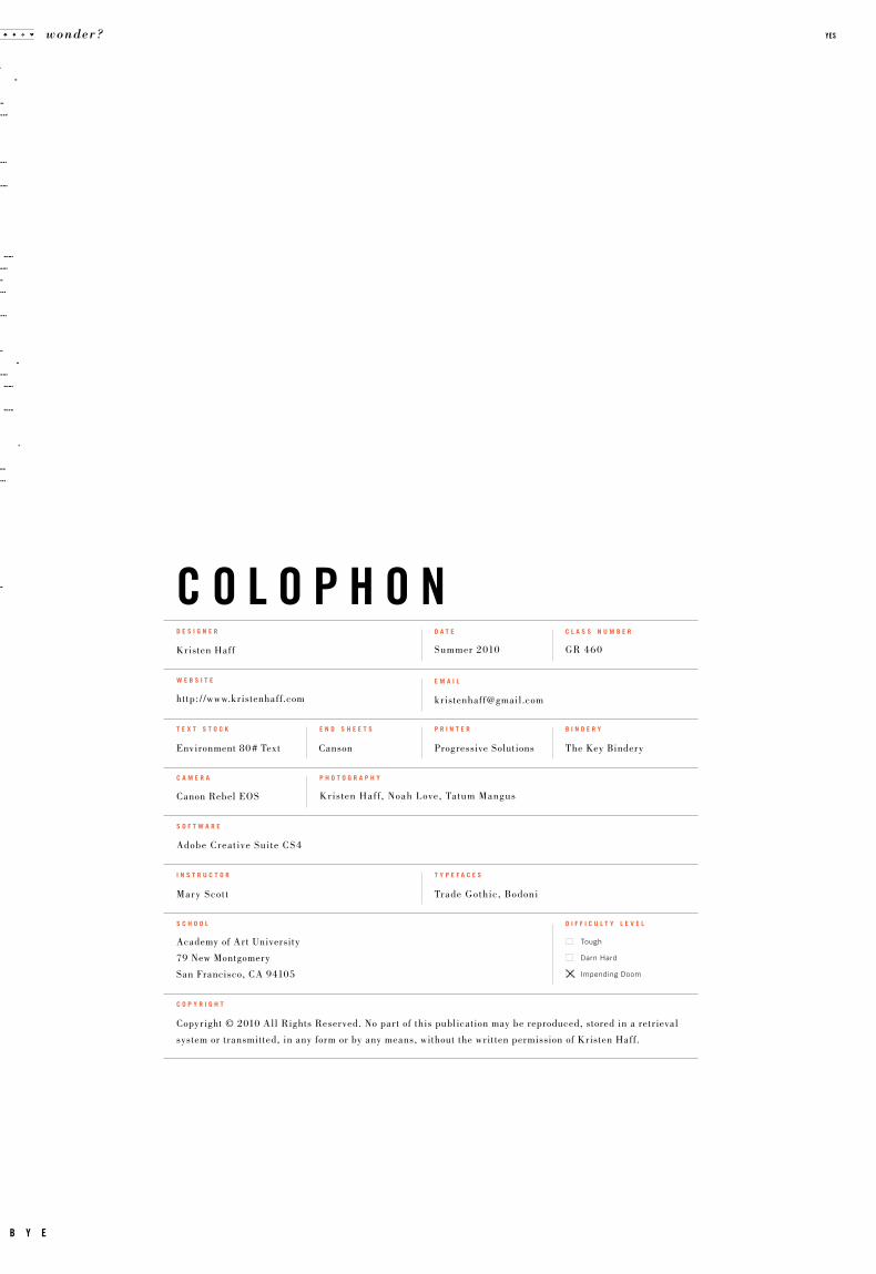
c o l o p h o n
Tough
Darn Hard
Impending Doom
Kristen Haff
Environment 80 # Text Canson Progressive Solutions The Key Bindery
http: / /www.kristenhaff.com
Copyright © 2010 All Rights Reserved. No part of this publication may be reproduced, stored in a retr ieval
system or transmitted, in any form or by any means, without the written permission of Kristen Haff.
Academy of Art University
79 New Montgomery
San Francisco, CA 94105
Mary Scot t Trade Gothic, Bodoni
Adobe Creat ive Suite CS4
w e b s i t e
c o p y r i g h t
t e x t s t o c k e n d s h e e t s p r i n t e r b i n d e r y
s o f t w a r e
i n s t r u c t o r t y p e f a c e s
s c h o o l d i f f i c u l t y l e v e l
d e s i g n e r
e m a i l
GR 460Summer 2010
c l a s s n u m b e rd a t e
Kristen Haf f , Noah Love, Tatum MangusCanon Rebel EOS
c a m e r a p h o t o g r a p h y
wonder? yes
b y e