06 mm1 b03
DESCRIPTION
TRANSCRIPT
Week 6, MM1B03, McMaster University
Colour
From L.A. White Elements of Graphic Design L. Holtzsch, Understanding Colour R. Landa, Elements of Graphic Designand Internet Sources
& Typography
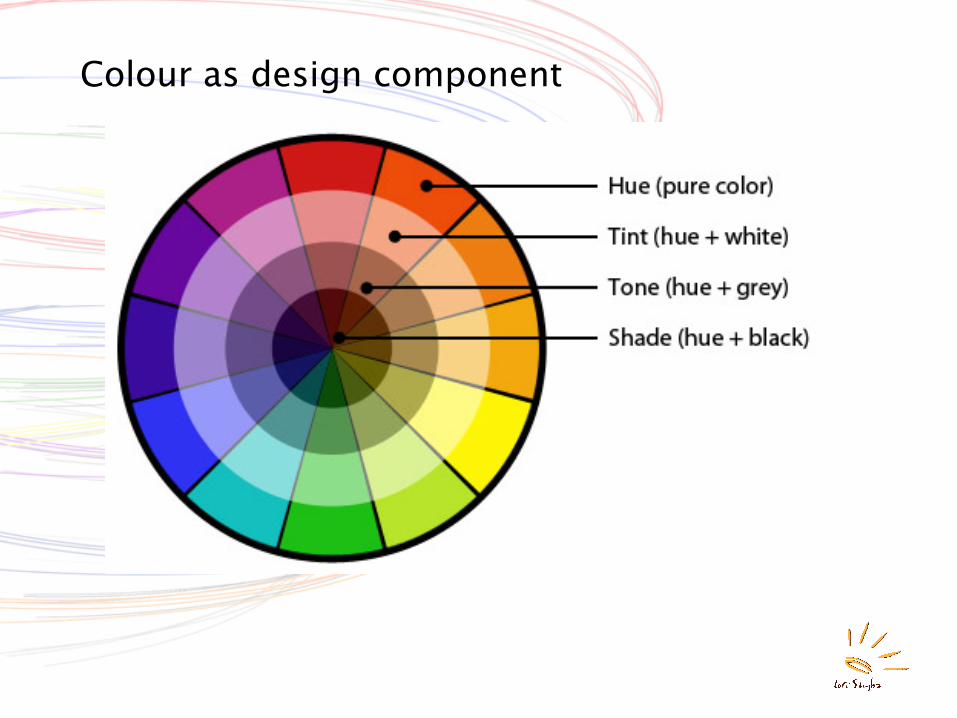
Colour as design component
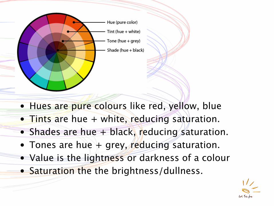
• Hues are pure colours like red, yellow, blue• Tints are hue + white, reducing saturation.• Shades are hue + black, reducing saturation.• Tones are hue + grey, reducing saturation.• Value is the lightness or darkness of a colour• Saturation the the brightness/dullness.
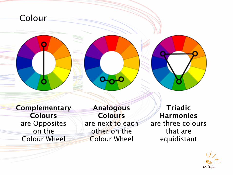
Colour
Complementary Colours
are Opposites on the
Colour Wheel
Analogous Colours
are next to each other on the Colour Wheel
Triadic Harmonies
are three colours that are
equidistant
Colour
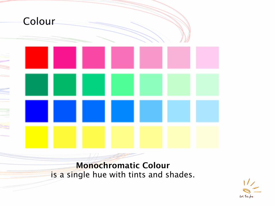
Monochromatic Colouris a single hue with tints and shades.
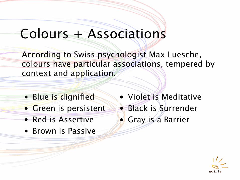
Colours + AssociationsAccording to Swiss psychologist Max Luesche, colours have particular associations, tempered by context and application.
• Blue is dignified• Green is persistent• Red is Assertive• Brown is Passive
• Violet is Meditative• Black is Surrender• Gray is a Barrier
Colour Space
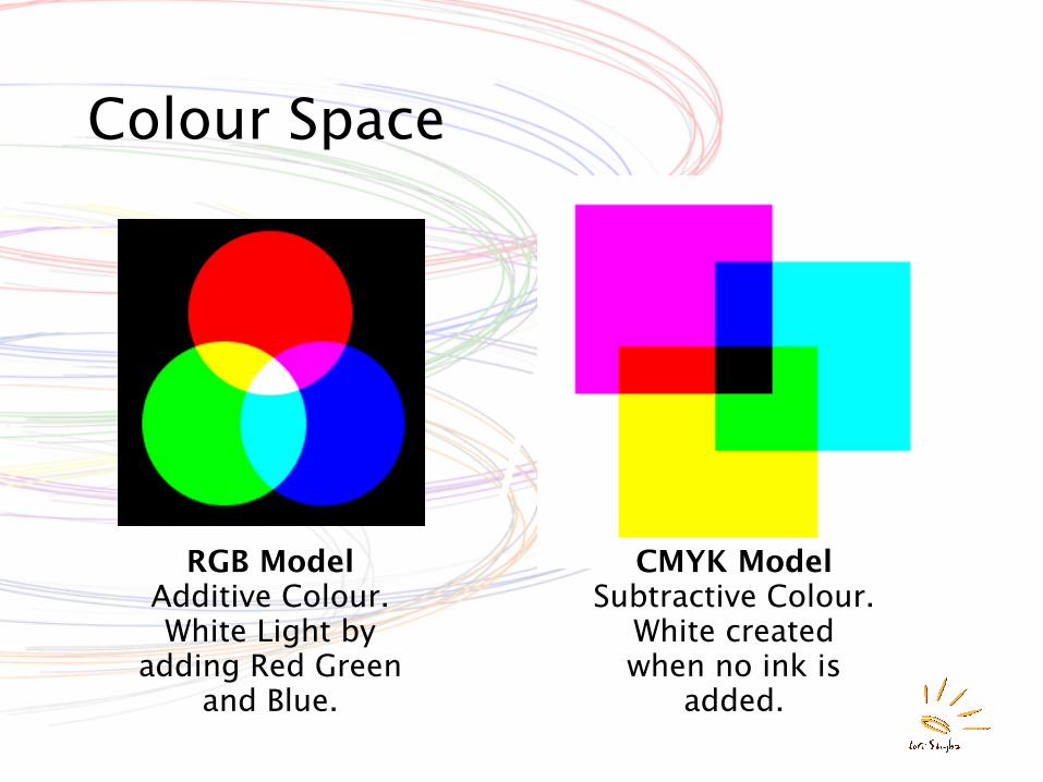
RGB ModelAdditive Colour.White Light by
adding Red Green and Blue.
CMYK ModelSubtractive Colour.
White created when no ink is
added.
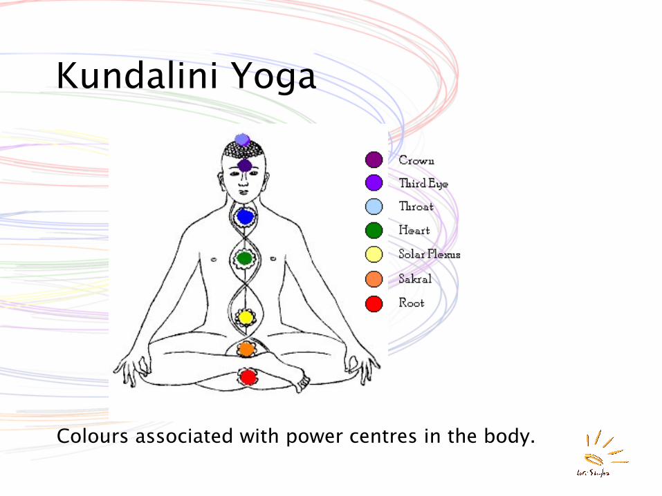
Kundalini Yoga
Colours associated with power centres in the body.
Colour Composition
• Colours that are used together create a colour composition: a group of colours meant to be sensed as a whole.
• A group of colours selected for use together is called a palette, a colourway, a colour story, depending on the industry or design discipline.
Ground and Carried Colours• The background of a colour composition is
its ground.• Colours laid on a ground are carried colours.• Ground established the visual reference
point for carried colours and is determined by composition not by colour.
• Visual cues and the arrangement of forms determine which parts of a composition are image or pattern and which part is understood as background.
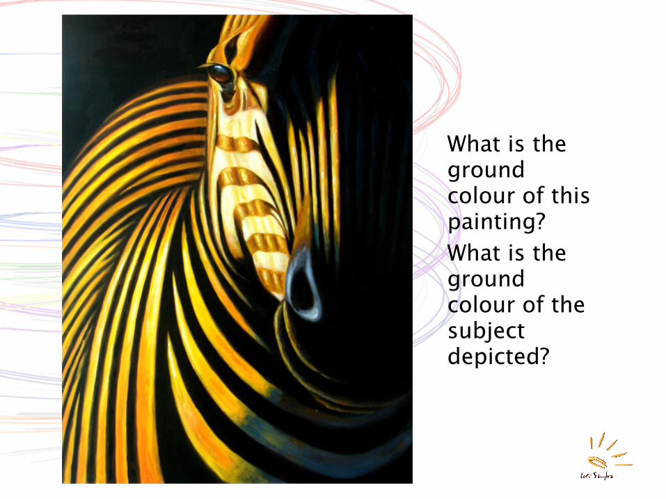
What is the ground colour of this painting?What is the ground colour of the subject depicted?
Ground and Graphic Quality• Graphic quality is the “readability” of a
composition, or how clearly images can be seen against their background.
• Differences in value -- contrasts between light and dark -- separate images from their background. Black+white most value contrast.
• High contrast images are not always desirable.
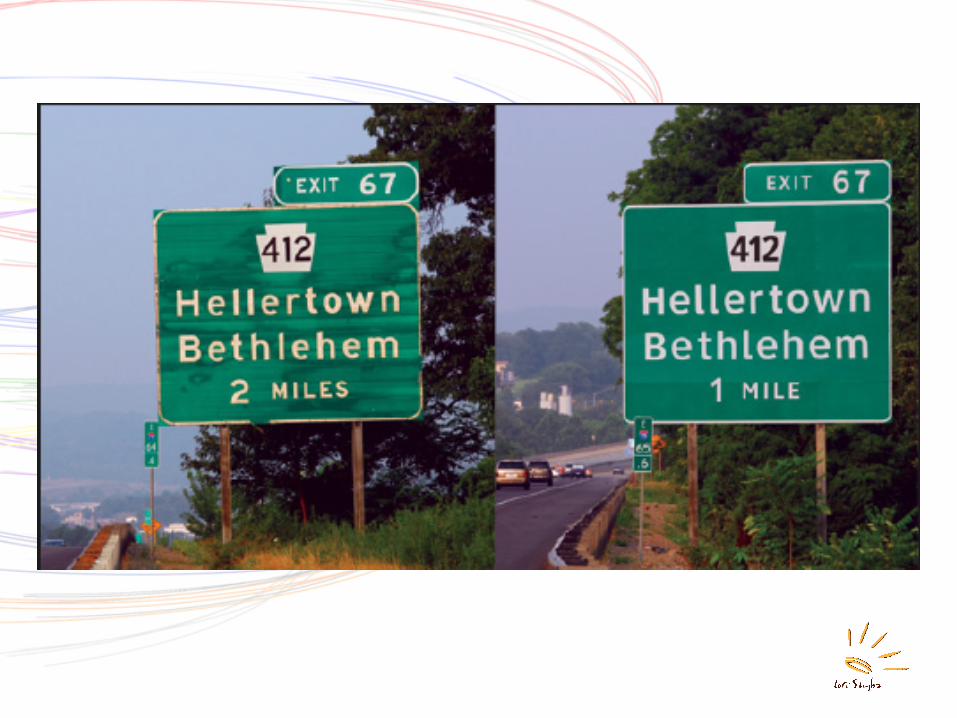
Scale of design • The distance from which something is
experienced is an important factor in design. ie magazine vs wallpaper vs highway billboards.
• In graphic design, “image” is a picture, “pattern” is an image or motif repeated against a ground.
• Optical mixes result when images or motifs converge to create a new colour or texture.
• Whether a design is seen as an image, pattern, or texture depends on the scale of its design elements relative to viewing distance.
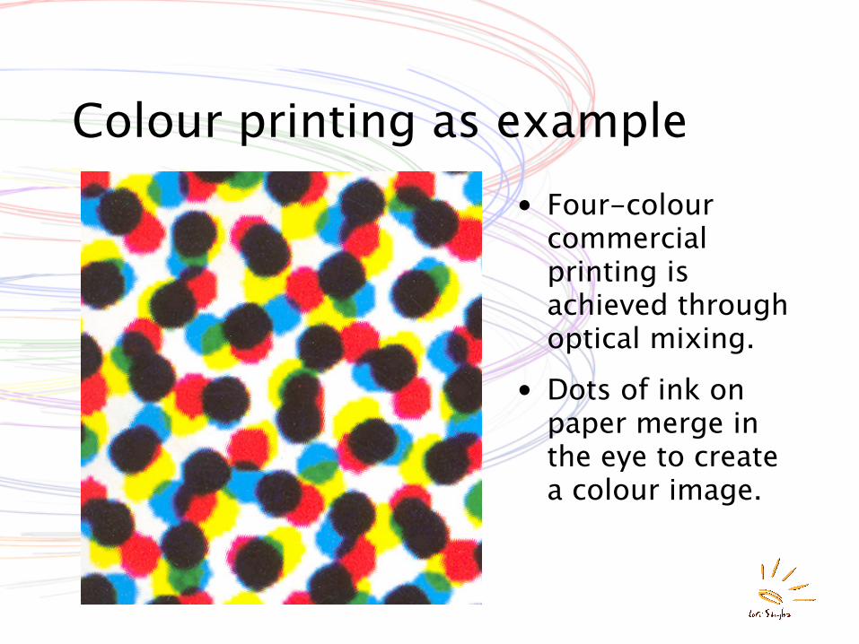
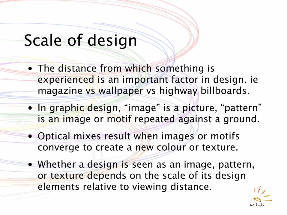
Colour printing as example• Four-colour
commercial printing is achieved through optical mixing.
• Dots of ink on paper merge in the eye to create a colour image.
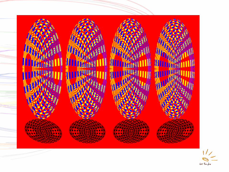
Vibration• Vibration occurs strongly with complementary
colours.
• The struggle to focus on edge, added to the struggle to reach equilibrium can be a tough visual experience.
• Vibration can also result from poor scale in a pattern relative to viewing distance. “Op art” is an aesthetic experiment in vibration causing visual distortion.
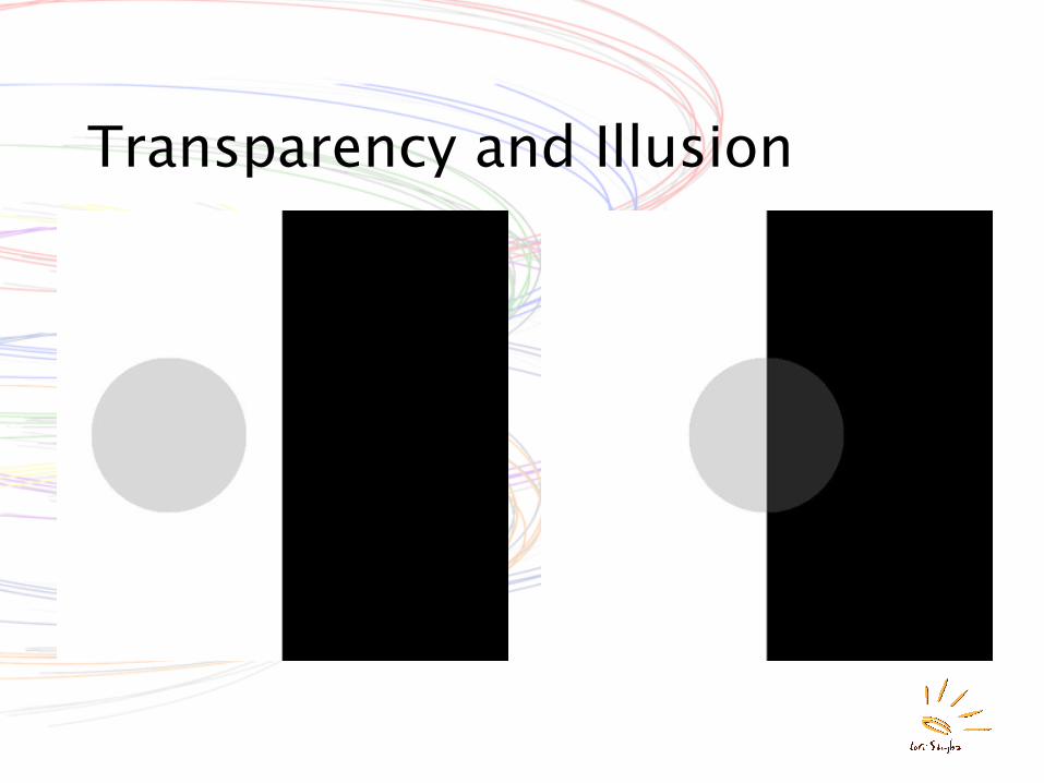
Transparency and Illusion• True transparency can be illustrated by the fact
that coffee in a pot is very dark but when spilled in a saucer is light coloured. Josef Albers describes this as “volume colour.”
• Perceptual transparency is the phenonmenon of seeing one surface behind another.
• When a small portion of a transparent surface is observed, neither the surface colour, nor the fusion colour is perceived, but only the colour resulting from the fusion of that of the transparent surface and that of the background.
Transparency and Illusion
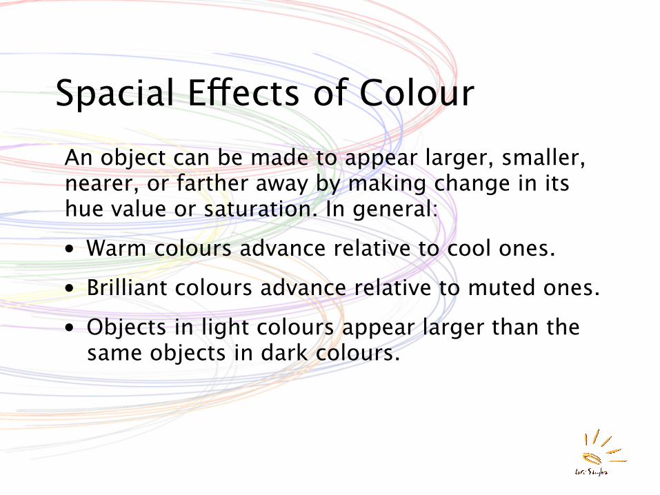
Spacial Effects of ColourAn object can be made to appear larger, smaller, nearer, or farther away by making change in its hue value or saturation. In general:
• Warm colours advance relative to cool ones.
• Brilliant colours advance relative to muted ones.
• Objects in light colours appear larger than the same objects in dark colours.
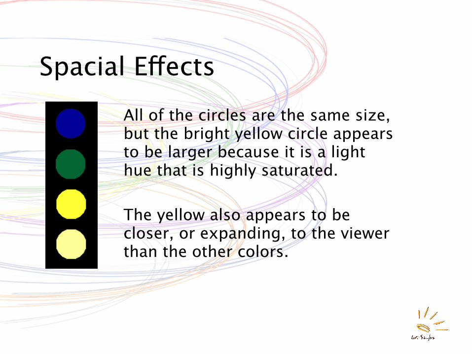
Spacial EffectsAll of the circles are the same size, but the bright yellow circle appears to be larger because it is a light hue that is highly saturated.
The yellow also appears to be closer, or expanding, to the viewer than the other colors.
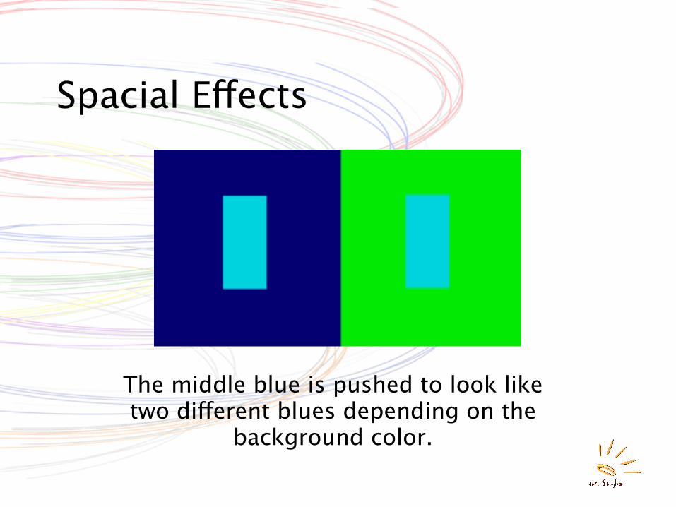
Spacial Effects
The middle blue is pushed to look like two different blues depending on the
background color.
Typographyfrom R. Landa, Elements of Graphic Designand Internet Sources
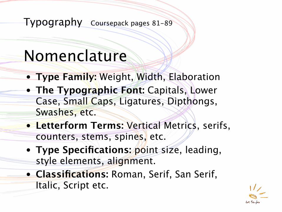
Typography Coursepack pages 81-89
Nomenclature• Type Family: Weight, Width, Elaboration• The Typographic Font: Capitals, Lower
Case, Small Caps, Ligatures, Dipthongs, Swashes, etc.
• Letterform Terms: Vertical Metrics, serifs, counters, stems, spines, etc.
• Type Specifications: point size, leading, style elements, alignment.
• Classifications: Roman, Serif, San Serif, Italic, Script etc.
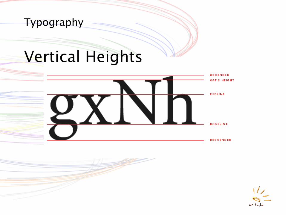
Typography
Vertical Heights
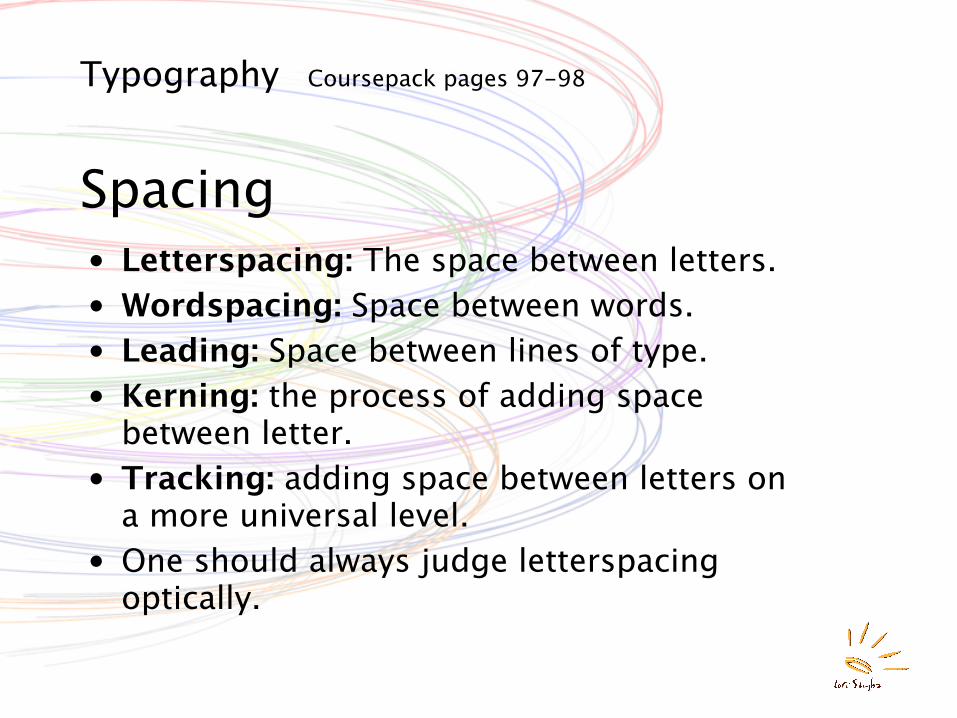
Typography Coursepack pages 97-98
Spacing• Letterspacing: The space between letters.• Wordspacing: Space between words.• Leading: Space between lines of type.• Kerning: the process of adding space
between letter.• Tracking: adding space between letters on
a more universal level.• One should always judge letterspacing
optically.
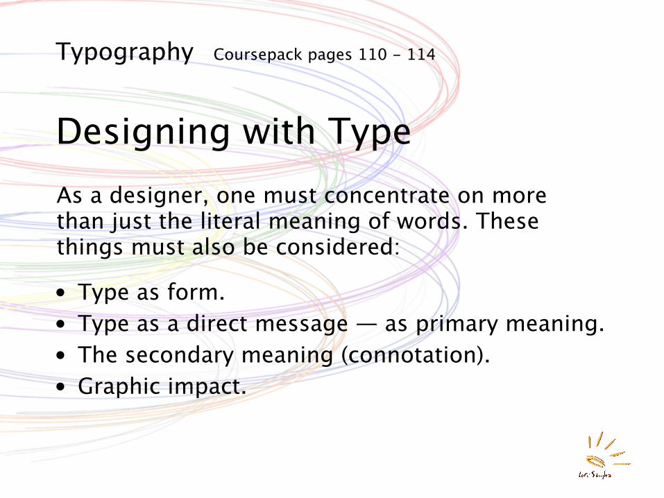
Typography Coursepack pages 110 - 114
Designing with TypeAs a designer, one must concentrate on more than just the literal meaning of words. These things must also be considered:
• Type as form.• Type as a direct message — as primary meaning.• The secondary meaning (connotation).• Graphic impact.